Inspired by Pantone’s Color of the Year Very Peri!
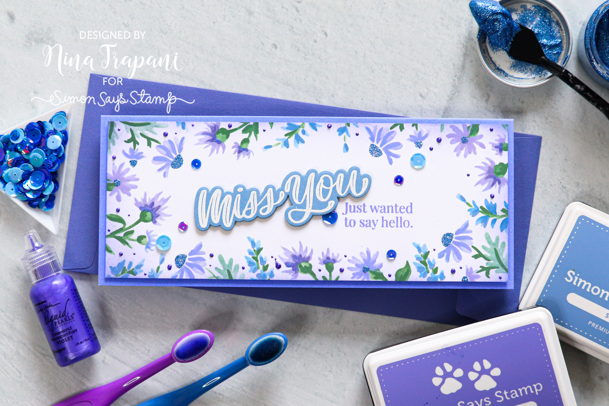
Hello creative friends, it’s Nina-Marie Trapani here with you! Pantone has announced its 2022 Color of the Year, which is Veri Peri! So obviously, periwinkle is the inspiration behind today’s project. I wanted to really highlight the uniqueness of this color; its mystical dance between blue and purple. I’ve used both hues to create this floral slimline card.
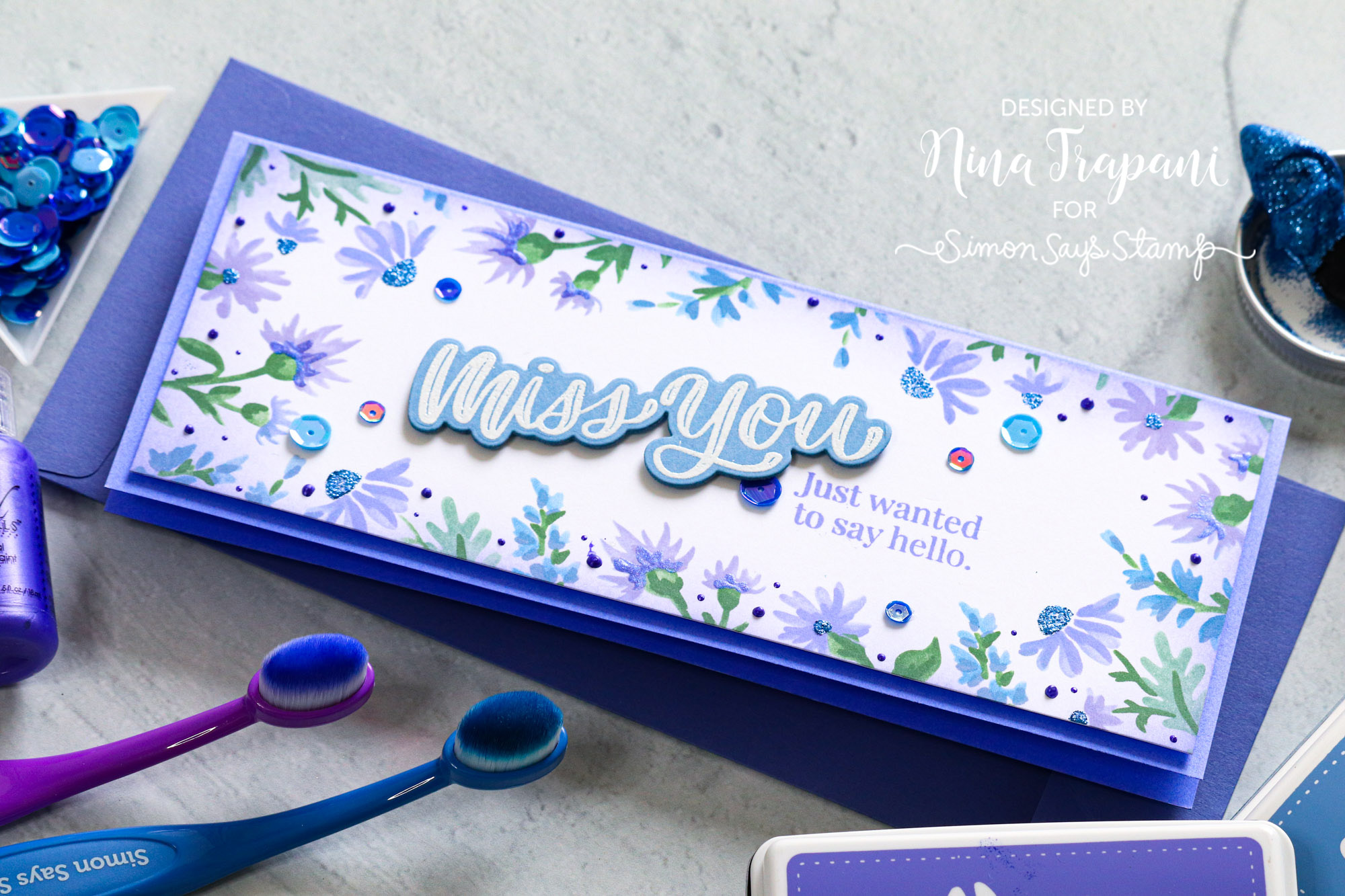
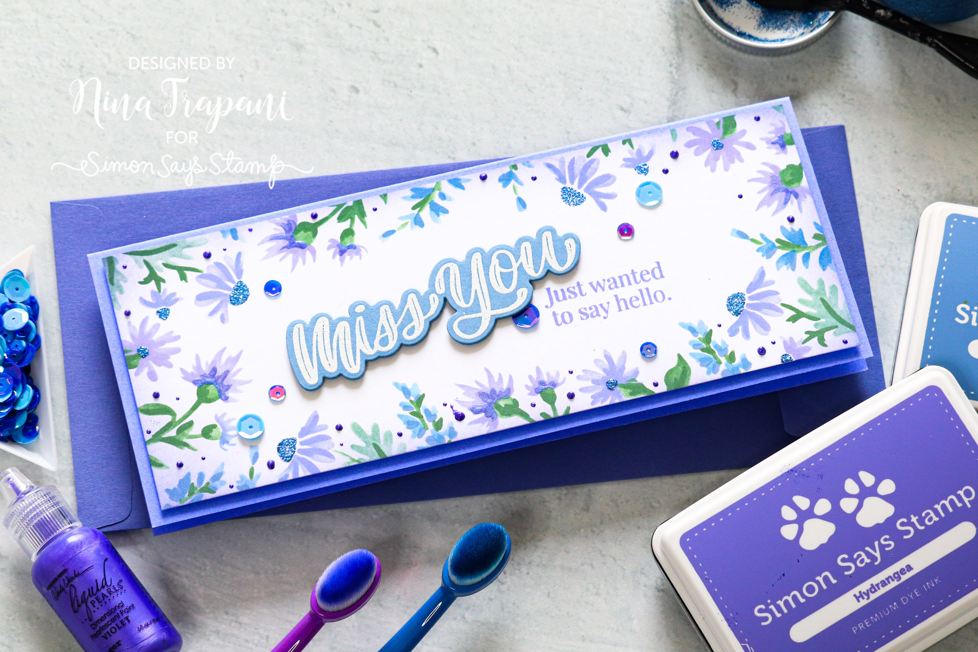
On this card, I used the PinkFresh Studio Daisy Frame stencil set to create a multi-layered design with different shades of ink. For the periwinkle colors, I utilized Simon’s Wisteria, Hydrangea, and Steel Blue inks. I added extra details and embellishments to the stenciling with Brutus Monroe Periwinkle Glitter Glaze and Cosmic Shimmer Reigning Purple Pearl Tints.
There are a pair of greetings stamped in the middle of the card, which are from Simon’s So Talkative and XL Greetings stamp sets. The sequins scattered around the card are from the Night Sky mix.
Want to see more on how I created this card? Be sure to watch the video for all the details!
WATCH THE VIDEO
SUPPLIES
|






Beautiful color for a Gorgeous card!!!
What a breath-taking card this was. I loved the colors and the materials you used. Anyone would be thrilled to get a card this beautiful. Thanks for sharing this. I look forward to using these colors.
Love the card and the colors…beautiful!
Love the attention Peri is receiving. Has always been one of my favorites. Looking forward to all the future projects emphasizing this color.
Nina-Marie I love what you’ve done with this gorgeous color of the year! These tiny daisies look very much like Periwinkle blooms!
=]
Love this card and watching you make it! Gorgeous colors!!!!
This is so pretty … I really love this colour
Utterly beautiful display of what a gorgeous card you can make with this year’s colour of choice. Great design x