Hello Autumn Home Decor Tag Reprise
Hi friends! Happy Sunday! This tag was originally made and shared a few years back but it is just so GORGEOUS my Autumn-loving heart had to share it again! Isn’t Emma Williams amazing?!! What season makes your heart happy? If you’re a “Fall fan” like me you’ll want to check this out (again or for the first time! ;)) Read on and enjoy!
Hi everyone, it’s Emma here and I’m thrilled to be back on the Simon Says Stamp blog to share my latest project with you all!
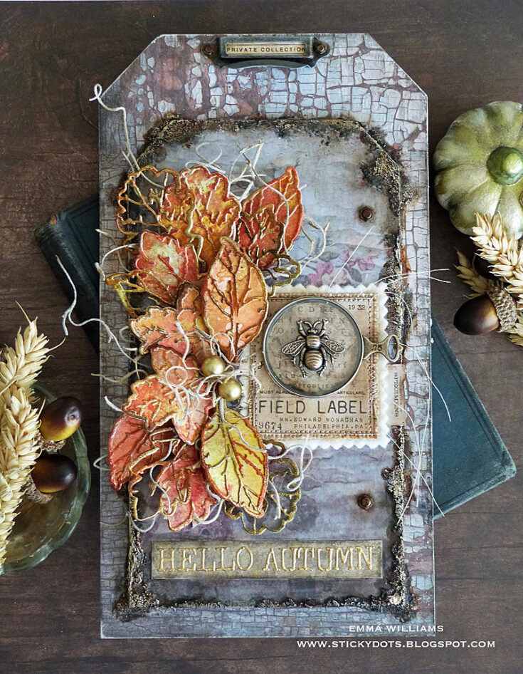
If you watched Tim Holtz’s recent Facebook Live, then some of you might recognize this piece as it was a project that I created especially for the live, using the beautiful Leaf Print Thinlits die set from the brand new Sizzix Chapter 4 release and I’m so happy that I get to share it with everyone today as this piece is perfect for displaying in your home to celebrate the start of Autumn!
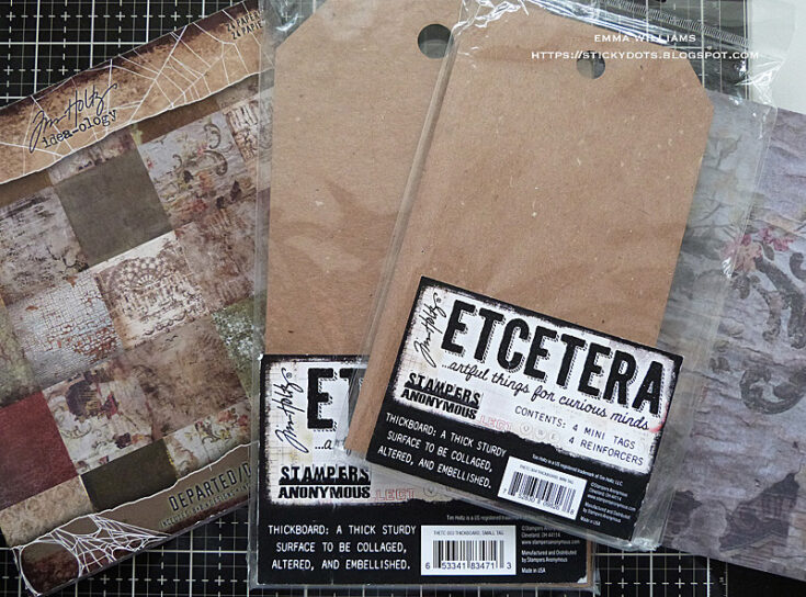
So, let’s get started and I began by covering two Etcetera Tags, the small and mini size, using two coordinating papers from the Tim Holtz Departed Paper Stash. Because the 8” x 8” papers aren’t quite long enough in length to cover the small sized tag, I cut a second panel and matched the design of the paper, ensuring you can’t see the join along the top section of the tag. Adhere the papers to each of the tags, using the Distress Collage Brush to apply Matte Collage Medium. Trim away any excess paper from the sides of each tag and then using a fine grade sandpaper, sand away any rough edges around the edges of the tag. Apply a coat of the medium over the top of the tags to seal the papers.
Adhere the mini sized tag onto the small tag with more of the Matte Collage Medium and once the tag is securely in place, I added some texture around the edges of the smaller tag. For this I used Distress Translucent Grit Paste by Tim Holtz, and using a palette knife I applied the paste around the edge of the entire tag using a palette knife. I applied the paste thicker and chunkier in some areas than others to create pockets of texture.
Put the tags to one side so that the paste can dry ~ I usually leave mine overnight to ensure it’s rock hard.
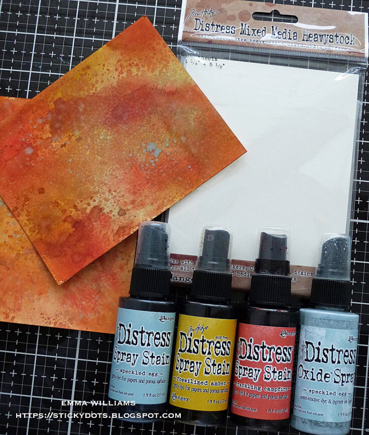
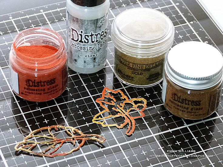
At this point, I started creating my leaves. I lightly spritzed pieces of Mixed Media Heavystock with a light misting of water and coloured the card panels with a combination of Crackling Campfire, Speckled Egg and Fossilized Amber Distress Spray Stains. I then spritzed another layer of water over the top, allowing the colours to blend together before heat drying the inked card. Once it was dry, I then lightly spritzed Speckled Egg Distress Oxide Spray over the inked surface, just allowing drips to fall onto the card.
When the coloured card is thoroughly dry, I took the Leaf Print die to die cut a selection of leaves ~ I used approximately 15 leaves for this piece.
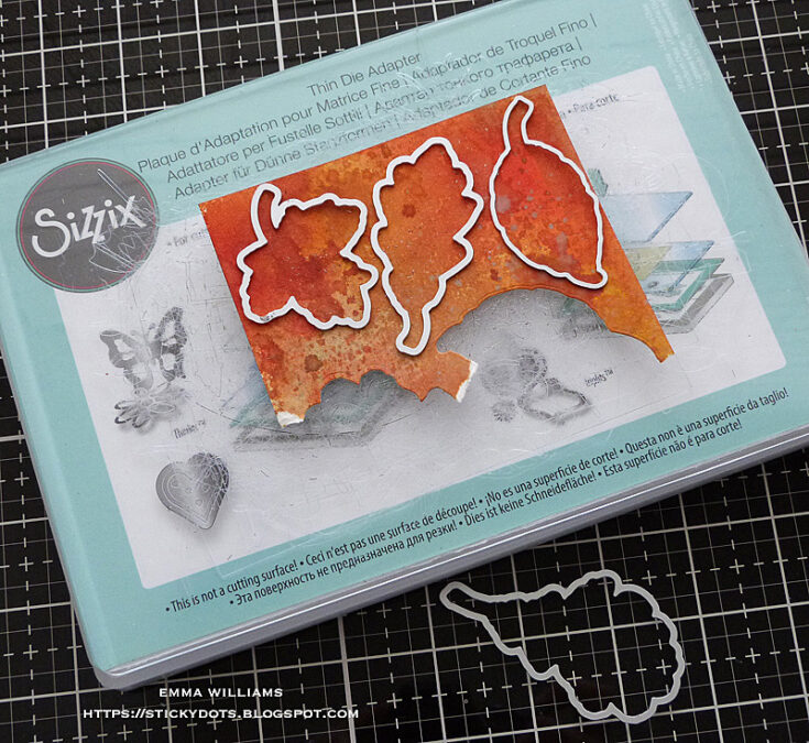
The clever thing about this die set is that you can cut the leaves in a variety of ways and I chose to cut some leaves to be used as solid pieces…
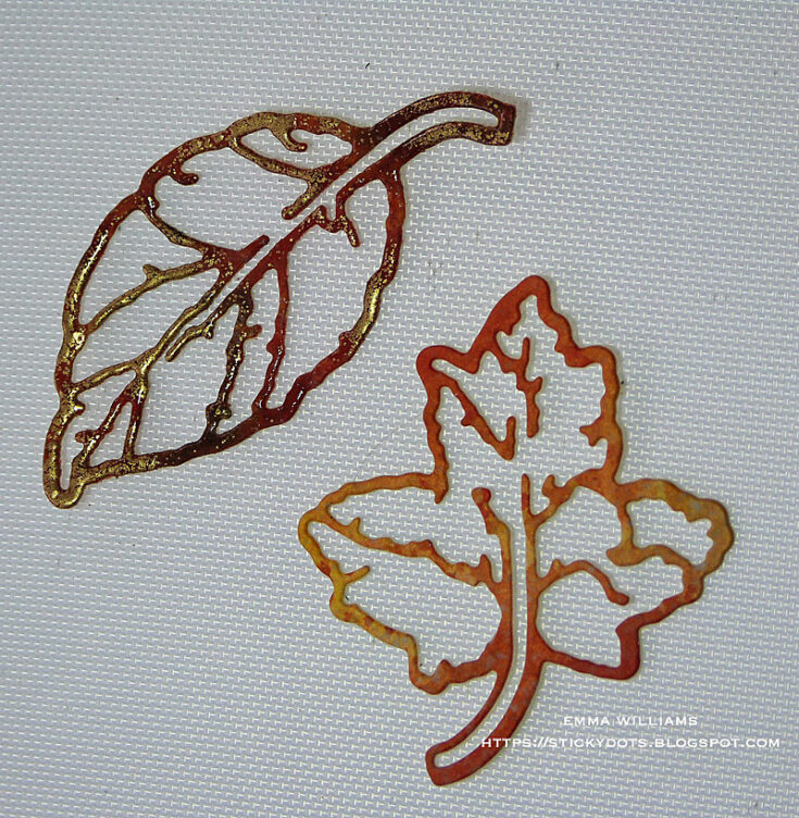
…and also cut a selection using the detailed die, together with the solid outline die and I will use these die cuts in two separate ways ~ some will be adhered over the top of the solid leaf die cuts, shown in step 9 and some will be left as they are, to create skeleton leaves.
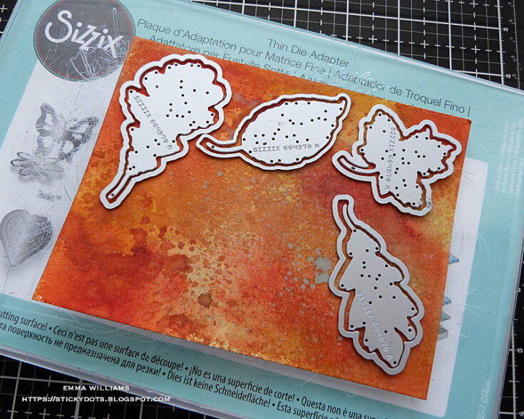
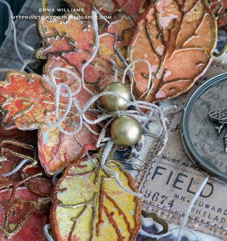
Once you have a selection of all the leaves you need, placing the solid leaves to one side, I took the outline die cuts and embossed these using a combination of Crackling Campfire and Vintage Photo Distress Embossing Glaze and Gold Embossing Powder. To apply these powders, I first used the embossing dabber directly onto the die cut leaf and then using one Embossing Glaze at a time, sprinkle the powder over the top. Tap away the excess powder and heat emboss until glossy and molten. To add gold highlights to each leaf, I applied the dabber to the embossed surface of the leaf, but made sure not to apply too much and not over the entire surface ~ you only want highlights. Sprinkle gold embossing powder over the top, tap away the excess and heat emboss.
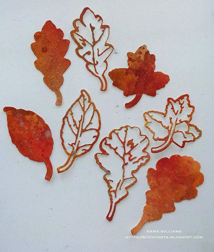
Leaving a few of the embossed leaves to one side, I then used the remaining ones to add texture to the solid die cut leaves. I overlaid and attached each of them using Matte Collage Medium.
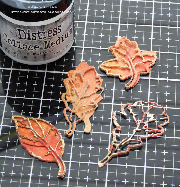
You can see from this close up photo how the embossing adds amazing texture to the die cuts and makes the leaves almost glow.
I now have all of my leaves ready and moving back to the layered tag, I wanted to add some colour to the textured paste around the edge of the mini tag and using a fine detail paint brush, painted over the top of the paste using Black Soot Distress Paint. When adding paint layers you do need to dry each layer between applications as you don’t want it to become muddy in appearance so at this stage, you can either be patient and wait for the paint to dry or if you’re like me, too impatient to wait, you can gently heat dry the painted area being careful not to apply to much heat as you don’t want the paste to bubble or melt.
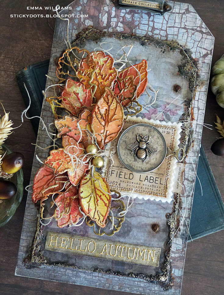
To build up the layers of colour I then added some Rusty Hinge, Ground Espresso and Antiqued Bronze Distress Paints, applying each paint separately. Once I was happy with the colour, and the painted areas were dry ~ I applied a light coverage of Metallic Distress Crayons over the paste , using my fingertip to blend the metallic crayon over the bumpy, crusty surface.
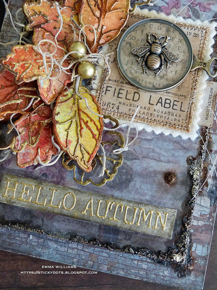
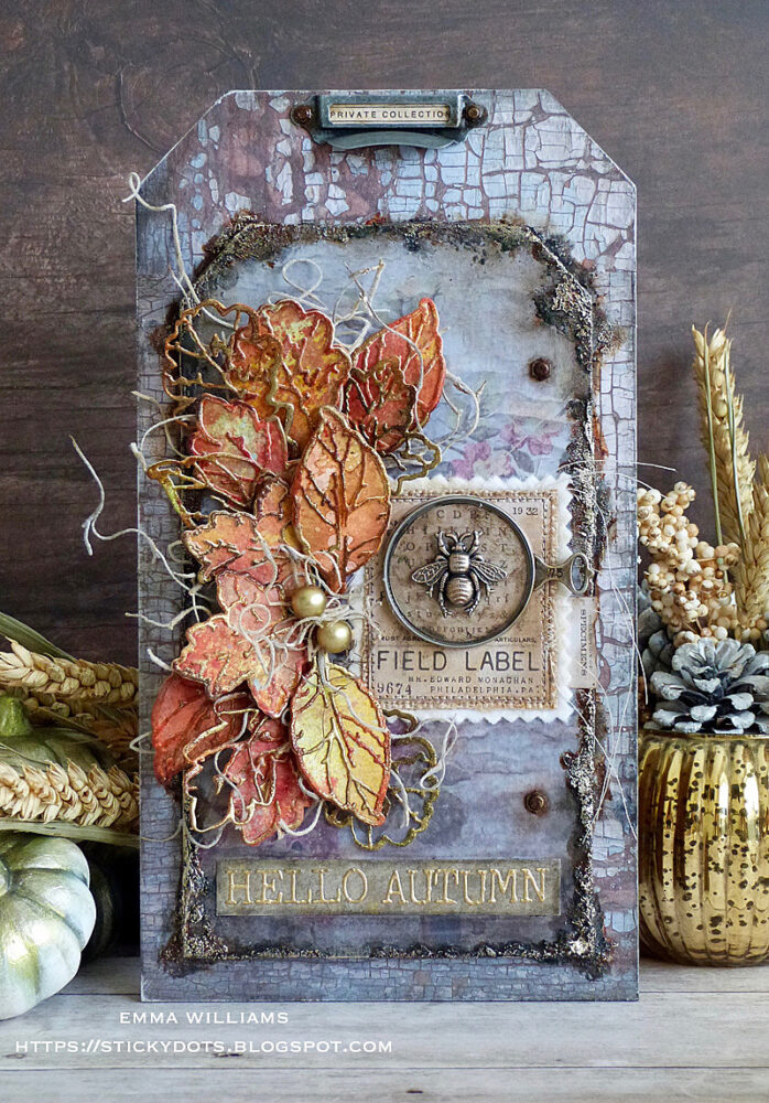
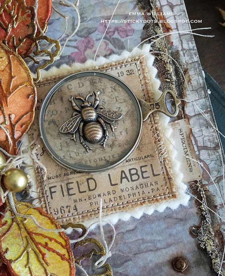
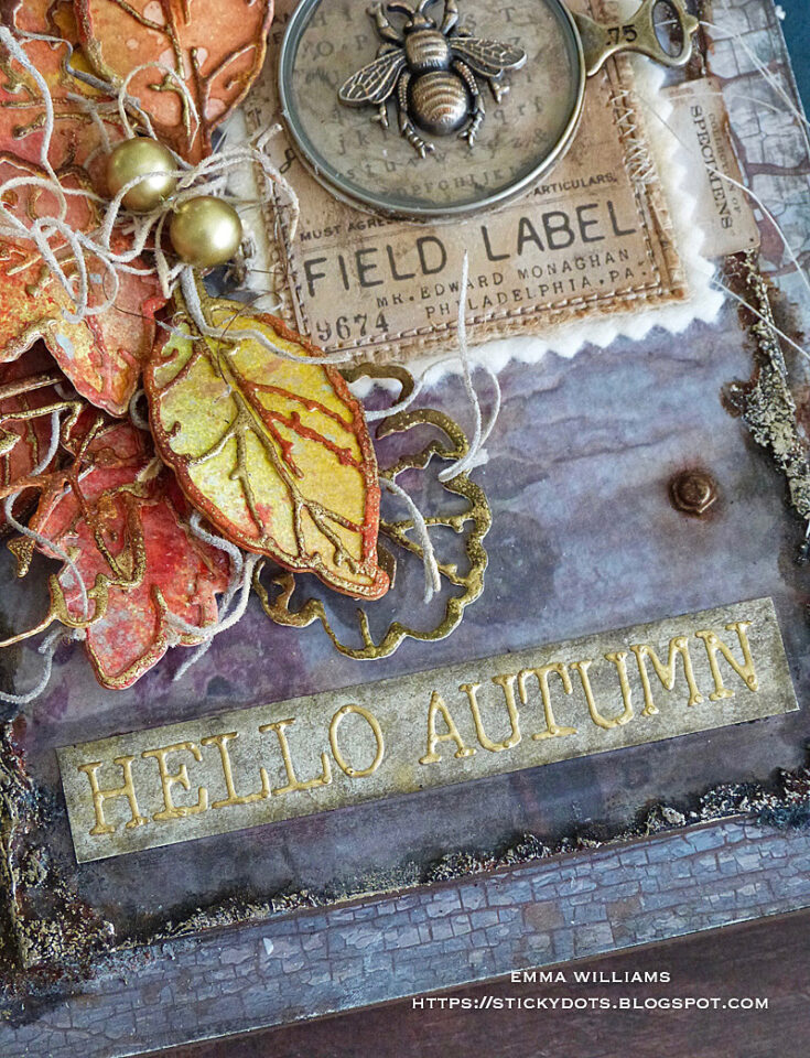
To create the label on the right hand side, I used a Field Notes Ephemera piece and machine stitched the label to a piece of felt that I cut with my pinking shears.
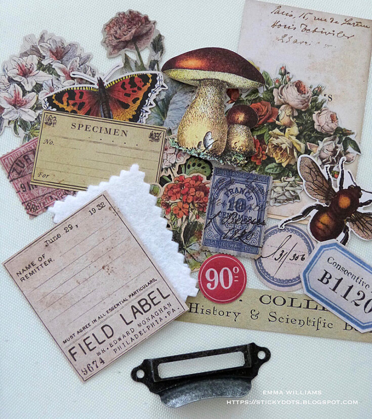
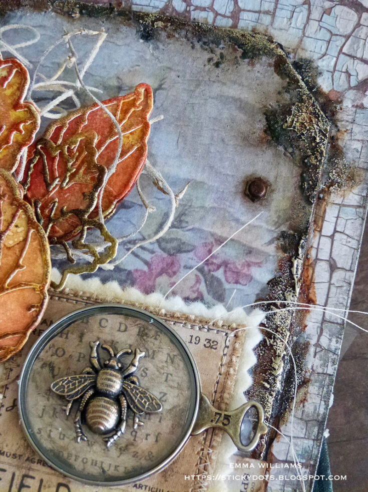
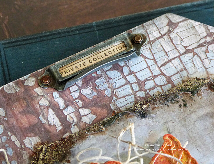
I also used a second Ephemera Piece which I placed behind an idea-ology drawer pull piece taken from the Hardware Pulls. I attached this to the top of my larger tag and added a Hardware Head to either side.
I used Matte Collage Medium to adhere the layered field label directly onto the tag and then attached an Optical Lens idea-ology piece.
Using the bee from the Entomology Adornments set, I coloured the metal piece using an Alcohol Ink Applicator Tool to apply a combination of Mushroom Alcohol Ink and Gilded Alloy Alcohol Ink to the surface of the metal. I also inked a couple of Bauble Findings with the same inks.
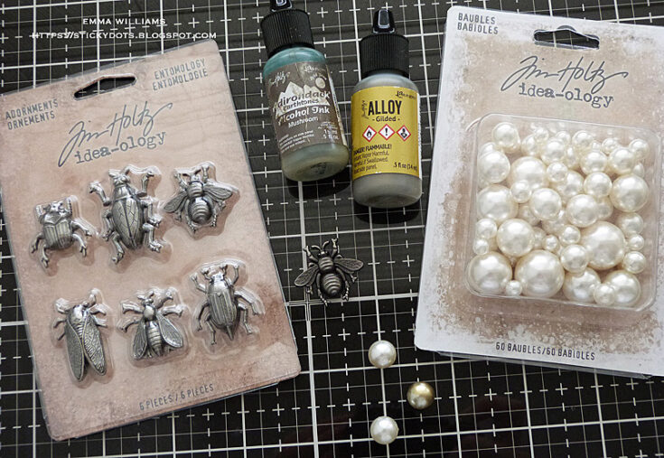
Attach the bee to over the top of the Optical Lens.
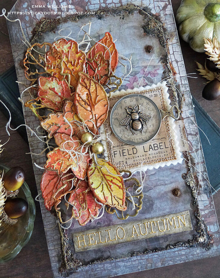
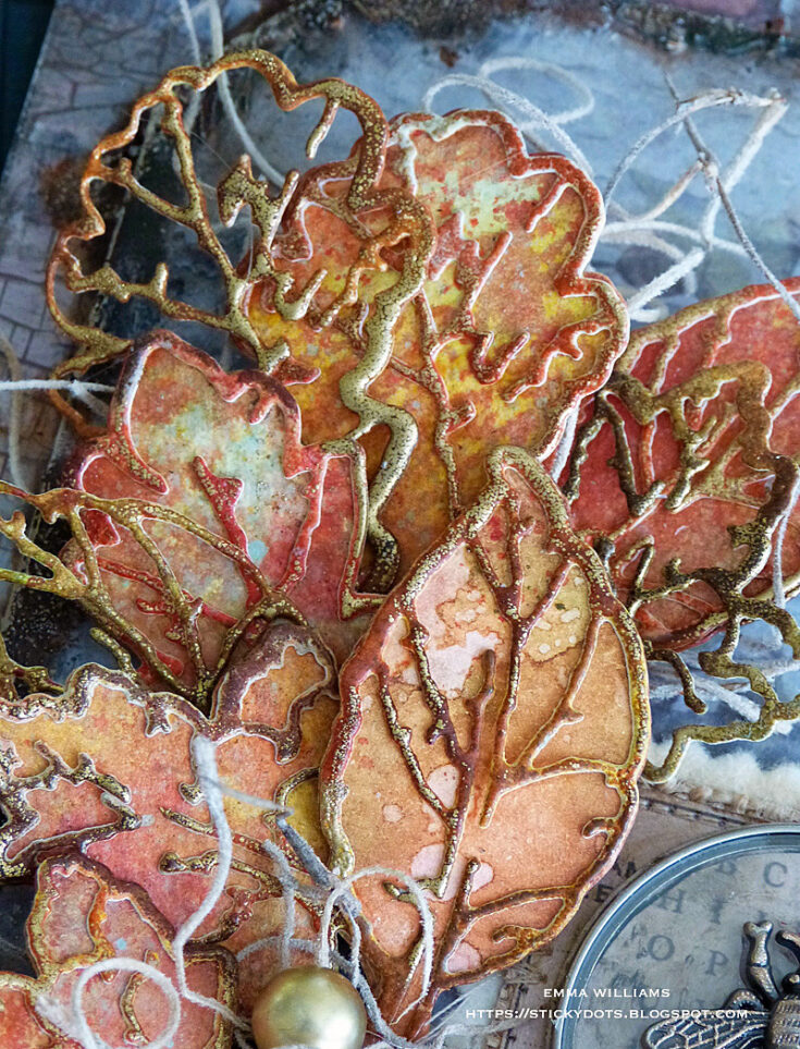
I arranged the leaves down the left hand side of the tag, shaping them to create dimension and also adding and tucking in small bunches of Spanish Moss that I have in my stash, placing it in-between the layers.
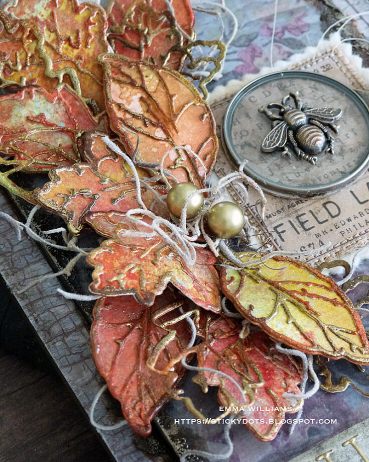
Attach the leaves with a hot glue gun, nestling them around the layered label and optical lens.
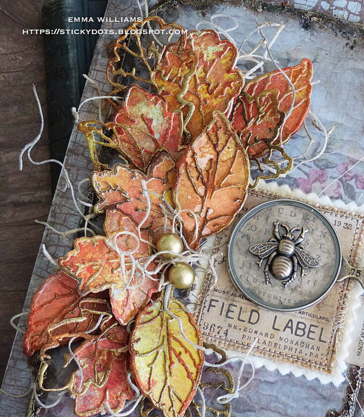
Add the two gold baubles in the centre of the arrangement.
To create the Hello Autumn banner, I cut a strip of silver metallic kraft stash and using a paint brush dipped into Black Soot Distress Paint, I lightly added the paint to the surface of the card strip. Wipe away the excess with a soft cloth before die cutting the lettering using the Alphanumeric Tiny Type Upper Thinlits Die Set from gold metallic kraft stash.
Adhere each of the letters to the silver banner strip before attaching the banner to the tag.
To complete the tag, I added two Hardware Heads to the right hand side, both of which I altered with Rust Alcohol Ink.
…and that finishing touch completes my autumnal home decor piece.
Thank you so much for stopping by today and I hope you love this project as much as I loved creating it. It’s been so much fun taking you through the creative process of this autumnal tag and I hope I’ve shown you some tricks and techniques that will inspire you with some ideas of your own. See you again soon…Emma x
SUPPLIES:
|


Thanks so much for stopping by, and thanks to Emma for being our guest!


Love the way you put this tag together. And the color combinations are gorgeous. Thank you for sharing.
The level of detail and richness in Emma’s creations always amazes me
so gorgeous
As autumn arrives, it’s time to refresh your home decor with seasonal touches. Embrace the warm hues of fall by incorporating earthy tones through cushions, throws, and wall art. Pumpkins, gourds, and festive centerpieces can create a cozy atmosphere. A stylish office chair can also elevate your workspace, combining comfort and aesthetics. Consider the Marics White Task Chair for a chic look that complements autumn decor beautifully. Explore more at https://workspace.sa/office-chairs/conference-chairs/marics-white-task-chair to find the perfect pieces that embody the spirit of the season.
Liftmonster Electric Gate Repair specializes in the maintenance and repair of electric gates for residential and commercial properties. They provide services such as troubleshooting gate malfunctions, fixing motor or sensor issues, and ensuring smooth operation of automatic gate systems. With expertise in various gate brands and types, Liftmonster ensures reliable and efficient repairs to enhance security and convenience for clients.
Love how you meticulously matched the paper design to hide the join—such a clever technique! The use of Distress Collage Medium and fine sandpaper for those clean edges shows such attention to detail. Can’t wait to see the finished project!
For more visit Caulking Services Melbourne.
When it comes to securing your home, business, or vehicle, you deserve a locksmith you can rely on. Professional Locksmithing Services combines expertise, reliability, and affordability to deliver unmatched service. Don’t let lock and security issues disrupt your day. Contact Brothers Locksmith today and experience the peace of mind that comes with knowing your security is in expert hands.
Color theory plays a vital role in interior design, influencing how a space feels and how people interact with it. Colors evoke emotions, with warm tones like red and orange often creating energy and excitement, while cool tones like blue and green promote calmness and relaxation. Neutral colors such as beige, gray, and white provide a versatile foundation, allowing designers to experiment with accents and textures. The choice of a color palette must align with the purpose of the space, whether it is a vibrant children’s playroom, a serene bedroom retreat, or a sophisticated office. The dynamic interplay of colors can transform a room into an inviting and harmonious environment. For more visit wood carved shop.
Hi,
Color theory plays a vital role in interior design, influencing how a space feels and how people interact with it. Colors evoke emotions, with warm tones like red and orange often creating energy and excitement, while cool tones like blue and green promote calmness and relaxation. Neutral colors such as beige, gray, and white provide a versatile foundation, allowing designers to experiment with accents and textures. The choice of a color palette must align with the purpose of the space, whether it is a vibrant children’s playroom, a serene bedroom retreat, or a sophisticated office. The dynamic interplay of colors can transform a room into an inviting and harmonious environment. For more visit wood carved shop.
Hi friends! Happy Sunday! This tag was originally made and shared a few years back but it is just so GORGEOUS my Autumn-loving heart had to share it again! Isn’t Emma Williams amazing?!! What season makes your heart happy? If you’re a “Fall fan” like me you’ll want to check this out (again or for the first time! ;)) Read on and enjoy!
Materials and textures are pivotal in shaping the character of a room, and their careful selection is a cornerstone of interior design. Natural materials like wood, stone, and leather often lend a sense of warmth and timelessness, while synthetic materials like glass, metal, and composites introduce modernity and precision. The interplay between hard and soft textures can create visual interest and balance. For example, pairing a sleek marble countertop with plush, upholstered chairs can result in a harmonious yet dynamic ambiance. The tactile experience of these materials also contributes to the overall perception of the space, making materiality an essential consideration for designers.
woodcarved.shop
Absolutely stunning, Emma! Your creativity never fails to inspire, and the textures and colors you’ve used really capture the cozy, magical vibe of fall. That layering with the leaves and metallics is just chef’s kiss—I can already imagine this tag displayed on a seasonal entryway table.
Speaking of fall home vibes, this time of year always reminds me to do a quick mold inspection in orlando around the house too, especially before decorating and moving things around! All that autumn air and moisture can sneak in if we’re not careful. Just another little way to protect the beauty inside our homes as we decorate the outside.
With autumn-inspired decor trending, it’s the perfect time to refresh your space, and if you’re in Bangalore, expert interior designers can help you create a warm, stylish home that’s inviting year-round
Creating a cozy and stylish home starts with selecting the right furniture and decor. For a collection of unique options and inspiration, check out this link. It offers a variety of choices to help you personalize your rooms without overwhelming the space.
Creating a cozy and stylish home starts with selecting the right furniture and decor. Each piece adds character and function to your living space, making it truly yours. Whether you prefer modern minimalism or classic elegance, the key is to find items that fit your lifestyle and taste. For a collection of unique options and inspiration, check out this link. It offers a variety of choices to help you personalize your rooms without overwhelming the space. Thoughtful furniture and decor transform houses into warm, welcoming homes.
Creating a cozy and stylish home starts with selecting the right furniture and decor. Each piece adds character and function to your living space, making it truly yours. Whether you prefer modern minimalism or classic elegance, the key is to find items that fit your lifestyle and taste. For a collection of unique options and inspiration, check out this link. It offers a variety of choices to help you personalize your rooms without overwhelming the space.
Creating a cozy and stylish home starts with selecting the right furniture and decor. Whether you prefer modern minimalism or classic elegance, the key is to find items that fit your lifestyle and taste. For a collection of unique options and inspiration, check out this link. It offers a variety of choices to help you personalize your rooms without overwhelming the space. Thoughtful furniture and decor transform houses into warm, welcoming homes.
Good home decor blog.