Doodling with Debby: Watercolor and Texture Nuvo Expanding Mousse
Hi friends! Let’s dive into our April 2020 edition of Doodling with Debby hosted by the fabulous Debby Hughes! Please enjoy!

Hi, it’s Debby here, and thank you for joining me for Doodling With Debby this month. I love texture, and in today’s video, I enjoy playing with Nuvo Expanding Mousse to add texture to a watercolored card. The Follow The Rainbows set I used was from a recent April card kit from Simon Says Stamp. As I write this, there are still kits available; however, you can buy the stamp set separately. The kit is filled with beautiful bright, happy rainbow colors, but I am always drawn to moodier color schemes. I wanted to create a background to the woman with umbrella image from the Follow The Rainbows set, which had layers of color, stamping and texture to represent the weather of a rainy day. With COVID-19, this card could represent the current chaos and the unknown but is supported by the strong, hopeful sentiment which we all need presently.
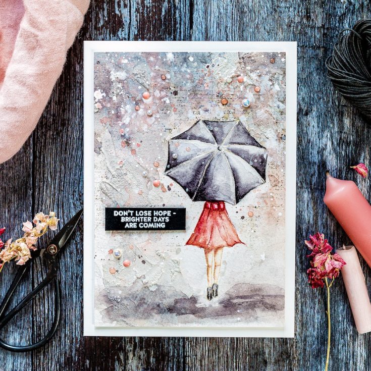
I placed the image in the Misti and stamped with Antique Linen Distress ink onto Fabriano Artistico Extra White cold-pressed watercolor card which I’d removed from its gummed block with a palette knife. I used an old cloth to wipe off some of the ink before stamping to ensure a light application which would blend and fade out with the paint. I used Daniel Smith paints and here’s my tip for mixing a lovely grey; I used Burnt Sienna mixed with Ultramarine Blue. You can vary the mix with more brown for a warmer grey or more blue for a cooler one. I started with a dilute mix of the grey and painted in one of the umbrella sections. I then brought in deeper color into the section. My aim with each section is to leave a lighter edge where the metal frame supporting the umbrella structure pushes the fabric up to a point and catches the light. I didn’t overthink the shading of the umbrella past that, just aimed for areas of light and shade but those light sections being on the spokes which fan out from the umbrella centre. I painted each section separately to help define the edges. If I’d painted one section next to another, then the paint would have spread and bled between the two areas. I carried on round the umbrella until I had painted each section with the first layer of color.
Moving onto the dress, I was undecided on what color to paint the dress. I wanted some depth of color but didn’t want it to look too much like Chris De Burgh’s Lady In Red! So, I went to a more subtle deep pinky-peach color. At this point, I’m concentrating on getting a base layer of color down before slowly building up the layers and shadows, adding those deeper colors to define the areas and add interest. However, before I went too far, I wanted to get the background started. This card was very much a play session for me of something I had in my mind and wanted to get out, and I wasn’t sure if it was going to work or not.
For the background, I washed the area with clean, clear water and a larger brush and then brought in some of the same colors I’d been working with up to this point – grays and pinky peaches. I wanted the colors in the background to reflect those of the woman. Adding paint into an already wet area is called wet-in-wet and is my favorite way to play with watercolors. I love the way the colors blend and bleed together, and by tilting the board, adding in droplets of clear water, you can affect the way the paint behaves and create lovely dribbles, blooms and interest. I must admit, when I first started painting the background I wasn’t keen, and then once I’d dried it with a heat tool, I loved the watercolor effect.
For most of the background, I used vertical lines to represent the rain coming down. However, I did create a horizontal area around her feet for the ground, and I kept this area directly around her feet light in color so that she had a slight glow around her with deeper colors further out. At this point, I wanted the woman to pop off the page much more. She was a bit wishy-washy in color and tone and blended in with the background too much, and so I went back in with deeper, darker tones. My method of doing this is the wet on dry technique – adding paint directly to the dry surface. I then take a damp brush and spread out the color so create softer lines.
At this point, I wanted to work on the background more. I took the watercolored piece of the board and popped it back into the Misti. I used the Good Reads Background from Simon Says Stamp to give some subtle areas of text to the area around the woman. To protect her from the ink, I stamped the image on a piece of masking paper and cut out before putting in place. I then inked the background stamp in Pumice Stone Distress Ink and again used an old cloth to wipe away some of the ink to create a softer impression. However, I ended up inking up the background twice so that the text of the stamp showed up on the textured watercolor card.
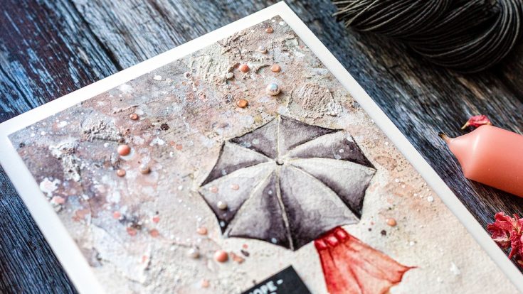
Next is the added texture I wanted to include on this piece. I used Nuvo Expanding Mousse in the Worn Linen colorway and a palette knife to spread the mousse over the background. This overlays and softens the stamped text. I spread the mousse in thin layers in some areas but thicker patches too. These thicker patches are the ones that will react the most to the heat tool. You can either heat the mousse straight away as I did or let the mousse dry and then heat it. The two methods give different results. I’m impatient so went with the heating straight away and loved how the thicker areas of mousse bubbled up under the heat to create texture.
I placed the piece back on a board and taped it down again to bring in more watercolor. All these different layers of watercolor, text, expanding mousse, and now more watercolor will create an exciting background to the focal point. Once I’d added more watercolor over the mousse, I covered the woman with the masking paper again and liberally splattered with white gouache and also left-over paint. I then removed the mask and splattered with a solution of Perfect Pearls for some sparkle. I took the watercolored piece off the board before working on deepening the shadows further with colored pencils.
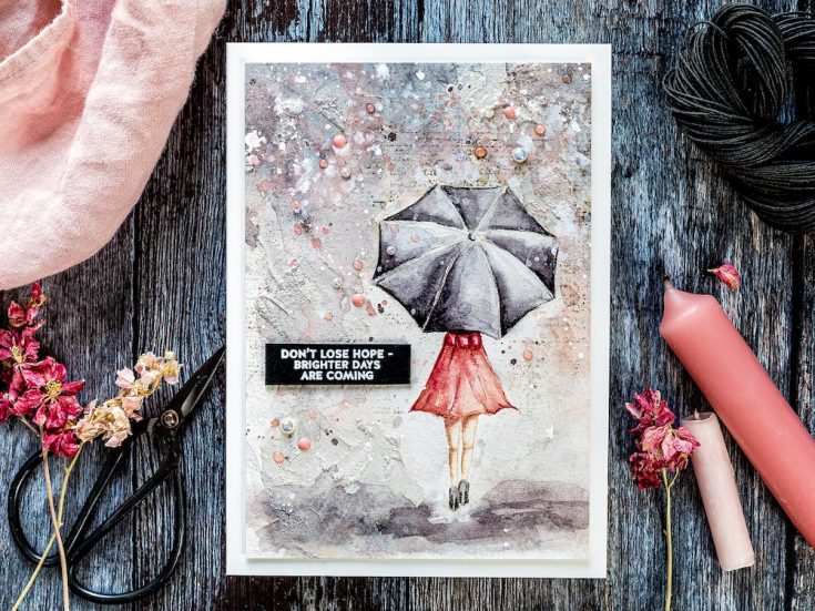
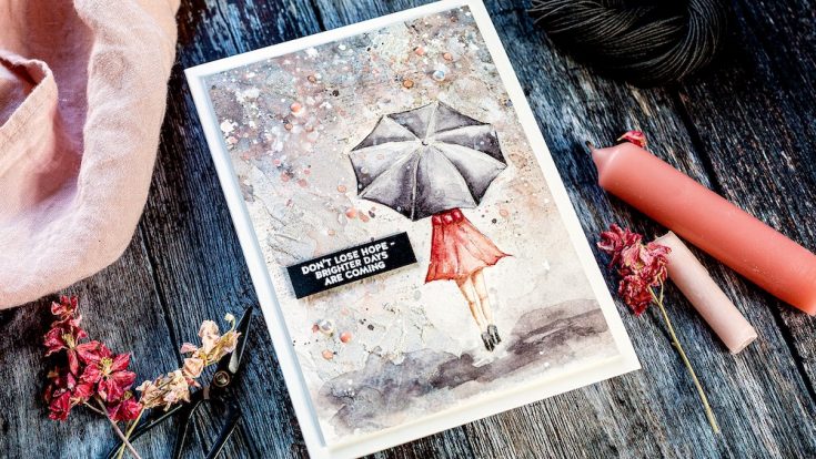
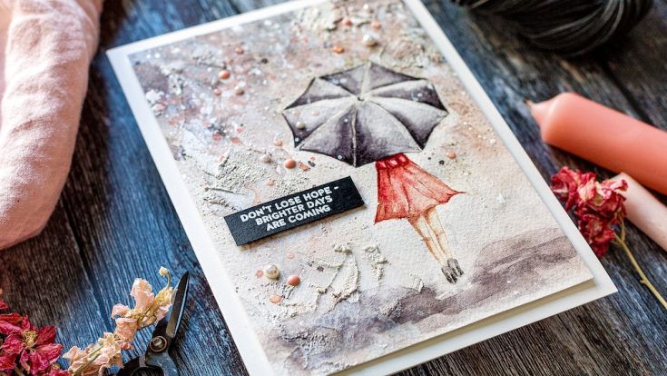
This piece started as 5 X 7 inches, I cut and scored a piece of Ivory card from Simon Says Stamp to be 5 x 7 inches and then trimmed the watercolored piece to be slightly smaller before adding foam adhesive to the back and adhering to the card base. For the sentiment, I was drawn to the “don’t lose hope – brighter days are coming”. It is such an uplifting greeting in these uncertain times that I wanted to include it on this card. I stamped the sentiment in clear embossing ink on a Black card I’d treated with an anti-static powder bag and then sprinkled with white embossing powder before heat setting. I trimmed around the greeting with a scalpel and metal-edged ruler before using a T square ruler to foam mount the sentiment in place. To add more texture and interest to the background, I added Glossy Eggshell Pearls from Little Things From Lucy’s cards kept in place with Gina K Connect Glue. I also added Bubblegum Blush and Rose Water Nuvo droplets to finish.
Well, that’s me for this month, thanks for joining me today and I hope you join me next time for Doodling With Debby.
WATCH THE VIDEO:
Watch below or in HD on YouTube.
SUPPLIES:
|


Thanks so much for stopping by and thanks to Debby for being our guest!


Debby, this is an amazing mixed media card! Your watercoloring always is stunning, but adding the moody, textured background takes this card to a whole new level. Stunning work. Now I need that Nuvo expanding mousse.
Debby, your watercolor cards never cease to amaze and WOW me. I LOVE the colors and how you made it moody but also popped it with her dress. Just a stunning design!
Wow! This card is absolutely stunning! I’m in awe!!
This turned out so amazing!
Love your process narrative.
So inspired
Debby,
I love your work ! Especially this card ! You did not give a source for your watercolor brushes ! What are they ? With what looks like metal handles ? Also please state the sizes of the brushes please . Thank you !
Amazing creation, I love the colors and all the extra texture!
Wow!!!! This is Gorgeous!!! Love all the texture!!
Absolutely amazing and gorgeous!!
What a fabulous card. If I received it, I’d frame it and put it up on my wall. Thanks for sharing all your techniques.
Amazing card. Your card if fantastic. Everything you do is beautiful. Thank you . Love watching for videos. Be healthy and be safe.
Fantastic card! I bought the stamp set, but have yet to use it…you’ve given me some enouragement!
Thanks Deb, this is wonderful. Love all the water color tips. I’m still waiting for my kit to arrive, I know they are delayed in their shipping. Hoping you are staying healthy!
wonderful card and message.
This is just amazing!!
Absolutely stunning! A piece of art for sure which must be framed and displayed! You are amazingly talented!
Every time I see one of your cards, my jaw drops! This card is amazing! I love that background with all of that texture and colour tones. Your painting of the image you know just where to put the highlights and lowlights to make the image pop of the card. Stunning!
Wow, what a masterpiece! That background you created is incredible and the watercoloring is stunning. Thank you so much for sharing your video!!
This is gorgeous.
I love this, Debbie. The layers remind me of how much we face today, the rain is hard to live in. The typed pieces in the background remind me of all the thoughts than cross our minds in a jumble. But the umbrella, the love of and for others and our faith, protects us as we walk through this storm. Her red dress and high heels dare the negatives and dangers to cross her path. Bravo! ??????????
Wow, what a gorgeous creation!!
Debbie another gorgeous card! I love all the texture in this card and the colors are perfect. I love to watch your creative process. Hopefully someday I can watercolor like you.
Wow Debby, this is stunning!
I love it just like the video that shows how you made it.
Thank you so much for sharing this masterpiece, stay safe and have a wonderful day.
This is such a beautiful piece of art! I would have to frame this and display it on a small table with a vase and one or two flowers. I just wouldn’t be able to send it to someone as a card. Amazing talent!
I have never heard of expanding mousse. Whatever it is, it makes for fantastic texture and interest in your card. Simply stunning! The sentiment is perfect for these times. Thank you for the uplifting inspiration.
Just another marvellous card of Debby, wow!