Doodling with Debby: Stencil with Watercolor
Hi friends! Happy Monday! Please join me in welcoming back the always inspiring Debby Hughes as a special guest on our blog today! Read on and be sure to watch the video for more info and enjoy!

Hi, it’s Debby here, and for my Doodling With Debby video feature this month I’m looking at a way you can use a stencil with watercolor. My love of watercoloring is still running strong, and my mind often turns to how I can use this beautiful media with my supplies. I love the design of the Bouquet Of Roses stencil and knew it would look stunning ink blended, but my paints were calling, and so I set about combining the two.
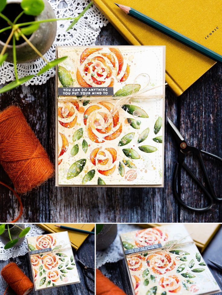
Before using the stencil though I decided to create a soft, warm background on which I could add the stencil design. I took a piece of Cold Pressed watercolor card and taped it to a board to help prevent warping. I started by using a brush to cover the card with plain, clearwater and then brought in a dilute wash of warm colors. There are several advantages to creating a background wash such as this; firstly, it means that you have color in the background of design, and you don’t need to go in after working with the stencil and paint around all the areas. Secondly, with watercolors being translucent this warm wash will affect every color painted on top of it giving a warm, beautiful glow to the whole piece. I don’t know if you’ve heard of the term ‘golden hour’ in relation to the lovely warm light just after dawn and just before sunset which photographers love. Well, a wash such as this is like adding a golden hour to a painting!

I sprayed the back of the Bouquet Of Roses stencil with a repositionable adhesive which keeps the stencil in place. This spray has been life-changing for me when using stencils; no more worrying about stencils shifting halfway through what I was doing! I tested various ways of using a stencil with watercolors and my favored method for a relatively simple design such as this stencil was to draw the design in with a pencil lightly. I did try painting directly through the stencil with watercolors, and this can work. However, I like to use a cold pressed watercolor card, and the texture of the card means that even with spray adhesive on the back of the stencil, it isn’t reliable, and you can get paint seeping under the stencil and ruining the design. If you wanted to try this method, I would recommend using a smoother hot-pressed watercolor card instead. Another technique you could use is to ink blend through the stencil with a light, water reactive ink such as Antique linen distress Ink which would lay down the design of the stencil and then you could paint over the top, and the water-reactive ink would combine with the watercolor as you painted. However, with a warm yellow wash already down I didn’t want to add ink with a similar tone and for it to dominate the color scheme. So that’s how I plumped on this method – lightly drawing the design in with a pencil, erasing the pencil lines until they were only just visible and then using these as a guide to paint on top. You do want to make sure the pencil lines are as light as possible because the watercolors will trap the pencil underneath and you won’t be able to erase the lines after the fact.
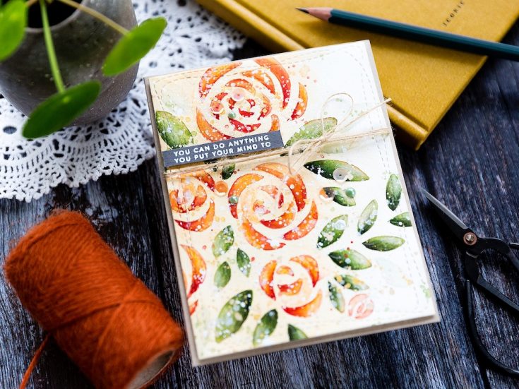
With the stencil design penciled in, it was just a case of filling in the shapes. My aim with each form was to get lots of lovely variation in color and ensuring there were areas of deeper shadow and lighter highlight areas too. I painted each shape and then dotted deeper shades into the areas I thought there would be shadows such as the base of a leaf, letting the wet paints blend. As I painted I used a more dilute paint in areas to create lighter, highlight areas, but sometimes these were lost when all the colors mixed and so to retain areas of highlight I used a brush which was just damp with clean water to lift some of the paint away.
I moved around the stencil completing the first layer of color over all the areas and keeping a paper towel in hand to mop up mistakes and to remove excess water when I wanted a damp brush for lifting color to retain highlights. With the base layer down, I then moved onto adding deeper tones and building up that texture that adding layers add. When doing this, I included a second brush. This brush is just damp with clean water, and I used it to softens the edges of the new deeper layers. With two brushes on the go, it saves paint as I can keep using the first brush to add color and the second to soften the edges while they are still wet and workable without having to rinse precious paint off my first brush to do the same. I also used dilute versions of the colors on my palette to give the impression of more petals and leaves. Using dilute paint will mean these dry lighter in color and will provide the feeling of being in the background, and the difference between the lighter and darker shades adds contrast and interest. Not only have you got lighter and darker colors on each petal and leaf but lighter petals and leaves too and the combination creates a more pleasing overall design.
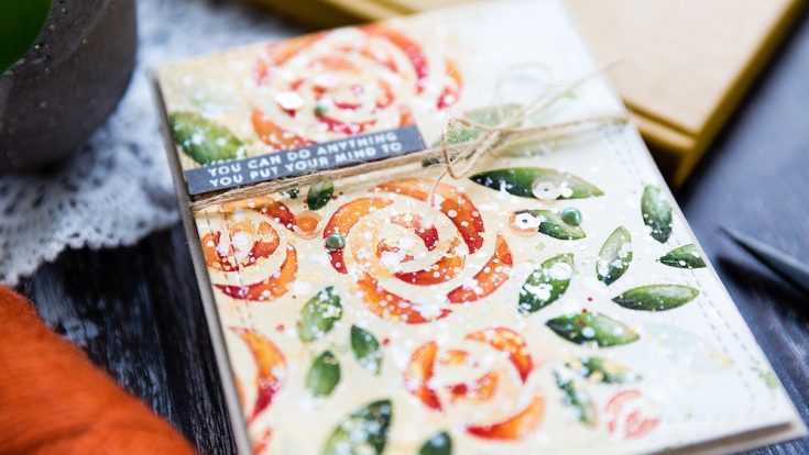
I added dilute splatter in the colors I’d used, aiming to keep the green splatter mainly over the leaves and the yellows and corals over the flowers. I have been asked why I like to add splatter so much, and I think it is because it adds that extra layer while also softening the lines and giving more of a loose look which I love. One other thing I love to do, and that is to use colored pencils to add more depth and a few details. The key here is to make sure your pencils are sharp, and you use a light hand. Finally, I added a splatter of white gouache and then my favorite perfect pearls solution for sparkle. The white did feel a bit stark against the warm colors of the piece, and so I also splattered with Iridescent Gold. This card indeed turned out to be very splattery – is that a real word? But it fits this piece perfectly!
I die cut the panel with a Wonky Rectangle die using washi tape to keep it in place while I ran it through my die cutting machine, and then I wrapped May Arts twine around the panel several times. I love this twine for adding that rustic feel to a card, and once I’d tied it in a bow, I was ready to add the sentiment.
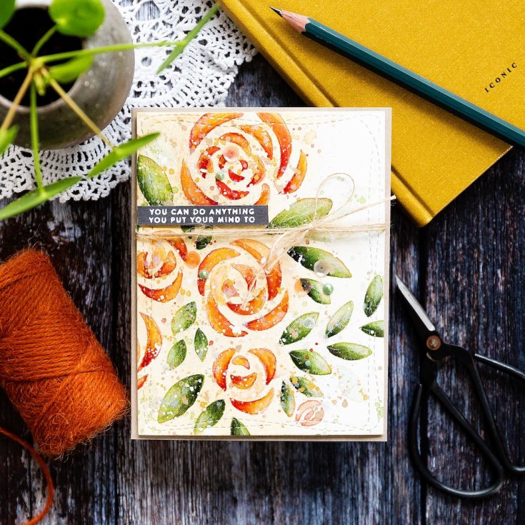
I picked a greeting from the Tiny Words Encouragement set and stamped it in clear embossing ink on Slate card which I’dtreated with an antistatic powder bag. The powder from this bag will help to prevent the embossing powder I sprinkle on top from randomly sticking everywhere. I sprinkled with white embossing powder from Simon Says Stamp and then heat set before trimming to a banner. I then added foam adhesive to the back of the greeting and placed it on the background using a T square ruler to make sure I had it on straight.
I then added the watercolored piece to a card base cut and scored from 100lb Desert Storm card which continues the warm rustic feel of this card. I arranged a few You’re Peachy sequins and then added Nuvo Dragon Scales droplets – I love the iridescent sheen. Finally, I kept the sequins in place with Gina K Connect Glue.
Thanks for joining me today, and I’ll see you next time for Doodling With Debby.
SUPPLIES:
|


Thanks so much for stopping by and thanks to Debby for being our guest!

Blog Candy Alert!! Follow our blog via email and comment on this post for a chance to win special blog candy!


Debby this could NOT be any more beautiful! I love the colour combo you use when w/c’ing your leaves, it is so pretty. This is truly stunning!
Ooh this is so beautiful!! What a wonderful technique :)
Gorgeous card… beautiful color combination.. Thanks for the inspiration..
Another way to use stencils!!! I have recently become obsessed with stencils, so this is the perfect tutorial for me. Love all the texture!!! Thank you for sharing!
So beautiful!! Such lovely effects. I need to use my stencils more often!!
<3 J
jwoolbright at gmail dot com
HerPeacefulGarden.blogspot.com
Wow! Amazing technique!!! This card is really beautiful!!!
I just love all your cards with the messy watercolour look! They are beyond gorgeous! THanks for the video it helps with trying to recreate the look.
So beautiful – love those warm colours.
WOW< gorgeous watercolord stenil design, thanks for the video!
Gorgeous card! I love Debby’s colouring!
love how you created this pretty card – great technique:)
Holy Moley. I got no other words.
Fantastic results!! Thanks for sharing this beautiful piece of art.
What a beautiful effect. The Orange is especially pretty
Great tips for using watercolors and stencils. When you break it down from lightly colorwashing the background to penciling the stencil in, it’s much easier than it looks!
Beautiful card!! I love those gorgeous colors!!
I love the warm glow of this wow!!
This card is absolutely stunning!
So very pretty!!
Beautiful card and love the watercolor wash look and how beautiful it turned out when you did all of the penciling in with the stencil. Thanks for sharing.
Linda D.
Gorgeous creation!
Stunning card, love the colors.
I’m going to try this using my watercolor pencils to lightly trace the stencil and then fill in the design with the same colors. I don’t know if that will work but sometimes it’s just fun to play. Thanks for the inspiration and your beautiful card.
Beautiful card! Love the colors.
Thanks for sharing…
Wow Debby, absolutely stunning!!
Another lovely card from you, Debbie! Love how you used the stencil & all the spatters! Thanks for the awesome video too!
Beautiful card!
Such gorgeous card! Love it.
Thanks for sharing.
Beautiful card.
Delicate coloring.
thanks for sharing
txmlhl(at)yahoo(dot)com
Wow, I love the overall look of this! Really beautiful coloring.
Thanks for all the great tips for creating this stunning card with watercolor and a stencil. You never cease to amaze!
Beautiful!
Wow! Gorgeous card! I love the natural look of your card using kraft and twine. Your watercoloring is just beautiful!
Really Beautiful card Debby!!!
Debby, this is such a lovely card. Your tutorial description and video has so many helpful options for watercoloring using a stencil. Thanks for sharing it all…hope you have many “golden hours” of crafting.
Just gorgeous!
Beautiful!! I just got the Nuvo Dream Drops and can’t wait to try them out. Your splattering looks so perfect
What a stunning card and technique, I love the stencil design!
Gorgeous!
Wow that is so pretty how you used the stencil.
So gorgeous!! I love watching you watercolor!!
Another knockout! I adore your style, Debby!
Beautiful card, love it!
This card is stunning Debby. I appreciate all the tips you gave us too!
Great tips for using the stencil and water colors. Your card is gorgeous, Debby. Thanks for the wonderful video!
Wow Debby what a stunning card, your watercolouring is amazing.
Beautiful card! Great tips.
As others have said, this is a beautiful card. Thank you for showing/telling us how it’s done! Like the warm glow part, too.
So pretty. Love the colors.
The coloration on this card is stunning…great technique.