Doodling with Debby: No Line Watercoloring Hints & Tips
Hi friends! Happy Wednesday! Please join me in welcoming the wonderful Debby Hughes back for her monthly installment of Doodling with Debby on our blog! Be sure to watch the video for more information and enjoy!

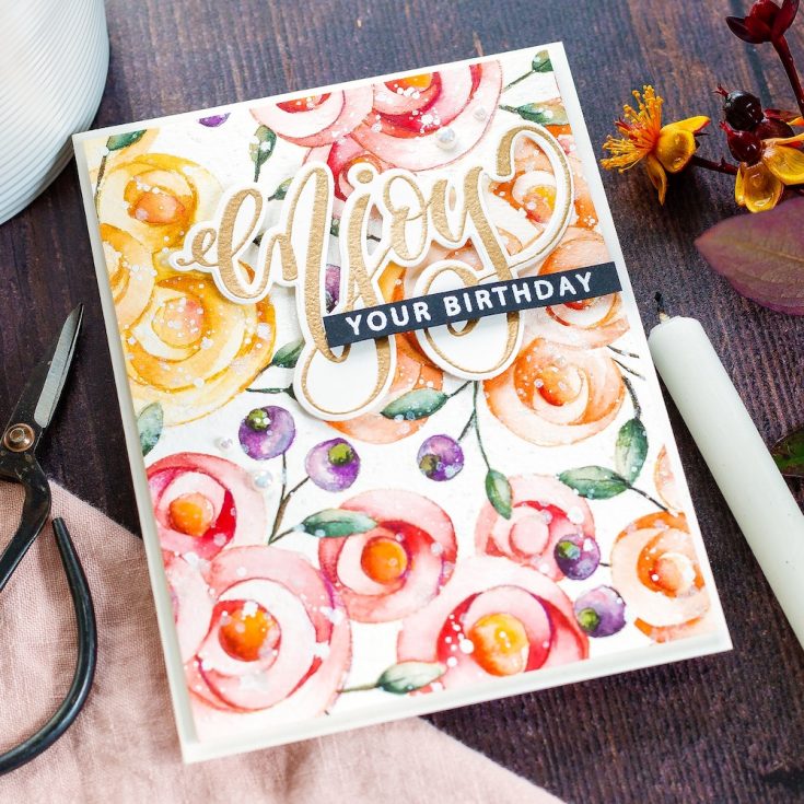
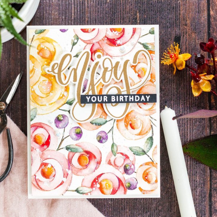
Hi, it’s Debby here and thank you for joining me for Doodling With Debby. This month I’m painting the gorgeous Spring Flowers Background from Shimon Says Stamp and giving tips and tricks for no-line watercolouring.
NO LINE WATERCOLOURING HINTS & TIPS
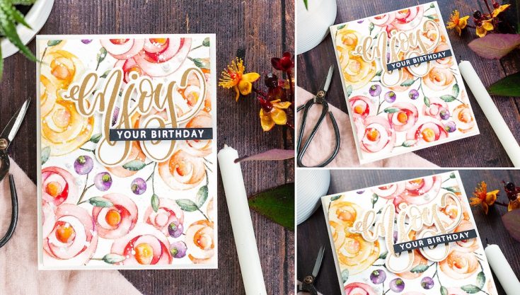
I stamped the Spring Flowers Background with Antique Linen Distress Ink on Fabriano Artistico Extra White Cold-pressed watercolour card. Here’s my first couple of tips when on-line watercolouring.
Firstly, choose a light, water-reactive ink such as Antique Linen – as you paint, the water in the paint reactivates the ink, and it blends with the paint to give a no-line look. If you are using a watery, pale colour to paint, for example, the edges of a petal, just make sure to bring your brush over the stamped line a few times to get the ink moving.
Secondly, a good watercolour card makes all the difference when watercolouring, whether it be no-line or not. I was recently practising a freestyle piece at home and grabbed multiple pieces of watercolour card on which to practice, and the results on the better-quality card were noticeable. I used Fabriano Artistico watercolour card, but another favourite is Arches. I choose a cold-pressed paper which has a slight texture because I like that look and the texture helps hold the water and allow more time for working.
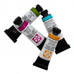
Moving onto the paint, I like Daniel Smith watercolours, and I used them on this piece. However, I also love all sorts of other watercolour media from Distress Inks to Karin brushmakers to Mission Gold watercolours, Altenew watercolours, my list could go on and on. I think what I’m trying to say is that the watercolour medium you use is less important than the paper. If you want to invest in just one thing, make it the watercolour card you are using, and you will see the benefit.
The process I use for no-line watercolouring is based on getting areas of light and dark. If you paint the whole of a flower the same depth of colour, it will look very flat and uninteresting. Also, it will be difficult to make out one petal from the next. To get definition and dimension, you want to look for the nooks and crannies as Kathy Racoosin would say. Please check out Kathy’s colouring challenge if you don’t already do so. Kathy is amazing at colouring with any medium and has excellent tips and tricks. Looking for the nooks and crannies and making those where your deepest, most concentrated paint goes and then spread the paint out more lightly over the rest of the petal, trying to keep one area particularly light as if the sunlight was catching it.
When colouring in this way, I often use two techniques – the wet-in-wet technique and the wet-on-dry technique. Those sound very technical, but in fact, it just means how you get the darkest areas spreading out into the lightest. With the wet-in-wet technique, you can paint the whole of a petal in clean, clear water and then drop in the paint from your brush in the nooks where the shadows would be. The paint then spreads through the water, getting lighter and more dilute as it does. With the wet-on-dry technique, you lay down the concentrated paint in the nooks and then using a damp brush, draw out the paint over the rest of the area.
Both of these techniques are great for no-line watercolouring, where the aim is to get the transition from dark to light. I often used the wet-in-dry option when colouring this piece, and it is helpful to use two paintbrushes. Paint is expensive, and I don’t want to continuously be washing my brush out and losing all the paint. So, I keep one brush with a concentrated mix of paint and one with clean, clear water to draw the paint out over the rest of the area.
I tend not to go too dark for the first layer of paint. I prefer to build up the colour using layers until I’m happy with the result. This first layer is the time-consuming bit. However, once that layer is down, for me, that’s where the fun bit starts. I love moving around the areas, adding more depth here, a darker shadow there, slowly building and building the contrast. The imagery on this background is excellent for no-line watercolouring – simple lines with defined areas. One thing I’ve forgotten to mention up until this point is to avoid painting areas next to each other or the paint will move over the whole area and blend as one so dotting around from one petal to another and looking for where the neighbouring areas are to make sure there is nothing still wet is a good plan. You can use a heat tool to dry in between, but I prefer to let the paint dry naturally as I think you see the best blends and bleeds this way.
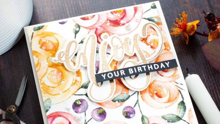
Let’s talk about colours for a moment. I chose an analogous colour scheme of reds, oranges and yellows. These are colours next to each other on the colour wheel and work together harmoniously. The leaves and berries in comparison are complementary colours with the green being complementary to the red and the purple to the yellow. These pops of complementary colour liven up the colour scheme. I think the berries are one of my favourite bits!
I could easily have kept going adding more layers, more accents and such but I decided to leave it and add some splatter. I like to use Winsor & Newton Permanent White Gouache. I squeezed a little onto my craft mat, mixed with just enough water so the paint will drop off the brush as I splatter liberally over the piece. I also splattered with a solution of Perfect Pearls for a little shimmer and shine.
Hindsight is a great thing, and in hindsight, I should’ve left the splatter until after this next step where I darkened a few areas even more with Faber Castell Polychromos coloured pencils. I chose a few pencils which matched my colour scheme and made sure they were sharp before going into those nooks and crannies and adding the extra contrast I felt was needed. I used a sepia pencil to add veins to the leaves and some extra depth to the berry tops also.
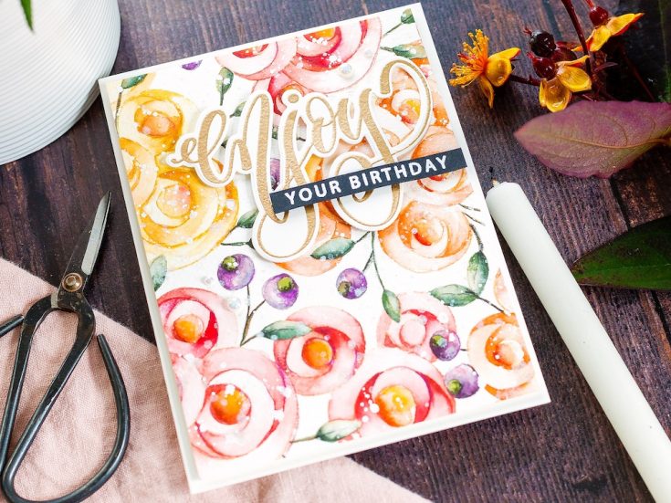
I then set the piece aside while I worked on the sentiment. I love the Summer Roses set from Gina K, and Simon Says Stamp, in particular, the large script with coordinating smaller sentiments perfect for adding on a skinny strip. Also, this set has matching dies which means it is ideal for adding the sentiment over this busy panel, so it pops up and stands out. I placed a piece of Ivory card in the Misti and treated it with Anti-Static powder before stamping the large Enjoy greeting in Versamark ink. This is a sticky ink that embossing powder will stick to. I used Antique Gold embossing powder from Simon Says Stamp and made sure to give it a good sprinkling to cover the whole of the area. I then melted the powder with a pre-heated heat tool. Once cool, I lined up the matching die, held it in place with washi tape and ran it through my Gemini Junior die cutting machine.
I also stamped, and white heat embossed a coordinating sentiment from the Summer Roses set on black card and trimmed to a skinny banner. I planned to add everything to an A2 card base, and so I worked out how I wanted everything placed before trimming the watercolour panel to size. I then added foam adhesive to the back of all of the pieces and adhered to the card base which I’d cut and scored from Ivory card. I used a T-square ruler to ensure I had my skinny strip on straight as I’m terrible for adding things on at a slight wonk! Finally, I added a few eggshell pearls from Little Things From Lucy’s cards which I held in place with Gina K Connect glue.
Well, that’s me for this month. I hope you enjoyed this tutorial. Thanks for joining me and I hope to see you next time for Doodling With Debby.
WATCH THE VIDEO:
Watch below or in HD on YouTube.
SUPPLIES:
|


Thanks so much for stopping by, and thanks to Debby for being our guest!


Lovely card and beautiful painting,Debby!
Always inspiring and stunning ! I love your videos so much. Thanks for this one too !
First, I read your information on how you created the card and then I watched the video. I am impressed with the detailed explanations and it’s like taking a mini-class. Thank you for sharing. I learned so much today about watercoloring and the creation of this stunning card!
Her work is always a joy to behold, so many tips to help us improve our skills.
The card is simply gorgeous, and I always love watching you paint! Thanks for all the tips.
What is the name of the paint brushes Debby was using in tis video… they look really nice and interesting.
Beautiful card… I think I’m going to have to try this technique.
Thank you for sharing and stay safe.
Love your coloring on the cards. I’m saving this post to go back to when water coloring later. I’m a beginner using water coloring paints and your tips are great. I’ll check out Kathy’s coloring challenge also.
Wow!!! Really Beautiful!!!
Debby, I so enjoy watching you watercolor.There’s always a new tip or technique to help me along. This background stamp shows so well with your choice of colors. tfs-stay well.
Fabulous tutorial! Thanks so much for all the tips and tricks, this helps a lot. Beautiful card!
Gorgeous card Debby! You are truly a watercolor whiz!
Great tutorial and tips.
Debby’s videos are my favorites. I always learn something! Such a beautiful card!
When I “grow up” I want to have Debby’s watercolor talent!!!!
Beautiful card and love the colors chosen. The tips are always a vital part of my learning. Thank you.
Gorgeous! I love your creations! Thank you for sharing!
Great tutorial, Debby-as always! Thanks for sharing.
Oh wow, this is so pretty
Fabulous post with your instructions on creating this beauty! Thank you so much for taking the time to explain each step.
What a lovely card. It seems this no line water coloring would be very soothing and relaxing. I have all the products and need to try this. Thank you for all your tips and techniques.
Another beautiful card and an excellent tutorial. Thank you.
Beautiful card as always! Love your videos!
Beautiful card. Your painting is amazing. Thank you.