Studio Monday with Nina-Marie: Distress Watercolor Stamping

Hello crafty friends, and Happy Monday! In this week’s Studio Monday video, I wanted to bring back a technique I love and have used many times in the past. That is, Distress watercolor stamping.
First let me touch on the inspiration for this card. I saw this gorgeous watercolor art print on Pinterest the other day and fell in love with it! I decided to use it as a jumping off point for the theme and feel of this card. Here’s a look at the image:
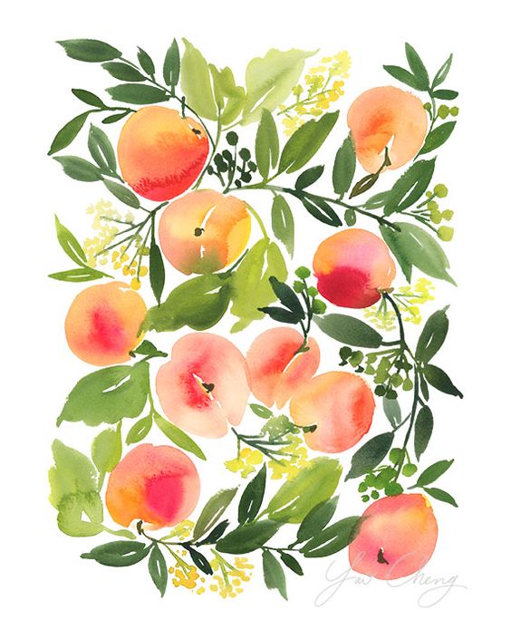
This was watercolored by an artist named Yao Cheng; she is very talented! I really love the use of color in the peaches here; lots of variegated colors that lend towards great visual interest. And her loose style has a whimsical feel that I am very drawn too.
So using Yao as inspiration, I created this card…
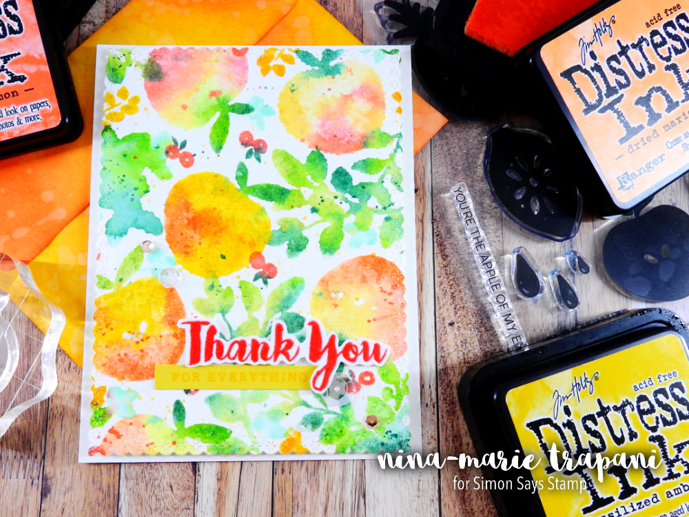
Distress watercolor stamping is where you apply Distress Inks onto a stamped image, mist with a bit of water, and press onto watercolor paper. The effect, instead of a crisp impression, is a loose and artistic image that resembles the look of watercolor. This is a great way to get the look of watercoloring without even bringing out a paintbrush!
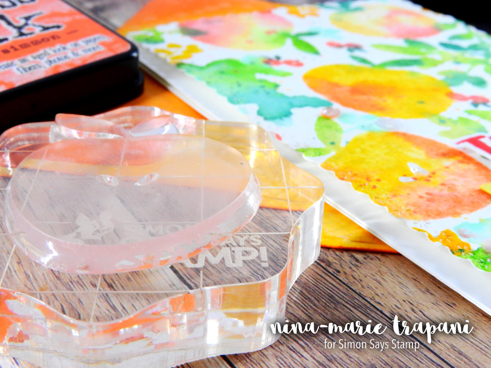
If you are new to this technique, I would recommend trying it first with solid images, such as the ones from Altenew’s Simple Fruits stamp set. This is what I used today in my card, along with a couple other images from both the Floral Shadow and Peony Bouquet sets.
Solid images are a bit easier to work with than outline images in this case and you’ll get better results on your first attempts until you get more comfortable with the technique. You’ll get familiar with how the ink reacts to water, as well as in knowing how much water to use to achieve different looks.
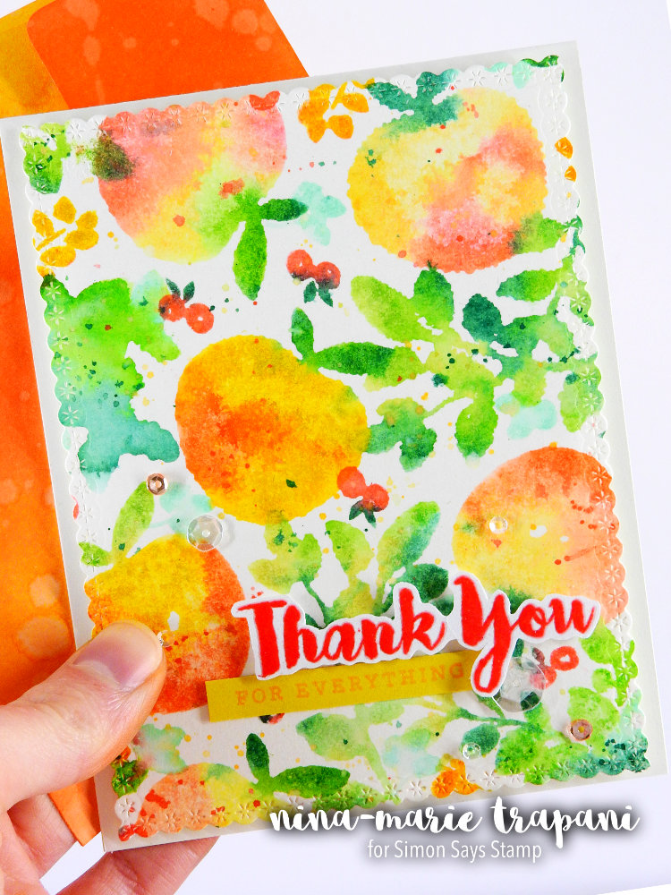
I used many different ink colors for the images on this card. However, if you do not have many Distress Ink colors, remember that you can still achieve a similar look with less colors. If any of you are interested in the colors I did use, I have them listed here for you:
- Peaches: Fossilized Amber, Squeezed Lemonade, Scattered Straw, Worn Lipstick, Ripe Persimmon, Dried Marigold, Abandoned Coral
- Leaves: Cracked Pistachio, Mowed Lawn, Shabby Shutters, Pine Needles
- Yellow branches: Worn Lipstick, Fossilized Amber
- Red berries: Ripe Persimmon, Pine Needles
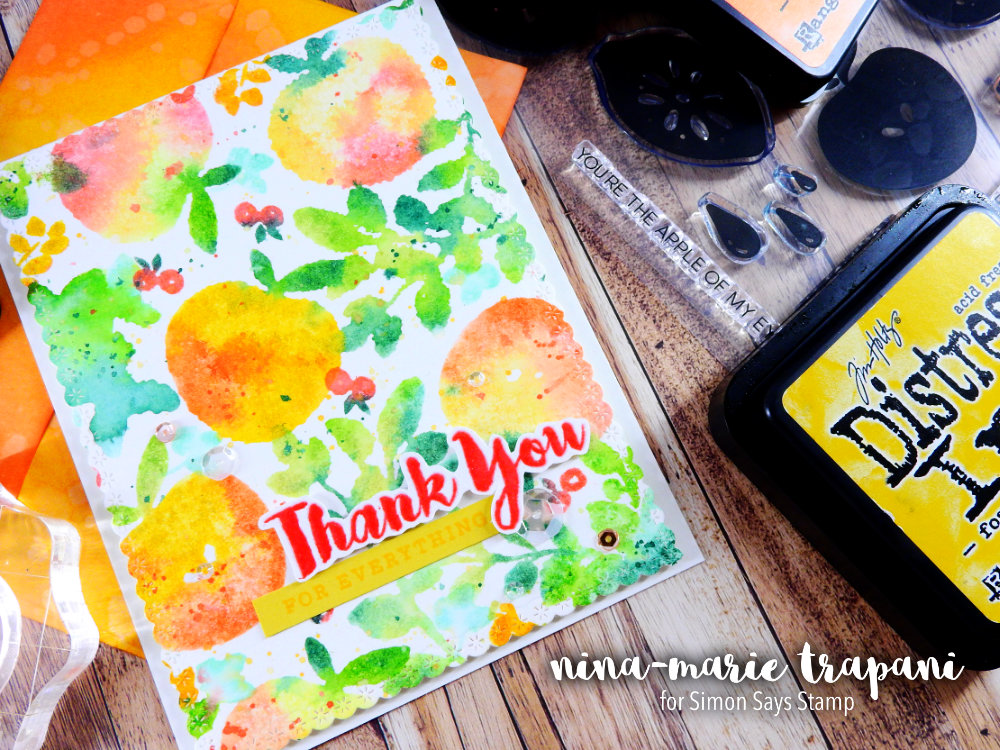
The sentiments I used were a combination of greetings from both Altenew’s Floral Shadow stamp set and Hero Arts’ Thank You Messages set. I also added sequins from Pretty Pink Posh as embellishments (Sparkling Clear mix, Sparkling Clear 3mm and Rose Gold 4mm).
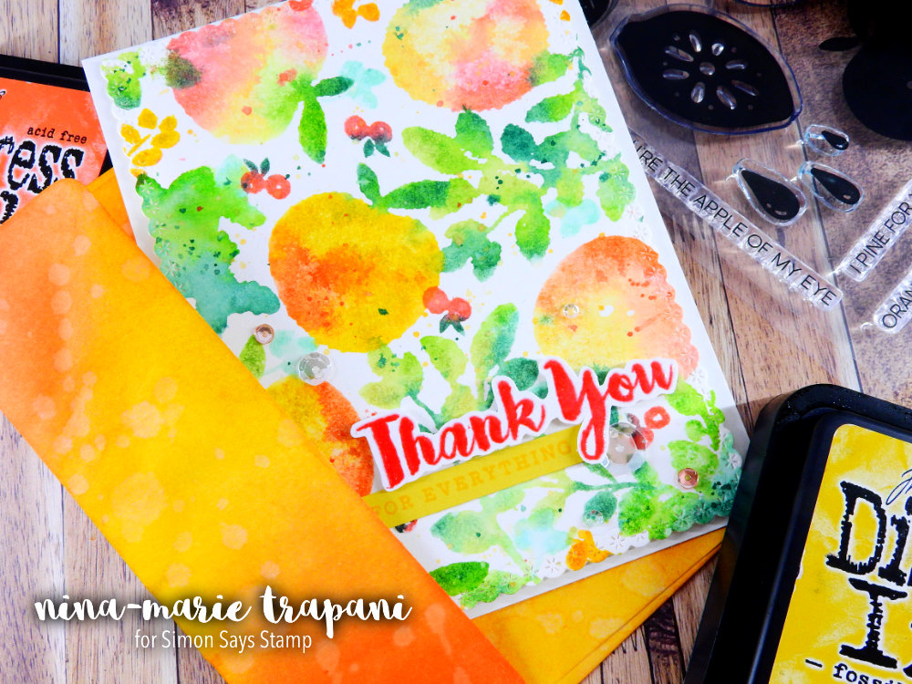
You may have noticed the envelope I am showing in the photos of the finished card, which is custom colored. I selected some of the Distress Inks that I had used in the “peaches” of my card and ink blended them onto the front and back of a white envelope. After adding the ink, I flicked on a bit of water to create water spots and help lend toward the watercolor feel of the card.
I could have created an envelope from thin watercolor paper and actually watercolored it – or Distress watercolor stamped a few of the images from the card onto the envelope – but I went with something a little more bold and simple here.
I hope you will be checking out the video below to see how I created this card and see the Distress watercolor stamping technique in action! Thanks for visiting me today; I’ll be back again next week with a new Studio Monday video!
WATCH THE VIDEO
SUPPLIES


Blog Candy Alert!! Follow our blog via email and comment on this post for a chance to win grab bags and blog candy! Remember to tag your awesome projects with #simonsaysstamp on social media so we can see what you are creating!


This is card is adorable!! It so makes me ready for summer :)
Very colorful card! Thanks for sharing!
This is so beautiful! I love your peaches.
Love the out of the box thinking and new ways to use what we already have.
Gorgeous card. Love the watercolor effect. And thanks for the great video.
VIBRANT and BEAUTIFUL!
LOVE your card and your inspiration too!
Very nice card
WOW! So beautiful and artistic!
Love the way you did this. Great job!!!
Your card is so beautiful! I love the colors and would never have thought fruit stamps could be so versatile! Thanks!
Very cool. Love the technique :)
Fantastic card.
I love the wispy look of the colors.
thanks for sharing.
Lovely card. Thanks for sharing!
Gorgeous. Great technique. Thanks for sharing!
Super pretty, makes me feel all summery!
Very pretty card full of lively color. And a great
adaptation to the inspiration piece.
What a beautiful card! Thanks for sharing the technique. I’ve seen it on other videos, but was never very impressed with the result. Now I can’t wait to try it out myself.
Very artistic!
Such a fun card. Love the watercoloured look.
This card is so beautiful!
Nice
Love distress inks! This card is awesome!
Wow your fruit looks sooo yummyy…love this watercoöor effect and no brush needed..clever!yayyy
Will remind your clever idea…
Hugs
Monika
This is beautiful! I love that watercolor background look–just gorgeous!! Thanks for your awesome video.
Love the technique and I love how you matched the card to the print you found. Love it! Thanks for sharing .
A great colorful card. Thanks for sharing the colors you use. It´s every time helpful to know them!!
Thanks for another super video!!
What a fabulous painterly look! Love this!
Love this card!
Absolutely gorgeous! What a beautiful card. Love the colors.
What a stunning card Nina! I must check to see what I have in solid stamps to try this!
I like how you used this inspiration piece to make your card.
Beautiful inspiration piece and gorgeous card, Nina! Your peaches look delicious and colors are spot on.
This is such a pretty card, and I love the colors. Thank you for the video.
Nina, what an awesome interpretation of Yao’s print! Absolutely wonderful. I love how you used 3 different stamp sets to achieve the look you were going for and the envelope is beautiful! Well done!
Great technique for a pretty card!
Very pretty card, I have been trying this technique for about a week, I really like it. Love your matching envelope, will give that a try as well.
Love this card! Great colors!
I love this type of stamping. Very nice colors too.
I love this technique!
Gorgeous card ! thanks for sharing this watercolor technique stamp. Love it !
Beautiful card! Love the colors!
So very vibrant!!
That’s so pretty. Fruit is such a lovely summery motif. x
Love that print & your stamped version is amazing! Thanks for the great video, Nina!
The distress stamped version of the print is beautiful as a card. Thanks for the tip about using the distress ink for a matching envelope! That’s a great tip, too!
Lovely card, such beautiful colors! Love this technique :)
Your card is just lovely and it looks like it would be fun to make. I love cards that are rather fluid in nature and hence you can hardly ever make a mistake! Not only that you used some of my favorite colors mixing yellow and red with some coral or orange… it reminds me of some of my favorite tulips!
Amazing card. Great video too.
Beautiful card! Love it!