Distress Color Combos
Hi everyone! Happy Friday!!
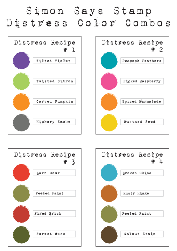
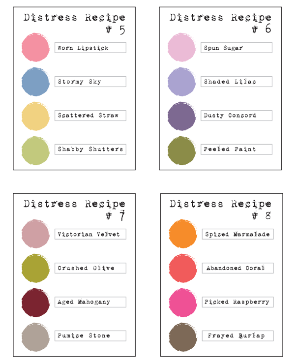
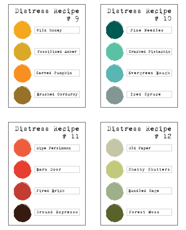
I have something a little different for you today. I’ve been playing with my Distress inks, some new, some old and came up with 12 color combinations for you to try. I’ve added in some holiday colors (#1 and #3) that look great together, also colors that blend well and some awesome gradients you can use for an ombre look.
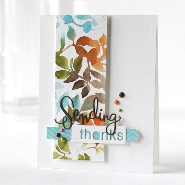
One of my all time favorite color combination is #4. It uses some of the older classic colors of Distress. These colors blend really well when overlapped and look great together side by side. I like them for their warm tones.
I’ve created a quick card to show you how these colors look on paper using the Leaves Background stamp and a little water misting.
I’ve used the mini’s for my card but remember all the Distress products that are available including Paints, Markers, Stains, Sprays and full size ink pads. You can view my video below or on our YouTube channel.
If you’re interested in playing with some combinations, I’ve put together 3 downloadable sheets that you can save, printout and cut to 3×4 cards to use for a reference!
Blog Candy Alert!! Follow our blog via email and comment on this post for a chance to win a special blog candy!
Thanks for stopping by, I hope you have a creative weekend!






Thanks for doing this, Shari! I’m in love with #8!
Thanks for this inspiration today Shari! I spent a lovely autumn morning and made three projects with the colors you featured. I keep forgetting how much I love working with Distress Ink. Thanks again for ‘Shari’ng!
Awesome – Love my distress inks and this gives me new ideas to try – thanks!
Great idea – especially great for us who are a bit color challenged!
Thanks Shari. The color combination printouts are such a great reference to have.
Thank you so much!! Putting the right colors together is one of the most difficult things for me. I really appreciate the downloads.
Thanks so much for putting these together!!, super awesome!!
LOVE your card, great video explaining the process too!
Totally awesome Shari!! I love this technique and I love that you used distressed inks. They are my favorite inks now. So this will be super helpful. Thank you so much for the PDFs. I’m going to make a flip chart with them.
Stunning card, I love the colors you’ve used- what an awesome technique also!
Great colour combos. They could also be used for regular SSS inks. Love the card and the leaf stamp. Thanks for the inspiration.
Beautiful card!! Love the color combos:)
I love using Distress Inks, these are great color combos. I already follow by email.
These color combos are fabulous! Thanks for sharing.
Thanks for the great cheat sheet for some new color combos.
Love these color combos. I will be trying some this weekend.!
Shari, thanks for sharing these color combos. They are just wonderful. Some of these I would never have thought of, but they are gorgeous. Looking forward to playing with them on some projects.
Thank you for these great combos.
Thank you!
These are fabulous Shari, thanks so much! Love your card, beautiful watercolour stamping with Distress! Deb xo
Thanks so much for putting this all together for us. Love the combos!
awesome color combo suggestions!
great card . . . thanks for sharing the recipes.
These are great! Some expected, but some unexpected. I like!
Thank you for these color charts!!!
What a great resource for all of us – thanks, Shari!
Thanks for the great color combos. Your. Are is gorgeous.
Thank you for very much… I often try different colors and sometimes end up with ‘mud’. I’m dying to try these combos out on my next watercolor projects. Great job!
I love this idea and thanks for the downloads as it will make it a whole lot easier!
Thanks so much for this!!! Distress are my go to inks and quite a bit of time is spent figuring out which green is right etc so this will definitely come in handy!!
Fabulous resource and a wonderful card! Thanks so much!
Thanks for providing the downloads! They will be a wonderful resource for those of us who struggle ith finding the “right” colors.
Thank you for putting these cards together! They will save me a lot of time. :) I can always use more time.
Thank you for sharing this! This will be a great help.
Thanks for the color combo sheets…some of these I already use, but there are a couple that I haven’t tried…I will now!
I love the recipe No. 2. I usually use similar colors a lot creating art in my art journals.
Thanks so much for doing this! Trying to figure what colors I should buy based on the colors on the lids doesn’t always work. I also love the color combo of #4 and the card you created using them. Just need two of the colors and I’ll be giving it a try. Thanks again!
So many fantastic combinations! I love 2, 6, 8 and 10!
thank you for the color combos
These are so helpful, Shari. Thanks for the printable cards, too. In just a few years as a card maker, I’ve gone from “what would I want with a stamp pad that doesn’t stamp a good impression on purpose” to “can’t live without my Distress Inks.” I love watercoloring with them. Your suggestions and color combos will make for a fun studio afternoon sometime soon. thanks again!
Absolutely love this card with these colors! Great color combo cards! Thanks!
Shari. Thank you for the recipes. Your #4 is delicious. This really makes things much quicker.
Great idea to do grouping like that it definitely will help me out when I need color combo ideas
This is fabulous! Love these color combinations. Thank you so much!
Wow, these are great color combos especially when I’m the worse at unique color combinations! Thanks so much Shari. Loving #4!!
Thank you so much. You are such a master of color. Love these combinations and your video.
Great technique! Thanks for the color combos and the video.
I watched the video today and really liked the combo.
Great idea, thank you for the recipes, love your card!
Thanks, this is awesome, will definitely use it!!!