Creating with Complementary Colors: EZ with CZ

Hi friends! Happy Tuesday! Please join me in welcoming special monthly Guest *CZ herself*, Cathy Zielske in the latest of our EZ with CZ blog series! Be sure to watch the video to learn all the details on this pretty card and enjoy!!
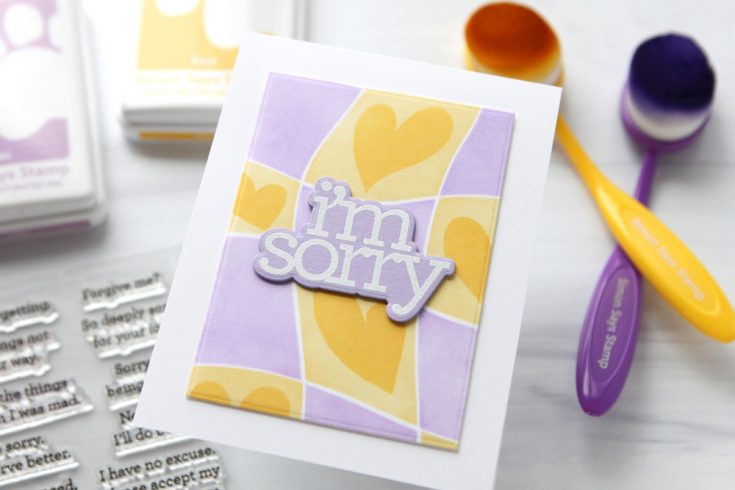
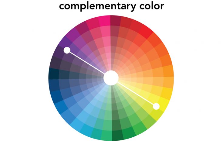
For today’s card project, I am using complementary colors to inform the design. Complementary colors are colors that sit exactly across from one another on the color wheel. They have extremely high contrast from one another and they always work as a pair. Today I’m using Lilac and Butter as the base colors for my design.
I chose to use light tones of both yellow and purple for my design, but the complementary relationship is there whether you use bold and bright versions of the colors, or soft and muted tones.
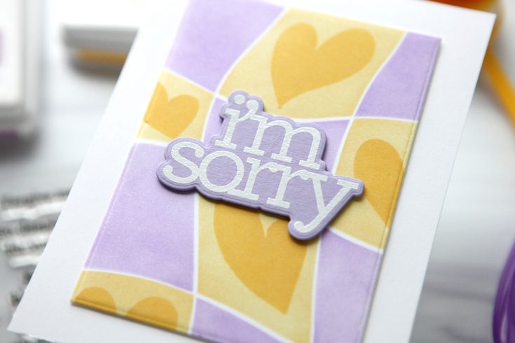
I used the Funky Hearts Stencils to featured these two colors on my card panel. Here is my video where I show it coming together.
WATCH THE VIDEO:

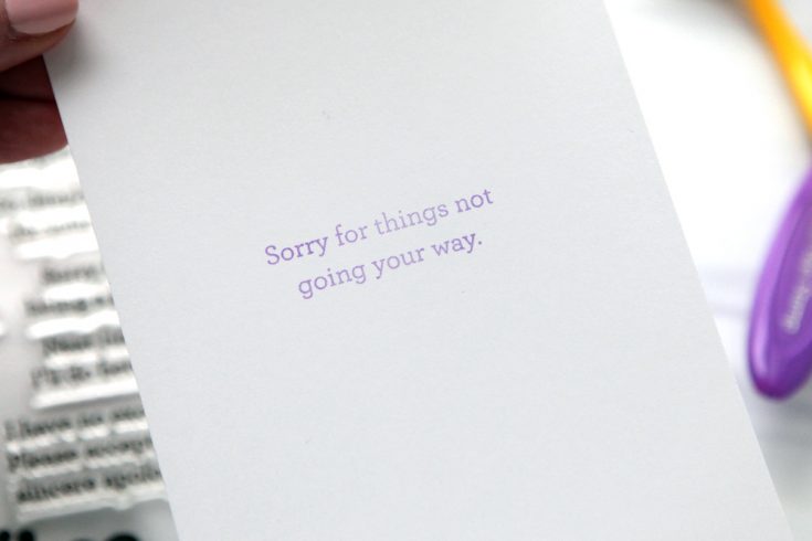
My CZ Design I’m Sorry stamps and die were a perfect set for this simple design. I also stamped a simple greeting on the inside, as well.
Pick a pair of complementary colors for your next card project and keep the color choices simple!
SUPPLIES:
|


Thanks so much for stopping by, and thanks to CZ for being our guest!


Really Beautiful card!!! I love purple and yellow together!!!
This is really pretty
Love the use of complementary colors in this project! The balance and contrast really make the design pop.
I recently visited your website and discovered a wealth of helpful information, particularly on this blog page. Many people have commented on your articles.
very cute