Creating with Pantone’s 2019 Color of the Year: Living Coral
Hello friends, and Happy 2019! It’s Nina-Marie here with you today and I have to tell you… it’s hard to believe we are beginning a brand new year!
One of the most exciting things about 2019 is the anticipation of fresh ideas and new ways to get creative. Discovering new colors is something I always love; did you know that every December, Pantone selects a color to embody the upcoming year? For this new year they have selected Living Coral; a vibrant, warm color that exudes comfort… and in my opinion, love as well. Which is why I centered my card’s theme around this very topic.
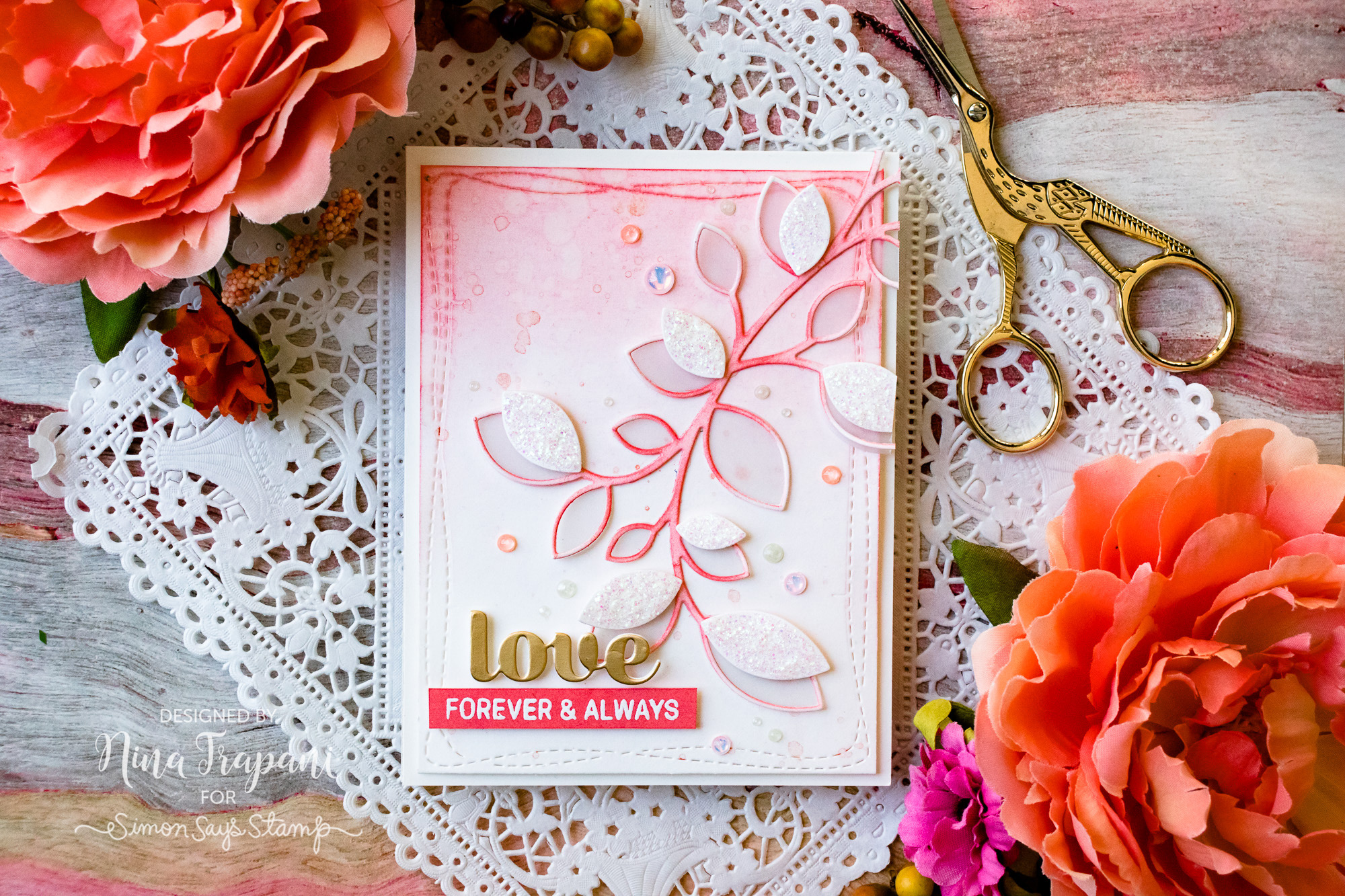
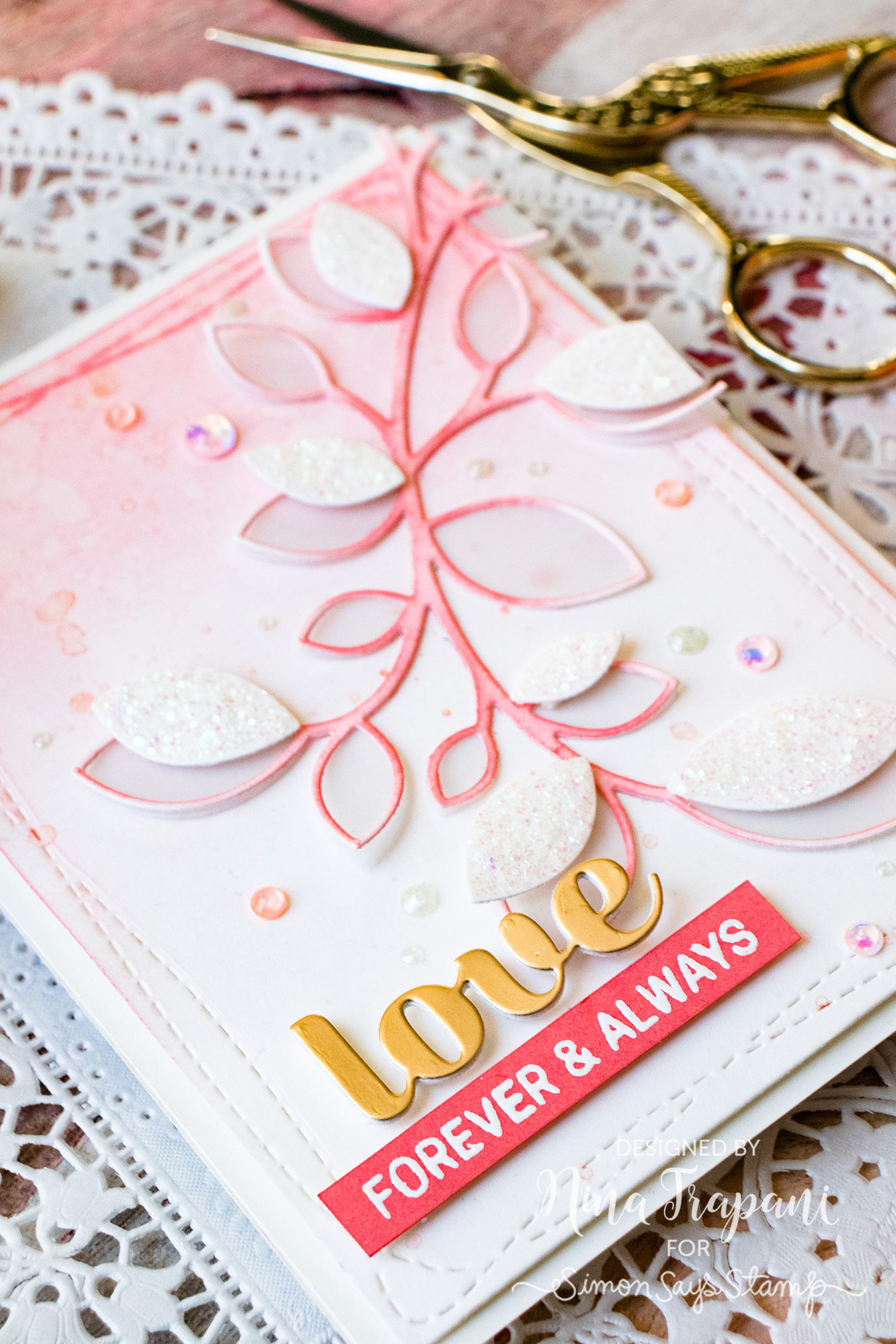
The challenge I gave myself was to make a card that was primarily made up of coral tones. As you can see, most of this card is white and coral, with a kiss of gold. I really love how well this card came togehter!
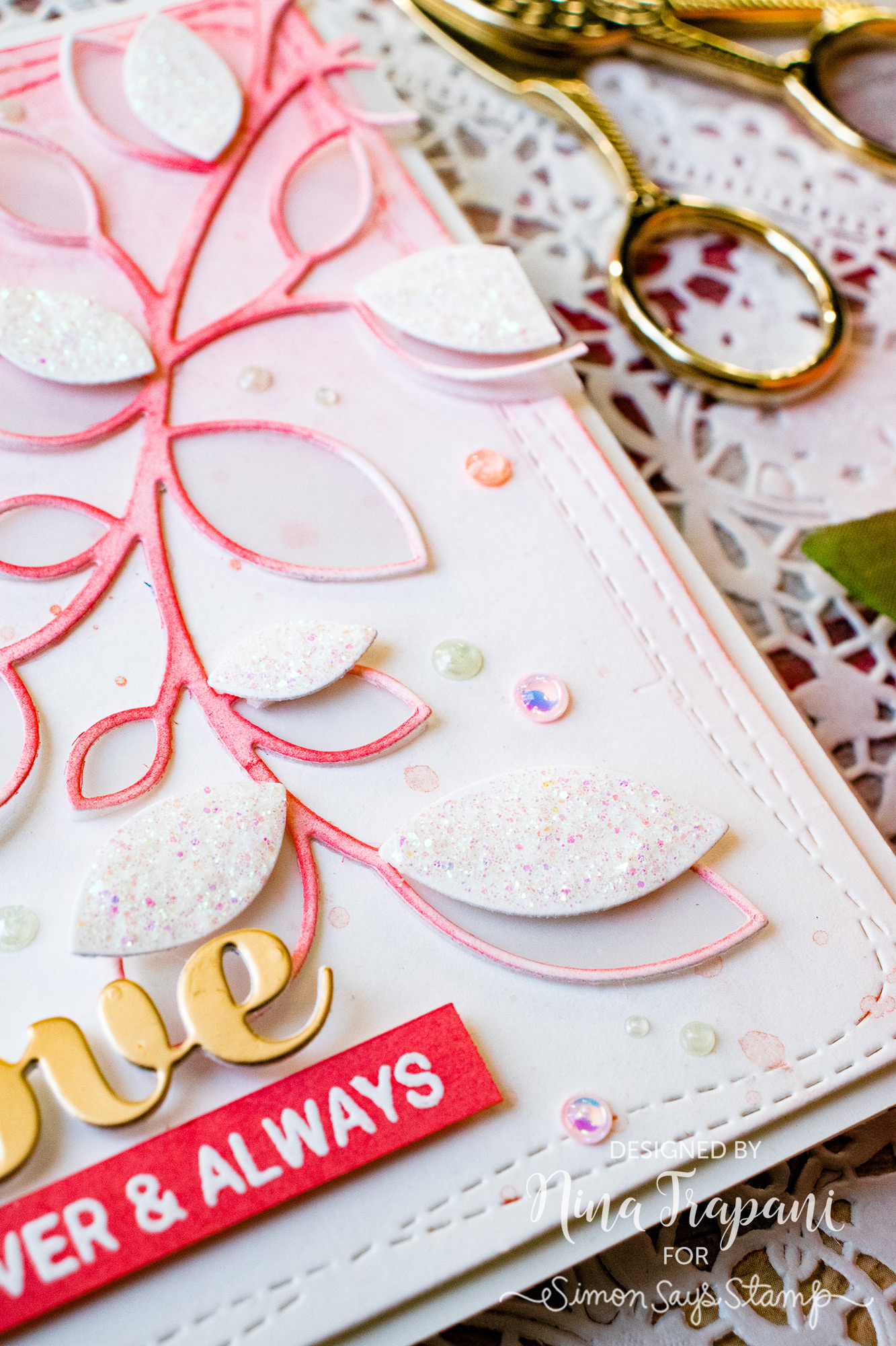
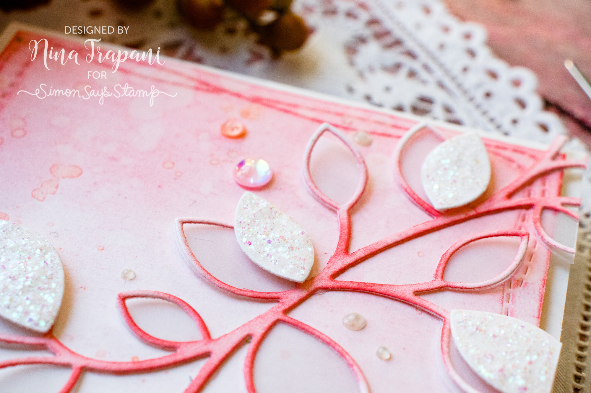
The main focal point includes the gorgeous Clustered Leaves and Outline Clustered Leaves die sets; I cut one from vellum and the other from white cardstock. Using Abandoned Coral Oxide ink, I blended color onto the outline leaves. That same Abandoned Coral ink was used to add some soft blending to the background panel as well.
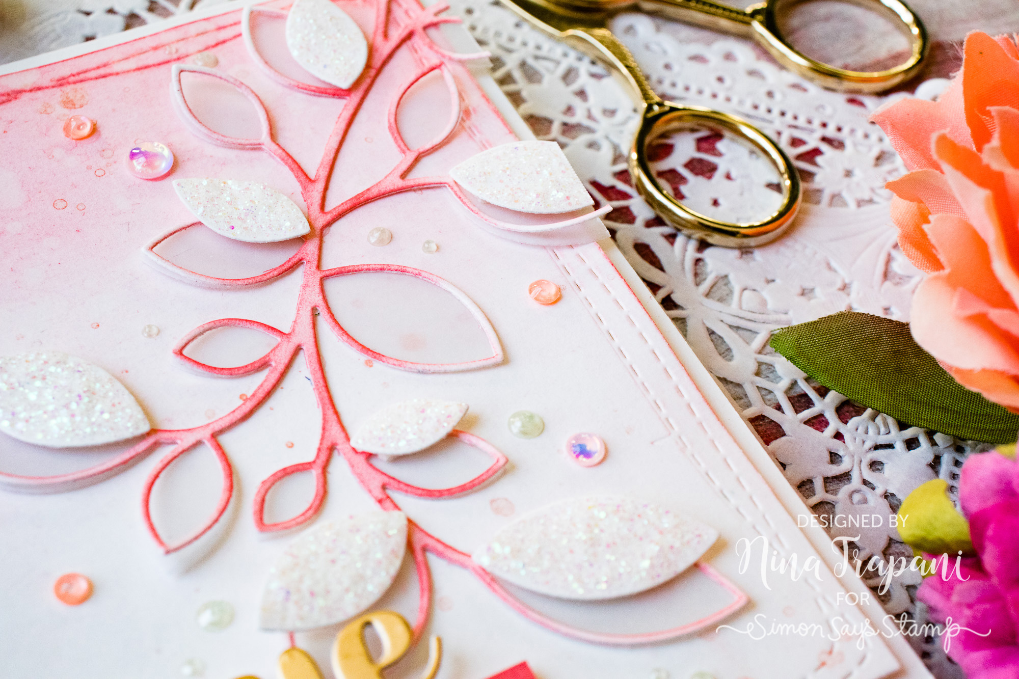
I splattered a watery mix of Perfect Copper Perfect Pearls onto the background, along with splashes of plain water; this created great texture. Around the leaf clusters, I added white leaves (covered with Moxi Glitter Glue), pearlized dots and Simon Says Stamp sequins; each sequin is filled with Morning Dew Nuvo Drops.
For the greeting, I used the Birch Press Design Sugar Script Love die, and a stamped sentiment from the Simon Says Stamp Floral Bliss set.
I hope you will watch the video to see how I created this coral-inspired project! I also encourage you to try using coral colors on your upcoming cards and papercrafting projects; the color is perfect for just about any occassion, not just love. Imagine birthday, Valentine, thinking of you and thank you cards all featuring this heartwarming tone.
Thank you so much for visiting with me today; I will be back again very soon with more crafty ideas to share!
WATCH THE VIDEO
SUPPLIES USED
|


Blog Candy Alert!! Follow our blog via email and comment on this post for a chance to win special blog candy!


Love the new colour! I always prefer coral over pink. And I love the inspiration card.
SQUEAL!! BEAUTIFUL Card!! THANKS for sharing and have a FABULOUS WEEK!!
This card is amazing!!!
This is so beautiful
Love This Color
Such a beautiful card and color.
stunning colour and gorgeous card xo
So beautiful
That’s a great colour! I think it will become a favourite of mine! Your card is gorgeous, Nina-Marie!
Oh Nina, this is stunning! What a unique color!
When I think of coral, sometimes my mind’s eye goes back to the horrible orange-y pinks of the 80s. This is a lovely example of how pretty coral can be. I look forward to seeing more modern examples of it!
I love that you used coral!! Did the same on my first card for 2019!! Love keeping track of the Pantone trends.
This is so pretty!
So lovely, beautiful color!!
This is stunning.
Love the new color Living Coral! Nina-Marie, another beautiful card! Very classy; love that you only used a few colors / tones. (coral, gold, white, and glitter! the perfect copper just fit right in)
This is so gorgeous, now I “need” this die too! Your work is always so inspiring Nina, thanks for sharing it!
Absolutely gorgeous and so refreshing like a breath of Spring air on this gloomy day here in Michigan!!
Beautiful card! Love the coral color.
Lovely card Nina-Marie. Coral is such a pretty color!
Love the colors of this card
Pretty card! I’m excited about using the pantone color this year!
ooh….living coral. Love it and your card is pretty awesome too….
Gorgeous card and I love that coral colour! Waiting for my leaf die to arrive!!
I’m happy to see that coral is the chosen color. It pairs well with all kinds of things. Such a lovely card – I’m sure it’s even better in person!
The glitter goes really well with the living coral color. What a pretty, pretty look!
BEAUTIFUL card Nina!!! LOVE the colors:)
Gorgeous card! I love that beautiful color!
I have the clustered leaves die & now I “need” the new open one! Your card is stunning! Even though orangy shades are not what I gravitate toward, I do love abandoned coral.
Wow! This card is so lovely!!! Beautiful colors!!!
Gorgeous color and card!!
Gorgeous card! I love everything about it.
Both your Card and the coral color is oh so pretty.
So gorgeous and delicate, I love the shimmer. Coral is such a beautiful colour!
Love the coral color. Beautiful card.
What a stunning card! I am loving this color of the year ?
Beautiful use of color. Thanks for sharing.
That’s such a pretty color! Very feminine. Lovely card.
Beautiful card, love the colors.
Oooh, love the colour. Such a beautiful card!
Gorgeous card! Love the color pick for 2019 and looking forward to creating with this color!
I think there was some concern about this color
but I think it’s great. Pinks are not my usual
color but this one squeaks in-between red/ppink.
thanks for sharing a pretty card.
txmlhl(at)yahoo(dot)com
So pretty. Love this color with gold.
Lovely card. Soft and simple and the recipient will “love” it.
I just love how you did this.
Oh my I am so excited about this color. It is my favorite. Beautiful card
Beautiful card, love the coral for 2019!
Beautiful card as always, Nina. Love the Pantone Color of the year — Coral. I think it has just become my favorite color!
So soft and pretty!!, love all the details!!
Just gorgeous!