Color Coordinates with Shari Carroll: Ghost Images

I’m having fun with the Pantone Color of the year 2019 LIVING CORAL. It’s a beautiful shade that sits right dab in the middle of pink and orange. To celebrate this color I’ve come up with a Color Coordinates using Simon Says Stamp inks.
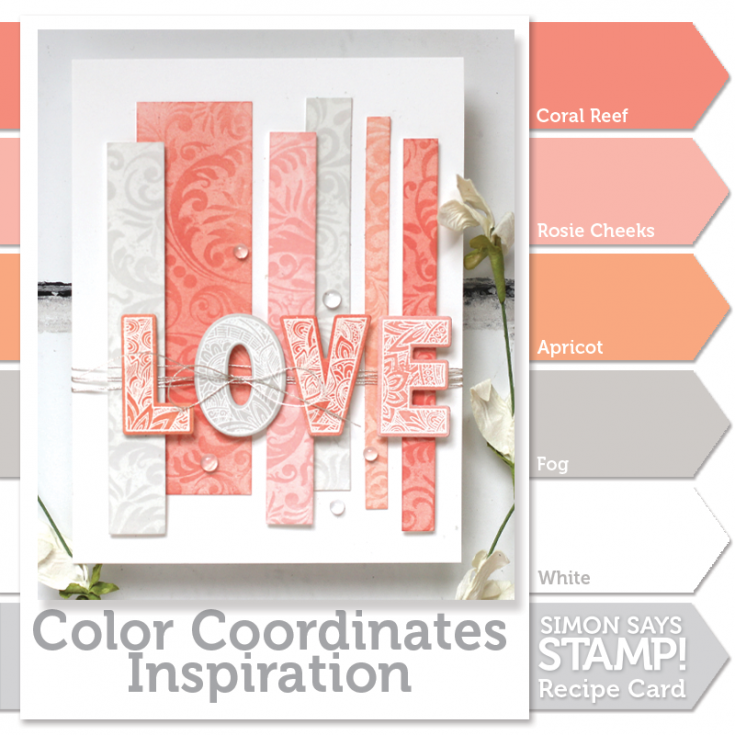
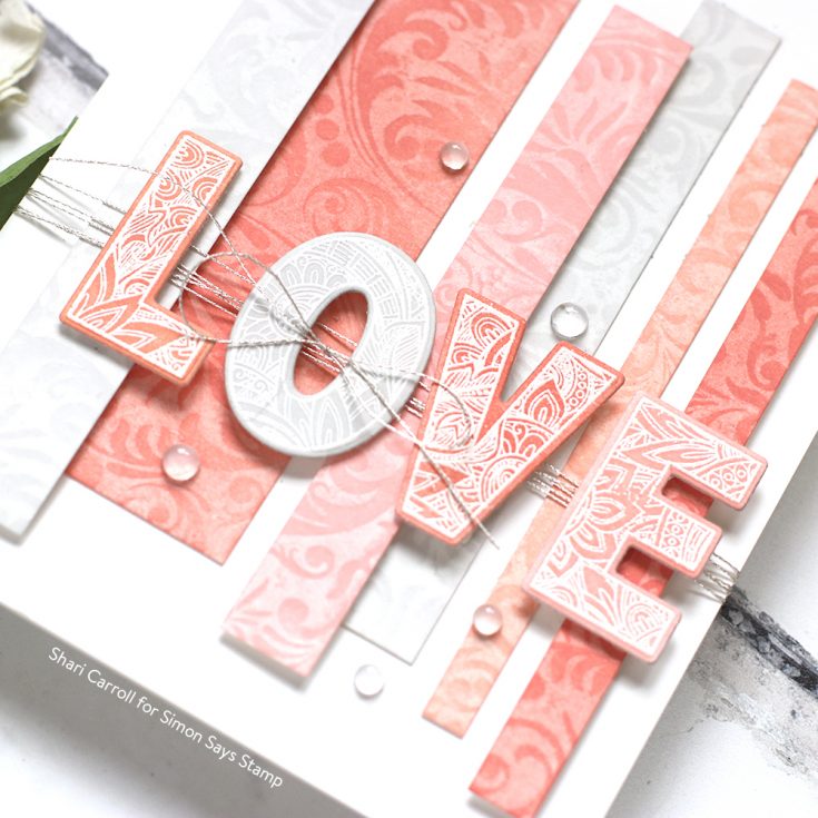
I’ve stamped a panel of white cardstock with the Simon Damask Background Cling using Simon Says Stamp white ink. Once it had a chance to dry, I cut the panel up into strips of various sizes. This is where the cool part comes in. I colored each of the strips with my ink colors using a blending tool. The image of the Damask leaves a ghosting effect with the inks.
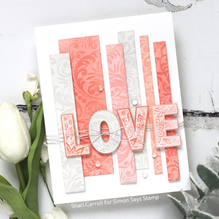
I varied how dark I colored the strips so I could get lighter and darker tones of the inks. I used the Simon Ornate Love stamp set where I white embossed the letters LOVE and inked up each of those with the same color inks. I adhered some of the strips flush onto the card base and some are lifted up with foam tape. I wrapped the card with Silver Metallic thread trying it in a bow. I pulled the bow through the “O” and place the rest of the letters onto the strips. To finish it up, I added a few Studio Katia clear drops.
If you are interested in printing out the Color Coordinates and creating a swatch book, I have the downloadable templates available below.
Blog Candy Alert! Follow our blog via email and comment on this post for a chance to win special blog candy!

|


I just love that colour palette…my favourite! Really lovely card. And thank you for creating the swatch book. Cheers.
Beautiful, elegant card – I love the softness of the Fog ink, it looks so wonderful with the corals/pinks.
SQUEAL!! BEAUTIFUL Card!! I LOVE the Design!! THANKS for sharing and have a have a FABULOUS WEEK!!
Very beautiful card. Love the ghosting technique. It looks very interesting!
I’m loving the Pantone color and how beautifully you used it on your card. So pretty!
So beautiful, love these colours, and what a fun design!
So elegant! Love this beautiful color!
I love how this card looks! :)
Love those peachy colors! Great card!
This is gorgeous, I love the soft colors and awesome layout, so beautiful!
Gorgeous card with that stunning color palette! I’ve always enjoyed these colors together.
Wow, that is such a cool technique, absolutely loved this card with lovely color shades.
WOW!! I love the colour combo, all the different shades. And the background stamp pattern is amazing!
What a beautiful card. I love the living coral color. So inspiring
Thanks for sharing the steps to making this beautiful card!!
BEAUTIFUL COLORING! I love this card soooo much!
What a beautiful card.
A simple concept, beautifully created and perfect for a Valentine’s Day card. Thanks again Shari! I’m going to us this idea today!
I love this pretty design! It is so soft and feminine and I love the pretty details in the letters! Beautiful!
This card is beautiful ! Great idea to pull the bow through the O !
Thank you for the very clear video.
Love this series!
Love this color combo!
This colour combo is beautiful! And so is SHari’s card!
I love these colors! I have painted at least one room apricot (in a slightly lighter shade) in every house we’ve lived in. It looks so pretty at all times of the day as the light outside changes. Have to have these inks.
Beautiful and so pristine – love the elegance.
WOW this is GORGEOUS! Thanks for the video!
Beautiful card, I like your use of the white pigment ink under the ink blending.
What a creative design–LOVE it!
I have been hungry for a new recipe Shari and this one looks yummy! Living Coral, it just sounds regal. Love it!
Beautiful card, I absolutely love the color palette!
Gorgeous card! Love the coral colors. This year’s colors are one of my favorites!
This card is absolutely lovely. I ? trying new techniques and have to try the ghosting technique. I am trying to figure out how it works…and assume that it is important to use the combination of pigment and dye inks.
Beautiful card! Love the color combination.
Simply beautiful!!! ?
Ive been using this technique for a couple of weeks now and Im loving the designs on my cards!
I love the white on pink in the lettering. It is really beautiful. It is an amazing card.
I love this card! everything goes together so well. I think the silver thread adds a nice touch. You are amazing!
Gorgeous! The colour palette is lovely and the way it’s used here is stunning.
Coral is a favorite – love love your layout on the use of coral – thanks for inspiration!
Shari – this is absolutely wonderful and I will certainly check out others. Thanks for sharing.
Linda D.
This is so pretty! Gorgeous colors!
Love the soft colors with the bold script! Gorgeous!
Ooooh, lovely card!
What a gorgeous card! And this coral color of the year is really starting to grow on me.
So beautiful and elegant!!
Coral is such a gorgeous color! Love the beautiful card.
Thanks for sharing.
I love this unique style and the colors are beautiful.
Beautiful colour palette. Love coral!!! Gorgeous card!!!
Love it! such a pretty colour theme too :)
I LOOOOVE this! The coral colors are amazing. I am a fan of the color of the year!