Color Coordinates with Shari Carroll: Fall Thanks

Welcome everyone to another edition of my Color Coordinates series. This time of year, I’m all about fall!!! I’ve come up with a combination of colors to use with the Simon Says Stamp Large Stitched Oak and Large Stitched Maple Leaf dies.
The colors I’ve come up with are Merlot (a rich red), Sparrow (a nice neutral to blend with), Coral Reef (a sweet pink/orange tone), Beanstalk Green (a mellow, warm green), and Duckling (Yellow of course!).
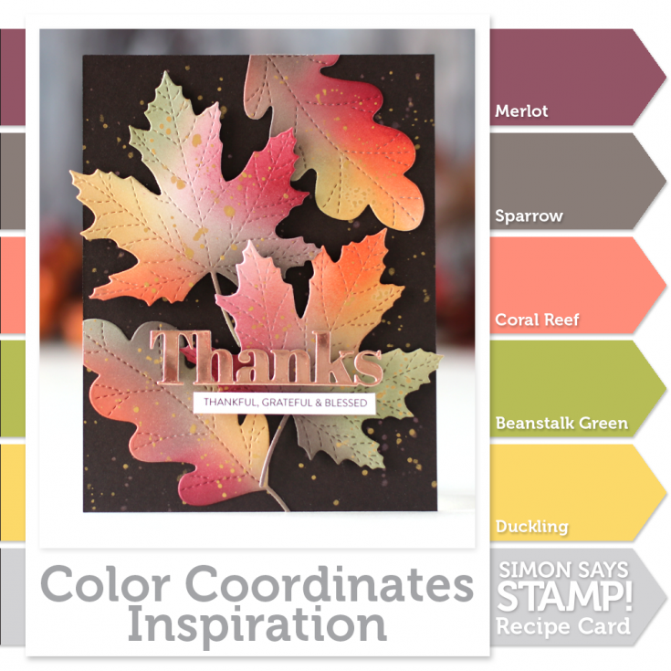
To start off, I traced the leaves onto some Simon Says Stamp 120# cardstock, I like this cardstock because it’s so smooth and the inks blend well. The tracing of the leaves helps me to determine areas of where to apply the inks. I used a larger Life Changing Blender Brush to apply the initial color.
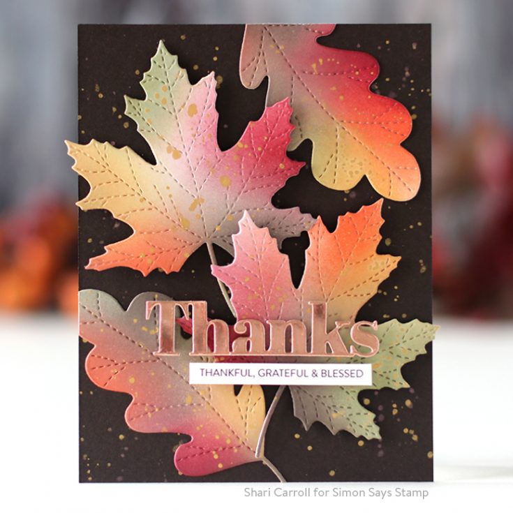
Once I had the sheet colored, I die cut the leaves. I used a small brush to add darker details of color. Why color the paper first? I find the ink glides across the cardstock when it’s precoated.
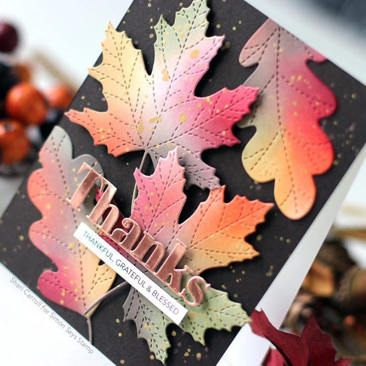
I splatted some gold paint onto the leaves and background cardstock and assembled the leaves onto the card. To finish it off, I die cut the Bold Thanks from Tim Holtz Copper Metallic Kraft cardstock and added a Sentiment Strip greeting.
If you are interested in printing out the Color Coordinates and creating a swatch book, I have the downloadable templates available below.
- Book template and past Color Coordinates
- May 2018
- July 2018
- August 2018
- October 2018
- January 2019
- March 2019
- April 2019
- May 2019
- June 2019
- July 2019
- August 2019
- October 2019

Blog Candy Alert!! Follow our blog via email and comment on this post for a chance to win special blog candy!
Thanks for stopping by!!
|


wow! this is gorgeous! I look forward to the color combos and the projects made with them. :) thank you for the inspiration!
Gorgeous colors. Love the leaves.
True fall item. thanks for sharing
txmlhl(at)yahoo(dot0com
Wow! Love the way those beautiful fall colors pop with that black background. Thanks for sharing this one!
What a beautiful fall card! Thank yiu for sharing the tip of adding the base colors first, die cutting, and then adding the final colors last. Love the copper and gold accents.
Thanks for more color coordinates inspiration from Shari! The card is beautiful, the colors gorgeous and the tip to apply a light base coat of color to any project first is the answer to perfect blending, I think!
Fantastic card! I love the fall colours!
Wow Shari, this is a stunning colour combination.
I love this series.
Thank you so much for showing and for sharing your beautiful card. Have a great weekend.
I love these gorgeous fall colors& your equally gorgeous card!! Fall ismy favorite season!
Beautiful!
This is a great video! Love this beautiful card.
Very pretty… love against the black cardstock! Just started following the blog… so much inspiration!
I get so excited when I receive my email saying “Color Coordinates . . .” Shari, you never disappoint! This is a beautiful card with the perfect colors! Love it!
What a beautiful color combo!
Lovely color combo.
Love how the colors pop against black.
My non-artist brain would never have chosen that color combination, but it is absolutely gorgeous. Shari has such an “eye” for color and design — gorgeous card.
Gorgeous colour combination, and love what you’ve done with it – such a pretty card.
Stunning color combos, love the addition of gold splatters and copper die-cut.
A fun and bright card!
Beautiful card and colors!
Thanks so much for sharing…
These leaves are so lifelike and pretty. Great color combos.
Fantastic , colorful card. Love those colored leaves.
Beautiful. Simple but elegant. Love the clean lines. Thanks for sharing.
love this color combo for these fall leaves – PERFECT!!
Love the colors. Nice!!!
Nice color combo! Thanks for the inspiration!
Simple and lovely. I love it and thanks for sharing your techniques with us.
Love these Fall leaves! Beautiful colors!!
Beautiful coloring and design!
That is a beautiful card, thanks for sharing your talent with all of us.
Carol B
GASP!! These Fall leaves are breath-taking!!
Absolutely beautiful colors!! I love these awesome fall gems!!
I don’t normally find myself drawn to fall colour palettes, but I LOVE what you’ve done with this card! The ink blending is beautiful and you’ve inspired me to expand beyond my colour comfort zone this weekend. Thanks Shari!
Gorgeous fall card and amazing ink blending.
Love these Dies and your color technique. I love these colors and downloaded the swatch. The card is beautiful!
Those leaves are lovely, such a pretty card!
Wow! It almost looks like oxide inks, gorgous!
Very pretty Fall color combo. Your card is gorgeous. Love the dark BG with these colors.
Beautiful, the leaves look so realistic!
Fall is my favorite time of year. Love these colors and the leaves.
I love your videos. Thanks for sharing another great tutorial.
Gorgeous card! Autumn is my favorite season and it is over far too quickly. A card like this is something to hold on to through the long, cold winter that follows! A reminder of those beautiful colors that came before the stark white.
Thank you for sharing your templates, it is much appreciated!
Love this Beautiful Fall card!!! I’ve been playing with the maple leaf and watercolors. So fun!!
What a stunning card! I love the fall colors and dimension that the layered leaves add. Thanks for sharing.
This one’s a keeper Shari… so rich. This time of year nature really shows its wonderful palette of colors. Great job.
Stunning card. Love the color combo.
I couldn’t have begun to pick out those colors for the fall leaves. They are perfect! Beautiful! Thanks for the great tutorial!
That is simply beautiful! Love the design, the colours, the font of that thanks die cut!
Your leaves are gorgeous and that gold really makes them pop! Thanks for sharing your video!!
That is simply GORGEOUS!!!!