Color Coordinates: Summer House

Welcome everyone to another edition of my Color Coordinates series. I’m in the mood for Summer houses on the beach with this selection of colors. They are calming and the card is super easy!
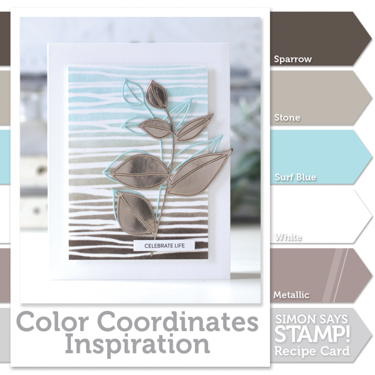
I’ve started out with some white Neenah cardstock, the Tim Holtz “String” Layering Stencil, and 3 delicious Simon Says Stamp colors of ink in Sparrow, Stone, and Surf Blue.
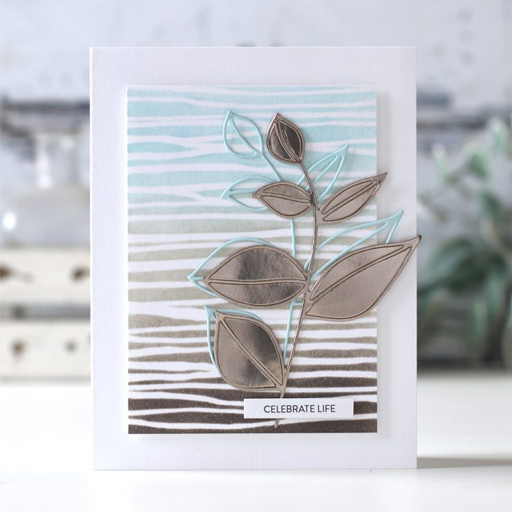
I’ve used the Stamp Market Botanilcal Beauty die to cut out the leaves from Simon Says Stamp Sea Glass and Tim Holtz Metallic Confections papers.
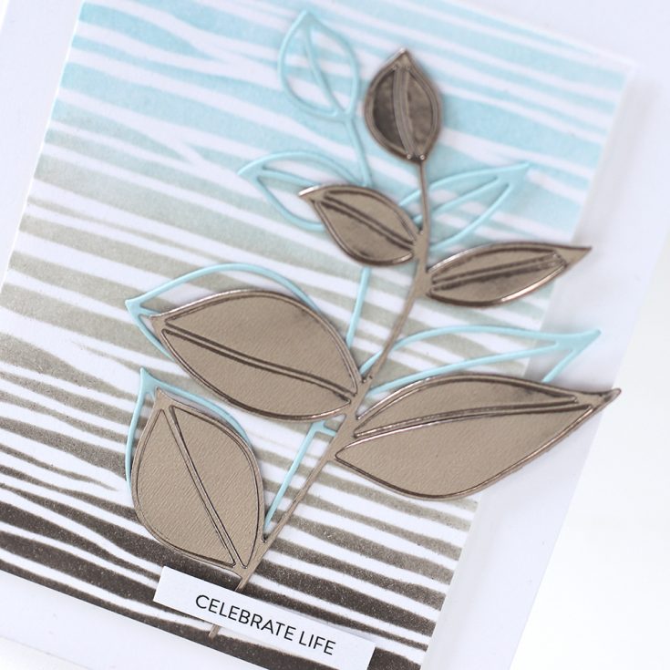
Be sure to watch the video for the tips and tricks used in the making of this card.
If you are interested in printing out the Color Coordinates and creating a swatch book, I have the downloadable templates available below.
- Book template and past Color Coordinates
- May 2018
- July 2018
- August 2018
- October 2018
- January 2019
- March 2019
- April 2019
- May 2019
- June 2019
- July 2019

Blog Candy Alert!! Follow our blog via email and comment on this post for a chance to win special blog candy!
|












Love this ink combo. It does evoke the memory of a beach house. Beautiful, Shari!
I SUPER love that color combo!
Gorgeous colours together – I really like those metallic papers I haven’t seen those before!
Love this card, Shari! So soft and so pretty!
what a lovely combination of colors
This card is elegant and simple. The colors work well together and appreciate the tip on holding the stencil in place with Pixie Spray.
What a beautiful color palette!
Another great colour combo! Lovely card!
I really love that color combo and I adore that stencil! Beautiful card.
Love this color combination!
What a beautiful pallet! And I love that it’s gender neutral. :)
This is one of my favorite color combos. I’ve never seen that stencil, it’s now on my wish list.
Awesome card. Love the colorcombi.
love how elegant this CAS card is – thanks for the ideas:)
Simply beautiful! I love this color combination and the mirror card!
Great card! Love the stencil..
Thanks for sharing.
Pretty color coordinate!
Oh so tres chic!
Love this elegant yet chic color combo
Wonderful card using the color coordinate
Love the combo of seaglass and Tim Holtz Metallic Confection paper for the leaves die cut.
Awesome card, love the calming colors!
Yum… I love blog candy. And this card. Great color combinations.
On this very, very hot day, this is refreshing and does remind me of long ago days and weather worn silver-grey beach houses on the NC coast. A fond memory and a beautiful card! Thanks!
Beautiful card! I love the metallic paper!
Love the card and those colours are gorgeous!
They definitely make me feel “beach”!
I love these colors!! And I totally agree, serene was the first word that came to mind. Thanks for sharing the Pixie Spray tip.
Love the color combination! :) Beautiful card.
What a beautiful color combination I probably always say this but I love your style! I love how you mix the metallics with the matte colors. I keep trying to mix it up like you do. Thank you so much for sharing your inspiration.
Stunning color combo.
Daily updated super sexy photo galleries
http://shemaleforsex.danexxx.com/?alexandrea
teen angle porn free online porn fucking the neighbour myfreewebsite erotic porn adams golf porn most degrading porn
This colour combo is so relaxing and gentle and the card design is really lovely. About the Pixie Spray…..is there much odour when spraying? I don’t have easy access to the outside or fresh air when crafting, and I’m wondering how strong/toxic the spray is? Also, is the Pixie Spray difficult to wash off the stencil? And finally, same question about the E6000 adhesive spray (odour/toxicity)?
SO refreshing to see non-rainbow color scheme !!!!!!!!! This is very sweet
Such a beautiful card!!!
Suck a lovely and simple card, but breathtaking. What did we ever do before Pixie Spray? I know it helps make my finished products look much more professional. Thanks for your tips.
You call it Summer House, I call it my current livingroom colour scheme… LOL! Love the combo! And I totally agree Carol that it is calming which is much needed after a hectic work day. Beautiful card and I love the addition of the metallics.
Love the design and the calming colors.
Awesome card with soft colors. Great Video and thanks for sharing.
Linda D.
I feel calmer just looking at this… great combination and I love that metallic card stock. Might be a shopping day! As always thanks for inspiring.
Love you colour choices for this card Shari, so fresh!
Gorgeous, soothing color combo & a fabulous card! Wouldn’t have looked at that stencil, but I love it!
Love the soft colors…and the designs…
Very pretty color combo and a sweet card.
I absolutely love this colour palette, the card is wonderful
Love those colors and hafta check out that stencil!!
What a beautiful card. Simple and elegant. Great color choices too as it is so peaceful looking. Thanks for sharing.
Ooh I love this color palette! Simple, clean, and the metallic paper adds such fun variety in texture. Gorgeous!
I LOVE these colors!!!!! Beautiful card!!
Wowza! What a beauty.
Great colourcombination Shari. I love this series.
Your card is gorgeous!
Thank you so much for showing and have a wonderful weekend.