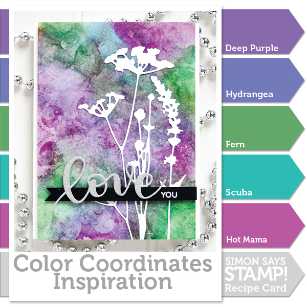
COLOR COORDINATES: Shari Carroll’s Purple

Happy Friday everyone!! It’s Shari here with a Color Coordinates set that I think you’ll enjoy.
One of my favorite two colors together is purple and green, a combination I don’t use it often, but it’s always been a favorite. For this Color Coordinates I started with those two and added in a few more to complete the look.
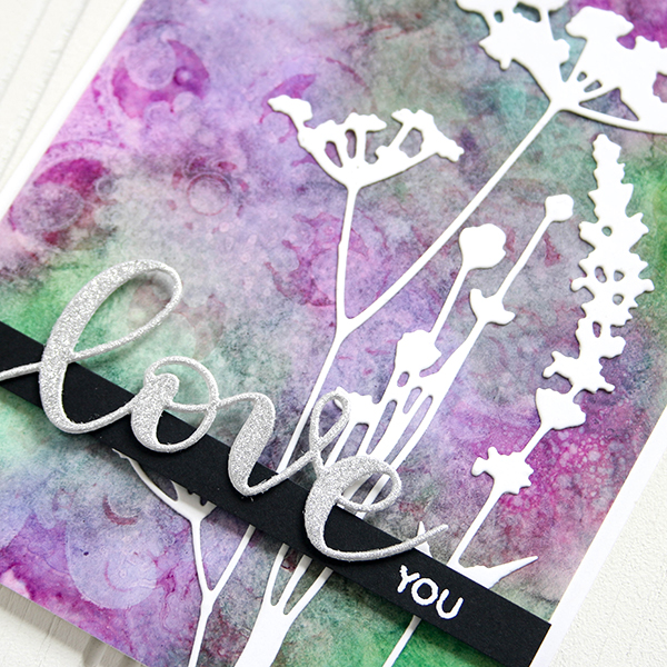
I totally experimented with inks to create this background. At first, I wasn’t sure if it would work… but it did! I used Yupo with the inks and blended them together with a blending tool and my finger, then added spritzes of rubbing alcohol. Yupo is an interesting synthetic paper that let’s the ink sit on top of the surface. Alcohol breaks down the ink so it can flow… resulting in this amazing marble effect.
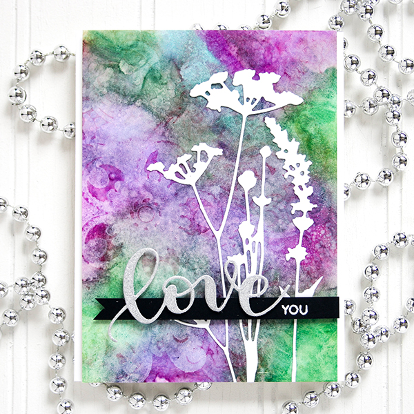
Once I had my background, I die cut the Tim Holtz Wildflowers from white cardstock and added them to the background. Then I die cut “Love” from a Tim Holtz silver Deco sheet which is set onto a strip of black cardstock with the white embossed “You”.
I’m so glad I filmed this technique as I was experimenting so I could share it with you. You can watch the full process video below or on our YouTube channel HERE.

Blog Candy Alert!! Follow our blog via email and comment on this post for a chance to win a special blog candy!
Thanks for stopping by today, I hope you have a creatively awesome weekend!
Supplies Used:
 |
 |
 |
 |
 |
 |
 |
 |
 |
 |
 |
 |
 |
 |
 |
 |
 |
 |
 |
 |
 |
 |
 |


it’s gorgeous Shari and reminds me of my mom’s violets on her window sill. She still cares for them at age 89.
Oooooo. This is beautiful!!!
I can see me trying this technique with your great instructions
Oh how beautiful
these colors are
all together!
They are just my
colors and a
gorgeous card.
Carla from Utah
Another beautiful colour combo. So lovely.
Oh my goodness. This is absolutely gorgeous. I love Shari’s Color Coordinates and this one is going in the SAVE file. :)
This is beautiful! I hope mine turns out just as nice. Thanks for sharing.
Love these colors together, pretty card and love this fun marbling technique!
What a cool technique! Turned out stunning!
Simply Beautiful! I love all the colors, very calming effect..
Nice card!! I can’t wait to try the technique on a card.
I love the colours and the softness of the background. Gorgeous!
Such a beautiful colour combination and a lovely card! Thanks for the inspiration!
Wow!!! Really Gorgeous card and color combo!! I love how the ink and alcohol reacted on the Yupo paper!!!
Absolutely gorgeous!!! Beautiful colors!!!
This color combination is gorgeous and I have not heard of Yupo!! This looks very intriguing, you have definitely inspired.
That yupo paper is some pretty strange stuff!
WOW-what a colour combo! So lovely… gonna try this on the weekend for sure!
Wow so cool technique! Thank you for the process!! Very beautiful card!!
Beautiful card! Love the contrast with the white die cuts.
Absolutely stunning!
Very lovely!
LOVE LOVE LOVE this post!! The card, the technique all of it! Thanks for the inspiration!!!
Beautiful colors, beautiful card!
Beautiful card, love the background, I am keen to watch your video when my internet speeds up as I love this look, Cathy x
Lovely color combination and a simple but beatiful card.
Gasp! This is stunning!
Love the color combo and new technique.
i”ve always loved purple and green together – love your colour combination and the card!
GORGEOUS card and colors!!!!
Lovely color coordination. I didn’t realize you had used the Elizabeth stamp until I watched the video, it’s very subtle…but I’m loving the three background stamps (Elizabeth, Emma and Elinor).
Love how you did the background.
That is very pretty Shari! Purple has always been one of my favorite colors too.
Green and purple go great together I have to try that out soon .thanks for the inspiration.
Janie
This is GORGEOUS SHARI! I LOVE the colors you’ve used & what you did with them!!!! SO GORGEOUS!!! ;)
Gorgeous color combination and card!
Oh Shari, this is gorgeous. Your background is stunning & the white die cuts were the perfect choice.
This is such a pretty color combo…love that background!
Love the color combo…beautiful card!
Shari, I look forward every month to read your color coordinates post. I really love the purples and blue. What really makes this card is how the white flower pops off the colored background.
OH MY GOODNESS Shari! Am I inspired???? HECK YA! This is stunning! Trying this tomorrow! Thanks for sharing!
Yay! Another mix. Thank you
A stunning card?! LOVE that gorgeous background! Didn’t think these colors would blend so well but am loving them. Thanks for sharing!
Such a striking card, Shari, and love the marbling effects from your technique! One can’t go wrong with purples, right?
Stunning card! Thanks for sharing your process – so much inspiration to try new techniques!
Shari, the color palette is simply gorgeous! I love the results of your ink blending and alcohol application, so cool! I can’t wait to try this technique as I so happen to have some yupo paper in my possession. Thank you for sharing your technique.
Love those colors!
This is one of my fave combos too! Love the background!
purple is one of my favorite colors. this is so beautiful
Beautiful color combination.
Fabulous colors together!
These colors are gorgeous together and I love the white die cuts against the burst of purple and green, wow!
Such a pretty card. Love the colour combo!