Color Coordinates Schoolhouse Red!

Hey there everyone! Happy Friday!!! It’s Shari here with the Color Coordinates Schoolhouse Red!
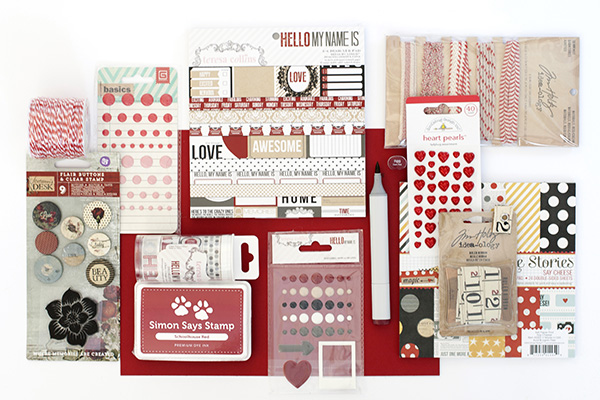
Simon Says Stamp Schoolhouse Red 100# Cardstock
Simon Says Stamp Schoolhouse Red Premium Dye Ink
Simple Stories Say Cheese 6×6 Paper Pack
Teresa Collins Hello My Name Is 6×6 Paper Pack
Teresa Collins Hello My Name Is Enamel Dots and Shapes
Teresa Collins Hello My Name Is Washi Tape
We R Memory Keepers Red Baker’s Twine
Tim Holtz Idea-ology Red & Cream Trimmings
Tim Holtz Idea-ology Ruler Ribbon
Basic Grey Red & Pink Candy Buttons
Doodlebug Ladybug Assortment Heart Pearls
Prima Stationer’s Desk Flair Buttons
Copic Sketch Marker Dark Red R89
Schoolhouse Red is the darker of the two Simon Says Stamp red card stocks and ink. It reminds me of an old time red… like paint on barns! I’ve brought together some product that works well together but have also focused on adding in some neutrals.
I’ve put together my walk through video and an introduction to my simple card. Enjoy!
Simon Says Stamp Khaki, Slate and Black cardstocks look fabulous with Schoolhouse!
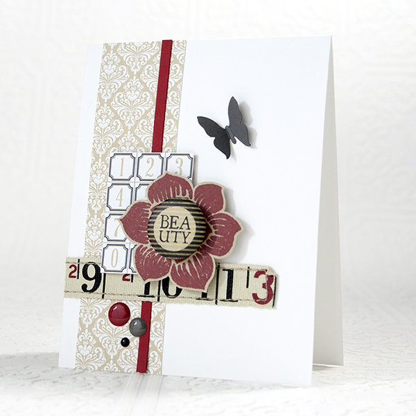
I’ve stamped the Prima flower image onto Khaki cardstock using Schoolhouse Red ink, then cut it out using my scissors. I’ve also cut out panels from the Teresa Collins Hello My Name Is paper pack to use as part of my arrangement. To finish things off, I added in a small butterfly cut from Slate cardstock and some enamel dots.
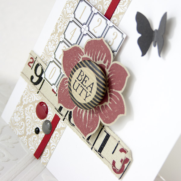
No special techniques here, just a little layering fun with a hint of elegance!

Before I go… I have a Blog Candy Alert for you! Follow our blog via email and comment on this post for a chance to win a special blog candy!
Have a fantastic week-end!
               |


LOVE this segment! Red is my favorite color!! Thanks for the chance to win!
Lovely card!
Adorable!
Fabulous variety!
Wow, a card on wich each detail is so beautifully placed…a stunning card!
oooh, a beautiful card I do love the flower!
This kit is fabulous and I loved the card. Red is one of my favorite colors!
So gorgeous. Look at that glorious red. A pop of pure colour against those neutrals. Fantastic
Fantastic selection here – loving this series
I really like the shade of that red colour!
The neutrals definitely go well with the red to both highlight it and tame it down. I really love this shade of red though. It reminds me of red love hearts and red roses especially today since it’s our 11th anniversary.
Love the monochromatic with the red… perfect!
The card is subtle and yet elegant. Great combination of the color red.
Nice colour and collection
Lovely card. Ohhh am loving the red collection. I love Simons red cardstock and ink.
I’m a sucker for all things red…LOVE it!
Love all the red, fabulous card.
Schoolhouse Red and coordinating products are a welcome pop of color!
Love this Schoolhouse Red! Great variety of products that will coordinate well with it too!
I love how Shari pulls everything together!
Just love your cards, and love red!!!!
That collection is absolutely stunning! I love every single little piece of it!
Very pretty Red!! Love your videos Shari.
Oh poo, I forgot, I always love the creative cards you make with all the colors you show in the videos.
I really like this shade of red. Great co-ordinating products!
I love the warm red in this collection and it really pops against the white background of the card.
Love this shade of red!
Oh, I love this card! I have got to get brave enough to try sewing on my cards…
Every week I look forward seeing all of the goodies that you pull together for each colour coordinated post, Shari. You certainly knocked it out of the park with schoolhouse red!
Love the pop of red against the soft neutrals!
Love love schoolhouse red color, thanks for the inspiration on what product go along with this color
I love the color red and I think it pops out the most on a color wheel. Red is also the main color for Valentine Day and Christmas. I love the touch of the tape measure on your card.
Great idea stamping the flower over khaki cardstock…love your layering!
my favorite color!
The red really does go with all that wonderful stuff. WOW.
I love this red! So perfect for lots of projects.
Amazing card!
I love red! And red on kraft is wonderful. Great color combo this week!
Love all the red! Really great card and video!
I love anything red, and as it´s our flags color too, I alaso should, and these are all sooo great.
I have just received my SSS inks and card in the mail.. I am totally besotted. the colours are rich, vibrant and luscious! This red is just saucy :)
Really enjoying the colour series, thank you Miss Shari! I have pinned them on a Colour board for all my followers to love too!
Red is warm, cozy and vibrant so yeah this is great just like the fab card!!
xx Irene M
Such a gorgeous red. I really like the khaki with the red and of course black is always brilliant with red.
Wow, that shade of red is stunning with the khaki/black/white combo!
Fabulous card! Love this color combo and the ‘Color Coordinates Schoolhouse Red’ :)
Gorgeous card! Love the colours! The Schoolhouse red is so vibrant!
Lovely card!
That is a great shade of red!! That card is fabulous!
GR EAT CARD LOVE HOW YOU BROUGHT IN THE TAPE MEASURE RIBBON AND THE FLOWER IS CUTE.I FOLLOW BLOG ON E-MAIL.
Super adorable cards. LOVE the colors!