Color Coordinates Recipe!
Hi everyone, It’s Shari here with another Color Coordinates Recipe card for you.
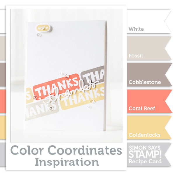
I chose a combination that is gender generic and not occasion specific. I LOVE these colors!!! This selection is from Simon Says Stamp ink colors.
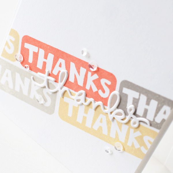
My card uses the Blocked Greetings stamps, they are beautifully bold statements great for stamping.
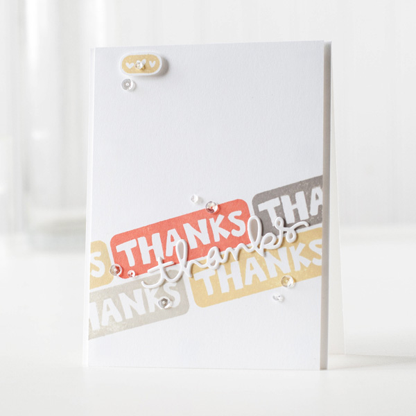
I stamped the “Thanks” at an angle do give my card a little different look and changed colors in between stamping the images. I also used the Thanks die to add a little something extra.
I put together a video of how this all came together which you can view it HERE.
Blog Candy Alert!! Follow our blog via email and comment on this post for a chance to win a special blog candy!

Thanks for coming by today! Have a fantastic week-end!!
 |
 |
 |
 |
 |
 |
 |
 |
 |
 |
 |
 |
 |
 |


A lovely colour palette, an eye-catching CAS layout…your card is pure delight! Thank you for sharing…
~c
Pretty soft colors.
Great color combo and card :)
Lovely card, Shari – and the soft muted shades are gorgeous :-)
Just love the color combination. Soft but with a little spark!! Thanks!!
thanks for these recipes…. they give me inspiration!
Very pretty color combo, I’ll have to remember this one for future projects.
Love the colors in this recipe, and what an awesome card design! Am going to have to give this a try! I’m starting on next year’s Christmas card fronts (yep, already!) and this technique is very cool… hmmmm… TFS! ;)
What a clean and simple card that has a wow factor. All colors are brilliant together. Thanks for such an understanding and inspirational video tutorial.
Enjoyed the card and the video!
Love the simple clean card, such awesome colors. Love all the recipes you share!~kim
Love the neutral color palette and use of the die-cut “thanks” in addition to the stamped sentiment in the various colors- great job!!
Nice color combo!
Love these wonderful colors! So soft & pretty. Great card!
This is a neat color combination!
I appreciate the Color Coordinate Inspiration. Is there a chart that has all the colors that go together? It would be a huge plus if I could get my hands on a chart to use with future cards.
Beautiful card! Coral is a color that I don’t often incorporate into cards. Thank you for showing how lovely and easily it can be used for a subtle, but effective pop of color.
Hi Shari! CAS, but not short on techniques and information. I was so curious about the thanks die cut and certain that you used vellum or bits of it inside the open parts of the thanks letters. Love the depth, the acrylic gave the die cut. I wish I had you color talent, Shari.
Very nice and clean card, Shari. I love how you did the three layers of die cuts together to add dimension, but still be inlaid in the die cut hole. Thanks!!
Beautiful card! Love the color choices!
Great stamp set! Thanks for the color inspiration on that card.
What a beautifully soft palette and always love to see videos.
Love this color combo! I also love the simplicity of this card…keeping it clean and simple. Thank you for the great idea.
What a fun idea!
Unusual colour combo – I like it! Love the way you handled the die cut to make it more prominent on the card. Very nice.
love the look of stacked sentiments.
Great card and wonderful color combo.
I would never think to put these colours together so thank you Shari for giving us all some inspiration!!
This color combination makes me want to work on beach-themed scrapbook pages! Or go to the beach. ;)
Thanks Shari. Pretty colour combo. Like the use of the die cut too. Thanks!
Great card – love the CAS look.
Lovely card!!!!! Love the colour combo!!! Thanks!
Love these colours and your project Shari!
The soft colors are beautiful. I also really like the die cut thanks. Beautiful!
Love this colours and your project Shari!
Beautiful colours and gorgeous CAS, Shari!
What a gorgeous colour combo, and a stunning card.
I would never have thought to put these colours together. I love it.
love this muted color scheme!
Love the diagonal stamping.
Very nice CAS card. The colors are very pleasing, as always!
Wonderful diagonal stamped image to inspire us and such a lovely color combo too. Thanks for sharing!!
Modern, clean, beautiful card!
Love the soft look of this color combo and the angle for this CAS card.
Gorgeous – you always put colours together so well.
I wouldn’t have thought to put these colors together but I really like the way they look. Great card!
I use to never use gray, but with all the different shades now available I’m coming around. I see it used a lot in art, crafts, and design with real success!
awesome card, like alway!
I love that you kept it minimal and simple but interesting! The colors are so pretty. I will have to build my ink supply with Simon Says inks, that’s for sure. Also, the inspiration is appreciated. Never would have thought to stamp on the diagonal like that.
Oh my goodness!! So simple but I love it sooo much!!