Color Coordinates: Offset Stamping

Hi Everyone! Happy Saturday!! It’s Shari here with a Color Coordinates recipe and offset stamping technique for you.
Do you store your inks away and forget about some of your favorite colors? I’m guilty of picking up the same 12 or so inks when making my cards, but this time I decided to dig into my oranges and found a forgotten treasure…Apricot!
I wanted a retro look for this offset stamping technique so I chose soft tones of Cloudy Sky, Apricot, Duckling (my favorite yellow), Dusty Sage and Fog.
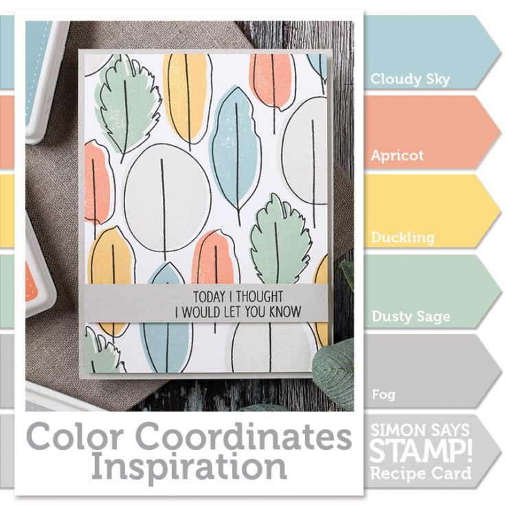
Using the Neat And Tangled stamp set Calathea, I stamped the solid images in my five colors onto a panel of Neenah White 80# card stock.
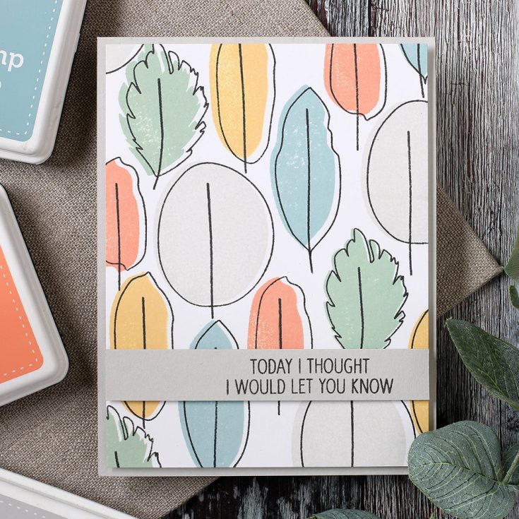
The inks work their way into the paper leaving a soft silky look. Once I filled the panel with the color images, I stamped again using the outline images with Simon Says Stamp Intense Black ink. To get an offset look, I positioned the outline to the right leaving white space next to the leaves.
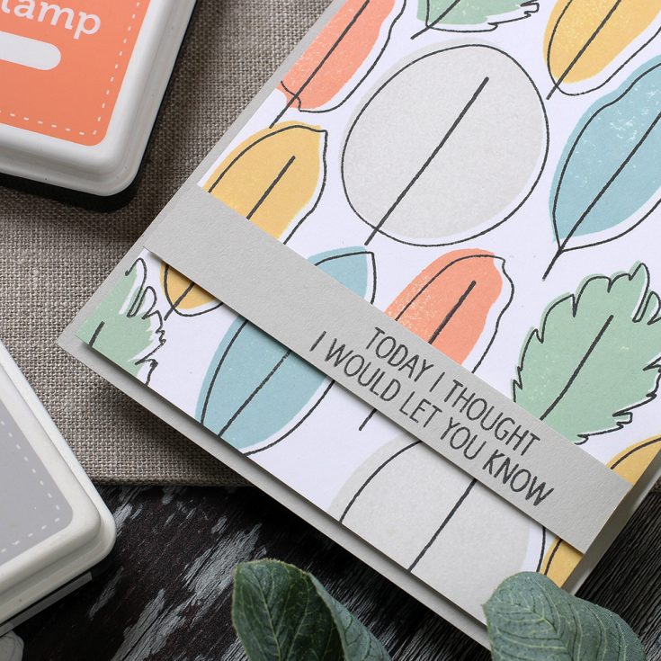
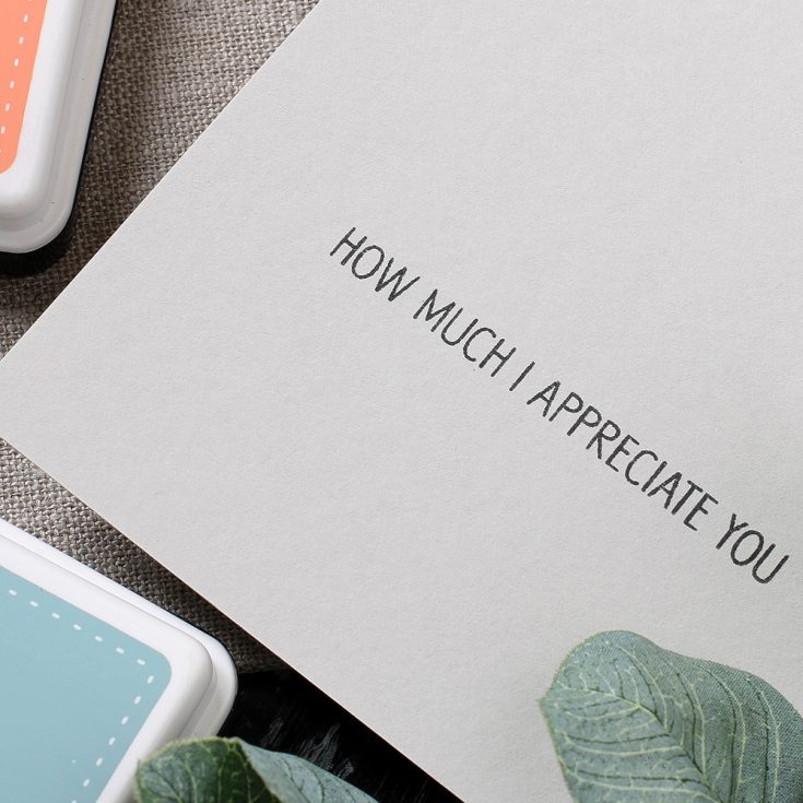
The Calathea stamp set offer inside and outside messages. I added a simple greeting using the Intense Black ink.
I have filmed how to make this card which you can watch below or on our YouTube Channel Here.

Blog Candy Alert!! Follow our blog via email and comment on this post for a chance to win a special blog candy!
I hope you all have a joyful weekend and thanks for stopping by.
 |
 |
 |
 |
 |
 |
 |
 |
 |
 |
 |
 |
 |
 |
 |
 |


Subtle, soft and sweet. Love this effect
I love this look!! Beautiful card!!
Fabulous color combo.
Lovely!
Such a beautiful color combo, Shari! Love this card.
Color Coordinates with Shari is one of my favorite features on SSS and these colors and this card are beautiful .Thanks!
Great card! :)
Great color combo. I like that soft palette.
Great card! I love the off set stamping and that stamp set looks like a good one. Thanks for sharing your video!!
Like the black outline stamping on the card….
Beautiful! Is there somewhere on the SSS site where all the Color Coordinates are together so I could print them off for reference?
Love the offset stamping and the soft color palette used for this! Beautiful!
Like the inside and outside messages with this stamp set. Perfect..
Fabulous stamping and
lovely colors.
Carla from Utah
I love the colors of this card. Carrying over the leaf to the inside is awesome.
Such a simple card but it is so visually appealing.
The color combination is so soft and pretty.
Shari, I love the soft color combinations and your card.
Beautiful soft color combo.
Love this look!
Great card, I fould this card to be soothing and calming to look at. I really like the retro vibe.
Love the colors and simple design of your card! The offset stamping looks fab!
Love the soft pretty colors of this awesome card!
It is a very pretty color combo !
Shari–As always, I love your color choices! They are always so elegant. I also love the retro look and feel of this card. Thanks so much for sharing!
Love the colors you used in your card. I am adding it to my wish list for future shopping. Love the technique, too! I should try this. In fact, I have a stamp in mind that I could use this technique. Thanks for sharing!
Beautiful colors & design!
Lovely card! Love the color combo!
That is one fabulous design!
I like the color combination! Very creative!
This is beautiful. I love these colors.
Love this reminder to go outside the usual and find a hidden treasure! Beautiful color combo and card design.
Cute card, great colors!
This is really great. I seldom think to use grey ink and I don’t know why. Its really nice on this card too and the retro look is so in style. Another great card Shari!
Shari, this colour palette had me ooooooohing! So pretty.
Beautiful combination, love that apricot color!
Fun color combination. I already follow by email.
Beautiful color combo – love the softness. Fun design for the card!
I’m always looking for new color groups. Nice simple card. Love the offset.
lovely color combination and great technique … such a clean and simple card with wow factor
Very soft colors. Love the retro look. :)
This colours really look gorgeous together, i love how simple yet stunning this card is <3
What a great colour combination! Love the offset leaves!
I love these soft colors, they’re gorgeous. Great card :-)
I’m so guilty of the same thing.. really need to dig out some of my old ink pads and get to work! Thanks for the inspiration :)
Ooohhh. Ooohhh. Ooohhh. I love this card. So clean and soft. Those colors and the stamps are lovely! Thank you, Shari!
Love it! Great way to use those types of stamps that have an outline.
Love this look!
offset stamping always reminds me of oldfashioned printing, where it was never quite possible to get things lined up properly in the presses. it has such a vintage feel and the colors are amazing as always, great color recipe
What a great technique! I’m heading to my “studio” (implies art in progress which also implies a bit of untidiness!) to try it with a favorite stamp set!