Art Journaling with Shari Carroll: Gouache Painted Background
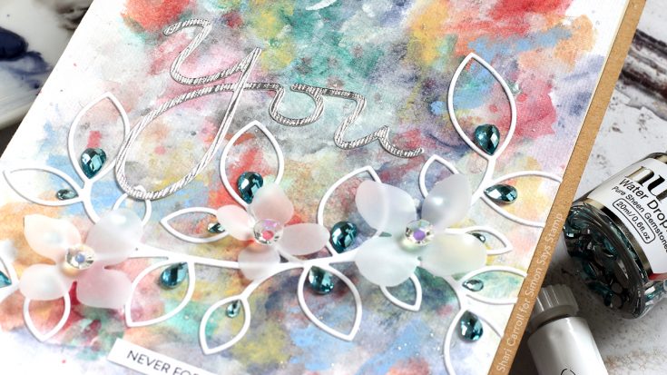
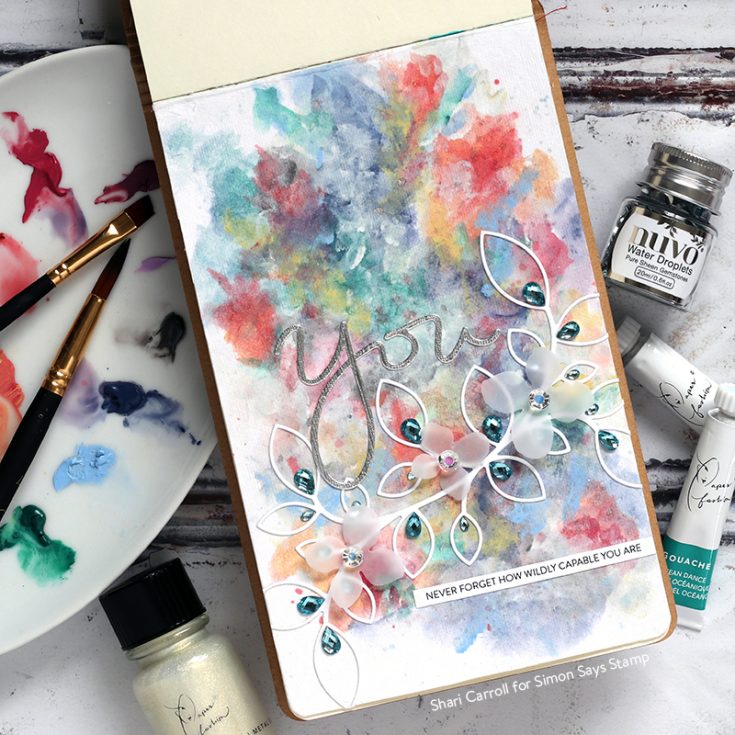
Welcome everyone!!! Its Shari here trying out some Gouache paints for a colorful background. I’ve never tried them before so I picked up the Paper Fashion Set 2 from American Crafts. This background was a practice sheet that I ended up liking, so into my journal it went.
You may be asking yourself, what are Gouache paints? They are opaque watercolors that have a few fantastic qualities about them. You can water them down like watercolors or use them straight from the tube. You can layer colors on top of each other, even lights over darks!! You can paint over pencil lines without the need to erase. They dry flat with a matte finish. Oh.. and they remain water reactive even once they’ve dried!
I started off trying a watered down wash then continued building color on top. I mixed my colors as I went just to see how they worked. Just playing with them to create a colorful background gave me an idea of how different they are from watercolors.
I was also wondering how they differ from acrylic paints. One thing that stood out was how they dry, I didn’t have any brush strokes, they dry flat. Clean-up is much easier and you can use all your watercolor brushes with them. And finally, you can easily journal over them since they don’t leave a coated finish.
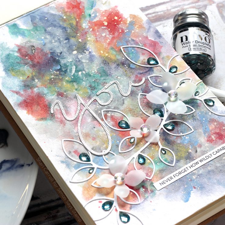
Once I had my background glued in place in my journal, I added splats of Paper Fashion Pearl Liquid Metal for a bit of shine. From there I went about decorating the page with die cuts and gems.
Blog Candy Alert!! Follow our blog via email and comment on this post for a chance to win special blog candy!

|


Great card!
This is just beautiful. What a pretty background.
Love this background!
Wow what a beautiful background.
Such a beautiful background. I love it!!
This looks so cool! I haven’t tried painting with gouache yet but I’ve heard a lot about it and love that the paint is opaque – as well as the other advantages you mentioned. Excited to try something like this!
This is beautiful!
xoxo
The colors look very cool behind the white die cut vine. NICE job.
Hi Shari! Thank you for this blog entry. I have worked with white gouache recently and been quite pleased with its effects. I have wondered if I should order it in colors and now I want to. I am wondering if gouache is a good idea on cards since it remains water reactive. Is there a sealant of some kind that I could use on top? Maybe Tim Holtz’s Distress Glaze will seal it. I will try it and repost here after the weekend.
Beautiful! I love all the texture and dimension! The Water Droplets gems look so pretty in the leaves!
Pretty! Pretty! Wow! This is beautiful. Thanks for a wonderful video. These paints look awesome.
Such a pretty page – would make a lovely card too. Will need to try these watercolor paints – the colors are so lovely!
Very pretty!
Awesome! Thanks for sharing about the gouache watercolors.
Such a pretty project! Love the gorgeous BG and the pretty vellum flowers.
This background is amazing – I love it – TFS your art work!
OMG love the texture and creativity of this projects – always love your work
Oh, these paints sound interesting in all the ways you’ve described them. Kind of “idiot proof” which is something I need. lol The background you created is lovely. Would these paints be good for card making? You’ve got me very interested. Thanks Shari.
Wow, love all those colours, and the gemstones really add sparkle!
I’ve never heard of those paints, but they sound very interesting & I love the look of your page!
What a great contrast between background and diecuts!
Your background looks like a bouquet. So pretty with the leaves on top. I suspect the photo doesn’t do justice to the card – it’s wonderful!
Oh my goodness Shari, now THAT is beautiful!
That’s a great background!! :)
Love, love, love this background! Love the way these gouache paints work with each other!
This is beautiful! I knew about gouache because I have a tube of white and used it mainly for spattering and adding a touch of white to watercolors. I know Lisa Spangler uses it and Debby Hughes, but I think she mixes white with watercolor to create her colors to try it out. Someone said that Gansai Tambi watercolors were really more gouache-like than watercolor-like, because they were more opaque. I do love the colors in the American Crafts set you were using. Something to think about! lol!
Love the abstract background.
Love how the gemstones give an elegant look to this journal.
Love that gorgeous unusual background! Thanks for sharing this new (to me) technique!
Those white die cuts pop out well against the colorful BG.
What an inspiring journal page…these paints sound like a great water coloring alternative. tfs
Such a beautiful art page!
Thanks for sharing…
Very pretty!
That is a beautiful background!!
Enchanting, especially the flowers xxx
Absolutely stunning, I love that die, just can’t afford it.
Very pretty creation! Love the colors and textures!
Just when you think you know about every craft product…Thanks for the explanation, another thing on the wish list.
Fabulous, I totally love the background and the colours you chose!
And those gems!!!
Oh my goodness, makes me want to be off work and paint!!
Absolutely GORGEOUS! You are so talented – wish I had some of those painting skills. Loved watching your process …. :)
So pretty!!!!
This is so pretty! I love the colorful background you created, and it looks great with the die cuts and jewels you added. :)
I love your artsy card, Shari! TFS
that is a wonderful background. need to try those!
Water colors is not a favorite but I would like to try these! Beautiful Card.
The background is stunning!!!
Tremendous background effect.
I’ve never worked with these colors, but right now I’m tempted to do so. :-)
I really want to try gouache as I’ve been seeing them everywhere! Such a pretty background