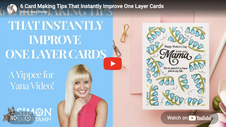
6 Card Making Tips That Instantly Improve One Layer Cards: Yippee for Yana
Hi friend! Please join me in welcoming back the oh-so-talented and amazing Yana Smakula! (Please note: our dear friend Yana is Ukrainian. To show support to our brothers and sisters in Ukraine, please see Yana’s post HERE.)
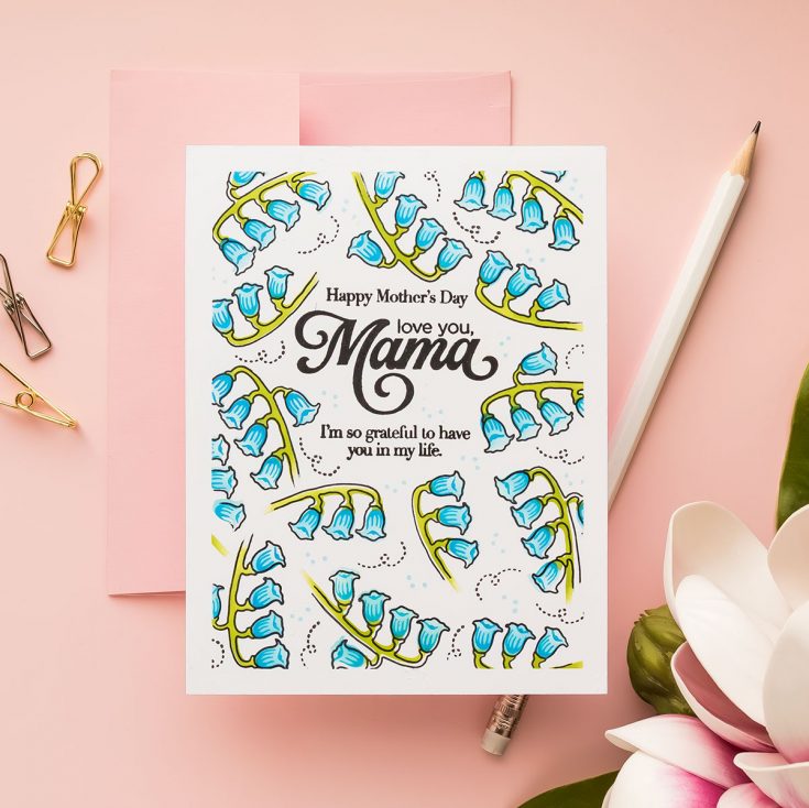
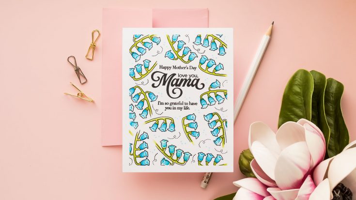
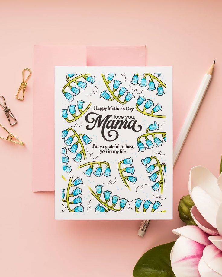
Hi everyone! Welcome back for another Yippee for Yana episode. One-layer cards are often described as simple. And they are. But they can also be surprisingly tricky to get right.
Without die cuts, foam adhesive, or layers to rely on, every decision you make matters more. Placement, balance, spacing, and detail all play a role in whether your card looks polished or unfinished.
Today I’m sharing a simple formula I use when creating one-layer cards. I call it the anatomy of a one-layer card. Once you understand these steps, you can apply them to any stamps you already have in your stash and create clean, professional-looking designs every time.
You can watch the full process in the video below.
Step 1: Start with the Sentiment
The most important decision on a one-layer card is where your sentiment goes.
Because you are not adding layers later, you need to plan your layout from the very beginning. I like to place my sentiment slightly above center to create a natural visual balance and leave room for the design to build around it.
If your card ever feels “off,” chances are it’s not your stamping, but your placement.
Step 2: Create the Illusion of Layers
Even though this is a one-layer design, you can still create the look of dimension.
One of my favorite tricks is to mask the panel edges with tape to create a clean border. This frames the design and instantly makes the card feel more finished and intentional.
You can use tape, draw light pencil lines, or simply visualize the border if you prefer.
Step 3: Plan Before You Commit
Before stamping anything onto your panel, take a moment to plan your layout.
I like to stamp my images onto scrap paper, cut them out roughly, and move them around on my panel. This allows me to test different arrangements, balance the composition, and avoid awkward gaps.
Once I find a layout I like, I take a quick photo with my phone so I can easily recreate it.
This extra step can save you from making mistakes and gives you much more confidence as you build your design.
Step 4: Build Your Background
Now it’s time to bring your design to life. Work around your sentiment and build your background using your images. Start with larger elements first, then fill in with smaller ones.
Rotate and angle your stamps to create movement. If an image feels too long or too large, you don’t have to use all of it. Fading or partially stamping images can create a more natural, organic look.
Whether you’re stamping or ink blending as I did here, the goal is to create a balanced composition that flows around your focal point.
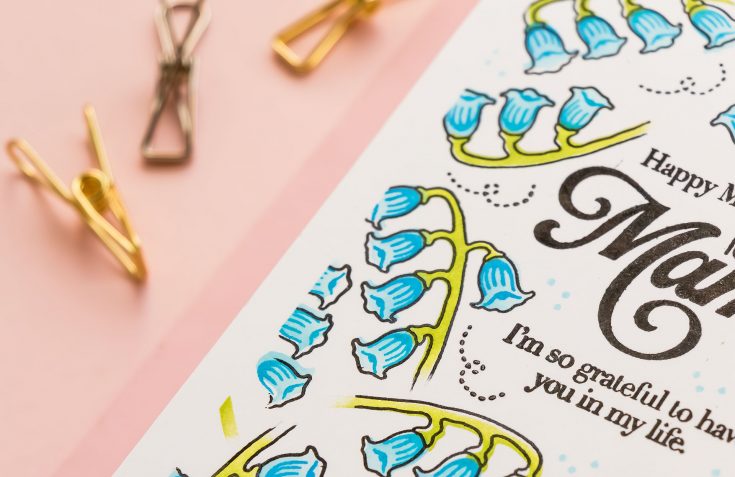
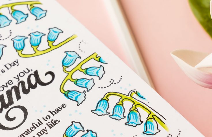
Step 5: Add Detail and Depth
Once your base layer is complete, go back and add detail stamping.
This step brings everything together and gives your images more definition. Don’t worry about lining everything up perfectly. A slightly offset look can actually add interest and dimension to your design.
This is where your card starts to feel finished.
Step 6: Fill the Gaps
Take a step back and look at your background.
If you notice any empty areas, fill them in with small details. This can be tiny stamps, dots, or simple textures that complement your main images.
These small additions help unify the design and eliminate any areas that feel incomplete.
Once your background is finished, remove any masking tape to reveal a clean border and mount your panel onto a card base.
That’s it. No die cutting, no layering, and no bulk.
Here’s a quick recap of the anatomy of a one layer card:
- Start with your sentiment
- Create a faux border or frame
- Plan your layout
- Build your background
- Add detail
- Fill the gaps
This approach takes the guesswork out of designing and gives you a repeatable process you can use again and again.
If you give this technique a try, I’d love to see what you create.
WATCH THE VIDEO:
SUPPLIES:
|


Ways to support Ukraine:
If you are looking for ways to support Ukraine, we encourage you to visit this page on Yana’s blog:

A big thank you to YOU, our reader — and to Yana for being our guest!


This is gorgeous
Space Waves is an arcade game that is entertaining, difficult, and visually stunning. It provides a fun experience for anybody seeking a brief yet thrilling gaming session because to its simple controls, rapid action, and captivating design.
During my search for a stable platform in the UK, I came across koispins-uk.com and realized how important it is to verify trust signals. Platforms like this may offer a smooth interface, but without clear licensing and transparent policies, there’s always some risk involved. UK players usually benefit from choosing platforms with stronger oversight and clearer reputations.
Sound plays an important role here. Some names feel smooth and soft. Some feel sharp and strong. This changes how people react. A soft name feels fairy names. A strong name feels powerful. These effects are important. They shape the user’s imagination. Fantasy Names Aura offers both styles. It gives users balance. It helps them choose wisely.
Such great tips for one layer cards! Yana always has the best advice for keeping designs clean yet impactful. I especially loved the tip about using stencils for texture without adding bulk. I have been experimenting with similar minimalist approaches for video content creation at vidglory.com, where simplicity in design really does make everything look more professional. Thanks for sharing these wonderful techniques!