Challenge: Blues
We’re back and ready to kick off 2014 with our first challenge of the year!
Do you have the post holiday blues? Is it rainy and dreary where you live? Perhaps you’ve escaped to Blue Hawaii for a tropical fix! Or, perhaps you’re like DT member Tracy and just adore the color blue. Whether you take the word blue to mean a color of state of mind – this week we’re all about all things blue.
Teal and aqua are Sandra Mouwen’s favorite shades of blue.
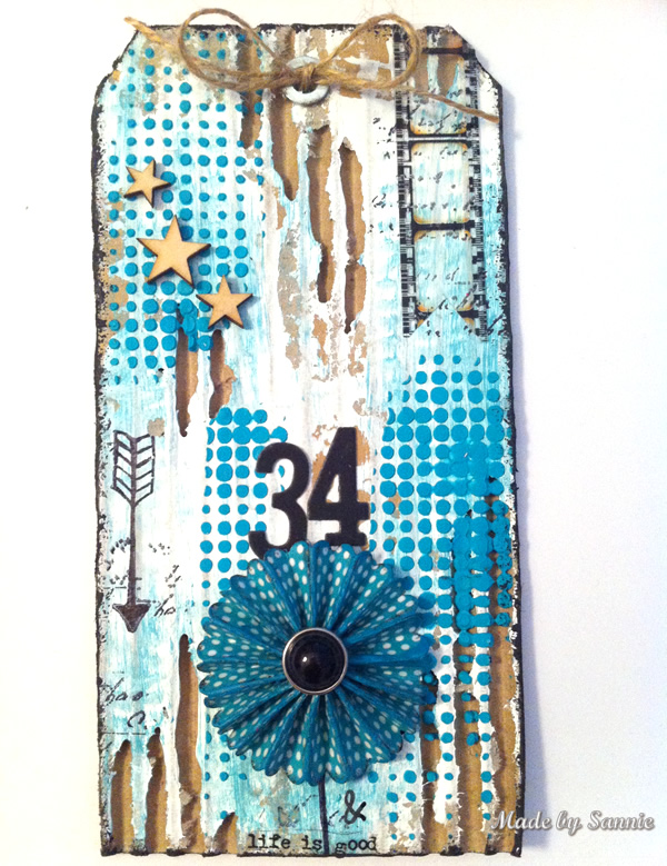
That’s true, I really like aqua and teal. Perfect fit for this blues challenge. I cut a #8 tag shape out of corrugated cardboard and peeled some of the top layer off with the Retractable Pick to show some of the corrugation. To give it a bit of a white wash effect I used some Gesso and gave it a blue hue with the Aqua Paint Dabber. Before cutting out the Mini Rosette I covered the cardstock with Scattered Dots washi tape. Love the shabby chic look of corrugated cardboard!
Blue isn’t a color that Dan uses very often so he relished getting a little outside his comfort zone this week.
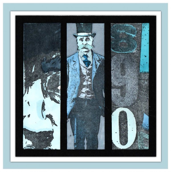
Blue, blue, blue. What is it with me and blue? I seem to avoid it as a general rule and not for any particular reason that I can put my finger on. This week’s theme was a lot of fun for that reason, the change of colour palette was a breath of fresh air. I decided I would go monochrome and really push the blueness (blueocity? blueaciousness?) of my piece right to the limit. I used Tim Holtz’s Paris Memoir, Artful Artifacts and The Countdown stamp sets and more shades of blue Promarker than you could shake a stick at!
Andrea explored the darker side of blue with her introspective collage.
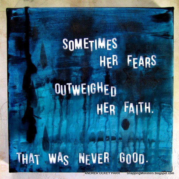
I usually go bright with my projects, but January really does kind of bum me out sometimes. So I decided to try a different look with this drippy dark collage made with Dylusions sprays in London Blue, Black Marble, and Calypso Teal. It was actually quite therapeutic and I hope the message reminds me that it’s always better to keep the faith, no matter how gloomy and gray things get.
Winter has Ashli longing for some warmer weather. And, when she thinks of warm weather, she thinks of flowers!
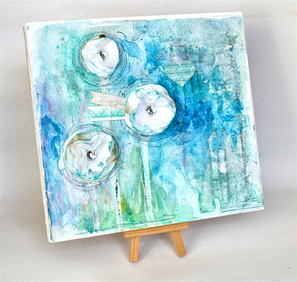
I don’t do cold well. I really do like the heat, and the sunshine, and most certainly the flowers! For this week’s challenge, I was inspired to create a blue and wintery canvas containing some of those lovely flowers I long for. Using lots of beautiful Heidi Swapp Mists and Watercolors, I layered on my background. I then added some Dear Lizzy Die Cuts and completed the piece with some handmade tissue flowers. Luckily, since I live in the south, warmer weather will be here in no time!
Suzz shares Tracy’s love of the blue hues and enjoyed mixing up a variety of them in her project.
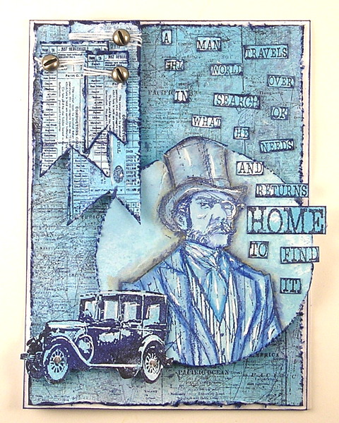
After I started playing with the blue tones I couldn’t stop creating projects using the blue hues. I ended up creating a masculine and feminine card from the same background. I used a mix of glimmer mists, chalkboard mists, and Dylusion sprays to create my projects. The Traveler was the focal point of my masculine card. To see the feminine card you will have to hop over and take a peek.
Candy is overcoming the after holiday blues with this “enlightened” project.
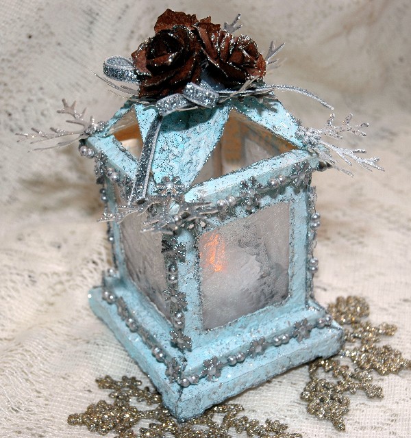
I love soft shades of blue and I have used them to create this glowing frosty Tim Holtz Luminary. Colored with a mix of Mermaid and Snowflake Fresco Finish Paints and accented with Silver Stickles and Paint Dabber, I think this piece captures the look of glistening, freshly fallen snow. Tim Holtz Tattered Pinecones and greenery adorn the peaked top.
Mona has the winter blues and is longing for a beach vacation with blue skies and crystal blue water.
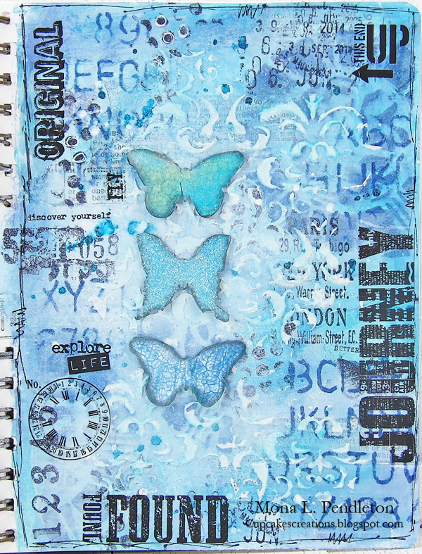
Inspired by the thought of a beach vacation, I created a page in my art journal using an assortment of blue colored mediums including the following products: Broken China Distress Paint, African Jade Acrylic Glaze, Denim Color Wash, and Tropicana Teal Spritz. Once I was satisfied with the multi-layered background, I added a trio of die cut mini butterflies and a variety of Remnant and Words Rubs.
Texture was the order of the day in Tracy’s design this week.
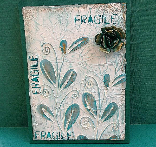
This week I just wanted to enjoy the creative process, no set plan in my mind. I had the Crafter’s Workshop Mini Whimsical Vines Template on my desk and decided to just play for the fun of it! I used a couple of blues in my creation using PaperArtsy Inky Pool Fresco Finish Paint and Broken China Distress Ink. I love using blue in my artwork, it really adds that fresh feel to any design!
Meihsia always enjoys playing mixed media elements. This week she was inspired to create a burlap canvas wall décor with blue color scheme.
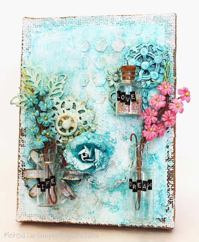
I had so much fun creating this wall décor since blue is one of my favorite colors. The background of this canvas was covered with Gesso and some modeling paste for the textures. Gelatos, Color Shine and Distress Stain were used to create this beautiful blue color scheme.
Blue is one of Anna-Karin’s favorite colours and this week she made a blue art journal page.

This is a blue page about not feeling blue and I thought Wendy Vecchi’s happy sentiment stamp was perfect to express this and a great way to start the new year. I felt like adding a photo and used a teenage one of myself. For the background, I played around with gesso, blue Distress Paints, and Wendy Vecchi stencils and stamps. The stunning washi tape is by Kelly Purkey and I also added some Tim Holtz border stickers.
The color blue reminds Michelle of her Mother.
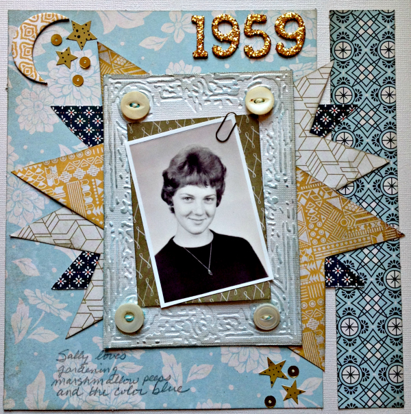
The Persimmon line by BasicGrey is loaded with beautiful blues. Since blue is my Mother’s favorite color, it seemed fitting to use the papers to create a layout in her honor. The Tim Holtz Sizzix Book Covers embossing folder created a lovely “frame” for the photo. By adding Kelly Purkey metallic gold sequins, I was able to add a bit of sparkle.
I (May) was inspired by Simon’s new blue exclusives.
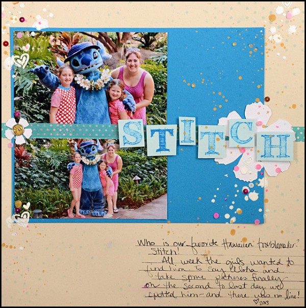
On my desk happened to be Simon’s new Island Blue and Sea Glass ink pads and cardstock. A sign? Surely it must be! So those ink and cardstock colors inspired this layout from last year’s trip to Hawaii. Though I must admit – I’m feeling a bit of the winter blues now seeing this tropical setting!

As always, Simon Says Stamp is giving away a $50 gift voucher that will go to a random entry chosen by random generator. To qualify all you need to do is create a new project that ties in (in any way!) with our theme and post it, along with a link back to this challenge, and add a link here. This challenge will end at 11:59pm on Sunday January 12th Eastern time.
We will also be choosing some of our entries to put in the spotlight – a special honor where we talk about why we loved that entry in particular and award a special badge too!
For the full rules, read the “challenge rules” posted in the side-bar here on our blog.
[raw]
[/raw]
Challenge Badge
Spotlight Badge


Thank you for another challenge and thanks to the DT for their inspiration
You all are so talented! Love everybody’s projects! Thank you! :)
Lovely challenge and fantastic DT creations!
Hugs, Hazel xx
I love the colour blue and what a fab challenge to start the new Year. I am all warmed up after viewing the DT makes.
TFS and Happy New Year to you all
Annie xx
What a fabulous set of blue projects, I’m totally in awe behind my screen!!! Coco x
Ok, I’m going to ask a question that has come up on the Simon Says Stamp Wed challenge. I posted an entry from 1/1 to the challenge there that started on 1/1 but have been told that since my creation was time stamped before the challenge started it is not valid and the rules on the sidebar for both Simon Says Stamp Mon & Wed indicate date and not time if time is the issue then the rule needs to change and make us aware of that. Please respond to this. I’m not trying to stir up trouble but want to know what is correct.
Melissa
“Sunshine HoneyBee”
Hey Melissa-
It has always been that the entries here must be posted after the challenge is. The spirit of the challenges is to be inspired by them and then create of course, but technically I suppose you could post an entry 5 minutes after the challenge is up.
Ok. Thank you for your response as to post must be posted after the challenge is posted so one is inspired which I am by the DT that wonderfully create here.
Melissa
“Sunshine HoneyBee”.
and we enjoy seeing your weekly entries – glad to clear that up for you! :)
Happy New Year to all the Team and thank you for the challenge and the lovely inspiration!
Hugs,
Claudia x
Beautiful creations from everyone! Very well done :)
hugs, Rita
Given it’s my favourite colour, it’d be rude not to play really, wouldn’t it?! Fabulous inspiration as ever…
Alison x
Like Tracy, blue is my favourite colour, so as Alison says, it would be rude not to join in!
Fabulous inspiration from the team.
Alison x
Gorgeous samples!
Wonderful DT inspiration! Great way to start the year. I find blue very peaceful.
Lots of pretty shades of blue. Thank you for the challenge!
I enjoy what you guys are usually up too. This kind of clever
work and coverage! Keep up the terrific works guys I’ve you guys to my personal blogroll.
Hello my friend! I want to say that this post is
amazing, nice written and include approximately all significant
infos. I would like to peer extra posts like this .