Challenge: M
Oh yes, I’ve gone totally self-indulgent this week as it is my birthday week! So what will you create? M could stand for the month of May, mist, markers, magenta, mowed lawn, metal, millinery, a masculine project, mounted stamps, or anything else you can dream up!
Over on my blog I’m listing my favorite past projects from challenges. The rest of the team have taken the “M” challenge in many different directions – check it out!
Emma chose M for…a miniature matchbox depicting all the wonderful things about beach life.
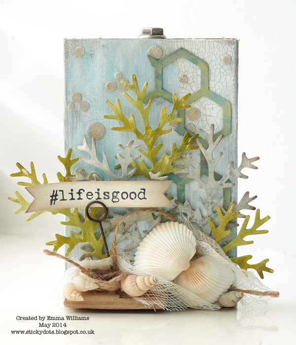
With summer just around the corner, I was inspired by Tim Holtz’s gorgeous new Nautical Blueprint stamp set to create my miniature altered matchbox, with a sliding drawer. I made the box using Kraft card, then painted with various shades of blue, Metallic Pewter and Picket Fence Distress Paints. I added some texture by applying Wendy Vecchi’s Crackled Embossing Paste and also added some white embossing paste through a PaperArtsy stencil before attaching seashells and driftwood against a backdrop of cheesecloth and die cut fronds and the Tim Holtz Honeycomb frameworks die from Sizzix.
Meihsia decided to create mixed media art journal pages this week.

M is for Mixed Media – this is the first thing that came to my mind when I saw this week’s challenge theme. To create the background patterns on these pages, I sprayed Color Shine over the mini bricks stencil. The watercolor effect was created with Izink inks and water mixture. The edges of these two pages were stamped with Tim Holtz Cling Rubber Stamp and distressed with Colorbox Melon Blends by Eileen Hull.
Anna-Karin made a journal page celebrating the month of May.

May was always a special month for me, since it is usually lovely spring weather and since it is my birthday month. I made a watercolour background with Hero Arts stamps and used Hero Arts Weeks and Months stencil to add more detail. I love trees and birds, and both made their way onto this page, in the form of stamps and dies.
Michelle created a Moroccan Mosaic jewelry box.
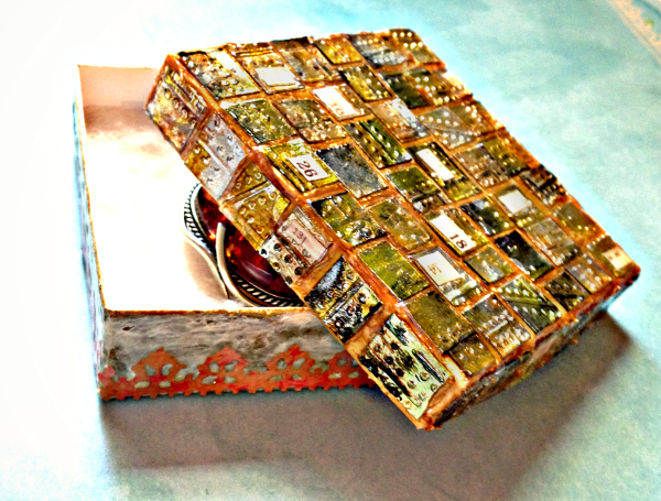
My jewelry box was inspired by a die strip on the Tim Holtz Sizzix Vintage Lace strip that has always reminded me of Morocco. Funky mosaic tiles were created from a Foil Sheet and the Riveted Metal embossing Folder. Wendy Vecchi Gold Embossing Paste not only held the pieces together, it also provided a wonderful metallic sheen. Now my vintage Amber brooch will have a lovely place to rest.
M is for merry this week as far as Dan is concerned.

You may be thinking M is for madness when you see that I’ve been thinking about Advent this week. We crafters like to get organised ahead of time though, right? This is the best time of year to stock up on holiday essentials, if you leave it until December you’ll be fighting everyone else to get what’s left in the stores. Right now for example, Simon Says Stamp has a great selection of Christmas-themed brads, perfect for closing these Sizzix Milk Cartons (another M) so you can use them year after year. Small enough to be hung on the tree, they also look great piled up in a nice bowl. Oh, and if that’s still not enough “M”s for you, the red cartons are also made with Merriment cardstock!
For Andrea this week, M is for masking tape.
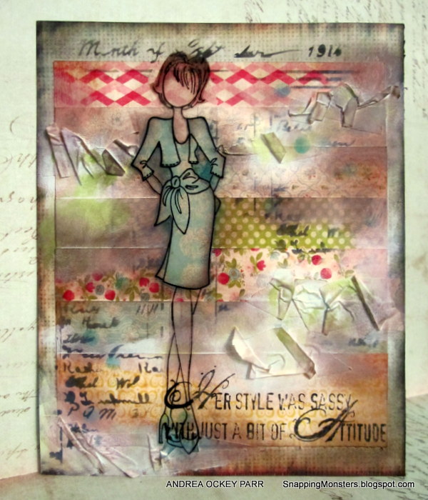
Masking tape may seem like a manly type of material (I did have to pilfer it from the garage, after all), but I love to use it to create texture for paper projects. And I tried to make this card extra girly to balance out any masculinity that may have been clinging to that tape roll. After all, there are some great new Prima girl stamps, like Natalie here, and she looks even more stylish when set against a background created from strips of Bazzill’s fabulous Vintage Lace paper collection.
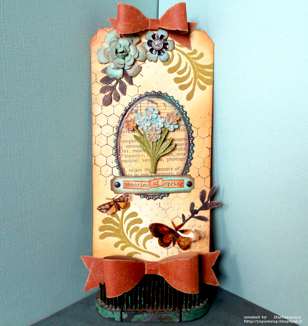
A recycled wall hanging was the order of the day from Tracy this week.
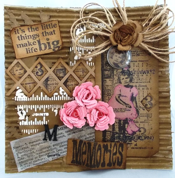
The letter ‘M’ for me inspired a MEMORIES rustic wall hanging created from recycled corrugated card which I painted with Gathered Twigs Distress Paint to give warmth and age to my design. Tim Holtz The Girls stamp was perfect for this piece as this image brings back fond memories of when my daughter Laura was a toddler. I added a feminine feel with touches of pink with the dimensional blooms cut using the Spellbinders Bitty Blossoms Die.
Sandra Mouwen’s M is for a Masculine card
I have to admit that I find masculine cards a bit more difficult to make. But I love a challenge! This card is a large one, it’s 6 x 8,25 inch. So that all my colleagues can write something on it. It’s for my colleague that just had surgery. The card base is Kraft Cardstock and I used Peacock Feathers and Rusty Hinge for the background. I love the way those Distress Inks blend. I seriously can’t stop playing with the Distress Marker Spritzer and created some interest with a few of Tim’s stencils, Schoolhouse and Bubble.
Barbara is mixing things up this week!
M is for Mix! I love so much Tim Holtz and Wendy Vecchi, they are two fantastic creative and their art always fascinates me. For this challenge I tried an experiment : to mix the two styles. I love the danger and I wanted to see what kind of creation could come out of this experiment. Wendy’s inks and stencils marry well with Tim’s dies and Idea-ology details that I’ve used. I love the chemistry and the word “mix” is almost a philosophy!
Ashli just celebrated her 12th wedding anniversary…
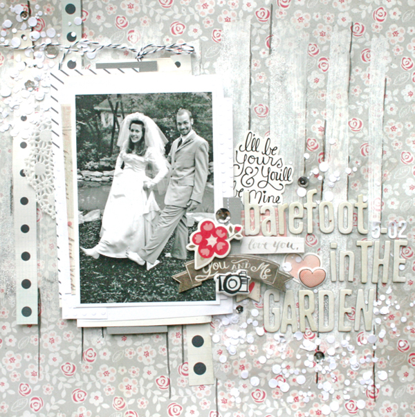
Twelve years ago on May 5th, the hubs and I got married! This seemed like a great reason to scrap about our wedding for the challenge of “M.” Some paint detail and tinsel color shine created the fun striped background for this page while the Punched Confetti breaks up the lines and adds a feeling of celebration. Since I have never scrapbooked our wedding, I’d say this was a good place to start!
Suzz decided that “M” was for map and it inspired a nautical themed wall hanging.
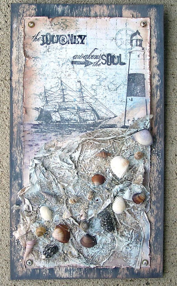
The letter “M” had so many ideas running through my head but what happened was I was cleaning up and re-organizing my stamps and the Impression Obsession Cover-A-Card stamps were being moved to join their other IO friends and the map fell out onto the table. I decided that my map was going to go on an elongated wall hanging with a mix of soft blues and grays created with the Ranger Archival Ink – Watering Can and Tattered Angels Glimmer Mist – Atlantic. This project will hang in the den as we have a nautical decor in there and it will be perfect.
Mona’s M is for a mixed media canvas featuring a variety of metals:
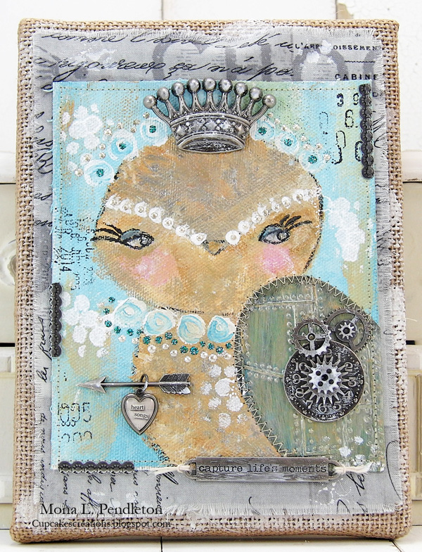
I love the shimmery appearance that you get when you use the Ranger Adirondack paint metallic Acrylic Paints so I thought this would be the perfect challenge to put them to good use! I painted an owl using a combination of Gold and Silver paints on a piece of canvas. I wanted to give the owl an overall steampunk vibe so I embellished with a variety of fun Tim Holtz products including: Industrious Stickers, a Heart Charm, Metal Word Band, a Regal Adornment and many more.
For more inspiration click on our design team’s blog links so you can see more photos (and full supply lists) for their projects. Leave them a little comment love while you’re there so they know how they’ve inspired you too, if you’re so inclined.

As always, Simon Says Stamp is giving away a $50 gift voucher that will go to a random entry chosen by random generator. To qualify all you need to do is create a new project that ties in (in any way!) with our theme and post it, along with a link back to this challenge, and add a link here. This challenge will end at 11:59pm on Sunday May 18th Eastern time. We will also be choosing some of our entries to put in the spotlight – a special honor where we talk about why we loved that entry in particular and award a special badge too! For the full rules, read the “challenge rules” posted in the side-bar here on our blog.
[raw]
[/raw]
Challenge Badge
Spotlight Badge


Happy Birthday to you! I love the beautiful creations the DT have come up with this week, a very eclectic mix.
Happy Birthday!
fantastic challenge!
I think my paper doll is modeling some great fashions, so I hope you like them. Blessings!
Gorgeous DT inspirations and another fab challenge – thank you! Karen x
Stunning inspiration!!!
Love the DT creations!! I LOVE Emma’s creation… everything is just gorgeous!!! Thanks for another fun challenge!
– Susan
Kazda kobieta myśli o to ażeby jej bielizna ekskluzywna byla jak najladniejsza także jak poprawnie na niej lezala.
Wybierajac właściwa dla polskich celowości bielizne,
czesto przesuwamy sie tylko bodzcami estetycznymi. Jednak przyjemna oraz pożyteczna
w uzytkowaniu bielizna damska to rowniez miekkosc koronki, odpowiednio wyprofilowane miseczki,
gładkosc szwow i jakosc wykonczenia. Nowinki technologicznie w swiecie odziezowym mozna przenosic
rowniez na tło produkcji bieliznianej, właśnie jak rtak jak dokonuje toż jednostka bielizna Lamore.pl.
Bielizna damska przez nia sprzedawana nadaza nie jedynie z bieżącymi trendami
w swiecie mody, ale rowniez wykorzystuje najnowocześniejsze
materialy dostepne na targu aby podniesc jakosc swoich produktow.
I am really inspired with your writing skills and also with the layout
on your blog. Is that this a paid theme or did you modify it yourself?
Either way keep up the excellent high quality writing, it is uncommon to look a nice weblog like
this one nowadays..
Take a look at my homepage; psoriasis
This is quite interesting; you’rea superb expert blog owner.
I have actually joined ylur feed and look forward to looking for
additional of your awesome posts. Also, I’ve discussed
your website in my ssocial networks.
WOW just what I was looking for. Came here by searching for cheap discount platform beds