Studio Monday with Nina-Marie: Doodlebug Halloween Envelope!

Hello crafters, its Nina-Marie here with you today featuring the Doodlebug Candy Carnival Halloween collection!

I don’t know about you, but I love decorating envelopes and I thought that would be a fun way to use this super-sweet collection of products! However, if you are more of a card-person, you could totally use this same design as a card instead!
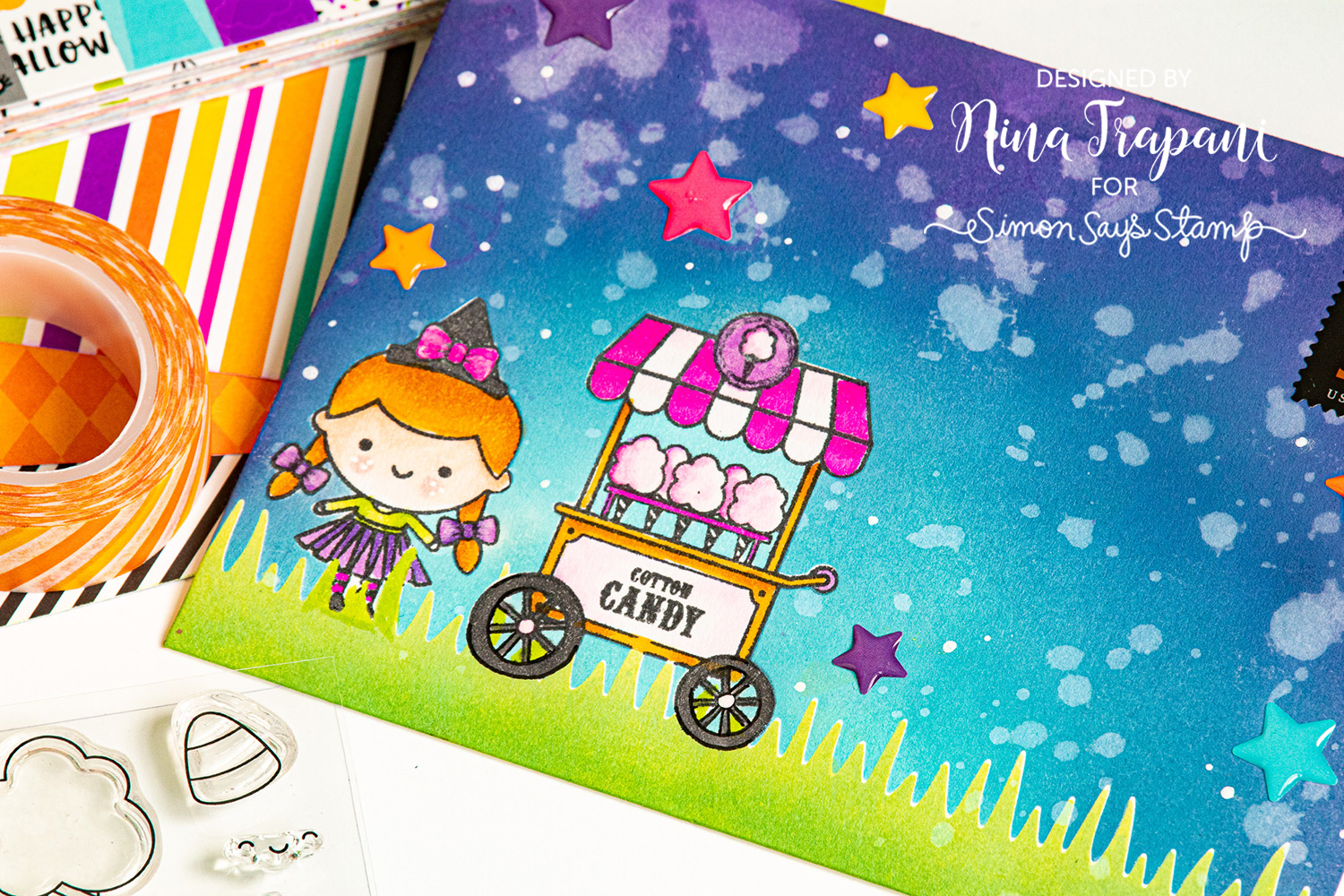
Want to see how I made this fun envelope? We’ll be working on masking, ink blending and Copic coloring throughout the video to create this scene and I’m excited to share the process with you! Press play below and let’s get started!
WATCH THE VIDEO
SUPPLIES
|


Blog Candy Alert!! Follow our blog via email and comment on this post for a chance to win special blog candy!
Blog Candy Winners!!:
Spooky Apothecary Tag: Tanja Gross!
Color Coordinates with Shari Carroll: Fall Thanks: Steffi H.!
Funny Friday! Watercolor Wheelies with Art Impressions: Lindar C!
Doodling with Debby: Coloring Die Cuts With Markers: Dee Earnshaw!
Simple Inking Techniques with Gina K Designs!: Barbara H!
Tim Holtz Halloween GOODNESS!: Claudia!
Yippee for Yana: Copic Markers on Kraft: Barbara-Jean!
Art Journaling: Beware with Shari Carroll: Heather Mills!
Amora Laurafadora: Happy Holla-ween: Anastasia M.!
Waffle Flower Bear Hugs Shaker Card: Jodi W!
Please email [email protected] with the name of the blog you won from, your prize(s), and your address if applicable!
Spooky Apothecary Tag
Hi everyone! Fall is at its prettiest here now and before writing this, I went on a long and sunny forest walk. I am so happy to be here today with a fun and slightly spooky tutorial. You can use the techniques for other types of projects too and it doesn’t have to be for Halloween. One example is that if you use different rub-ons and colors, this could easily be turned into a cosy winter scene.
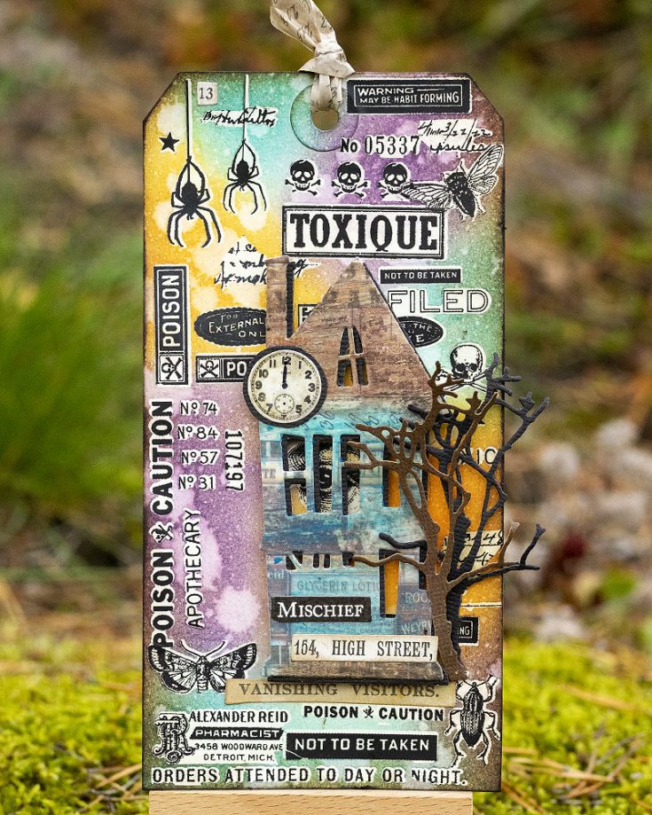
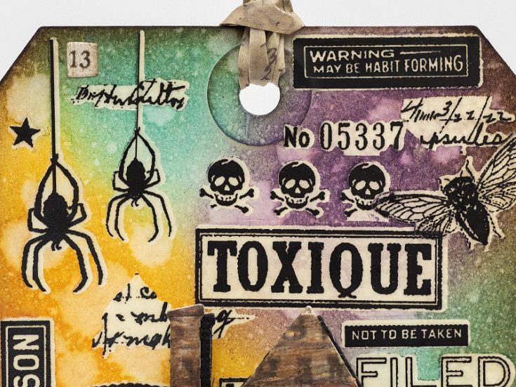
Spooky houses are always great for Halloween, and you can use just one or build an entire spooky town. They can be ghost houses, or as in this case, the home of a mean apothecary. The background was done with rub-ons and Distress Ink, with an easy and cool resist technique.
Start by applying Tim Holtz Halloween Remnant Rubs on the background. I planned the placement, since I wanted the eye to peak out through the window of the house, and some of the words to be clearly visible.
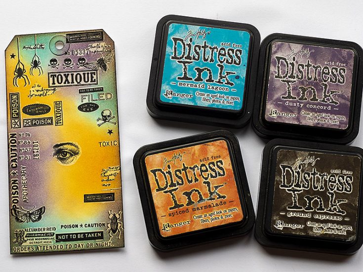
Ink the background with Distress Inks using an ink-blending tool. I used Spiced Marmalade, Mermaid Lagoon, Dusty Concord and a little bit of Ground Espresso.
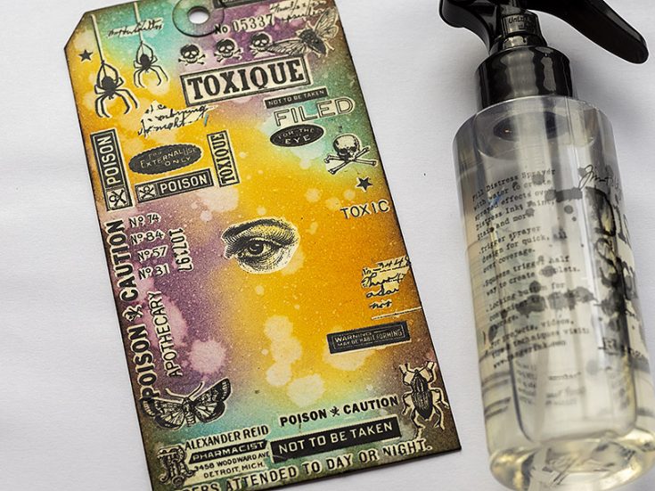
Splatter the background with a little bit of water, for extra texture.
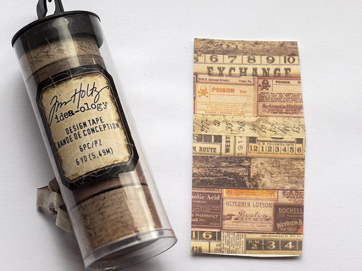
Cover a piece of cardstock with Tim Holtz Halloween Design Tape.
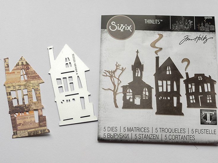
Die cut one of the houses from Tim’s Ghost Town die set. This is a very quick way of getting an interesting looking die cut. You can leave it as it is or color it.
EDITOR’S NOTE: unfortunately the Ghost Town die set is out of stock at the time of publication of this blog but dies to get comparable looks are listed in the supply section below!
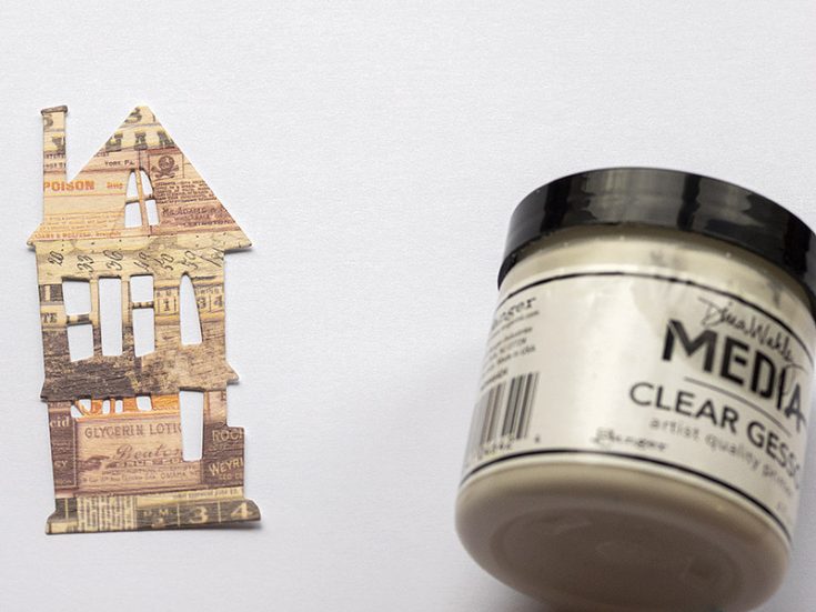
Coat the house with Clear Gesso, to give it some tooth for the next step. Let dry.
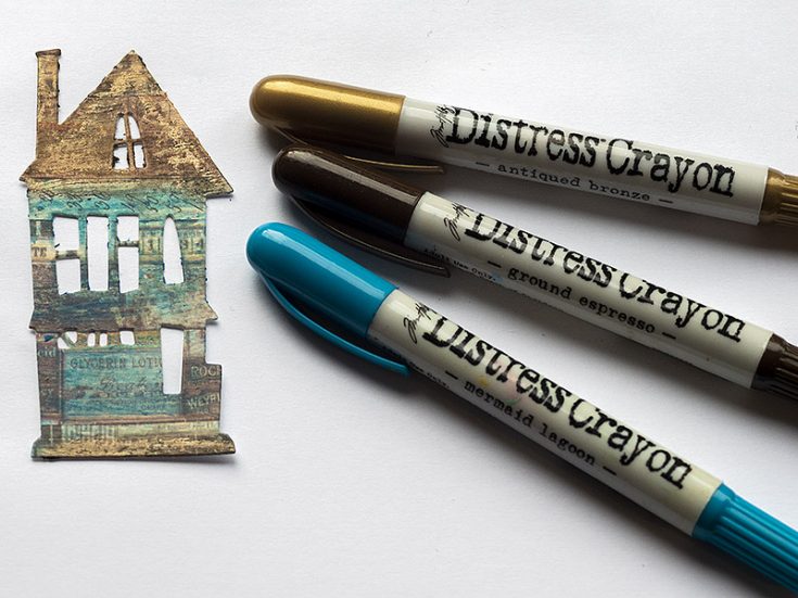
Color the house with Distress Crayons, smoothing them out with your finger. Add metallic Antique Bronze to the roof. If it gets too dark, you can remove some color with a slightly moist cloth.
The rub-ons resist the ink and since they have an invisible area around them, you get this cool resist effect, with a white field around and in between the rub-ons. Fold a piece of Design Tape over itself and use as a ribbon to tie at the top of the tag.
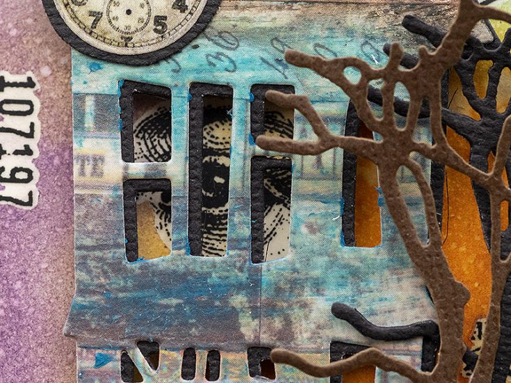
The house was adhered with foam tape, giving it dimension. Here you can see the eye peeking out through a window. Die cut the tree from the Ghost Town set from brown and black cardstock and glue to the tag.
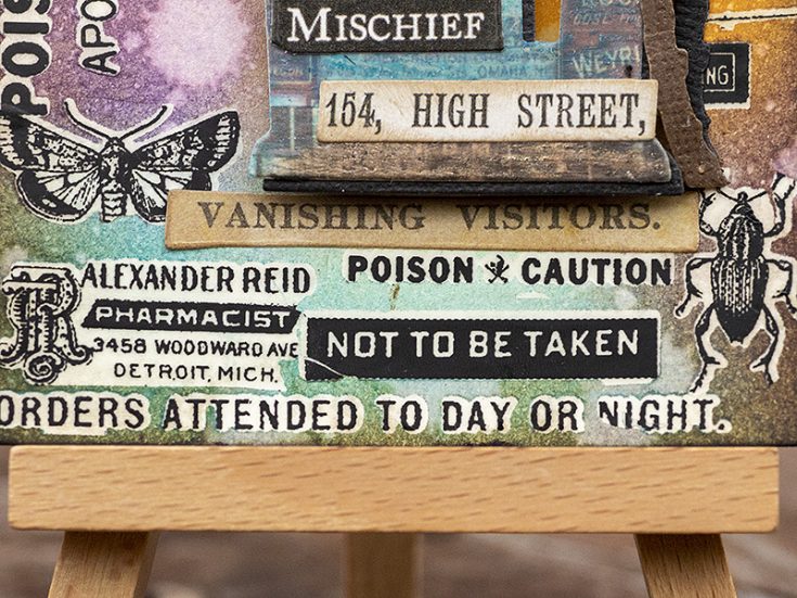
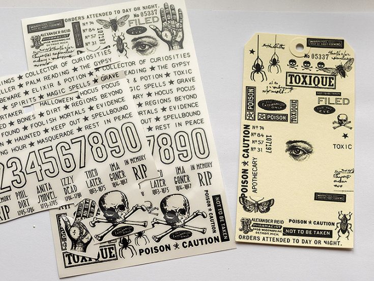
I added some clippings stickers from Tim Holtz’s Curiosities Sticker Book, which fit well with the theme of the tag.
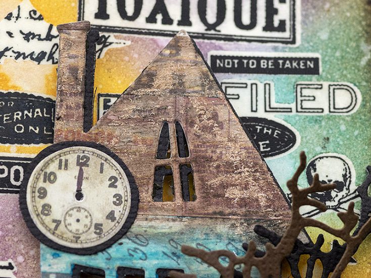
Here you can see the metallic effect on the roof. I also used a sticker of a clock, matted it on black cardstock and added a clock hand with a marker.
I hope this tutorial inspired you to use some rub-ons, ink and Design Tape, for fun results.
Thank you so much for looking! Happy crafting! Anna-Karin
SUPPLIES:
|


Thanks so much for stopping by, and thanks to Anna-Karin for being our guest!
Blog Candy Alert!! Follow our blog via email and comment on this post for a chance to win special blog candy!
Color Coordinates with Shari Carroll: Fall Thanks

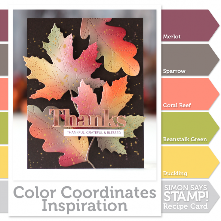
Welcome everyone to another edition of my Color Coordinates series. This time of year, I’m all about fall!!! I’ve come up with a combination of colors to use with the Simon Says Stamp Large Stitched Oak and Large Stitched Maple Leaf dies.
The colors I’ve come up with are Merlot (a rich red), Sparrow (a nice neutral to blend with), Coral Reef (a sweet pink/orange tone), Beanstalk Green (a mellow, warm green), and Duckling (Yellow of course!).
To start off, I traced the leaves onto some Simon Says Stamp 120# cardstock, I like this cardstock because it’s so smooth and the inks blend well. The tracing of the leaves helps me to determine areas of where to apply the inks. I used a larger Life Changing Blender Brush to apply the initial color.
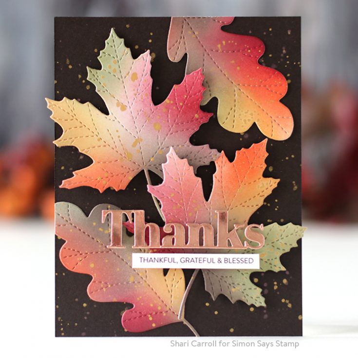
Once I had the sheet colored, I die cut the leaves. I used a small brush to add darker details of color. Why color the paper first? I find the ink glides across the cardstock when it’s precoated.
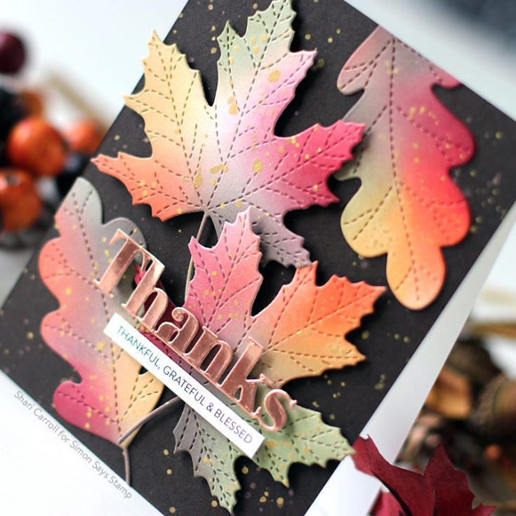
I splatted some gold paint onto the leaves and background cardstock and assembled the leaves onto the card. To finish it off, I die cut the Bold Thanks from Tim Holtz Copper Metallic Kraft cardstock and added a Sentiment Strip greeting.
If you are interested in printing out the Color Coordinates and creating a swatch book, I have the downloadable templates available below.
- Book template and past Color Coordinates
- May 2018
- July 2018
- August 2018
- October 2018
- January 2019
- March 2019
- April 2019
- May 2019
- June 2019
- July 2019
- August 2019
- October 2019
Blog Candy Alert!! Follow our blog via email and comment on this post for a chance to win special blog candy!
Thanks for stopping by!!
|