Waffle Flower Crafts Love You Bunnies
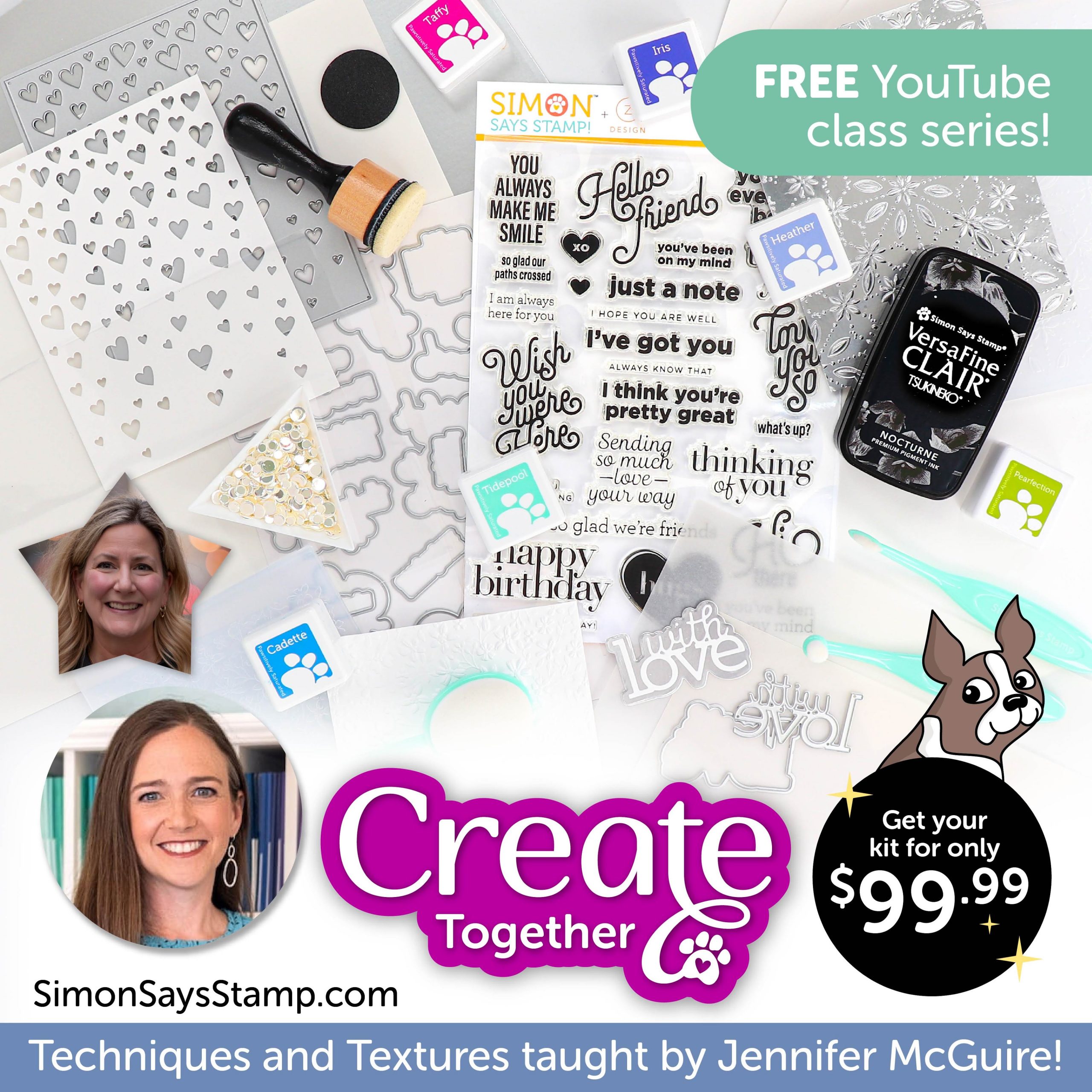
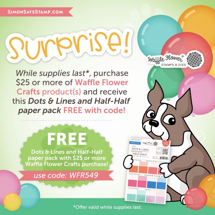
Hi friends! Happy Thursday! Please join me in welcoming special guest Keeway Tsao to our blog today! Don’t forget! Going on all April long with any Waffle Flower Crafts purchase of $25 or more or while supplies last receive the AWESOME Dots & Lines and Half-Half paper pack FREE with code WFR549! Keep reading to learn more about how Keeway made this adorable card and enjoy!
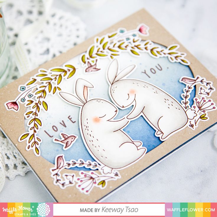
Hello everyone, it’s Keeway here for Waffle flower! We are so excited to be the Brand of the Month for Simon Says Stamp! My project is inspired by some of the new Waffle Flower products in combination with some old! Bringing together new and old stash is always something I love to do and when you have sets over time that mix and match so well, it really puts my stash into great use and extend its versatility.
I have stamped my images in a dark brown hybrid ink and colored them with Copic markers. The Little One Baby provided the images for the foliage frame, and a little creative fussy cutting allowed me to remove any additional parts of the image that I didn’t need. I had die cut a large oval frame out of kraft card stock using the Additional Ovals Die to build my foliage frame around.
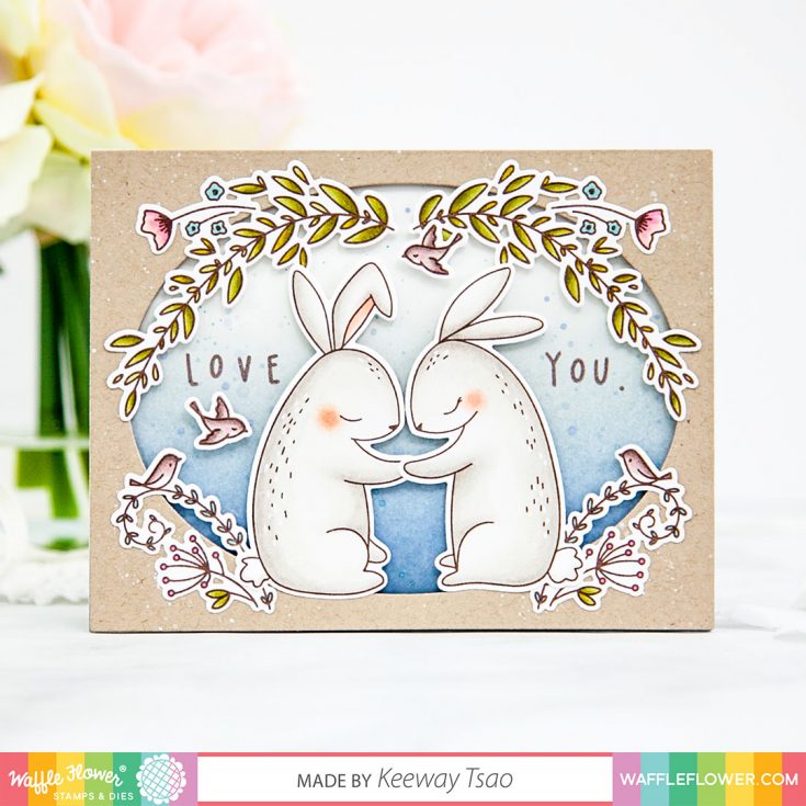
Behind the frame, I have ink blended a soft blue background using Black Soot, Stormy Sky, and Iced Spruce distress oxide inks with blending brushes. I stamped my sentiment to the left and right center line, knowing that I will be placing another image in the center focal position. The frame sits behind the kraft oval frame with foam tape. I have also stamped a pair of bunnies from Love You Bunnies in dark brown hybrid ink and colored them with Copic markers. Once I die cut them with the matching dies, I added them together to the center of the card with foam tape.
SUPPLIES:
|


Thanks so much for stopping by and thanks to Keeway for being our guest!
Doodling with Debby: Watercolor and Texture Nuvo Expanding Mousse
Hi friends! Let’s dive into our April 2020 edition of Doodling with Debby hosted by the fabulous Debby Hughes! Please enjoy!
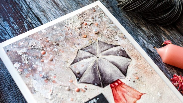
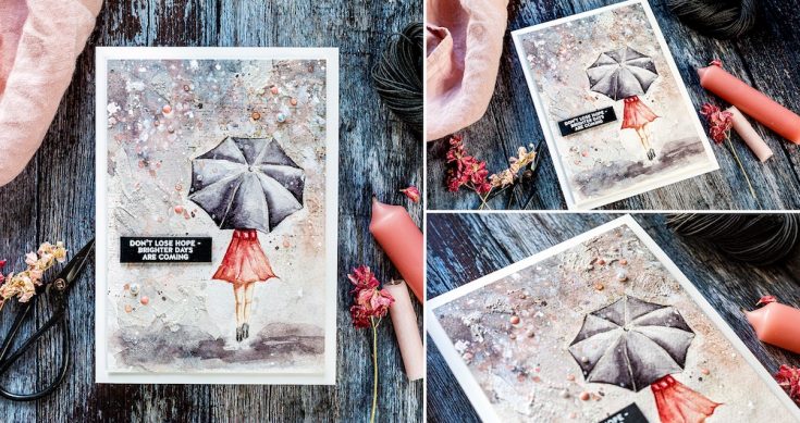
Hi, it’s Debby here, and thank you for joining me for Doodling With Debby this month. I love texture, and in today’s video, I enjoy playing with Nuvo Expanding Mousse to add texture to a watercolored card. The Follow The Rainbows set I used was from a recent April card kit from Simon Says Stamp. As I write this, there are still kits available; however, you can buy the stamp set separately. The kit is filled with beautiful bright, happy rainbow colors, but I am always drawn to moodier color schemes. I wanted to create a background to the woman with umbrella image from the Follow The Rainbows set, which had layers of color, stamping and texture to represent the weather of a rainy day. With COVID-19, this card could represent the current chaos and the unknown but is supported by the strong, hopeful sentiment which we all need presently.
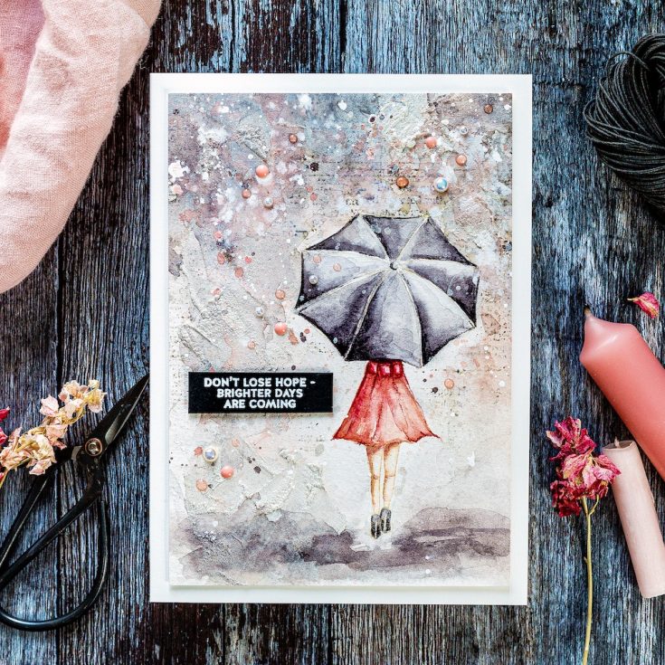
I placed the image in the Misti and stamped with Antique Linen Distress ink onto Fabriano Artistico Extra White cold-pressed watercolor card which I’d removed from its gummed block with a palette knife. I used an old cloth to wipe off some of the ink before stamping to ensure a light application which would blend and fade out with the paint. I used Daniel Smith paints and here’s my tip for mixing a lovely grey; I used Burnt Sienna mixed with Ultramarine Blue. You can vary the mix with more brown for a warmer grey or more blue for a cooler one. I started with a dilute mix of the grey and painted in one of the umbrella sections. I then brought in deeper color into the section. My aim with each section is to leave a lighter edge where the metal frame supporting the umbrella structure pushes the fabric up to a point and catches the light. I didn’t overthink the shading of the umbrella past that, just aimed for areas of light and shade but those light sections being on the spokes which fan out from the umbrella centre. I painted each section separately to help define the edges. If I’d painted one section next to another, then the paint would have spread and bled between the two areas. I carried on round the umbrella until I had painted each section with the first layer of color.
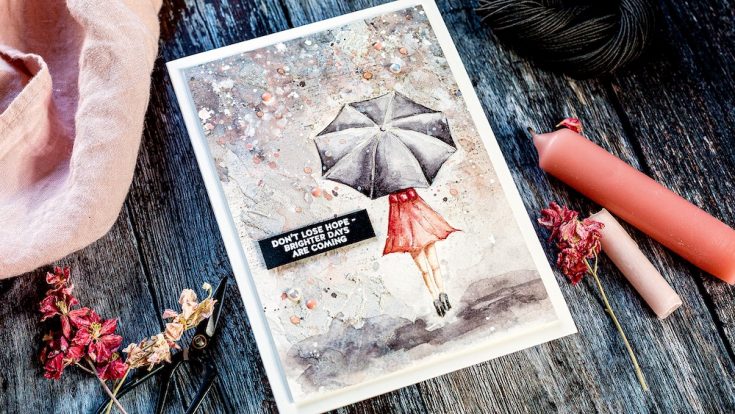
Moving onto the dress, I was undecided on what color to paint the dress. I wanted some depth of color but didn’t want it to look too much like Chris De Burgh’s Lady In Red! So, I went to a more subtle deep pinky-peach color. At this point, I’m concentrating on getting a base layer of color down before slowly building up the layers and shadows, adding those deeper colors to define the areas and add interest. However, before I went too far, I wanted to get the background started. This card was very much a play session for me of something I had in my mind and wanted to get out, and I wasn’t sure if it was going to work or not.
For the background, I washed the area with clean, clear water and a larger brush and then brought in some of the same colors I’d been working with up to this point – grays and pinky peaches. I wanted the colors in the background to reflect those of the woman. Adding paint into an already wet area is called wet-in-wet and is my favorite way to play with watercolors. I love the way the colors blend and bleed together, and by tilting the board, adding in droplets of clear water, you can affect the way the paint behaves and create lovely dribbles, blooms and interest. I must admit, when I first started painting the background I wasn’t keen, and then once I’d dried it with a heat tool, I loved the watercolor effect.
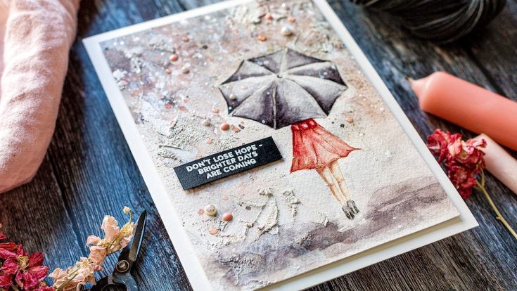
For most of the background, I used vertical lines to represent the rain coming down. However, I did create a horizontal area around her feet for the ground, and I kept this area directly around her feet light in color so that she had a slight glow around her with deeper colors further out. At this point, I wanted the woman to pop off the page much more. She was a bit wishy-washy in color and tone and blended in with the background too much, and so I went back in with deeper, darker tones. My method of doing this is the wet on dry technique – adding paint directly to the dry surface. I then take a damp brush and spread out the color so create softer lines.
At this point, I wanted to work on the background more. I took the watercolored piece of the board and popped it back into the Misti. I used the Good Reads Background from Simon Says Stamp to give some subtle areas of text to the area around the woman. To protect her from the ink, I stamped the image on a piece of masking paper and cut out before putting in place. I then inked the background stamp in Pumice Stone Distress Ink and again used an old cloth to wipe away some of the ink to create a softer impression. However, I ended up inking up the background twice so that the text of the stamp showed up on the textured watercolor card.
Next is the added texture I wanted to include on this piece. I used Nuvo Expanding Mousse in the Worn Linen colorway and a palette knife to spread the mousse over the background. This overlays and softens the stamped text. I spread the mousse in thin layers in some areas but thicker patches too. These thicker patches are the ones that will react the most to the heat tool. You can either heat the mousse straight away as I did or let the mousse dry and then heat it. The two methods give different results. I’m impatient so went with the heating straight away and loved how the thicker areas of mousse bubbled up under the heat to create texture.
I placed the piece back on a board and taped it down again to bring in more watercolor. All these different layers of watercolor, text, expanding mousse, and now more watercolor will create an exciting background to the focal point. Once I’d added more watercolor over the mousse, I covered the woman with the masking paper again and liberally splattered with white gouache and also left-over paint. I then removed the mask and splattered with a solution of Perfect Pearls for some sparkle. I took the watercolored piece off the board before working on deepening the shadows further with colored pencils.
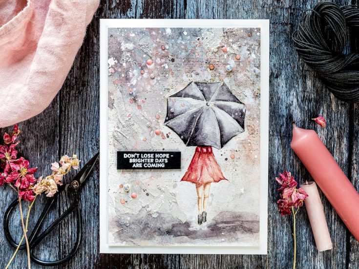
This piece started as 5 X 7 inches, I cut and scored a piece of Ivory card from Simon Says Stamp to be 5 x 7 inches and then trimmed the watercolored piece to be slightly smaller before adding foam adhesive to the back and adhering to the card base. For the sentiment, I was drawn to the “don’t lose hope – brighter days are coming”. It is such an uplifting greeting in these uncertain times that I wanted to include it on this card. I stamped the sentiment in clear embossing ink on a Black card I’d treated with an anti-static powder bag and then sprinkled with white embossing powder before heat setting. I trimmed around the greeting with a scalpel and metal-edged ruler before using a T square ruler to foam mount the sentiment in place. To add more texture and interest to the background, I added Glossy Eggshell Pearls from Little Things From Lucy’s cards kept in place with Gina K Connect Glue. I also added Bubblegum Blush and Rose Water Nuvo droplets to finish.
Well, that’s me for this month, thanks for joining me today and I hope you join me next time for Doodling With Debby.
WATCH THE VIDEO:
Watch below or in HD on YouTube.
SUPPLIES:
|


Thanks so much for stopping by and thanks to Debby for being our guest!
Art Journaling with Shari Carroll: Colorful Backgrounds
Welcome everyone and Happy Tuesday! I hope you are all well and safe!
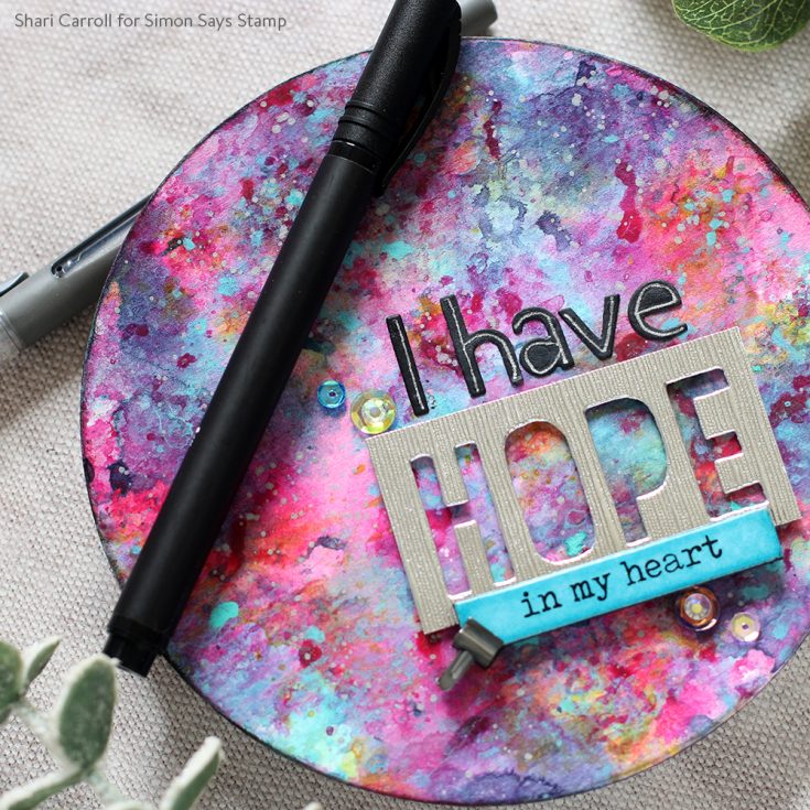
I’m working in my circle journal creating and collecting techniques that I don’t want to forget about. The page today features the Dina Wakley Gloss Sprays.
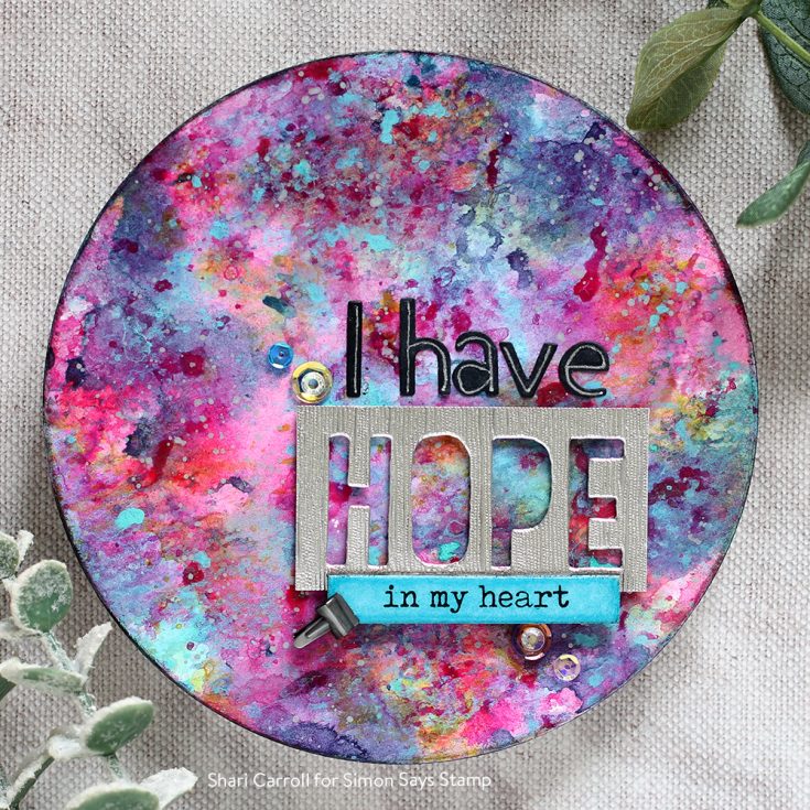
I’ve tried something a little different with them. Instead of spraying, I’ve dripped and dabbed the paint to create layers of color. They did exactly what I was hoping giving me a bright and beautiful background.
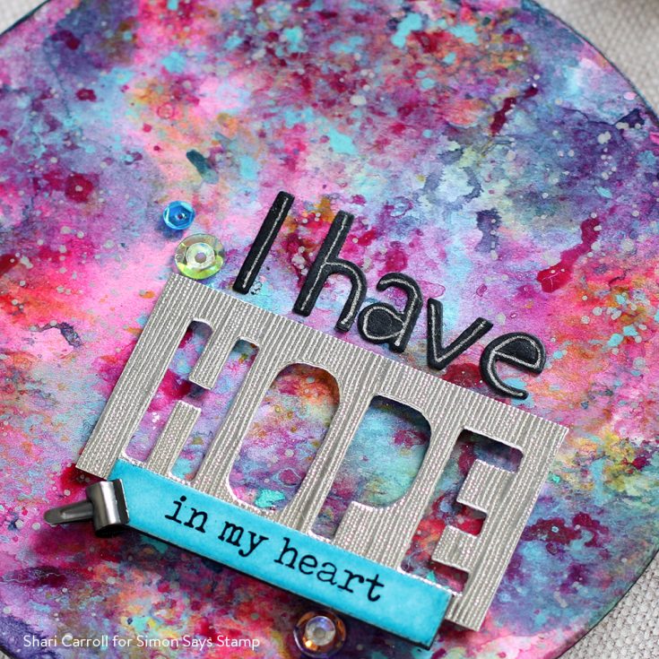
Since these sprays are acrylic paint, they are permanent when dry with a gloss finish. You can use any medium over top without them reacting or moving. To add your journaling, I suggest using the Letter It pens.
Thanks for stopping by. I hope I’ve given you the inspiration to try something new with your crafting and journaling projects. Be well!!
|