Yippee for Yana: Foiled Birthday Cards

Hi friends! Happy Tuesday and welcome to the latest edition of our bi-monthly card series with Yana Smakula; Yippee for Yana! Read on to learn more about this gorgeous duo of Birthday cards and enjoy!
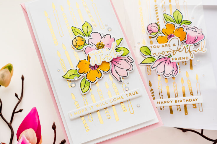
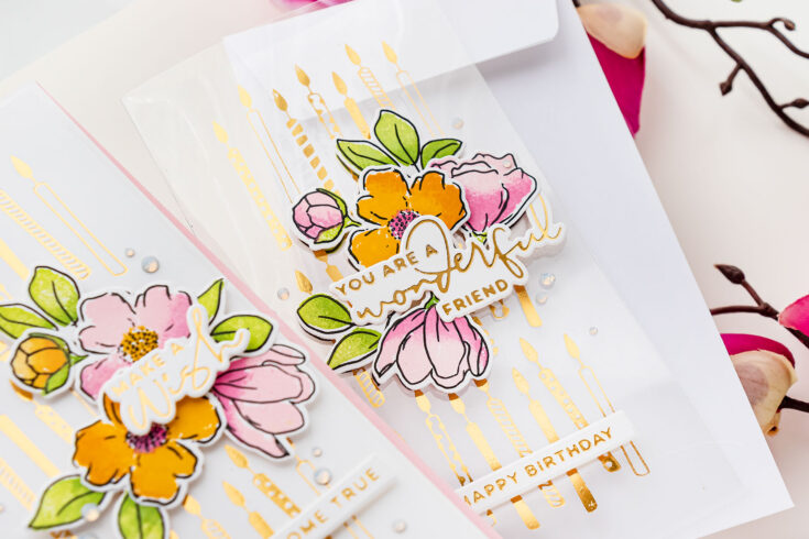
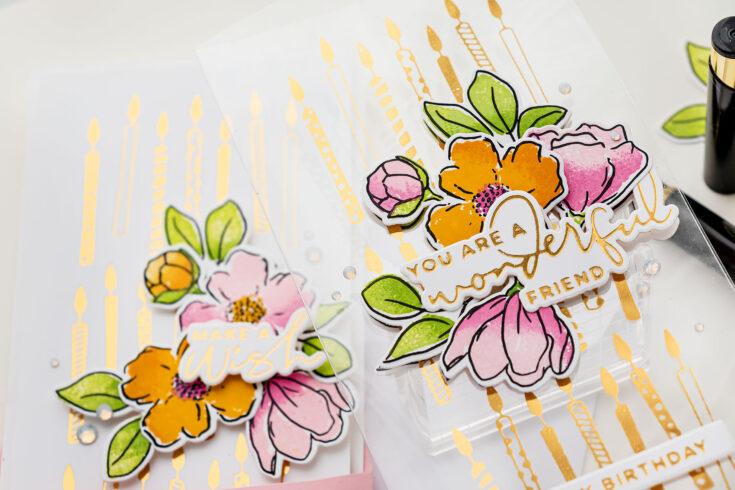
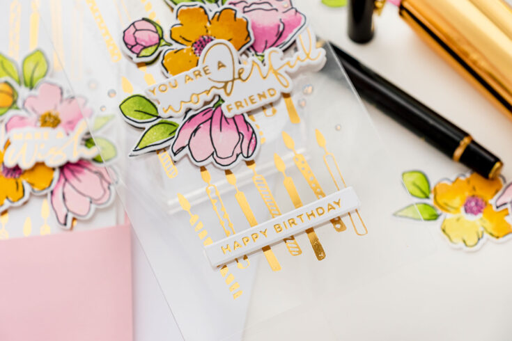
Hi everyone, this is Yana Smakula, welcome back for another Yippee For Yana video! Today I have 2 mini slimline foiled birthday cards to share – one showcases foiling on acetate and another card, with an identical design, features foiling on a specific type of cardstock to get the best, most smooth, and ideal foiled results!
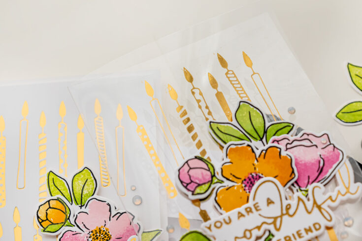
We are going to start by foiling on acetate. It is crucial to pick the right kind of acetate, the one that is resistant to heat. If you’ve ever done heat embossing on acetate, you know that the acetate, unlike paper, can warp and even melt from the heat applied using the heat tool when melting embossing powder. When you want to hot foil on your acetate, you also need to pick the right kind of acetate for the job, the kind of acetate that can withstand the heat from the Glimmer Hot Foil System and remain perfectly flat afterward. Simon Says Stamp has the Hot Off The Press Heat Resistant acetate in the store for you to try this technique with. Or you can try using any other heat-resistant acetate you might already have in your stash.
I started to work on my clear card by creating a card base from a sheet of heat-resistant acetate. I was making a mini slimline card, so the card base size I made was 3 1/4 x 6 1/4”. I used my scoring tool and board to score a sheet of acetate at 3 1/4”, I folded it and creased the scoreline and next used my paper trimmer to trim the card base to size. I am quite into the mini slimline trend these days, hence why I picked this particular card size.
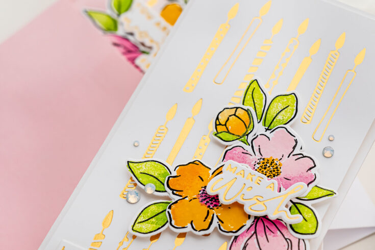
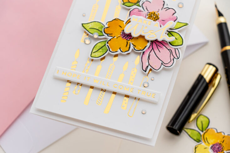
To create my Birthday cards I used a new glimmer plate from Spellbinders, this is a Birthday Candle background plate from my latest Blooming Birthday collection and I foiled it in the center of my clear card base (and in the center of 3 x 6” white cardstock panel when making an identical, but a cardstock-based card).
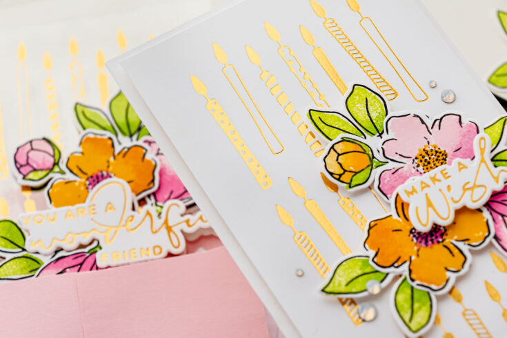
This background plate was designed as a half background to create a full card background for an A2 card. If you were to make an A2 card, one that measures 4 1/4 x 5 1/2”, you would foil this background twice and it would give you a full card background. The mini slimline card has a slightly different proportion, and I have found that you can use this background plate to foil a partial background that fits nearly perfectly on the mini slimline card. It is quite a coincidence, but when I foil this background you’ll see how perfectly well it fits on this card side.
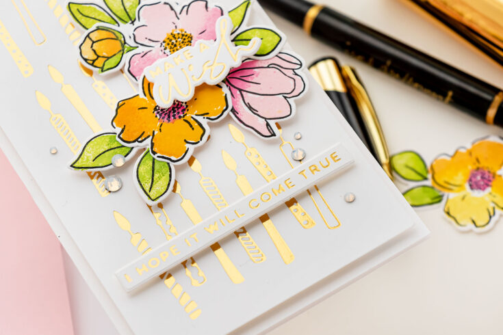
The rest of the foiling was done on cardstock. I have found Simon Says Stamp 130lb and 120lb cardstock to give me the best, most smooth, and perfect results when foiling, regardless of the foil color or glimmer plate I use. I used this paper to foil another candle background and sentiments for both of my cards.
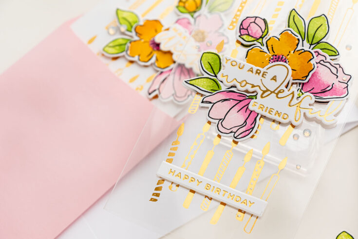
Next, I wanted to add florals, because who doesn’t like to receive flowers on their birthday? I love Simon’s new Blooming Meadow stamp set and so I stamped several flowers and leaves from this set using a combination of Distress Oxide and Simon’s Dye Inks. The outlines were stamped and black, I also used coordinating dies to cut the images out.
Having created all the elements for my cards, I put the project together using foam adhesive. Lastly, I embellished my cards using Spellbinders gems. Have fun stamping!
WATCH THE VIDEO:
SUPPLIES:
|


Thanks so much for stopping by, and thanks to Yana for being our guest!
Color Once, Make 2 Cards! + International Women’s Day Blog Hop 2021

Hello friends, it’s Nina-Marie Trapani here with you! In celebration of the 2021 International Women’s Day Blog Hop, I have a duo of mini slimline cards to share, which would be perfect to send as encouragement cards to your women friends!
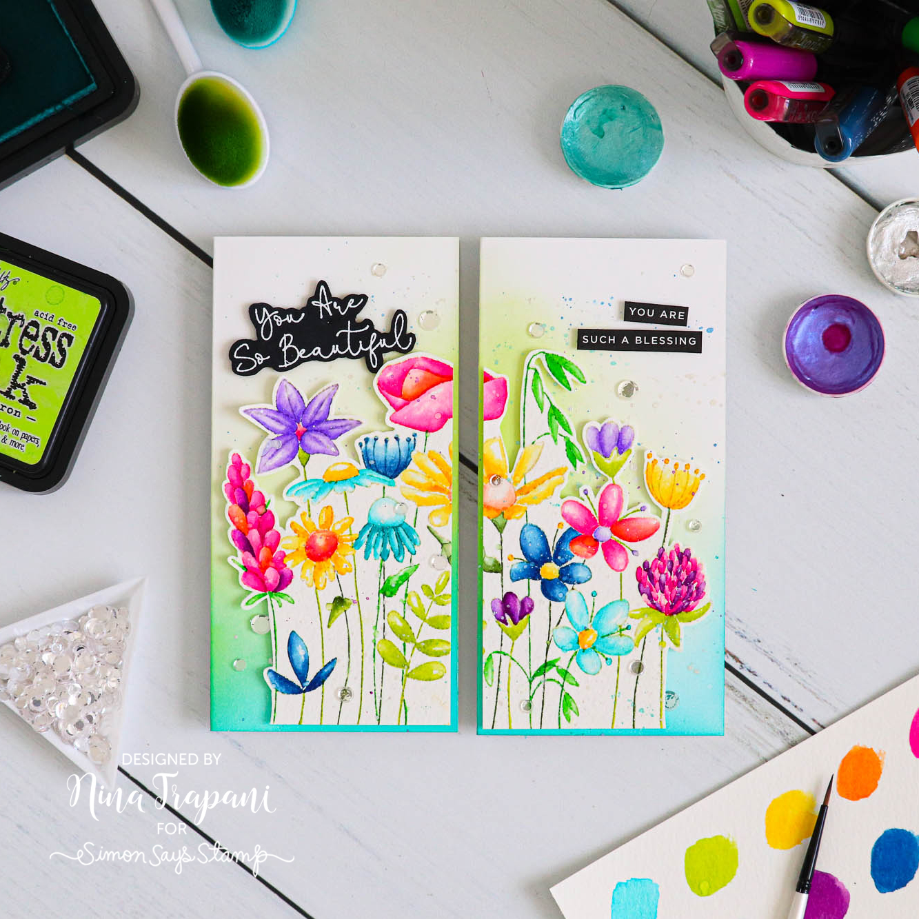
These bold and colorful cards feature our Simon exclusive So Beautiful stamp set! I wanted to no-line watercolor the floral images with Karin Markers, but we all know how time-consuming coloring can be. So to make the most of my time, I thought I would cut my colored image in half so that I can make two beautiful cards at once!
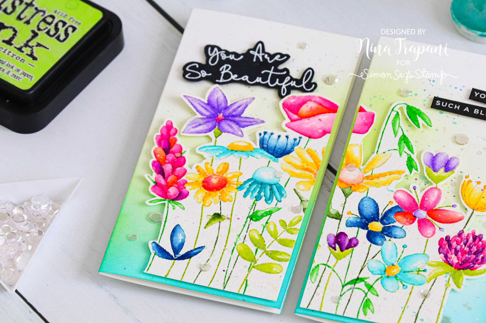
After trimming the colored florals in half, I also fussy cut around the outer edges. Peeking around the edge is a bright background that blended with Peacock Feathers and Twisted Citron Distress Inks. I also added shimmery splatters with Prima Metallic Accents and Finetec Metallic Watercolors.
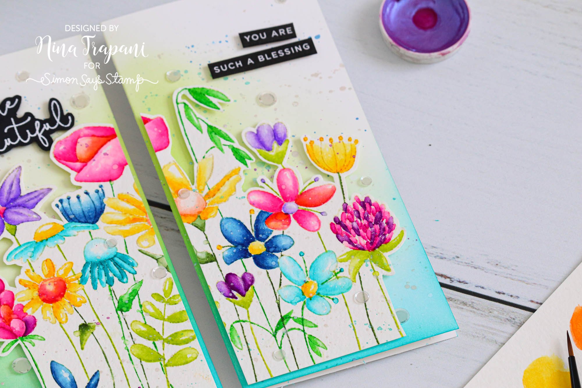
The encouraging greetings I used for each card come from the So Beautiful stamp and our exclusive, Reverse Gratitude sentiment strips.
Inside the cards I continued the encouraging theme by adding sentiments from our Inside Friendship Messages set. This set has great, heartfelt messages that can be stamped on the inside for an extra-special touch.
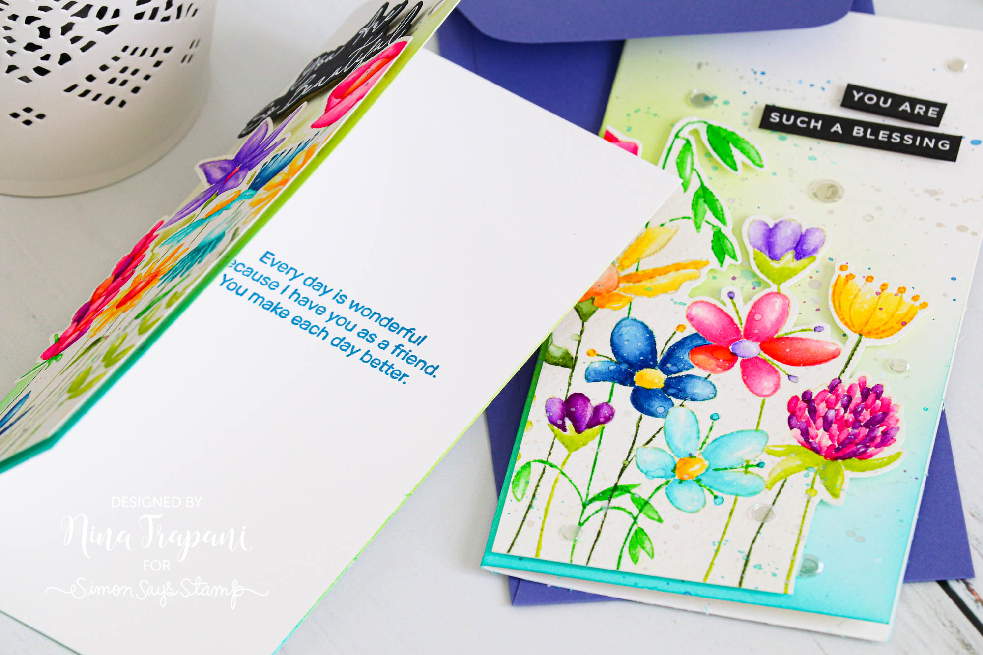
I plan on mailing these lovely cards in our Simon exclusive Blue Violet and Soft Navy mini slimline envelopes. The colors coordinate perfectly with the watercolored florals.
Be sure to watch the video to see how I made these colorful cards!
WATCH THE VIDEO
SUPPLIES
|


We are honored to be participating in the International Women’s Day Blog Hop! Along the hop you can win prizes from the sponsors – including a $25 gift card to shop here at Simon Say Stamp! Be sure to leave a comment here and visit the BeYoutifully You blog for all the hop details!
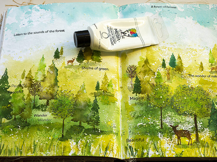
Spring Forest Art Journal by Anna-Karin Evaldsson
Hi friends! Happy Sunday! I hope you’re having a great weekend! Keep scrolling for a fun and inspiring Art Journaling installment from Anna-Karin Evaldsson!
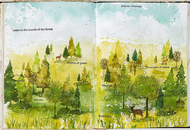
Hi everyone! I am so happy to be here on the blog today to share a stamping tutorial with you. It is March and spring is in the air. I love trees and I am in the forest several times a week. There is no place as peaceful as the forest. For this post, I created a spring forest in my art journal.
I wanted a large surface to work on and did a double page in my Dina Wakley Media Journal, working on cotton rag watercolor paper. The spread measures about 15 x 10 in. If you would rather make a card, or a smaller art journal page, it is easy to do, by just using a part of the design. This is a mixed media project and might look complicated when you see the finished result, but it is not difficult and very forgiving.
It is best to work on watercolor paper or on another surface that can handle a fair amount of water.
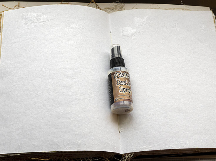
I started by applying Distress Resist Spray as strands of grass in the foreground and as clouds in the sky. It was applied by removing the sprayer and applying the liquid with the end of the sprayer (the part that goes into the bottle). The resist worked well for the clouds, but the strands of grass gave a more subtle resist effect. I think the reason is that the cotton rag paper has a lot of texture and is very absorbent, so the ink travelled underneath the resist spray, making the resist effect less visible, but there is still an interesting texture.
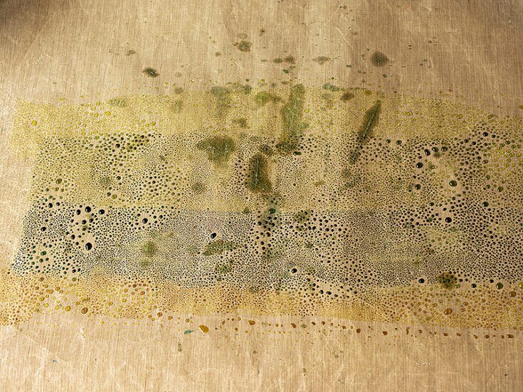
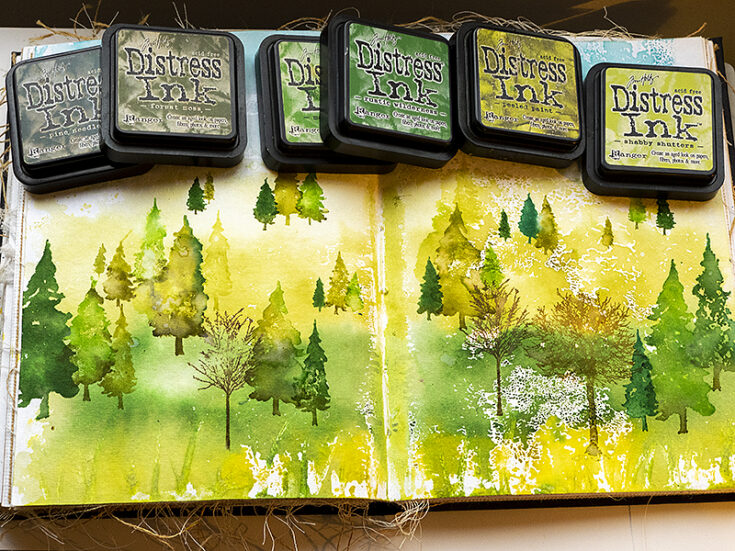
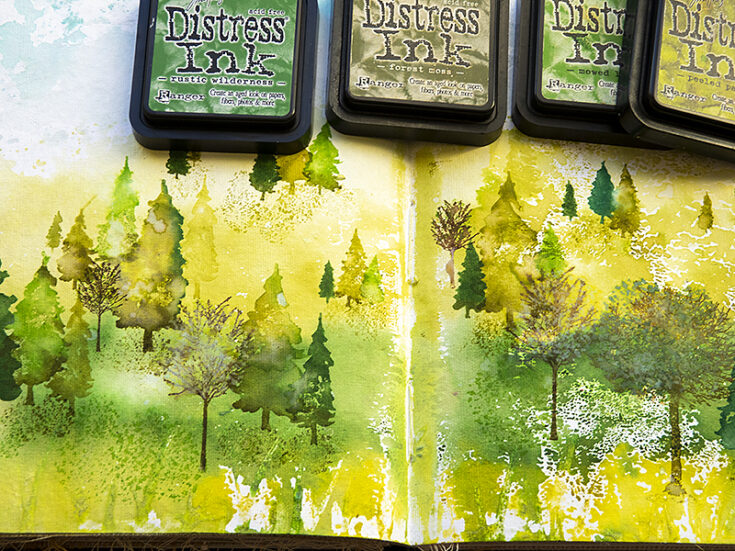
Smear four lines of green Distress Ink on a non-stick craft sheet, with the lightest shade at the top. I applied the inks in this order (from the top): Shabby Shutters, Peeled Paint, Rustic Wilderness and Crushed Olive. Mist with water.
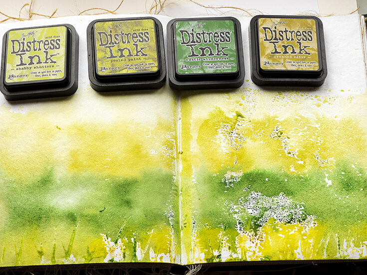
Press the book or paper into the ink. This is an unpredictable technique and you will never get the same result twice, which is also why I like it so much.
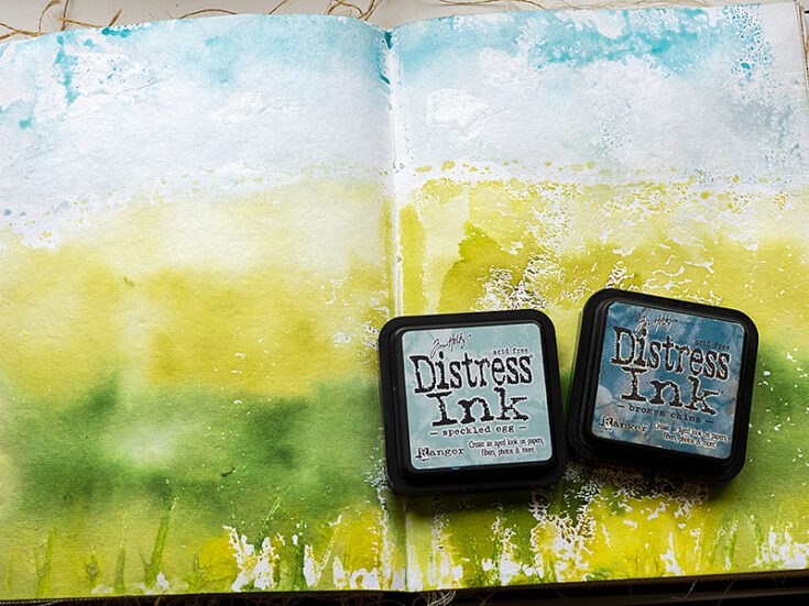
Repeat for the sky, using Speckled Egg and Broken China.
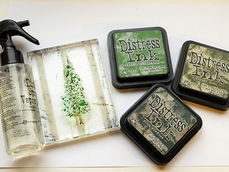
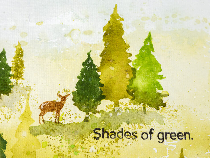
Ink pine trees from Simon Says Stamp Forest Scenery with two or three shades of green Distress Ink. Mist with water. You need more water for the larger stamps and just one or two mists for the small stamps.
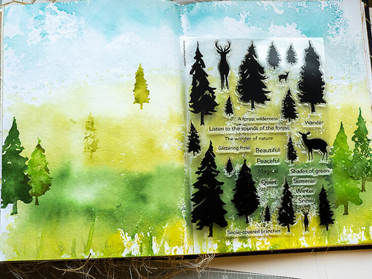
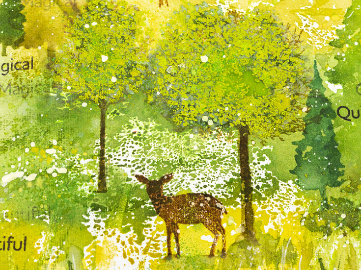
Start stamping the forest. The Forest Scenery set contains a large variety of pine trees in different sizes, so you can create a varied forest with dimension. Place the smaller trees towards the back and the larger towards the front. This creates a sense of perspective. I also used darker inks for the larger foreground trees.
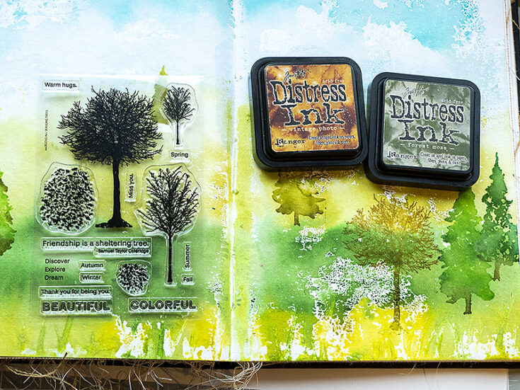
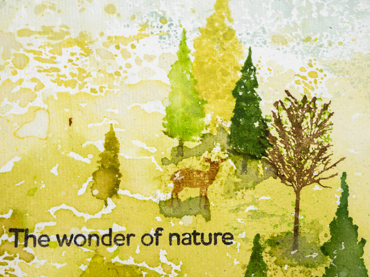
Stamp the trees from Simon Says Stamp All Seasons tree. Ink with two shades of brown/green, mist with water and stamp.
Continue adding trees to build up your scene. I stamped a few more trees after this photo was taken too.
Use the leaf cluster stamps from All Seasons Tree, ink with green, mist and stamp under the trees and on the ground to create texture. These stamps are great for texture, they don’t have to be leaves, but can be used for general texture.
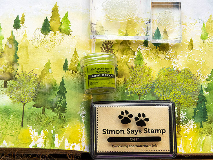
I wanted spring leaves on some of the trees. They were stamped with the two leaf cluster stamps from All Seasons Tree and embossed with Lime Green powder.
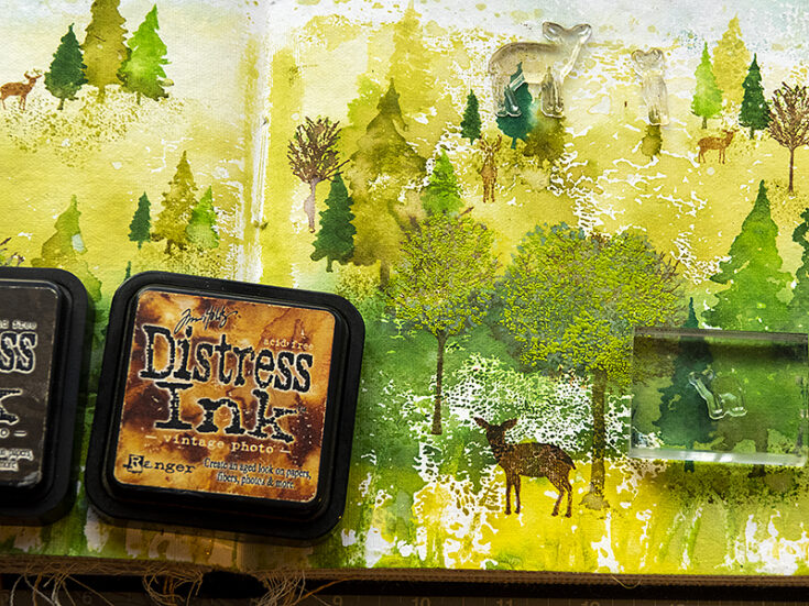
Ink the deer from Forest Scenery with brown ink. Before stamping, move them around on the scene until the size and perspective look right. Mist with water and stamp.
Stamp sentiments. Some of the single word sentiments were stamped more than once without re-inking in between. The sentiments all come from the Forest Scenery set.
Smear darker shades of Distress Ink on a non-stick craft sheet, mist with water and pick up with a paint brush. Paint more grass in the foreground and add shadows under the trees.
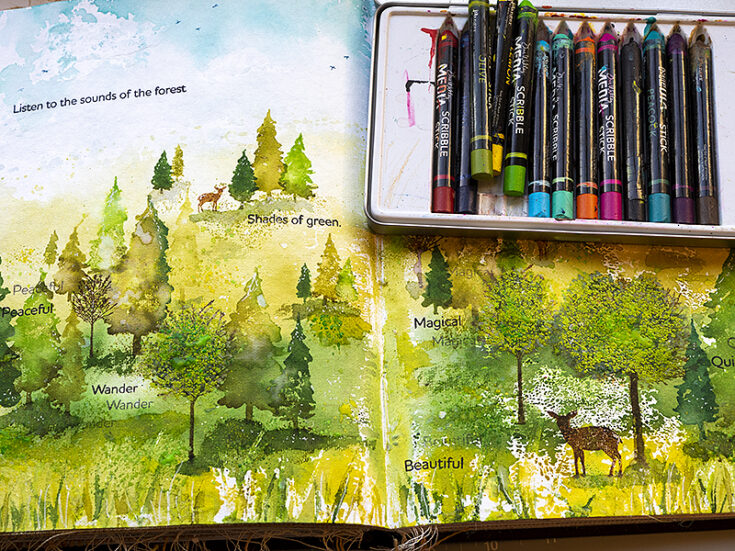
I wanted even more green on the leaves and splattered quite a bit of green Scribble Sticks on the leaf trees. Dip the stick in water and flick a paint brush against it. This is a great, and fairly mess-free, way of adding splatters. I splattered green in the grassy areas and on some of the pine trees too.
Finally, splatter a little white paint on the background. This creates texture, highlights and looks like white flowers scattered through the landscape.

The pine tree stamps are perfect for watercolor stamping and since the trees were inked with more than one shade of green, you’ll get interesting and unpredictable blending.

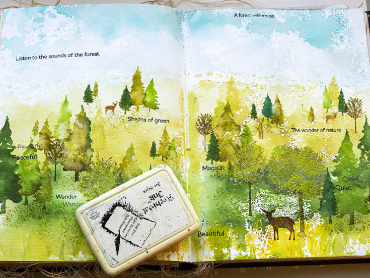
One of my favorite details on the art journal spread is this spot of light where the word ‘wander’ was stamped.
During spring you can see an amazing number of shades of green in nature. I love seeing how the world turns green after winter.
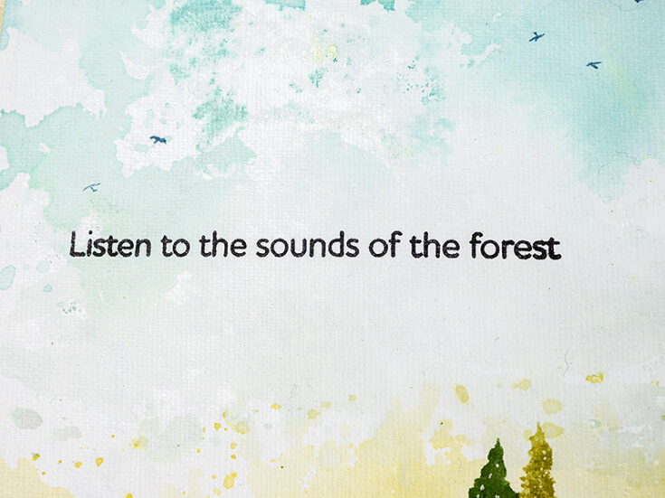
Paint a few birds in the sky, using Faded Jeans Distress Ink.
The white texture here happened in the inking process, since I probably had misted less water in that spot. It made me think of white spring flowers.
Just a small cluster of trees like this one could be the focal design of a card.
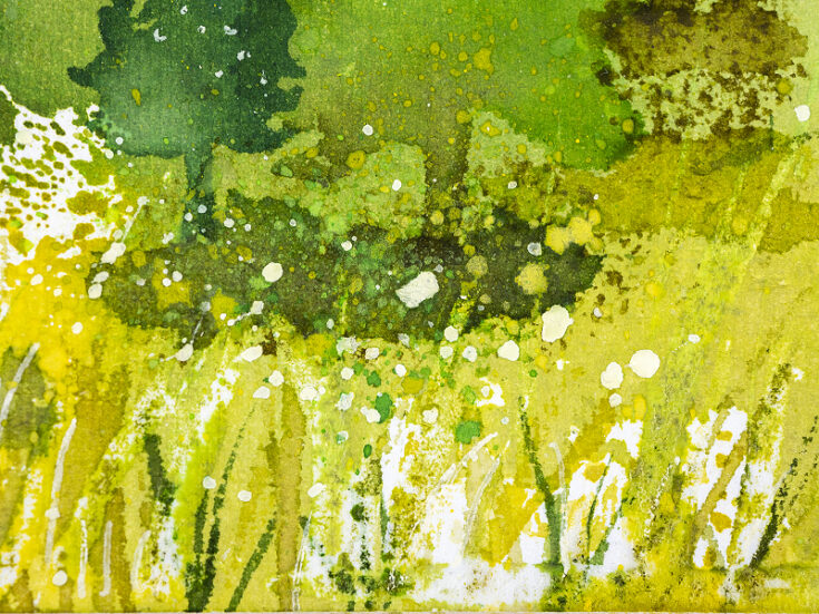
Here’s a closeup of the inky, splattered and painted texture in the foreground. I also added strands of grass with a white gel pen.
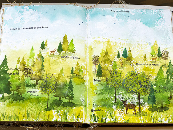
I hope this tutorial inspired you to create scenes inspired by nature and to play around with mixed media techniques.
Thank you so much for looking! Happy crafting! -Anna-Karin
SUPPLIES:
|


Thanks so much for stopping by, and thanks to Anna-Karin for being our guest!


