Yippee for Yana: Holiday Sprigs & Foiling

Hi friends! Happy Wednesday! Please join me in welcoming back special guest Yana Smakula in the latest edition of our Yippee for Yana blog series! Read on and be sure to watch the video for all the details! Enjoy!
Hello, crafters, this is Yana Smakula for Simon Says stamp.com! Welcome back for another Yippee For Yana video!
In today’s video, I am creating a holiday greeting card by combining clear stamping with hot foil stamping. I’m using Simon’s Holiday Sprigs stamp set to create beautiful Christmas blooms and Spellbinders Essential Christmas Greetings to create a foiled sentiment.
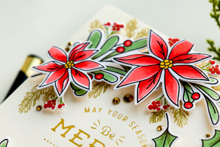
I stamped the Holiday Sprigs in Memento Tuxedo Black ink onto Neenah Solar White 80lb cardstock and colored with Copic markers. I used my go-to colors. The greenery was colored using G99, G94, and G21. This color combo gives a very pretty muted green as opposed to a vibrant grass green color. I find this combination to be perfect for holiday imagery.
Mistletoe berries were colored red using R27, R24, and R22. I simply outlined each berry leaving a spot of white in the center working as a highlight. You can add a highlight using a white pen or a white marker, but whenever possible, I like to leave the paper white, this type of highlight looks a lot more natural. Of course, it all depends on the type of coloring I am doing and the type of image I am coloring, it that’s a cartoony type of image, I would probably stick to using a white gel pen to create a highlight. If I am coloring organic foliage I try to keep a part of the paper free from coloring to create a natural-looking highlight.
My poinsettias were colored using the same colors as the berries, with R27, R24, and R22. I didn’t do much blending, in fact, I did almost no blending at all. The yellow centers were colored using a Y19 marker. I used coordinating dies and cut these images out in my Platinum Die Cutting Machine.
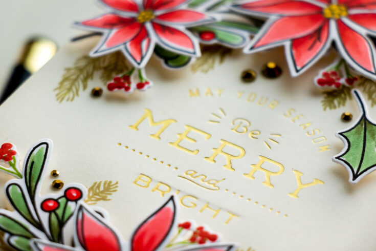
To create a sentiment I foiled an Essential Christmas Greeting from Spellbinders in Matte Gold Foil on Simon’s Cream cardstock panel cut to 4 1/4 x 5 1/2”.
I prefer the matte foils to regular shiny foils, as matte gives a much softer look, it still looks like foil, but not as flashy and not as shiny.
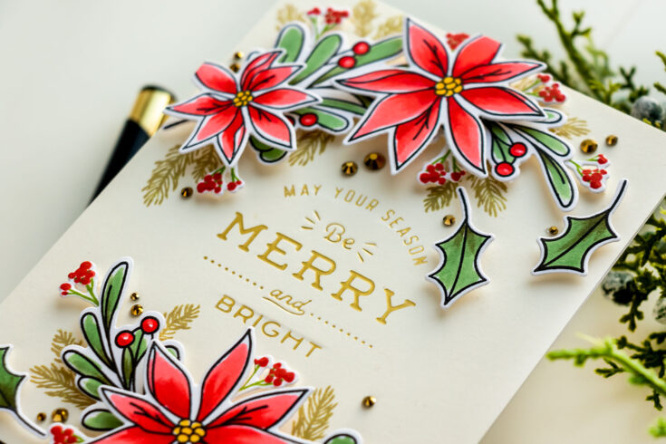
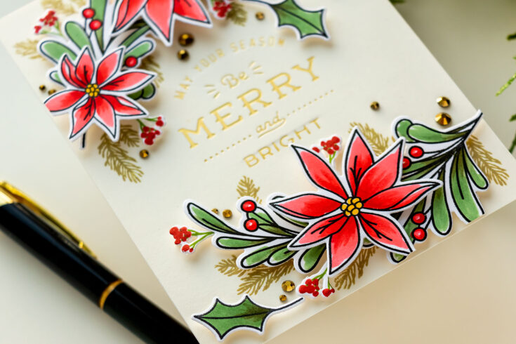
I did some additional stamping – I created a few filler pieces for my foliage. I wanted to have more red, so I stamped tiny berry branches using the Happy Poinsettia stamp set. I used Simon’s Green Leaf and Lipstick Red inks to stamp these and I cut them out using coordinating dies. I stamped pine branches directly onto the background in Khaki ink so that it looked as if they were coming from under my foliage.
I foam mounted the branches onto the background and I also added the filler pieces using foam adhesive. The red berries really added a lot of detail to this design.
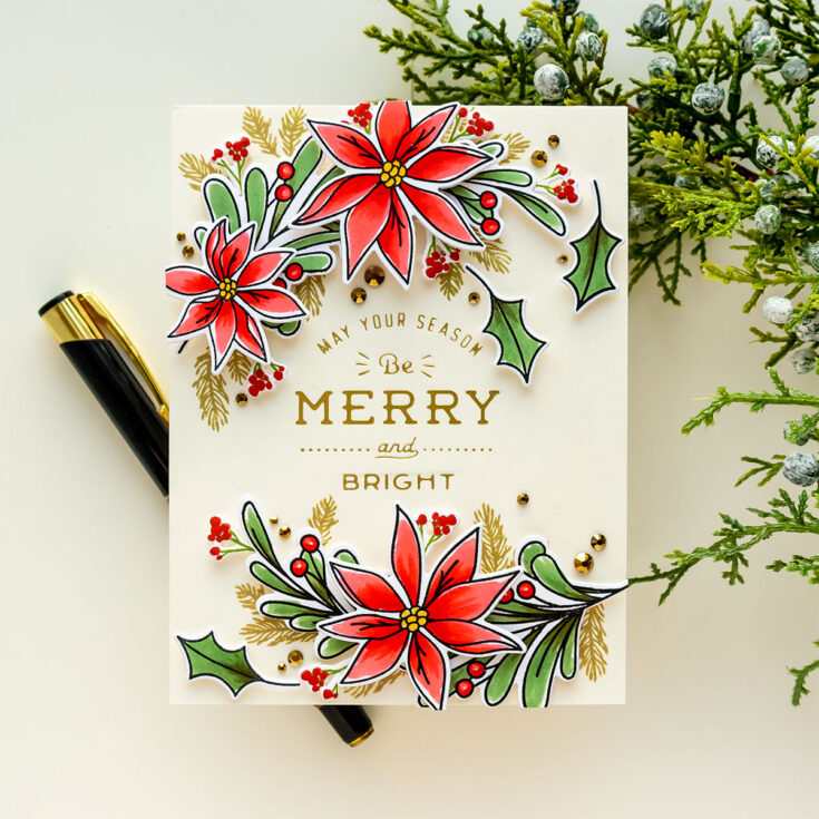
I also embellished the card with gold gems from Spellbinders – I added quite a few placing them next to the foliage. I recently had a question on my Youtube channel asking how I distribute the embellishments on the card – here I clustered them immediately next to the images. I didn’t follow the rule of a triangle, instead, I used the gems as extensions of the images. Where I had little crevices in the design I just added 2 or 3 gems to fill that space in. Have fun stamping!
WATCH THE VIDEO:
SUPPLIES:
|


Thanks so much for stopping by, and thanks to Yana for being our guest!
Amore Laurafadora: Thankful for You


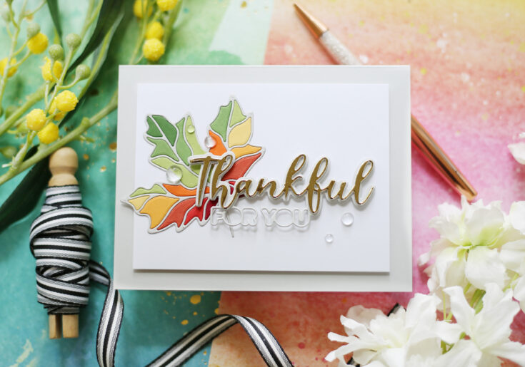
Hi friends! Happy Tuesday! I’m delighted to share this gorgeous Autumn themed card with you in the latest edition of Amore Laurafadora with Laura Bassen! The Ornate Leaves die set is brought together so beautifully, don’t you think? She uses a variety of Simon Says Stamp cardstock to fill in the leaves and the gorgeous Thankful For You sentiment to top it off! Be sure to watch the video for all the details and enjoy!
WATCH THE VIDEO:
SUPPLIES:
|


Thanks so much for stopping by, and thanks to Laura for being our guest!
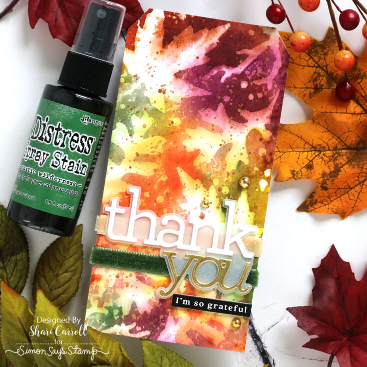
DISTRESS Color Combos: Rustic Wilderness
Welcome, everyone!!! It’s Shari here with some new inspiration for you. In the coming months, I’ll be selecting colors to go with some of the NEW Tim Holtz Distress ink colors. Today is Rustic Wilderness.
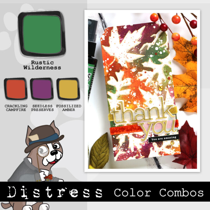
Rustic Wilderness is a perfect green, rich in color but not too dark, and has a great balance between blue and yellow. I’ve paired it with Crackling Campfire, Seedless Preserves, and Fossilized Amber for an Autumn-themed tag.
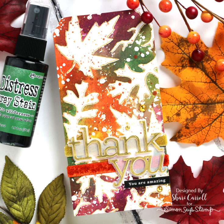
I used the Distress Sprays directly onto the Tim Holtz Autumn Layering Stencil, then pressed the stencil onto watercolor paper. My favorite reaction to the combo is where the Rustic Wilderness hits the Seedless Preserves for a wonderful brown/raisin color.
I did two tags, this second one was spritzed with water allowing the stains to wick into the white areas.
SUPPLIES:
|