Studio Monday with Nina-Marie: Clear Shaker + Multicolored Die Cut
Hello friends, welcome back to a brand new Studio Monday! Today I have another clear shaker card to share with you, this time using some of our Simon exclusive stamps and dies! I also am going to share some inspiration on creating multicolored die cuts and a bit of easy Copic coloring, so let’s get to it!
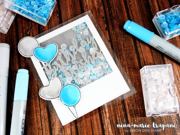
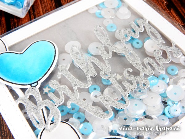
For this card I have used the Birthday Wishes Frame die, as well as the Cuddly Critters Accessories stamp and die sets; all of these products are Simon exclusive and they are so much fun to use together.
I really like the versatility of the Cuddly Critters Accessories stamp set; while it is technically meant for using with the Cuddly Critters stamp set (which is so dang cute by the way!), it can also be used alone, like I have done here. The balloons that are included in the set are just the perfect shape for any style of card, and I like having the option of using either the heart or traditional circle… or both together! There are also coordinating dies that go with the Cuddly Critters Accessories set, which saves a lot of fussy cutting!
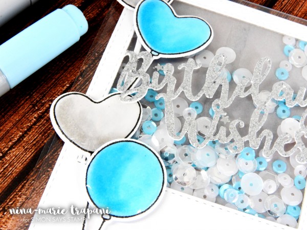
I wanted to create a clear shaker card today, and the Birthday Wishes Frame makes it SUPER easy to do so! I even did some multicolor die cutting, which I will be sharing a few tips on in today’s video (at the bottom of this post). What makes this die cut more unique than other frame dies, is that the brush script “birthday wishes” sentiment is attached to the frame, so everything die cuts as one whole piece. Pretty nifty, huh?? I will show you in the video below how I put this entire shaker card together, so be sure to stick around for that!
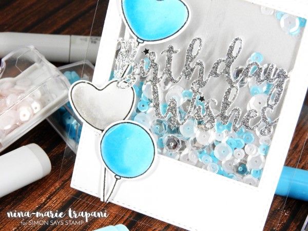
Inside the shaker I wanted to use colors that matched my balloons; so I grabbed some Pretty Pink Posh sequins in Marshmallow (4mm and 6mm), Aquamarine (4mm) and Sparkling Clear (6mm) to fill inside my shaker’s well. I think the way the sequin and balloons coordinate together looks fab!
To see how I created this card from start to finish, as well as to get a few tips and tricks on creating clear shaker cards, be sure to check out the video below or over on our YouTube channel! If you enjoy, please give it a thumbs up and subscribe to our channel for more weekly inspiration!
WATCH THE VIDEO:
SUPPLIES:
 |
 |
 |
 |
 |
 |
 |
 |
 |
 |
 |
 |
 |
 |
 |
 |
 |
 |
 |
Blog Candy Alert!! Follow our blog via email and comment on this post for a chance to win a special blog candy!
Fabric Flowers with Shari Carroll
Happy Sunday everyone! It’s Shari here with a technique to create fabric flowers using Spellbinders dies designed by Tammy Tutterow.
These flowers are a fresh departure from flat paper, the frayed edges and crumpled fabric add texture with a hint of whimsy! I used white fabric that had a small white pattern. When I started out, I wasn’t sure if the design would soak up the Abandoned Coral color or resist it. To my delight, it resisted giving me a white pattern!
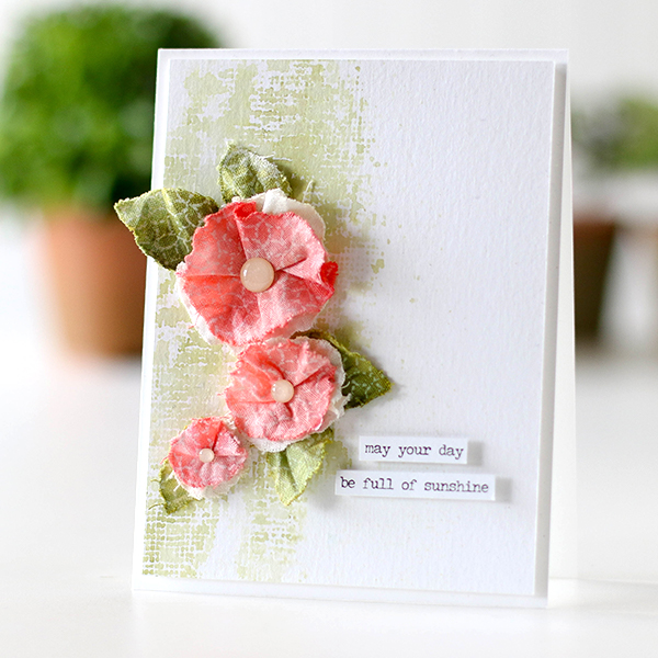
I did sew just a little to add folds to the flowers. I promise, it’s really easy to do. You could use glue or glue gun for this as well. The stamped Cheesecloth background sets the stage for the flowers adding a garden feel.
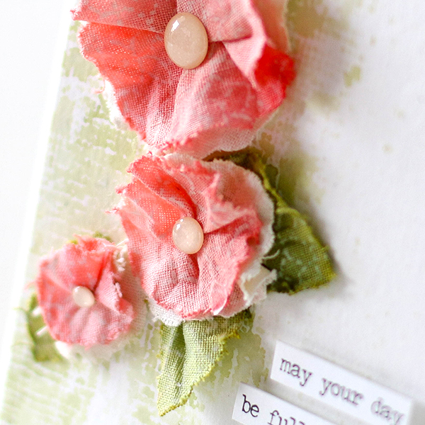
I finished off the card by adding an enamel dot to the centers of the flowers and a simple greeting. Clean and simple with texture!
I have filmed a video to show you the process, you can watch it below or on our YouTube channel.
Blog Candy Alert!! Follow our blog via email and comment on this post for a chance to win a special blog candy!

I hope I’ve given you some inspiration to use your dies with fabric to create dimension and texture. Enjoy!!
 |
 |
 |
 |
 |
 |
 |
 |
 |
 |
 |
 |
 |
 |
 |
 |
|
Weekender with Wanda – Go where your heart takes you!
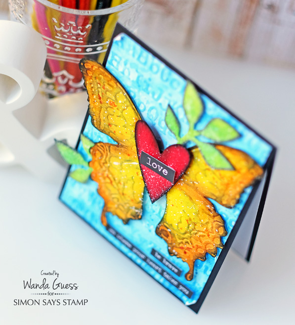
Hello crafty friends! Welcome back to the latest edition of Weekender with Wanda here on the Simon Says Stamp Blog! I’m so lucky that I get to see you every weekend. I really look forward to thinking up a new project to share with you, and I love hearing from you! I read every single comment you leave on my posts, and your kind words uplift me and inspire me! Thank you! Today is my post of the month in which I feature Tim Holtz and Ranger supplies. I try to challenge myself to do something new, or bold, or different. Well, for today’s card I went way out of my color comfort zone! I went big and super bright with lovely primary colors! I used some of my favorite dies from Tim Holtz and lots of ink pads. Let’s get started!
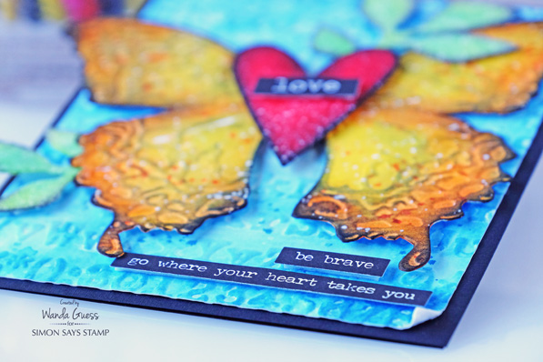
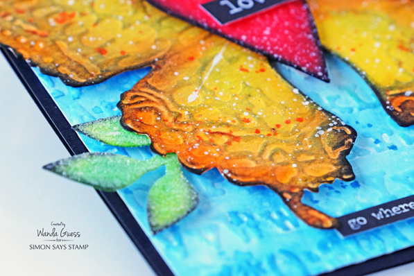
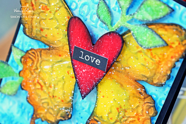
The focal point of my card is the beautiful Layered Butterfly Die from Sizzix by Tim Holtz. In the package with the die, you get a matching embossing folder that perfectly embosses the butterfly. To do this, you first cut out the butterfly. Then you put the cut out piece of paper into the embossing folder and run it back through your die cutting machine. Lovely! There is also a Bee and a Dragonfly version. My card base for today is deep black cardstock – a nice contrast to all that color.
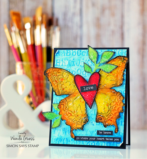
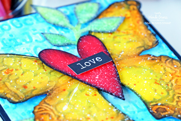
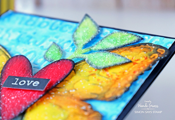
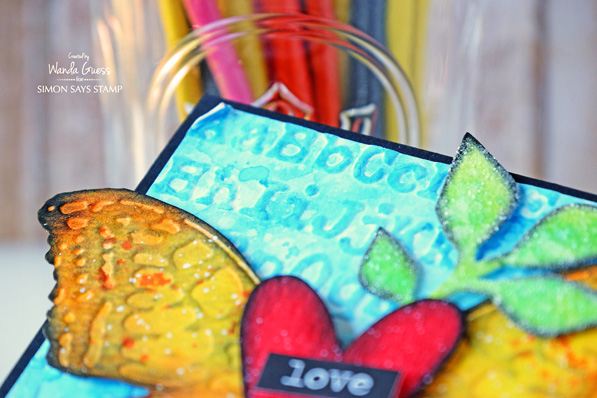
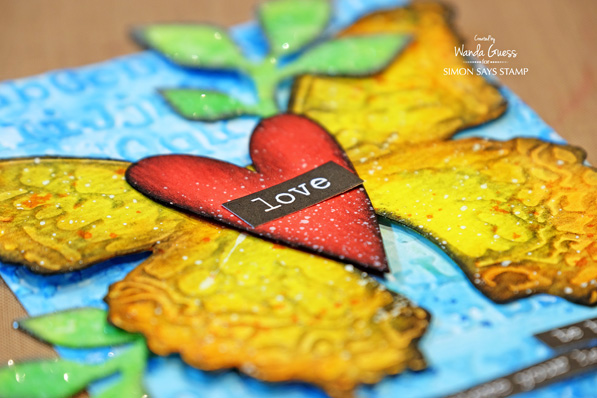
Even though the butterfly is my focal point, I really LOVE how this heart came out. It just pops off the page. There is a lot of texture going on in this card. I decided to add more by covering my leaves with Rock Candy Distress Glitter too! (more is more)! In this close up you can see all the different mediums I used. I started by die cutting all of the pieces out of Tim Holtz Watercolor Paper. For the heart, I sprayed it with three layers of Candied Apple Distress Stain and let it dry. For the butterfly I used Squeezed Lemonade, Carved Pumpkin and Ripe Persimmon Ink pads and a sponge dauber to put the color down. The leaves were inked with Twisted Citron and Cracked Pistachio. YUM! (Ink color links at the bottom of the page!)
Once all the pieces were dry I used a small sponge dauber and Black Soot Distress Ink and edged all of the parts. Then I used Picket Fence Distress Paint and the Tim Holtz Splatter Brush to add white flecks. This was a really fun project!
In this photo, you can better see the glitter. The embossing on the blue layer was made using the Tim Holtz Typewriter Embossing Folder. Then I layered two colors of blue ink over it. Since these are all primary colors they just pop all together!! This is not my normal color palette but it’s so rich and happy. I might have to do more of this!
At first the background was created with embossed watercolor paper. Then, I added Tumbled Glass and Salty Ocean Distress Inks to the paper and wet it all with my water brush. When it was dry, I splattered clean water over it to remove some of the ink. This is a great technique! Then I splattered Salty Ocean ink on it a second time – to build up the layers of color. This sounds harder than it is, truly! The trick is to let your paper dry in between the different ink layers.
My accents are from the Tim Holtz Stickers lines – Big Chat and Small Talk. I love those stickers! They are perfect for any project – and they come in white or black.
Here are some in-process photos. In the first photo you can see all my pieces ready to ink. I used the Tim Holtz Movers and Shapers Hearts, and the Garden Greens Dies. These are a couple of my go to items in my Tim Holtz stash. In the middle two photos you will see some close up shots of the background layer. The bottom two photos show the finished pieces ready to assemble. I trimmed the center of the butterfly since I was going to layer the heart over that part.
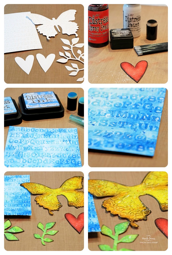
One of my tips is to assemble your card on your craft sheet or table first until you get it the way you want it. In this next photo all the pieces are loose. So, when I get it the way I want it I snap a quick picture with my iPhone before I take it apart again. That makes it easy to reference when I am gluing everything together! This works especially well when I am doing cards with flower clusters or leaves.
I like how some of the paint made a big splotch across the butterfly wing. This part always makes me nervous!! It’s the very last step after I’ve worked really hard on something… One bad speckle or splatter can mess up the whole thing!
Thank you for spending part of your weekend with me! Hope you have found something to inspire you to get crafty! Have a great weekend, and I’ll see you soon!
SUPPLIES:
 |
 |
 |
 |
 |
 |
 |
 |
 |
 |
 |
 |
 |
 |
 |
|
 |
 |
 |
 |
 |
 |
 |
 |
 |
 |
 |
 |
 |
 |


