Weekender with Wanda – Creativity with Distress Crayons!
 Hi everyone! Welcome back to Weekender with Wanda here on the Simon Says Stamp Blog! Happy New Year! It’s my first Weekender post of 2017 and I’m so happy you’re here with me. Let’s kick off an amazing year of fun and creativity together! What are you up to in your craft room? I’m sort of starting to pull out all the Valentine goodies and thinking hearts and cupids! I’m also excited to be headed to CHA in two weeks to meet up with the SSS team to bring you the latest news from the craft industry. Can’t wait to get there and see everyone and see all the new products!
Today is my monthly feature on Tim Holtz and Ranger supplies. I put myself out of my comfort zone with this project and I hope you like it. I am almost always a Distress Ink or Marker crafter. But, I challenged myself to use the beautiful Distress Crayons! Well, I’m a convert now! The card I made is full of bright, happy colors and some new techniques too. This card has lots of yummy layers and a hint of gold… All anchored with deep rich black. I used Tim Holtz supplies from Sizzix, Ranger, Stamper’s Anonymous and Ideaology.
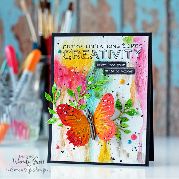
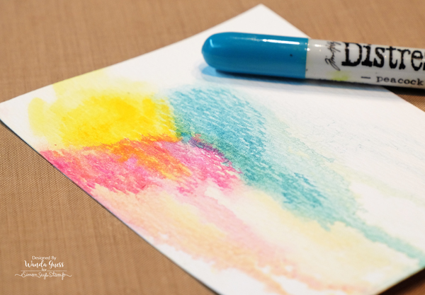
The card base is A2 size and made from SSS Black Cardstock – to ground all the color. All the color elements (except the gold) are Distress Crayons. Here in this photo you can see how vivid and dense the colors are. They react with water, like all Distress products, and are easy to move around on the paper. I chose to use watercolor paper for all the elements to stand up to all the layers. The Distress Crayons are like soft crayons, almost the texture of lipstick. It’s very easy to place the color where you want it, like drawing. They stay creamy for a long time so you can use a paint brush, sponge, or your fingers to smudge the colors together. Very pretty!
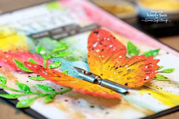
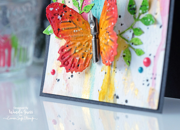
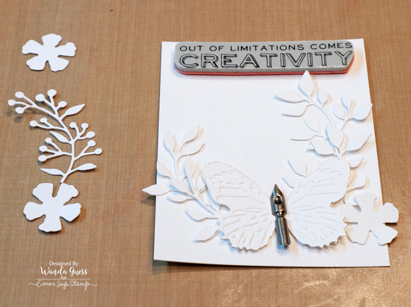
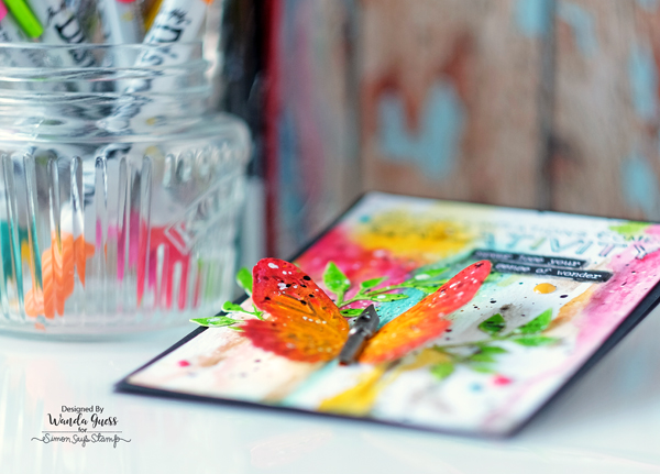
I die cut the leaves from the Sizzix Garden Greens Die set and cut the butterfly from the Sizzix Butterfly Duo Die Set. You can see that the butterfly is also embossed. This particular die comes with a matching embossing folder to exactly line up with the butterfly. It’s really a beautiful effect! I used an Ideaology pen nib as the body of my butterfly.
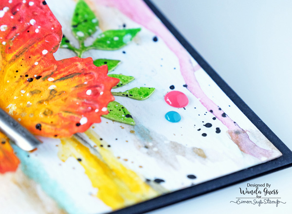
I speckled and splattered everything with white mist, black mist, and gold paint flecks. Be sure to let each of these elements dry before adding the next color. Otherwise they will all bleed together. I use my heat tool to quicken the process.
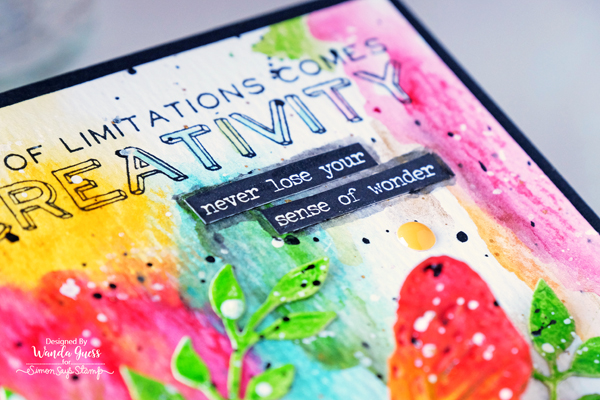
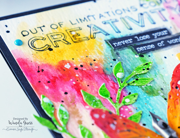
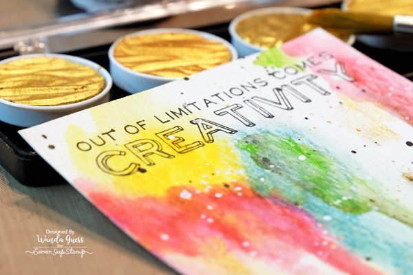
I really love this stamp and sentiment. It’s from the Tim Holtz Random Quotes stamp set. I added a few word stickers from the Small Talk pack that I thought went well with the main sentiment. In this photo below you can see the layers of colors.
I turned the card sideways in this photo to show you the gold paint. I sprayed the entire piece of paper with water and let all the colors drip down to the bottom. I love that no two cards would come out the same with this technique!
Before I start coloring a project I like to lay out everything on my craft sheet. This way I know where to put the color and how the elements will go together. I was ambitious in thinking I had room for a few flowers too! I ended up just using the pretty leaves dies.
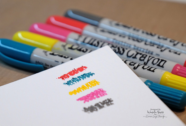
I did a test sheet of the colors I wanted to use. SO pretty!
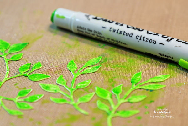
I used the Twisted Citron Distress Crayon on the leaves and after putting the color straight onto the watercolor paper, I ‘smushed’ it around with my fingers and then sprayed a bit of water on them. this made the color really pretty.
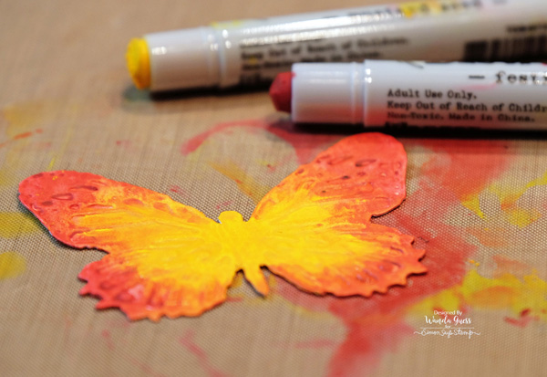
For the butterfly I used beautiful Mustard Sees and Festive Berries Distress Crayons.
Here is a close up of the panel before I put on the leaves and butterfly. I really think that gold is marvelous mixed in with everything. These Finetec paints are a go-to staple in my craft room.
I gently curved the butterfly wings upwards with my fingers and glued it to the paper using Glossy Accents. I attached the pen nib with Glossy Accents also.
Thank you so much for spending part of your weekend here with me. I hope this post has inspired you to try some of your new products and get out of your comfort zone too! Happy Crafting until we meet again!
SUPPLIES:
 |
 |
 |
 |
 |
 |
 |
 |
 |
 |
 |
 |
 |
 |
 |
 |
 |
 |
 |
 |
 |
 |
 |
 |
 |
 |
 |
 |

COLOR COORDINATES: Shari Carroll’s Purple

Happy Friday everyone!! It’s Shari here with a Color Coordinates set that I think you’ll enjoy.
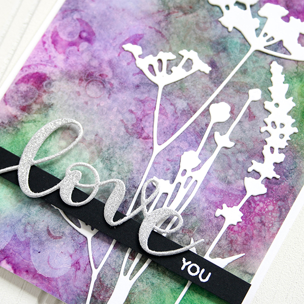
One of my favorite two colors together is purple and green, a combination I don’t use it often, but it’s always been a favorite. For this Color Coordinates I started with those two and added in a few more to complete the look.
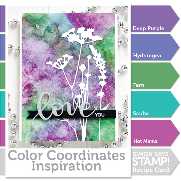
I totally experimented with inks to create this background. At first, I wasn’t sure if it would work… but it did! I used Yupo with the inks and blended them together with a blending tool and my finger, then added spritzes of rubbing alcohol. Yupo is an interesting synthetic paper that let’s the ink sit on top of the surface. Alcohol breaks down the ink so it can flow… resulting in this amazing marble effect.
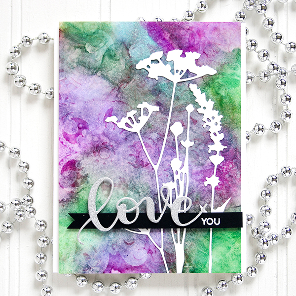
Once I had my background, I die cut the Tim Holtz Wildflowers from white cardstock and added them to the background. Then I die cut “Love” from a Tim Holtz silver Deco sheet which is set onto a strip of black cardstock with the white embossed “You”.
I’m so glad I filmed this technique as I was experimenting so I could share it with you. You can watch the full process video below or on our YouTube channel HERE.
Blog Candy Alert!! Follow our blog via email and comment on this post for a chance to win a special blog candy!
Thanks for stopping by today, I hope you have a creatively awesome weekend!
Supplies Used:
 |
 |
 |
 |
 |
 |
 |
 |
 |
 |
 |
 |
 |
 |
 |
 |
 |
 |
 |
 |
 |
 |
 |
Monthly Mail Art – January 2017
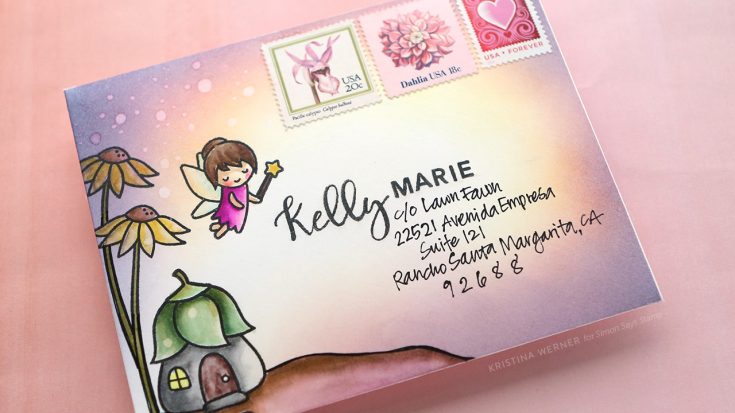
Hi all! Kristina here! I’m excited to share with you a new monthly feature here at the Simon blog: Monthly Mail Art. On the first Thursday of every month I will be showing how I create a custom mail art envelope. This month I’ll be sending an envelope (with a card inside, of course) to Kelly Marie of Lawn Fawn. :)
Most envelopes are not made out of paper or cardstock that can handle lots of stamping and watercoloring, so I first created my own envelope out of Strathmore Bristol paper with the aid of the We R Memory Keepers 123 Punch Board. This punch board does envelopes, bows, and boxes. For this envelope, I followed the instructions for an A2 envelope.
I stamped images from Lawn Fawn’s Fairy Friends stamp set and ink blended some Distress Inks from the edges of the envelope. I then watercolored the images using Zig Clean Color Markers.
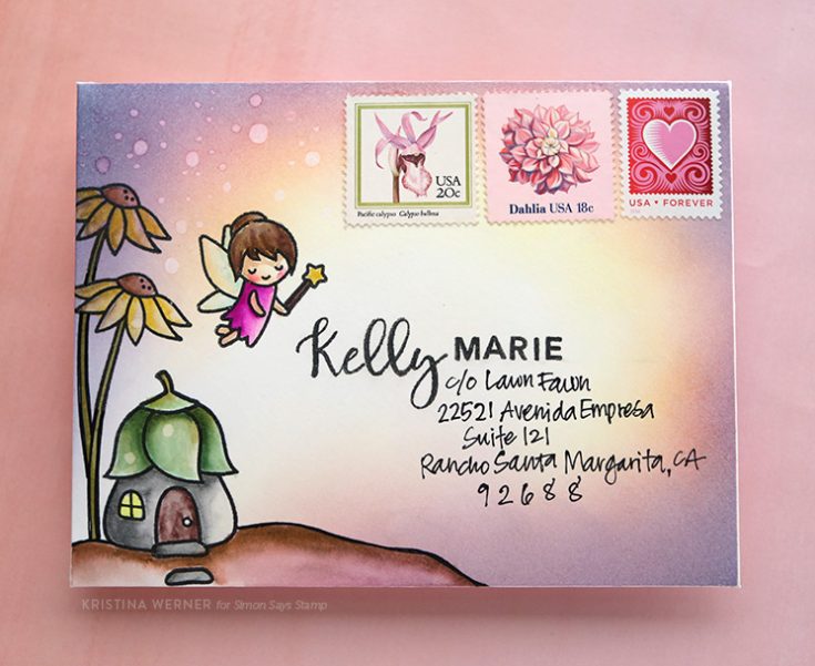
I used Concord & 9th’s Perfectly Penned stamp set to add Kelly Marie’s name on the envelope and wrote the Lawn Fawn business address below.
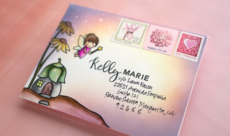
Before the last step of applying some Distress Micro Glaze, I made sure to add the postage stamps. The postage stamps won’t stick to the envelope if the Distress Micro Glaze is applied first since the glaze seals off the surface and makes it fairly slick (it protects the paper from moisture so it’s perfect for protecting all the ink and watercoloring I did). So just to avoid having that problem, I stuck the postage stamps to the envelope first. Then I rubbed the Distress Micro Glaze into the envelope using my fingertips. Once applied over the entire surface, I buffed off any excess Distress Micro Glaze using a dry paper towel.
I hope you enjoy today’s envelope. And yes, this will definitely go through the mail! You just have to make sure the address is legible. :)
Supplies
 |
 |
 |
 |
 |
 |
 |
 |
|
 |
 |
 |
 |
 |
 |
 |
 |
 |
 |
 |
 |
 |
 |
 |
 |
|