Flora & Fauna New Summer Release!
Hi friends! Happy Tuesday, and Happy 4th of July! We have some awesome Summer themed inspiration from Flora & Fauna today! Read on and enjoy!
This is Lara from Flora & Fauna and I’m so excited to be here guest blogging again for Simon Says Stamp! We have a new line of summer images out so we wanted to show everyone some fun techniques we’ve been playing with lately.
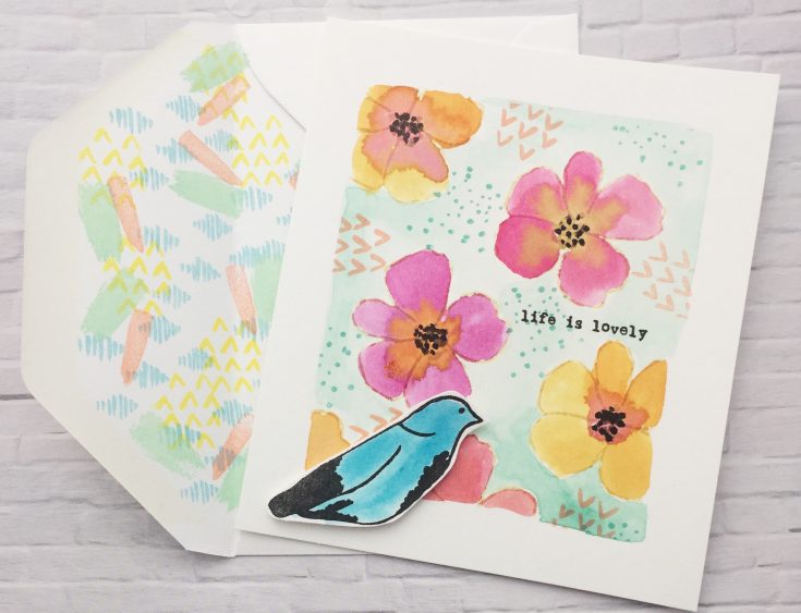
The first card is using watercolor with our Life is Lovely clear set. For this card we first created a masked frame and then stamped the flowers using Distress Ink in Antique Linen for a light outline. We love this technique because it allows you to use a stamp but since the ink is so light it looks like you are watercoloring on your own. We then watercolored the flowers using Distress Ink Spiced Marmalade, Picked Raspberry, and Mustard Seed. Next we stamped the bird in Black and colored it in with Mermaid Lagoon and cut it out and attached it to the card. We then used Distressed Oxide Peacock Feathers to color in the background behind the flowers. Finally to complete the card we stamped background images from our Texture and Texture 2 Clear set to add more interest.
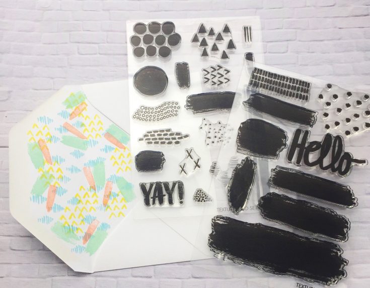
Another favorite technique we have is using our texture sets to create backgrounds that mimic watercolor. We showed this concept on the envelope for this card. To create this look we just stamped the different watercolor looking blocks and patterns for an easy fun background look. Check out our Instagram at florafaunaclear for more examples where we’ve used this technique as we like to do it a lot!
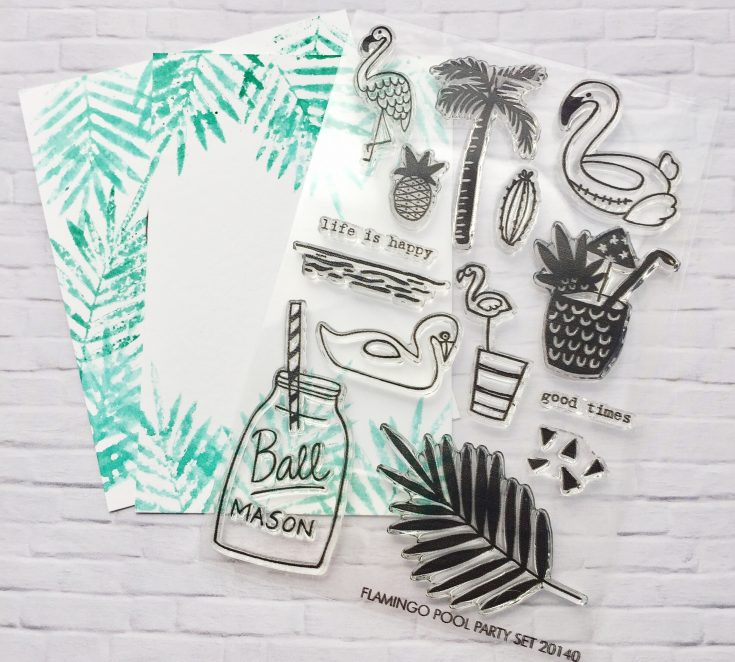
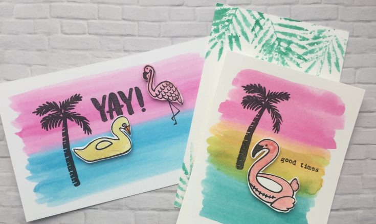
The other cards we are showing using watercolor are perfect for summer and showcase our new Flamingo Pool Party set. For these cards we stamped the flamingo using Distress Oxide ink in Black and cut it out for a 3-D effect. We then watercolored the background using Distress Ink Picked Raspberry, Mustard Seed, and Peacock Feathers. To finish we stamped the palm tree and good times sentiment on top.
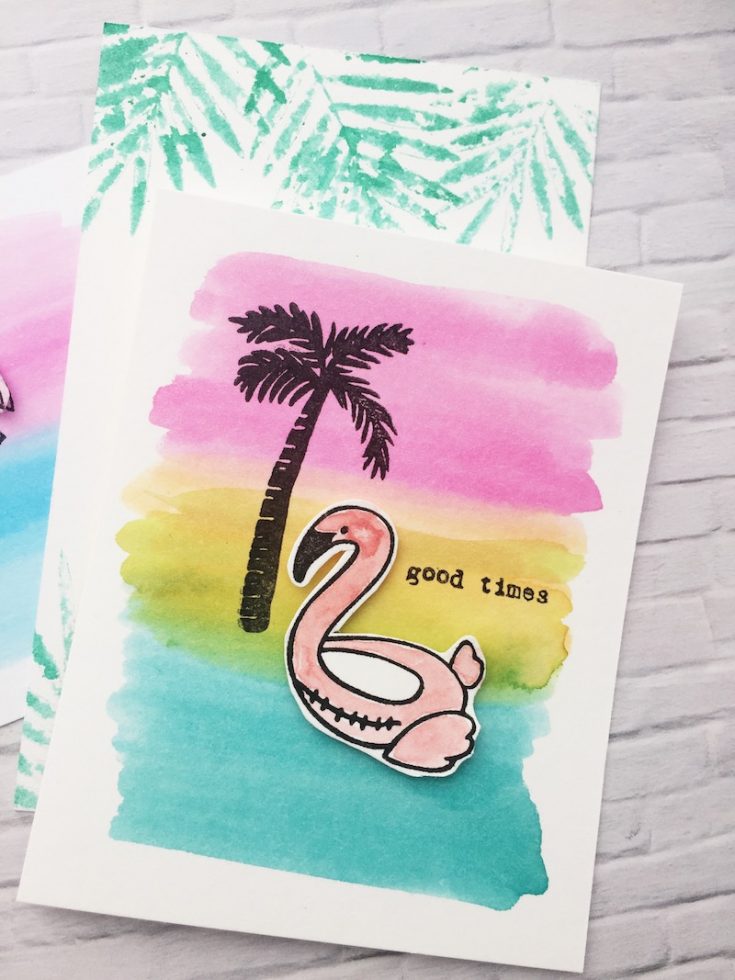
For the envelope on this one we used the Palm Branch and stamped it in Distress Ink Lucky Clover and then misted the back with water before stamping it on the envelope for another take on watercolor. We love watercolor and there are so many ways to incorporate that look into your summer cards.
SUPPLIES:
 |
 |
 |
 |
 |
 |
 |
 |
 |
 |
 |
 |
 |
 |
Thanks for reading today, and thanks to Lara for being our guest!

Blog Candy Alert!! Follow our blog via email and comment on this post for a chance to win a special blog candy!
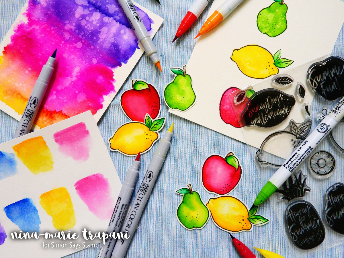
Studio Monday with Nina-Marie: Zig Marker Comparison
Hello crafters and Happy Monday! Have you tried out the Zig Clean Color FELT brush markers yet? Well if you haven’t, then you’ll want to check out today’s video because I am going to demonstrate the felt brush markers for you! I’ll also show you some of the differences between these and the REAL BRUSH Clean Color markers we all know and love.
Most of you are by now familiar with the Zig Clean Color Real Brush markers; these are a favorite coloring medium amongst many of the designers here at Simon and are featured regularly. Just recently Simon has started carrying the Zig Clean Color Felt Brush markers. With the same color palette as the Real Brush, these Felt Brush markers are a perfect compliment to the Real Brush, or as a stand-alone medium.
Because each of these have their own brush type, this means there are some differences between the two markers. I also find that each marker performs certain techniques better. We are going to dive into all of this in the post and the video below.
Note: In all examples, I used Strathmore Bristol Smooth paper for my coloring. Most people – myself included – get great results when using Zig Markers with this paper.
THE NIBS & MARKER BODIES
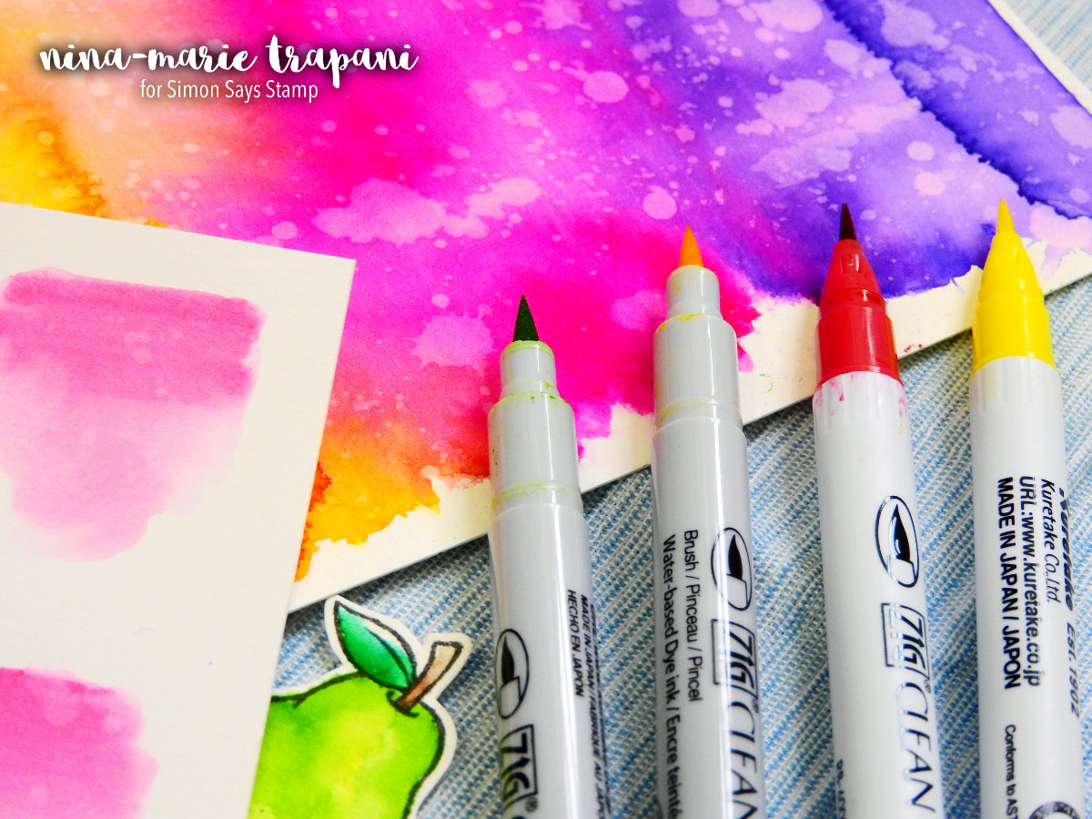
The first noticeable differences you’ll see between the Felt and Real Brush markers are the nib and the barrel differences. The Felt brush markers have a firm felt tip, whereas the Real Brush markers are made of flexible nylon bristles.
The Felt brush markers have a shorter body than the Real Brush markers; I cannot verify this, but I would assume this means they may hold slightly less ink than the Real Brush markers. The barrels of the Felt markers are gray, and the Real Brush markers are white. This makes it easy to distinguish them from one another.
Both markers have their corresponding ink color marked on the bottoms; this is another great reference feature.
As for the caps, only the Felt markers have the color number listed on them; the Real Brush marker caps are plain. But both Real Brush and Felt both have the color numbers listed on the sides.
COLORING DIFFERENCES
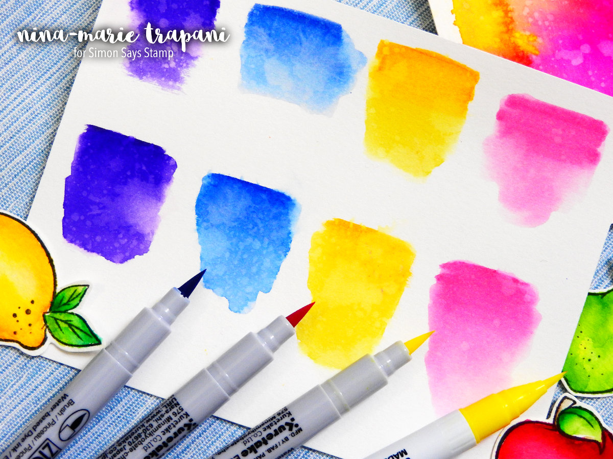
My initial curiosity when first trying out these markers was would they both act the same when used on paper or would there be distinct differences between them? The answer is somewhere in the middle… while there are certain aspects about these markers that are similar, there are other areas in which the markers behave different from the other.
One big difference is how they react when used as a watercolor medium applied directly to paper. The Real Brush markers blend with even just a small amount of water almost instantly. The Felt markers however take a bit more water and/or effort to get them to blend. I believe this has a lot to do with the make up of the inks themselves.
Both markers are listed as water-based pigments, but the Felt brush markers also are listed as a dye ink. I noticed that the ink seeped into the paper a lot faster with the Felt brush markers than the Real Brush. The ink from the Real Brush markers sit on top of the paper longer.
That said, you can still get watercolor effects with both, as demonstrated in the photo above. When applied directly to paper, I feel you get best results with the Real Brush markers. The Felt brush markers – when applied direct to paper – seem to dry faster.
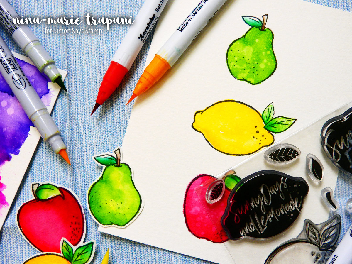
When applying the Felt brush markers to a slick surface, picking up the pigment with a water brush and applying the ink-coated paintbrush onto paper, you get better watercolor results. When Real Brush markers are applied to a slick surface and you pick up the pigment, the colors are much less saturated and not as intense. This method allows you to have better control of the intensity of the Felt brush marker’s pigment, as seen in the photo below.
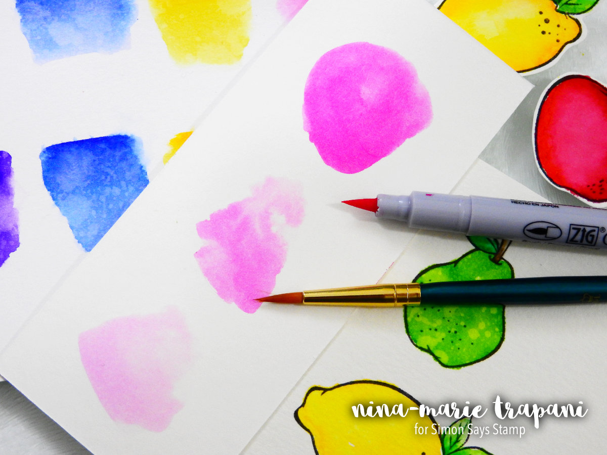
In this example I applied some pink Felt brush marker onto a palette; I then used a strong amount of pigment to paint the top swatch of color. The next two swatches have more water gradually added to the pigment on my palette. As you can see, the results got lighter the more water I added to the pigment. This is where I find the Felt brush markers shine when used as a watercolor.
COLORING STAMPED IMAGES
With the Real Brush markers, most everyone colors onto the paper and blends out with water for a watercolor effect. The Felt brush markers of course produce this same effect but you also have the ability to color layer them as well.
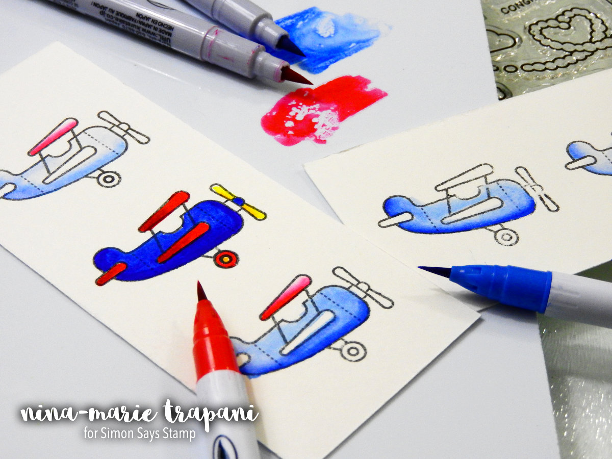
The only trick to color layering with the Felt brush markers is that you need to let areas dry after they’ve had a good amount of ink already applied. The Felt brush markers have a tendency to pill the paper if you overwork an area too quickly. But the results of the color layering look great if done with care, as seen in the airplane example above (see the middle airplane on the left).
I colored this airplane with two shades of each Felt tip marker and you can see I got pretty smooth results. Again, I made sure not to overwork any areas. If I were going to need to go back over an area, I would wait until the first layer had a chance to dry for a few minutes before going back in with more color.
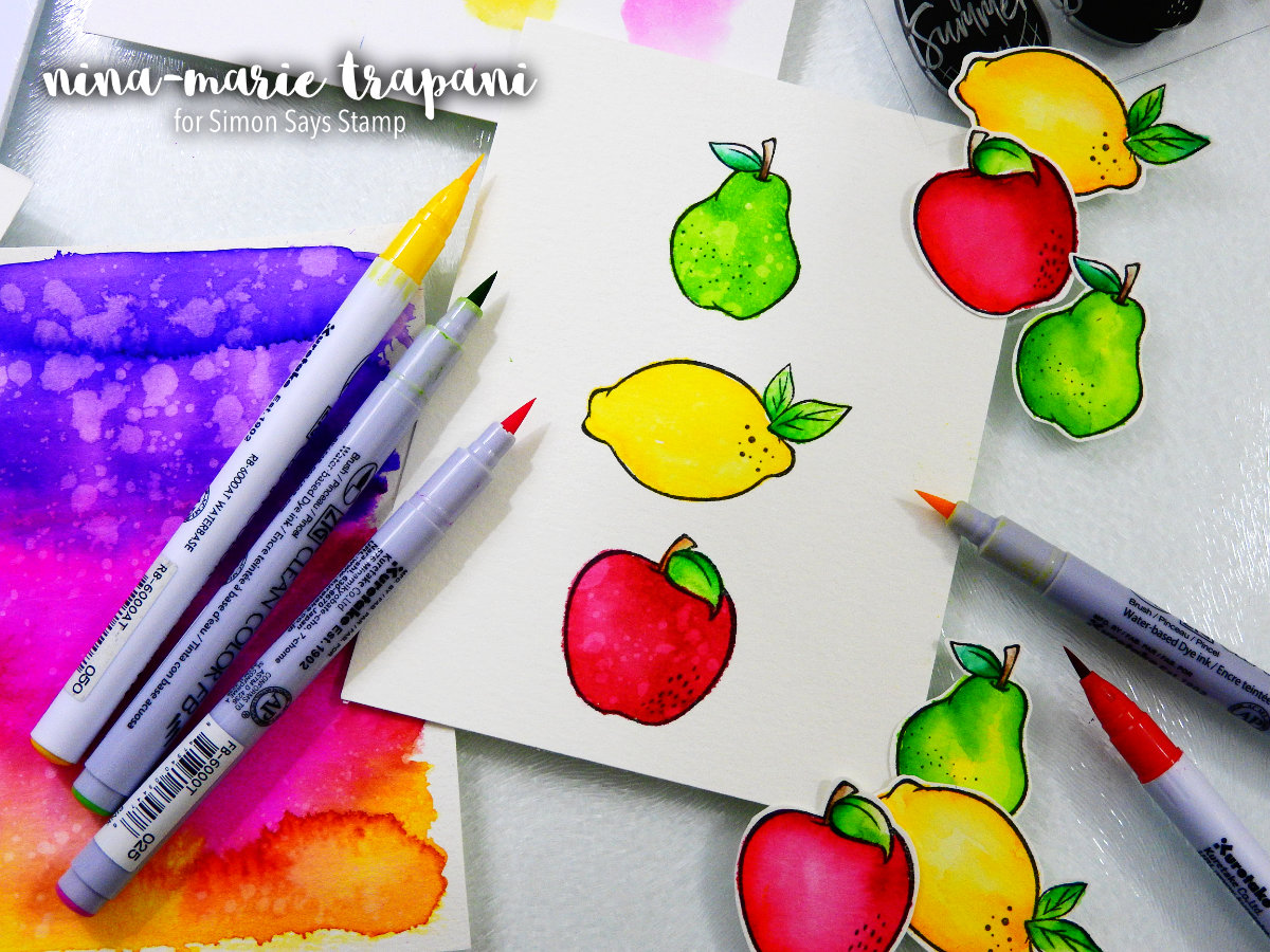
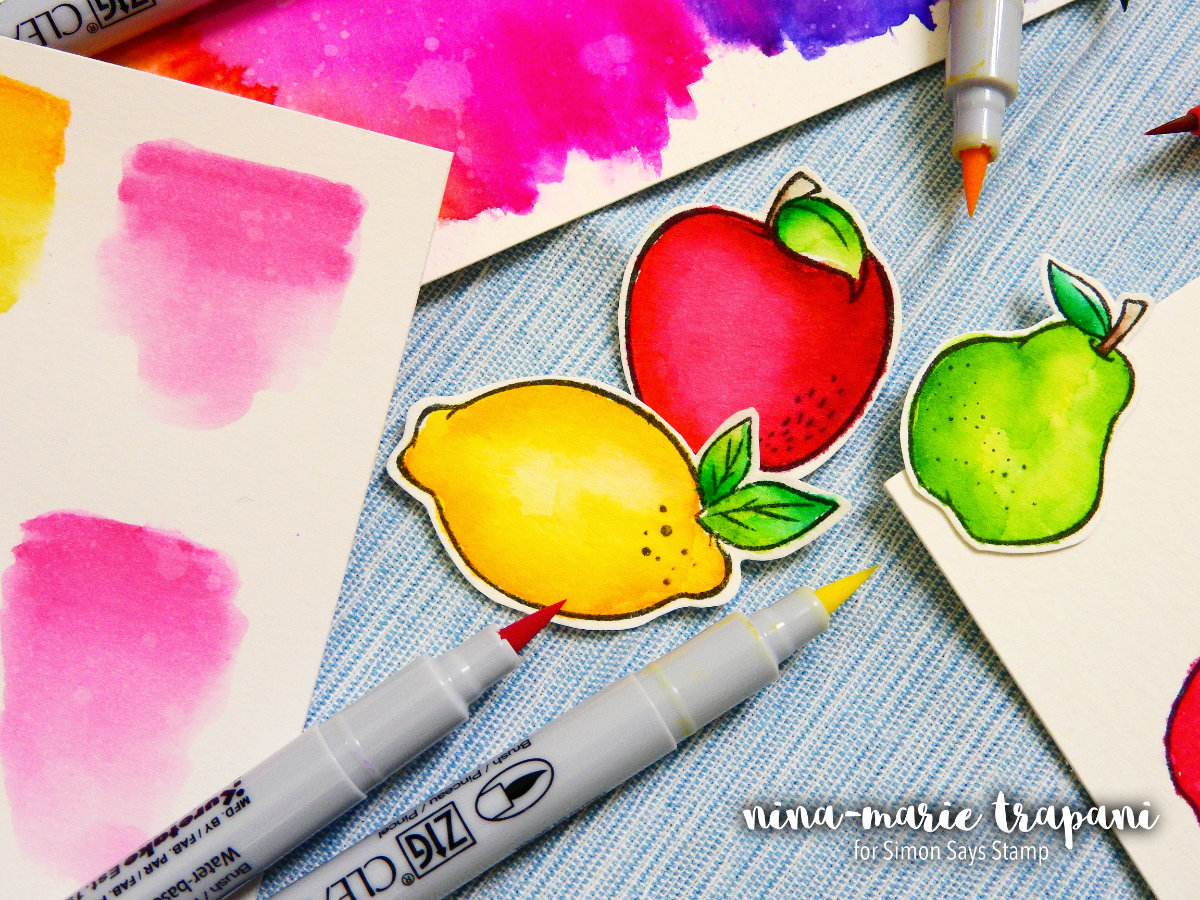
Another fun aspect about both markers is that they react to water beautifully when adding splatters over top. In the example above, I colored each image with one single color of the Felt brush markers and then added water splatters. The result leaves a great variegated finish to the coloring, and you almost can’t even tell that just one marker color was used on each image!
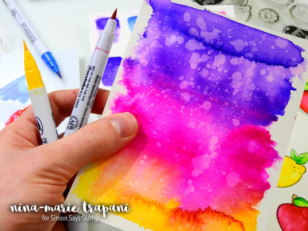
You can also create vivid backgrounds with both of these markers. Because most of you have already seen the Real Brush markers in action, the next example below was done with the Felt brush markers. I scribbled three areas of color onto the paper and then used a wet brush to blend the colors together. Again, because this was done with the Felt brush markers, I used quite a bit of water to get the blended results, but you can see that the intensity of the color stayed intact. Isn’t the color blending gorgeous!?
Yet another thing that you can use the Felt brush markers for is to highlight areas of your watercoloring done with the Real Brush markers. Because the marker colors are exactly the same between the Real Brush and Felt brush markers, you can use the two interchangeably on the same project and not notice any difference in color. I love the Felt brush markers for their detailed nib, whereas the Real Brush tip is a little less precise because of its flexible nature. So by pairing the two together, you have even more creative avenues to explore!
Be sure to check out the video below to see these markers in action and watch the demonstrations of everything I talked about! I hope today’s post and video helps you to decide if you need to add one or both of these markers to your crafty-stash; I had a lot of fun experimenting with these new Felt Brush markers and I think you will too!
Thanks for stopping by and visiting with me today! And until next week, have a fabulous day everyone!
SUPPLIES


Blog Candy Alert!! Follow our blog via email and comment on this post for a chance to win grab bags and blog candy! Remember to tag your awesome projects with #simonsaysstamp on social media so we can see what you are creating!
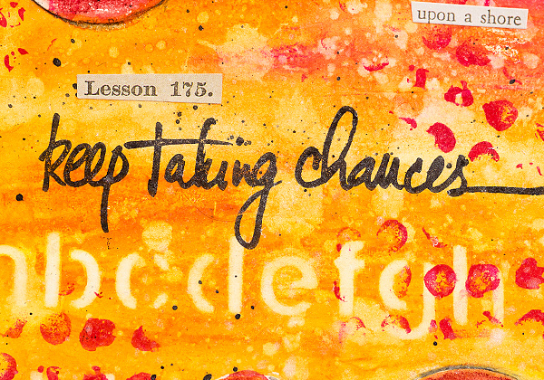
Take Chances Journal Page
Hi friends! Happy Sunday! Please read on for a very special art journal entry from Anna-Karin Evaldsson and enjoy!
Hi everyone! I am so happy to be here today with a fun and easy tutorial for you. I was in the mood for an art journal page, but the techniques work just as well for cardmaking, scrapbooking, tags or 3-D projects.
I try to avoid adding bulky and dimensional elements to my art journal pages, since I don’t want to crack the spine of the book. It is also easier to work on the remaining pages in the book if there aren’t lots of bulky items. But, I still want to create layers and a dimensional look in my art journals, and in this tutorial, I will show you some techniques for how you can do just that, without creating very bulky pages.
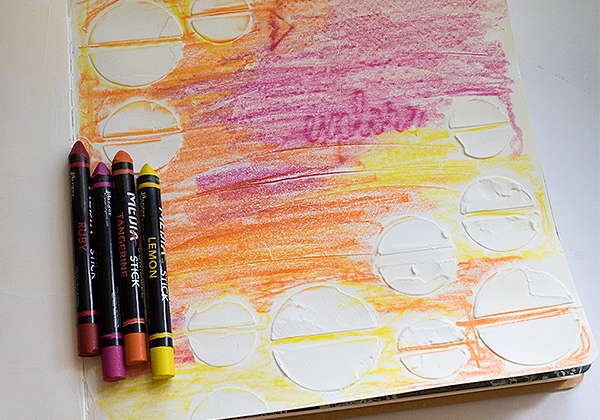
I used mainly products by Dina Wakley and Ranger. I really like Dina’s Scribble Sticks and they are so easy to work with and mess free. You can apply the color directly to the page, or pick it up with a paint brush from the tip of the crayon.
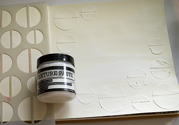
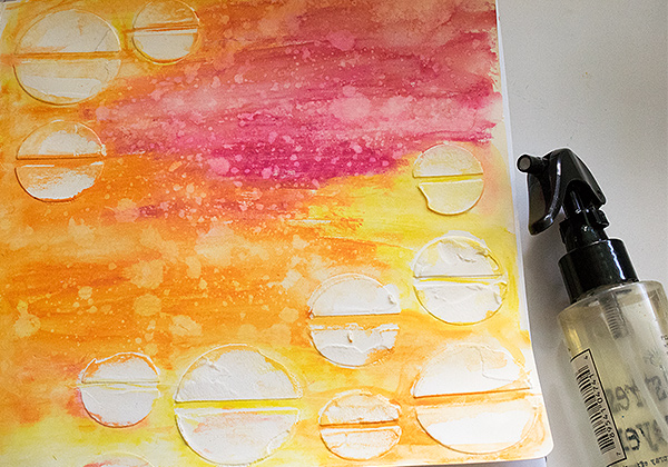
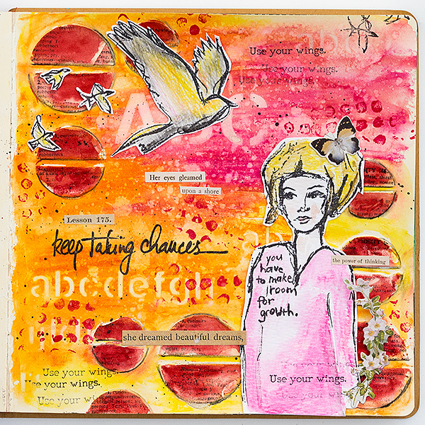
1. Start by applying gesso to a page in a Dylusions journal. I used the square journal. When the gesso is dry, smear Texture Paste through the Halves stencil. Leave to dry.
2. Scribble Scribble Sticks all over the page, avoiding the circles (but it doesn’t matter if some gets on the circles). By surprise, I got an ‘explore’ rubbing from the page underneath, a technique I will explore some other time.
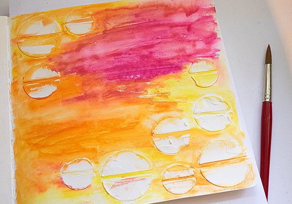
3. Dissolve and blend the Scribble Sticks with water and a paint brush. You can blot some off, if you think the shade is too strong.
4. Spray droplets on the page with Tim Holtz’s Distress Sprayer. Press the lever about half-way to create drops instead of mist. Blot off with a paper towel. This step creates instant texture.
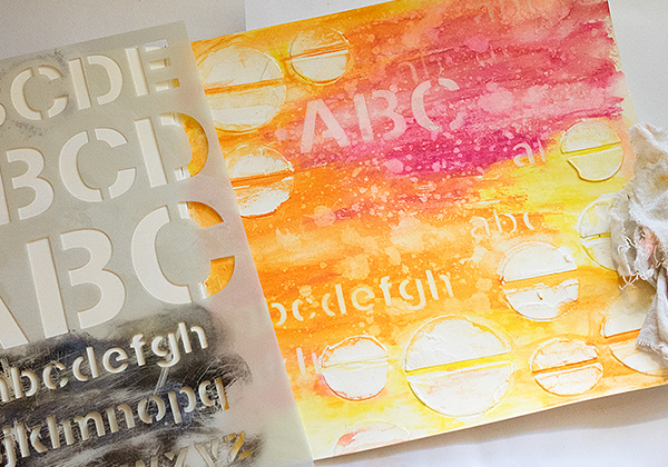
5. Place a stencil on the background and use a slightly wet cloth to remove colour through the stencil.
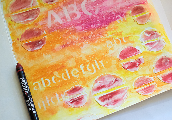
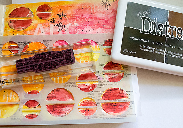
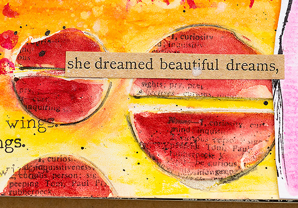
6. I wanted the circles to be mainly red, so I applied the red Scribble Stick over them, varying the pressure, to get different shades.
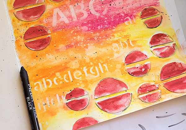
7. Dissolve the red colour with a paint brush and water. If you want a stronger shade of red, you can keep on adding red by picking it up with the paint brush from the tip of the crayon. Pick up pigment from the black crayon with a fine brush and paint a shadow around the circles. You can also flick a paint brush against the tip of the Scribble Stick to make great splatters. Just put some water on the crayon first.
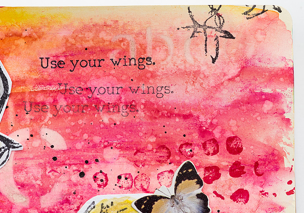
8. When the page is dry, place the stencil back and stamp through it with a text stamp. I used a Tim Holt’s stamp which defines the word ‘curiosity’.
9. Stamp dots here and there with Dina’s Ruby Archival Ink, from her Mixed Media palette.
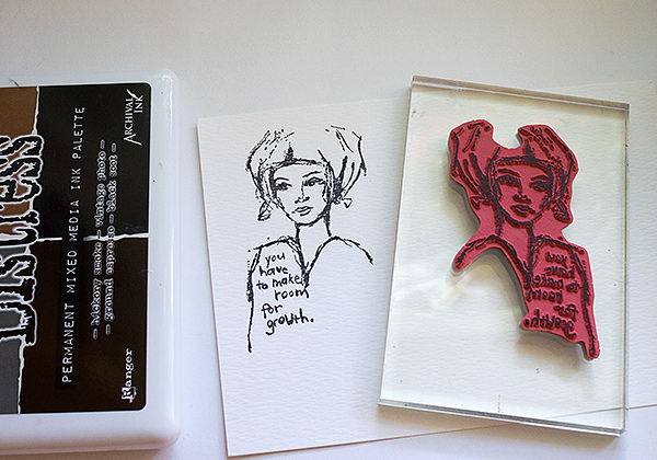
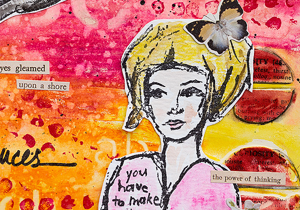
10. Stamp a woman on watercolor paper with Black Soot Archival Ink. You need to use a waterproof ink for this step.
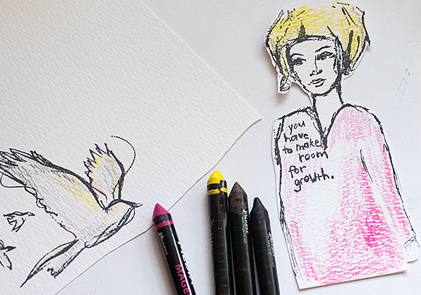
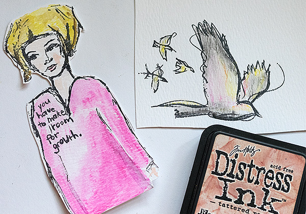
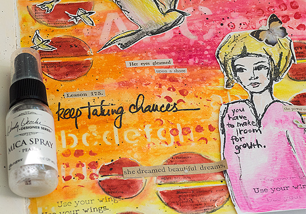
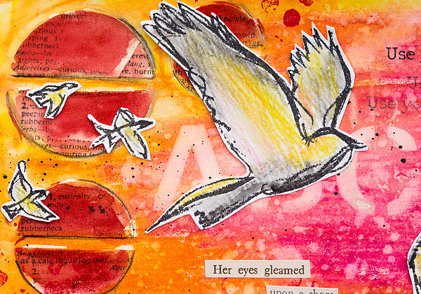
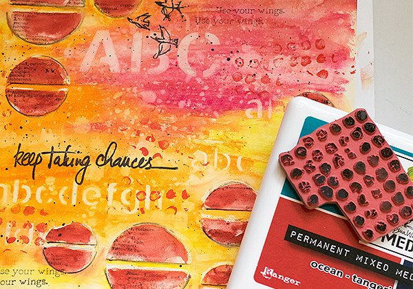
11. Extend her body with a marker and then scribble on color. I avoided the skin areas since I was planning something else for them. I also stamped some Scribbly Birds in Flight and colored them.
12. Tattered Rose Distress Ink is a great shade for skin color. I pressed it on an acrylic block, misted with water and picked up with a paint brush. Dissolve the Scribble Sticks with water and a paint brush.
13. Finally, I wanted to add some shine to my page and misted it with Pearl Mica Spray.
14. I thought the birds fit with the theme of the page, and I also really like birds.
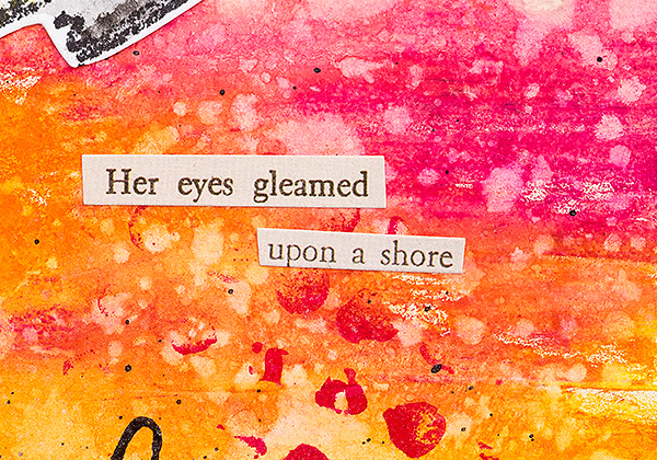
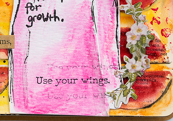
15. For my sentiments, I used Tim Holtz’s Clippings Stickers and had such fun looking for and combining phrases from the sticker sheets.
16. The title comes from Dina’s lovely Handwritten Quotes set.
17. I like the look of the partial stamping on the dots and the shadows add dimension to the page.
18. She is holding a flower in her hand from Tim’s Botanical Layers set.
19. I also added a butterfly to her hair, from the same set.
20. Sometimes, I like to stamp a small sentiment more than once without reinking, and this one was stamped on three different places on the page, three times each time. Here you can also see the layers of color, stencilling, splattering and stamping.
I hope you enjoyed this tutorial and that it inspired you to play around with stencils, stamps and background techniques.
Thank you so much for looking!
Happy crafting!
Anna-Karin
Supplies:
 |
 |
 |
 |
 |
 |
 |
 |
 |
 |
 |
 |
 |
 |
 |
 |
 |
 |
 |
 |
|
|
|
Thanks for reading today, and thanks to Anna-Karin for being our guest!