NEW Pretty Pink Posh Card Designs!
Hi friends! Happy Wednesday! Please welcome a new special guest to our blog today! Pretty Pink Posh designer, Lexa Levana has made two gorgeous cards to inspire you! Please read on and enjoy!
Hello everyone! Lexa here today with two cards featuring some of Pretty Pink Posh new release. Let’s begin with the first card I made.
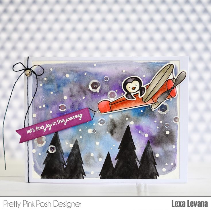
I start my card with an idea of a night sky in mind, so I created one using Zig Kuretake Gansai Tambi watercolor. I use some blue, purple and black paints. I love how vibrant and gorgeous this watercolor is, I finished my night sky with some white paint splatter. To create some tree’s silhouettes I stamped the trees from Winter Friends with Black Soot Distress Ink and fill them with black watercolor paint. After all the paints dried up, I add some Texture Paste along with SSS Falling Snow Stencil upside down. I stamped the plane (Fly Away Friends) and a penguin with Versafine Black Ink and watercolor them using Distress Markers. It looks so adorable on the plane, don’t you agree? I created the fishtail banner using some strip of leftovers and blended Seedless Preserves Distress Ink and white embossed the sentiment.
Here’s a closer look of my first card, I add some shimmer using the Gansai Tambi watercolor but it’s so hard to capture it on a picture. I never forget the PPP Sparkling Clear Sequins, the love is real. Hehe. Let’s go to my second card which screams summer!
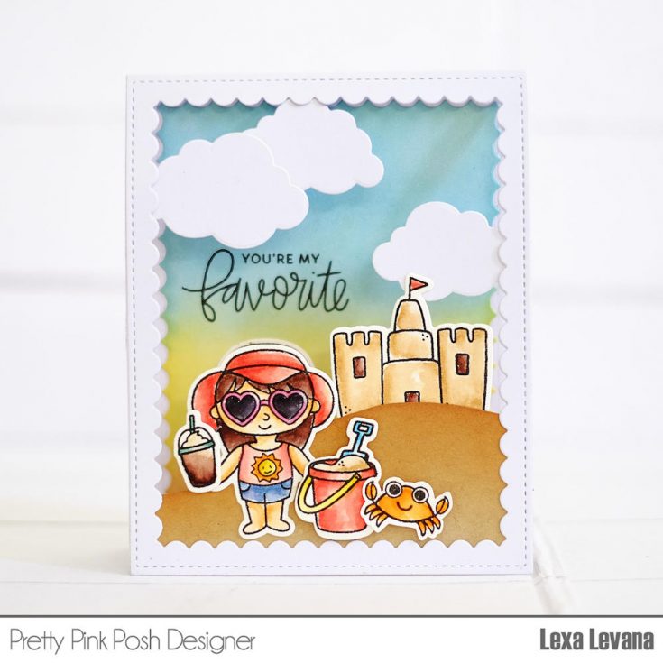
For my second card, I got my inspiration from both of my kids who really really love to play sand whenever we go to the beach. This time I created a window card with a little surprise inside. This popular set from PPP is a real deal, it’s super cute! Summer Friends stamp set has really cute beach elements that everyone needs. I stamped all the images with Versafine Black Ink and watercolor them with Distress Markers. I created the sand hill with kraft cardstock and blended Tea Dye Distress Ink on the top part to create dimensions and shades. The Scallop Frames is just perfect for this card. I also die cut some clouds using Rainy Days Coordinating Dies in two sizes and it completes the beach scene. Not forget mentioning my most favorite crab from Sea Friends to accompany the little girl in the front.
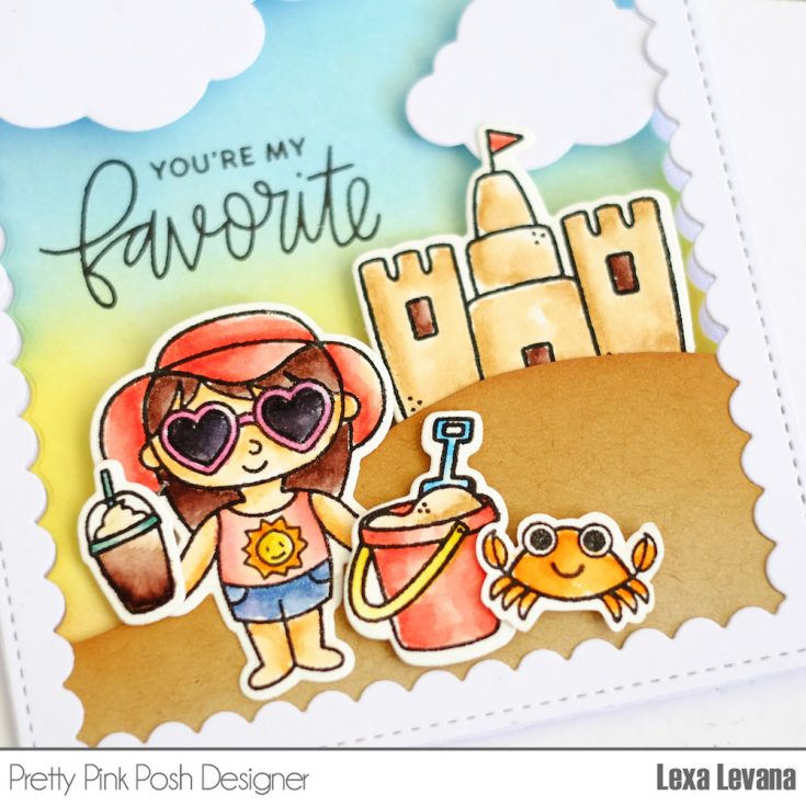
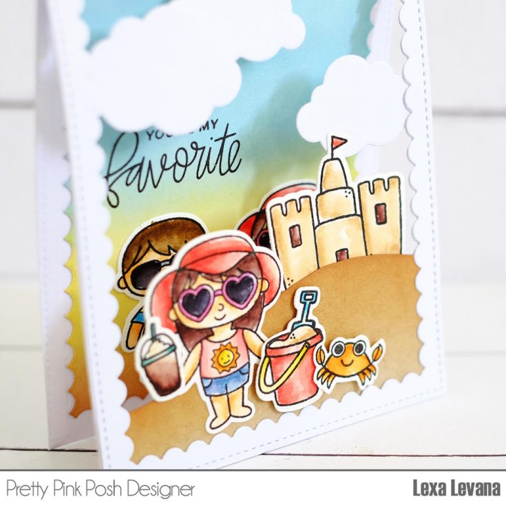
On inside I blended some Distress Inks (Tumbled Glass, Squeezed Lemonade, Tea Dye) to create a little scene and of course the sky for both outside and inside’s scenes. I also stamped the sentiment “You Are My Favorite” from Friends Forever Stamp Set.
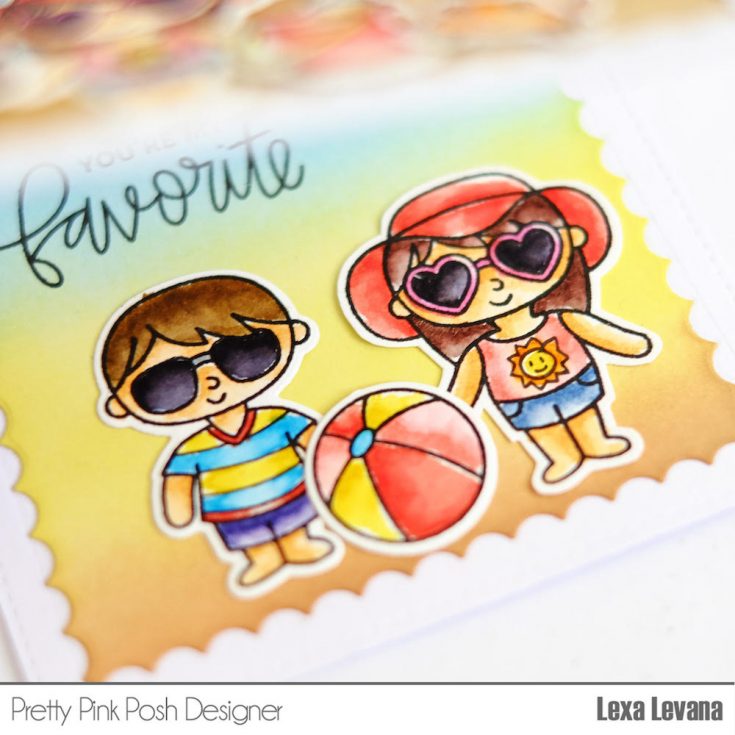
Look who are waiting for you inside? They represent both of my son and daughter as they play together and have fun on the beach. Oh, did you notice that I add a sun on the girl’s tee and some stripes for the boy’s? :) I really hope you guys like my cards, which one is your favorite? Let me know. Thank you so much for stopping by today and have a wonderful day!
SUPPLIES:
 |
 |
 |
 |
 |
 |
 |
 |
 |
 |
 |
 |
 |
 |
 |
 |
 |
 |
 |
 |
 |
 |
 |
 |
Thanks so much for reading today, and thanks to Lexa for being our guest!

Blog Candy Alert!! Follow our blog via email and comment on this post for a chance to win a special blog candy!
Distress Foiling with ThermoWeb 3 Ways + Embracing Your Imperfections
Hi crafters, it’s Nina-Marie here with you and I am really excited to be sharing a few foiling techniques today! I’ve shared some other foiling ideas before but today I wanted to focus on something a little bit different. In my previous foiling tutorials, I’ve shared how to get great foiled results. I know you all really enjoyed the techniques in that video, but I also know that sometimes we can get less-than-perfect results with a technique, especially if we are new to it. Foiling is one of those techniques that can take a bit of getting used to, so its easy to get an “imperfect” result.
So in today’s video I am going to share both “distressed” foiling and also a tip for fixing a foiling mistake! These “distressed” foiling techniques are SO easy to recreate because you don’t have the pressure of making sure your design is foiled perfectly. I hope you enjoy!
Note: For all of these cards, I used a laminator to adhere the foil to my cards and I used ThermOWeb foiling products.
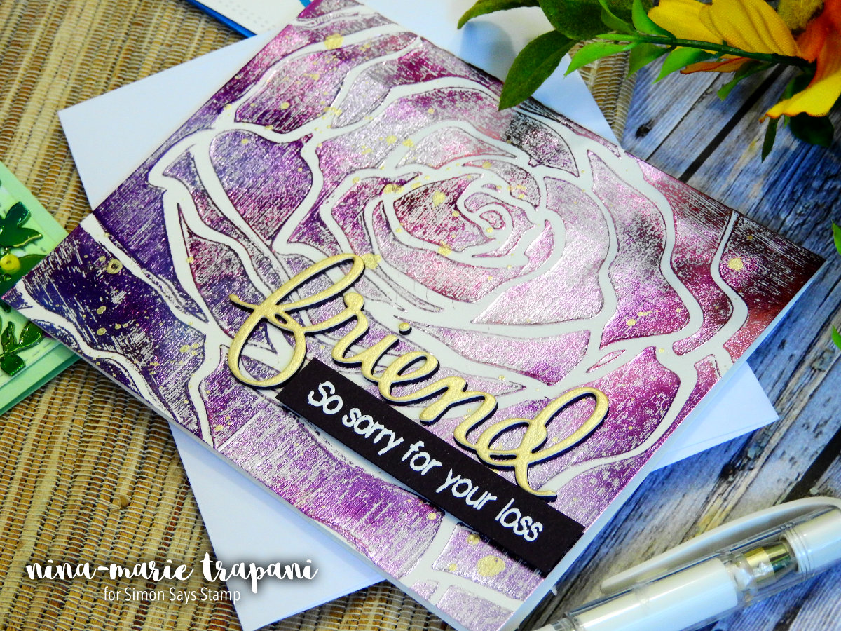
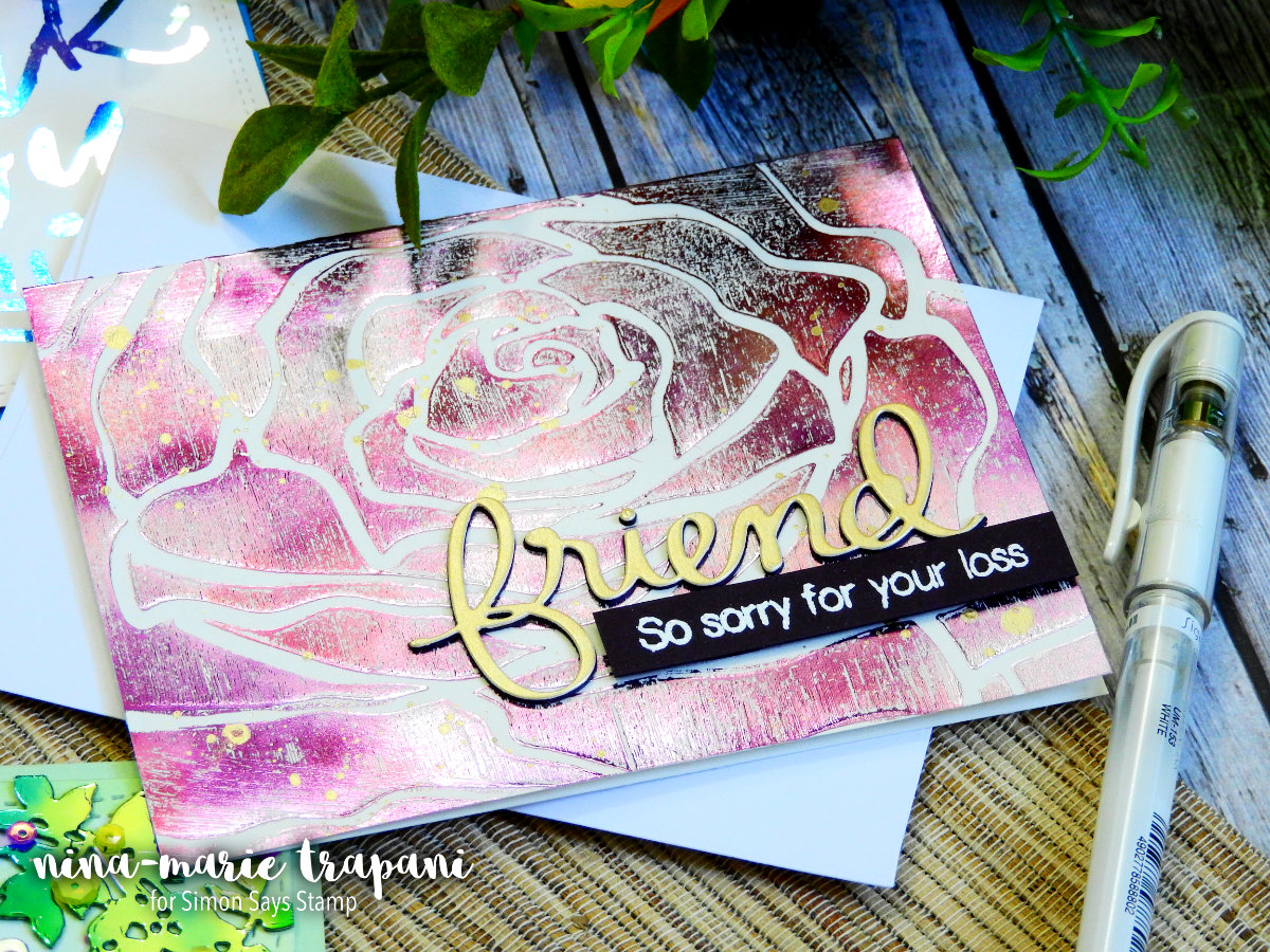
This purple rose is the first technique I share in the video (you can find the video down at the bottom of this post). The rose is from an Altenew stencil and I applied ThermOWeb Transfer Gel onto it using an ink blending tool. Normally I would apply transfer gel with a palette knife and it would have made for a smooth, dimensional finish. But because I applied the paste in a thin coating using the blending tool, it produced a very textured effect. It also took very little time to dry because the gel was such a thin coat. For foiling, I used the gorgeous Amethyst Watercolor foil.
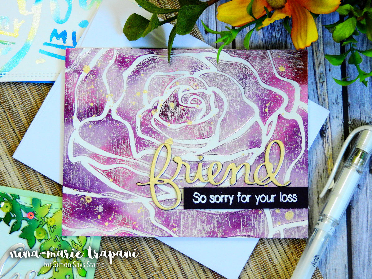
I finished the card by cutting a “friend” sentiment using a Mama Elephant die and a supporting sentiment from Altenew was heat embossed onto dark purple cardstock. I love the effect of applying transfer gel in the traditional method, but I am now also addicted to adding gel in this manner as well!
My second card features ThermOWeb’s adhesive-backed Toner Sheets, which are EXTREMELY handy for foiling and then adhering intricate die cuts. I paired the Toner Sheets with another watercolor foil from ThermOWeb: Emerald.
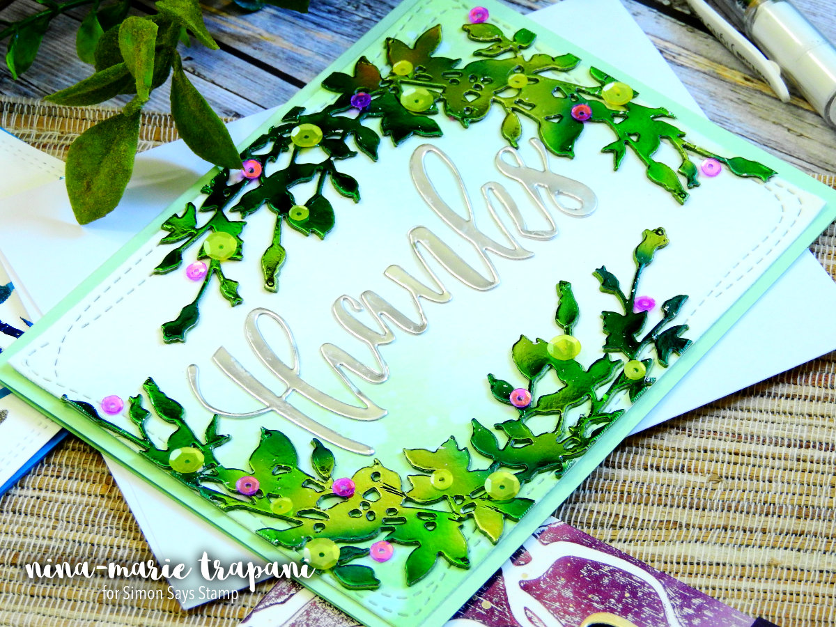
These die cuts were actually foiled perfectly and I wasn’t planning on “distressing” them… but as I created my card, I accidentally scratched off some of the foil on the die cuts. At first I was really bummed… as much as I love distressed foiling, I also enjoy seeing a perfectly foiled piece. Honestly, either way its a win-win! But because I was planning on having these die cuts be “perfect”, there was some disappointment. But, I don’t like giving up on a project. Usually there is a way to fix it! So, I continued on and I decided to hide my mistake by attaching sequins over the scratched-off foil areas. And in the end, it turned out totally perfect; even more so than I was expecting!
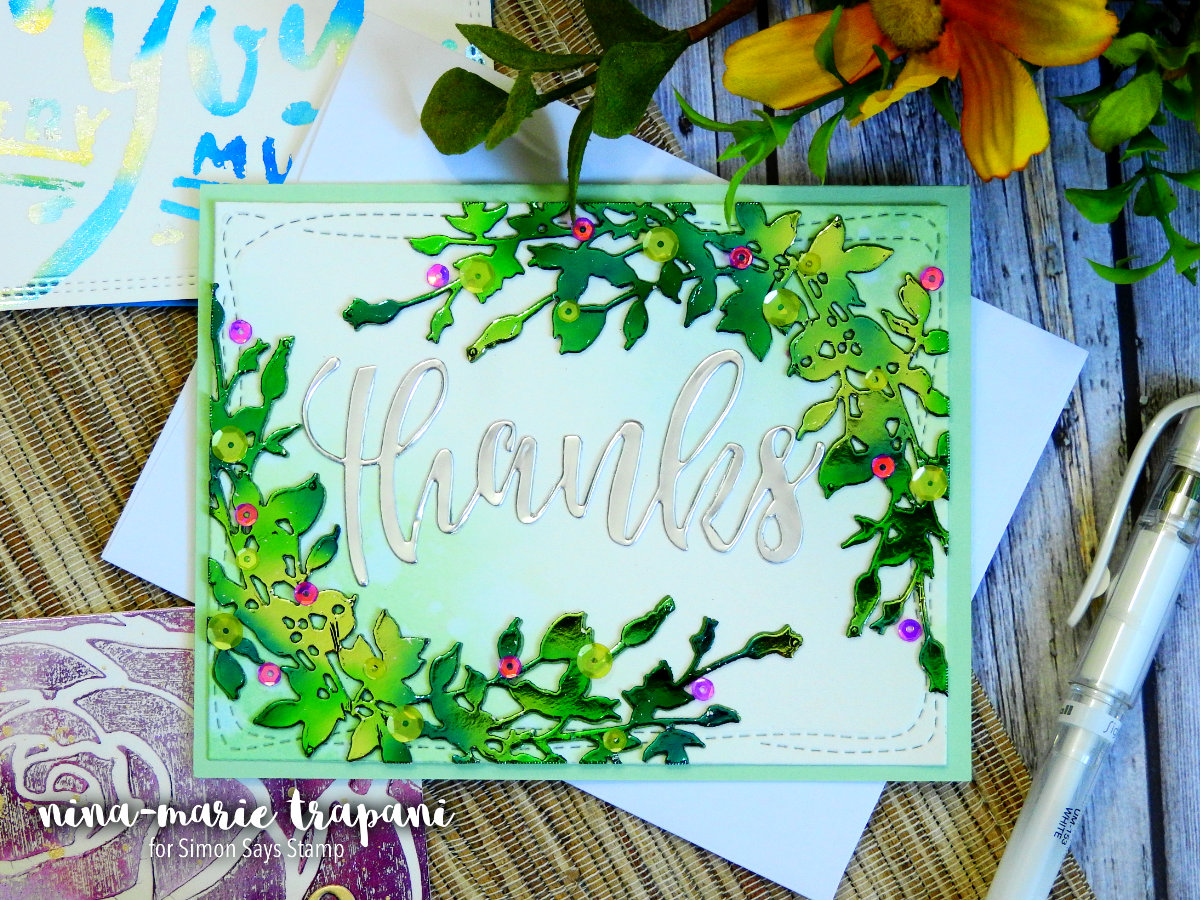
The foiled leaves were cut with Altenew’s Leafy Garland die and the sequin “berries” were from Pretty Pink Posh’s Lemon Drop and Fairytale Fuchsia collections. I added ink blending behind the leaves using Cracked Pistachio Distress Oxide inks; there are water spots added to the ink blending to add a bit of variation to the background.
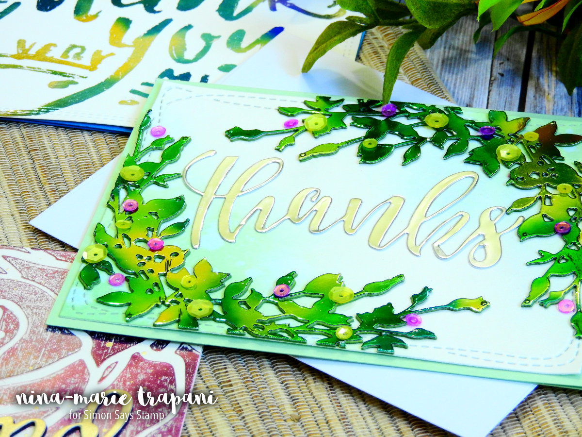
And that beautiful script thanks? That was foiled with ThermOWeb’s silver foil and some adhesive-backed toner sheets. Because of the adhesive-backing on the toner sheets, that made attaching the intricate die cut SO simple!
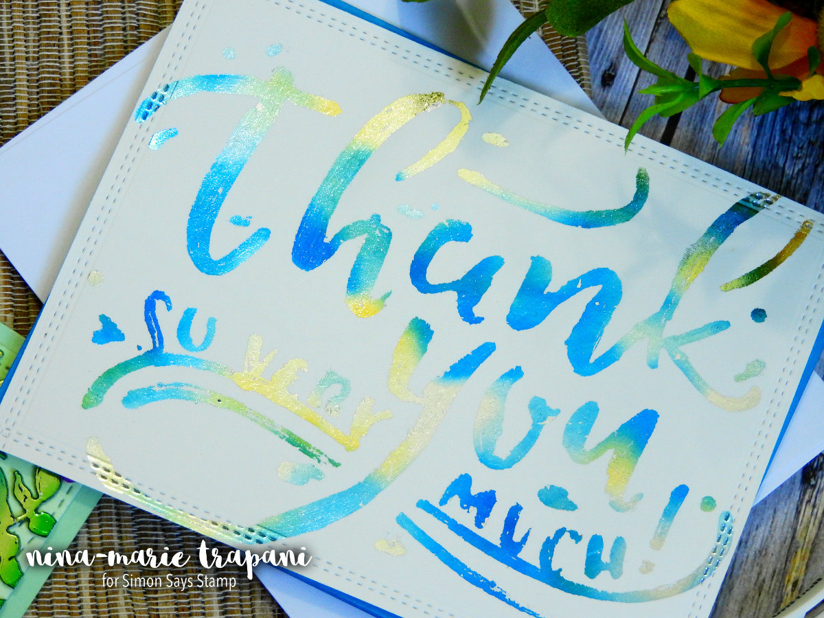
One more card (can you tell I was having a lot of fun with the foiling? I tell you, it’s addicting)! This time I wanted to stencil a sentiment onto my paper using a glue pen. ThermOWeb has a great glue pen that works really well for adding small foiled details.
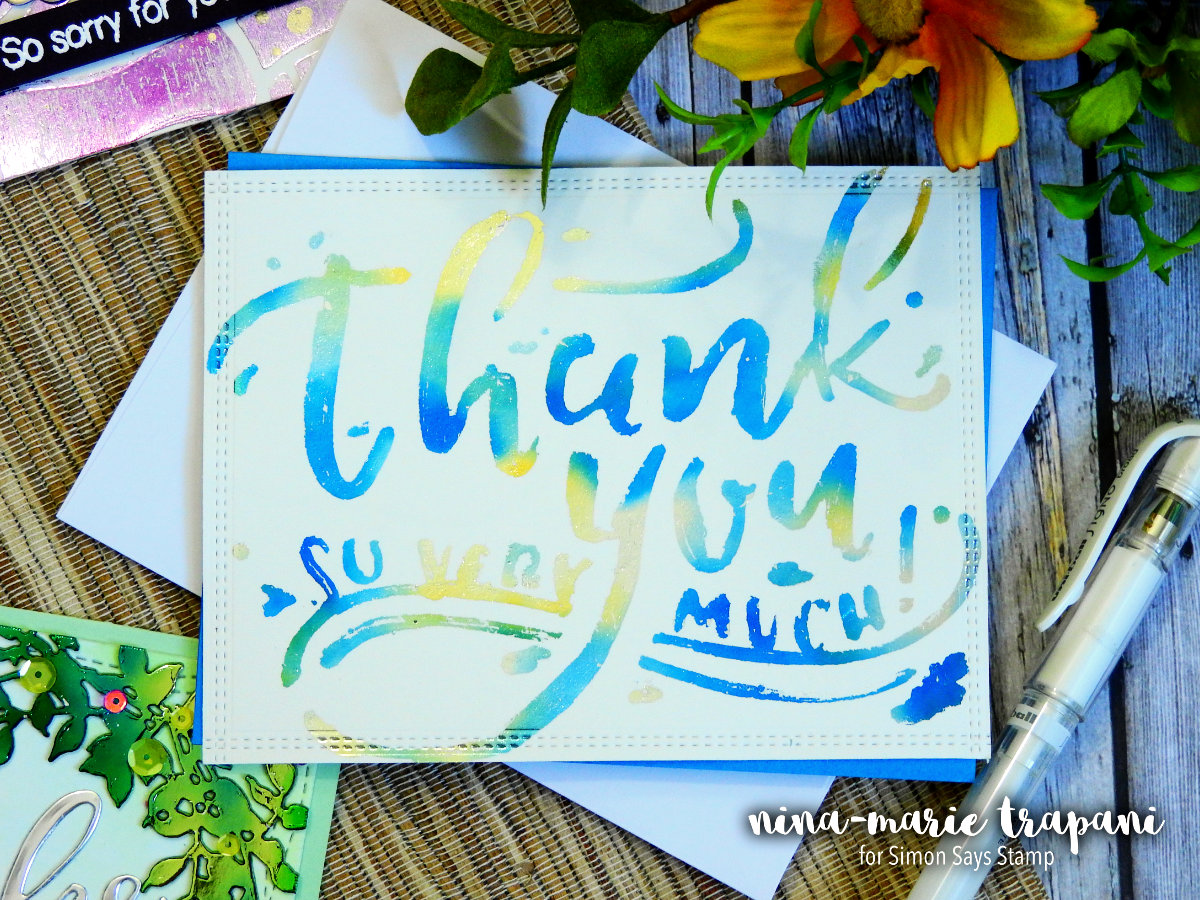
The stencil I chose for this card is from a pack of fun stencils from Faber Castell. I applied the glue pen into the negative areas of the stencil, being careful to “skip” a little. This way when I went to foil the design, it wouldn’t be a perfect transfer. As you can see from the picture, there are small areas where the foil didn’t adhere to the paper because there was little-to-no glue there.
Again I used a watercolor foil (they are my favorite) from ThermOWeb; this time in Lapis. To mimic the watercolor feel of the foil and the sentiment itself, I used the glue pen and added “splatters” around the sentiment. This allowed me to place scraps of foil over those glue spots and create the look of watercolor splatters on the background.
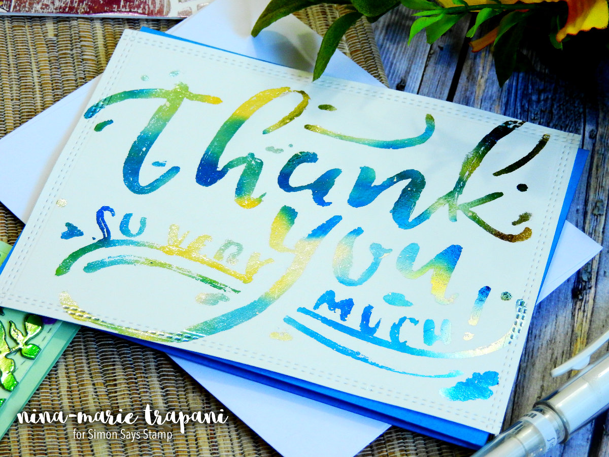
I kept this card super simple because that sentiment is the star of the show! Using a My Favorite Things Basic Stitch Line die, I added stitching details around the edges of the panel and then matted that piece with a Island Blue card base. By mounting my foiled panel on a slight angle, that allowed the blue card base to peek through and compliment the blue in the foiling.
These were so much fun to make! I really hope it encourages you to embrace your mistakes and things we might perceive as “imperfections” as actually works of art. Because we are all artists with our own unique styles – our cards shine when we allow our creativity to flow freely! Thanks for visiting with me today… I’ll see you again on Monday!
WATCH THE VIDEO
SUPPLIES


Congrats! Blog Candy Winners!
From: Studio Monday with Nina-Marie: Encouragement Cards for Kids: Jean Marmo!
From: In the Garden Burlap Panel by Emma Williams: BunnyD!
From: Brand NEW Sunny Studio Inspiration!: Mary Shaw!
From: Exclusive NEW Stamps & Dies from Cathy Zielske: Available NOW! Marjorie Dumontier!
Please email [email protected] with your mailing address (if applicable), the name of the blog you won from, and the prize you won to claim your prize!
Blog Candy Alert!! Follow our blog via email and comment on this post for a chance to win grab bags and blog candy! Remember to tag your awesome projects with #simonsaysstamp on social media so we can see what you are creating!
Studio Monday with Nina-Marie: Encouragement Cards for Kids
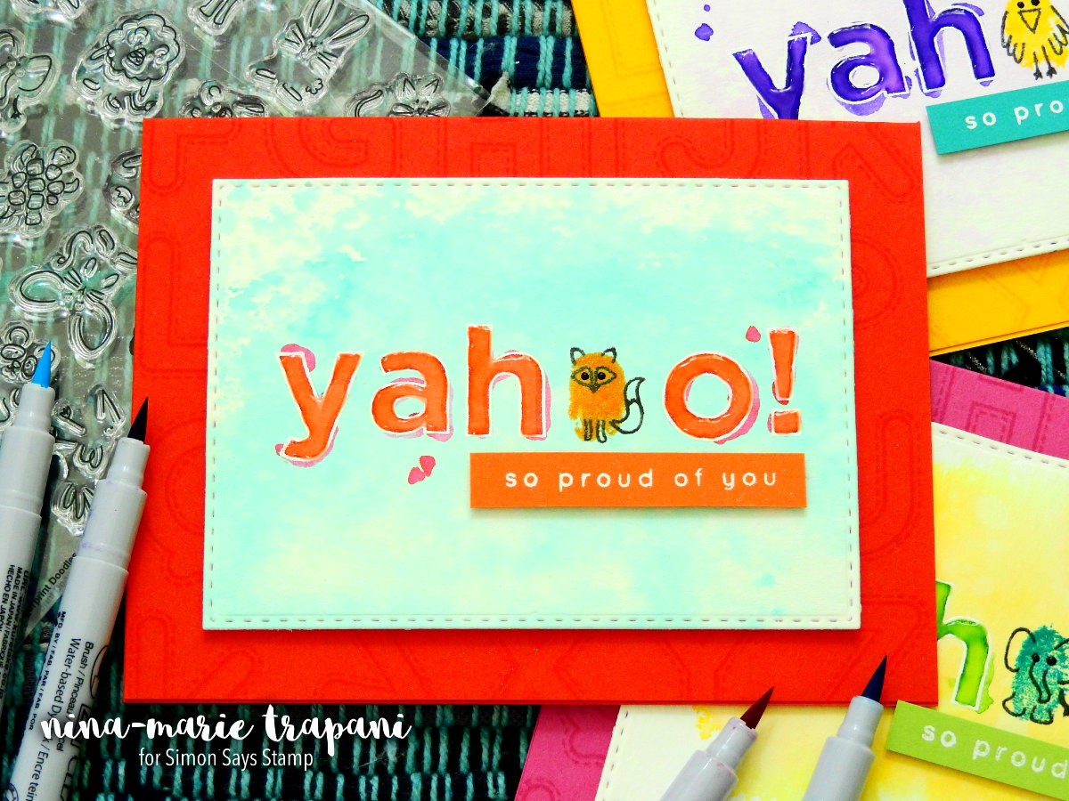
Hello crafters, welcome back to a new Studio Monday video! Here at Simon Says Stamp we just had two BIG releases jam-packed with products that are perfect for encouraging the ones we love. Today I wanted to feature some of those products in a card set geared towards kids but could also be used for adults too!
There are a few easy techniques incorporated into these cards; one of which is watercolor smooshing. This is a really fun and easy way to achieve a watercolor effect with little thinking or planning involved.
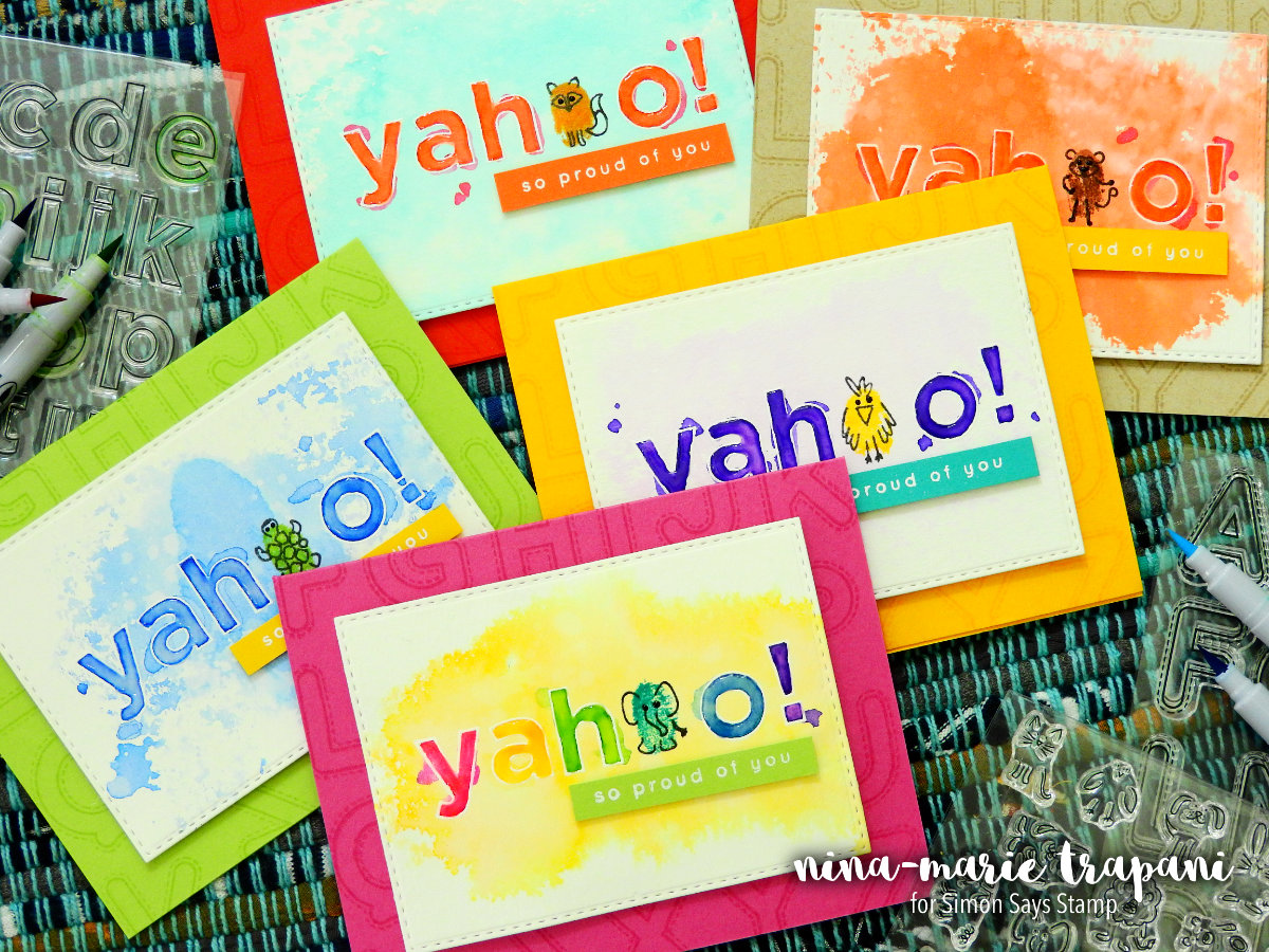
I used a combination of both Zig Clean Color Felt and Real Brush markers with an Art Impressions palette to achieve the smooshing technique; however you can also do this same smooshing technique using any sort of slick surface.
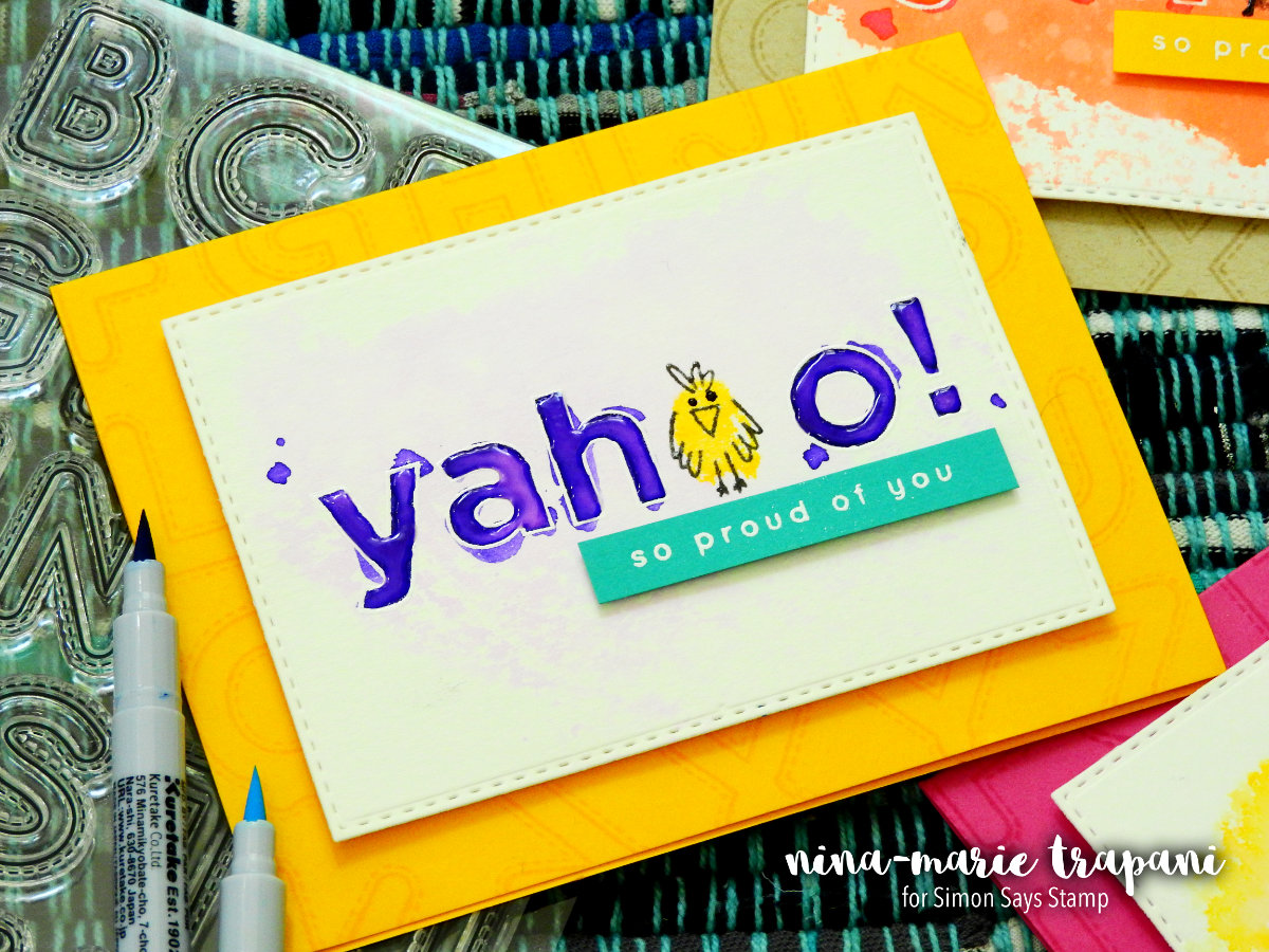
The “yahoo” sentiment was stamped with one of the new Simon Exclusive CZ Design stamp sets; Everett Alphas. In place of one of O’s in the sentiment, I used the adorable Fingerprint Doodles stamp set and added little critters onto each of the cards. You could make this even more “authentic” by stamping your own fingerprint instead of using the fingerprint images included in the stamp set.
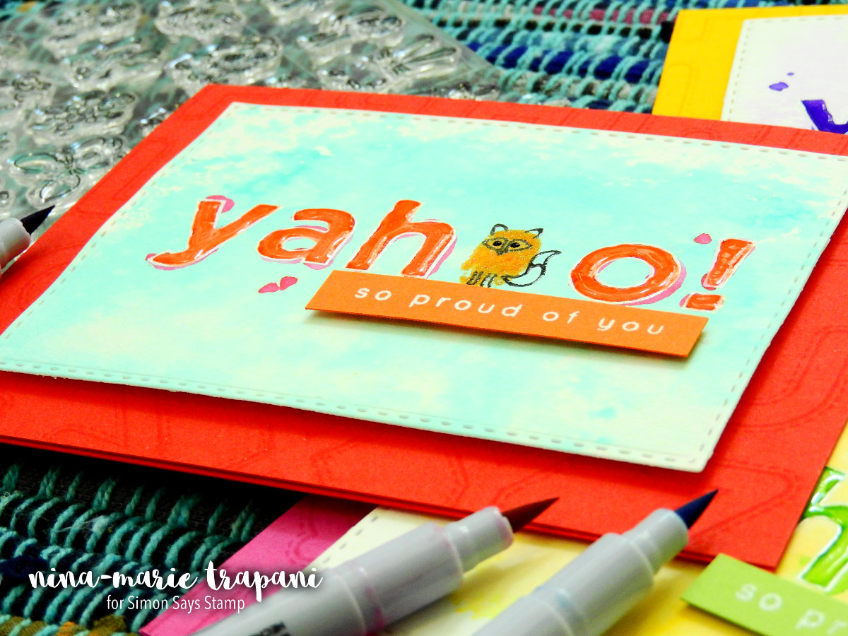
The supporting sentiment “so proud of you” is heat embossed onto coordinating colors of cardstock strips. Isn’t it fun to create your own sentiments by making use of letter stamps?
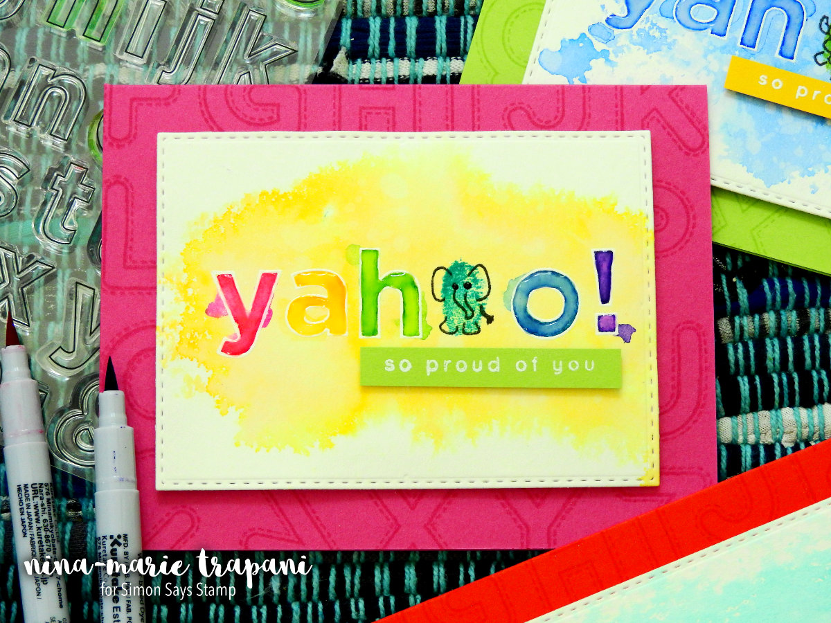
To finish up the cards, I put my stamped and watercolored panels onto card bases that are decorated with Simon’s new Stitched Alphabets stamp set. I wanted a bit of texture and pattern on the card bases, but nothing distracting. Using embossing ink, I was able to get a tone-on-tone effect that coordinates perfectly with the card design. To stamp those alphabet letters I did not remove them from the stamp packaging; this saved time in not having to line them onto a block or MISTI tool!
The watercolor smooshing technique is really fun and in the video I share some other tips and tricks as well… even a fix for a mistake I made during the creation process! I hope you enjoyed today’s post and will check out the video below to see how these cards came together! Thanks for stopping by; I’ll be back again tomorrow with more crafty inspiration to share with you!
WATCH THE VIDEO
SUPPLIES


Blog Candy Alert!! Follow our blog via email and comment on this post for a chance to win grab bags and blog candy! Remember to tag your awesome projects with #simonsaysstamp on social media so we can see what you are creating!