Amore Laura Fadora: Hello Hot Mama
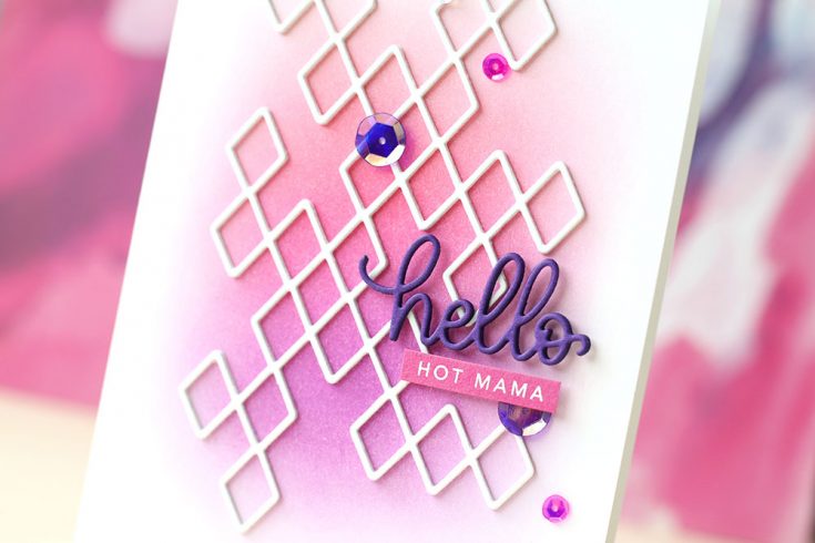
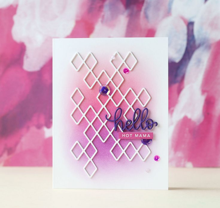
Hi friends! TGIF! Welcome to the first edition of Amore, Laura Fadora for 2018! The always fun and creative Laura Bassen takes us a creative approach to a blend of Hot Mama, Watermelon, and Doll Pink for this gorgeous outcome! Watch the video for additional details, and enjoy!
WATCH THE VIDEO:
SUPPLIES:
|


Thanks for reading today and thanks to Laura for being our guest!

Blog Candy Alert!! Follow our blog via email and comment on this post for a chance to win a special blog candy!
Congrats! Blog Candy Winners!
From: Using the Pantone Color of the Year: Ultra Violet: Maureen Reiss!
From: Color Coordinates: Skyline Thanks: Tara Prince!
From: Heffy Doodle Interactive Inspiration + 20% off Sale!: Jodi Warren!
From: Mind and Body: Art Journaling with Shari Carroll: Holly Klingensmith!
From: Sassy Days: Tricia Ann!
From: Amore Laura Fadora: Flip Over Hello: Danielle Dietz!
From: Newton’s Nook Designs: Winter Woofs!: Marjorie Dumontier!
From: What Would Kelly Make: Volume 14!: Denise Bryant!
Please email [email protected] with the name of the blog you won from, the prize you won, and your address (if applicable) to redeem your prize(s)!
Monthly Mail Art with Kristina Werner – January 2018
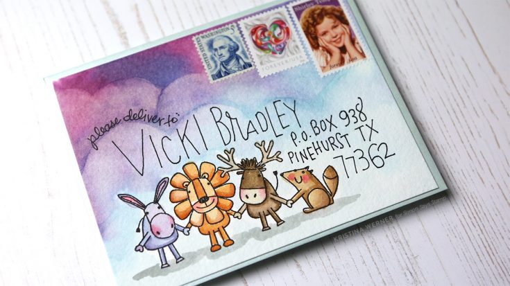
Hi all! Kristina here. I’m back with another year of Monthly Mail Art! I’m so excited to start of 2018 with a fun, watercolored envelope.
I love the soft blue color of a Metallic Sea Glass Envelope, but also wanted to watercolor the images from the new Best Friends stamp set. Watercoloring on the envelope wouldn’t give a good result, so I decided to cut a piece of Strathmore Cold Press Watercolor paper to the size of the envelope, paint my scene, and then adhere the watercolor paper to the envelope. You could also create a custom envelope out of watercolor paper if you wanted to skip the adhering step.
After stamping the animals image from the Best Friends stamp set in Versafine Onyx Black ink, I watercolored the scene using Distress Inks. And I addressed the envelope using an Extra Fine Envelope Addressing Pen from Pilot.
NOTE: Mailing address used with permission. Thanks, Vicki!
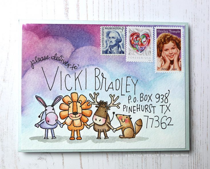
To make sure the watercolor paper was adhered completely on the edges, I used X-Press It Tape. This allowed me to apply the adhesive right up to the cut edge of the watercolor paper. I pressed the watercolor piece onto the envelope and then added my return address to the flap on the back.
I hope you enjoy today’s envelope video! Thanks for stopping by!
Supplies
|


Using the Pantone Color of the Year: Ultra Violet
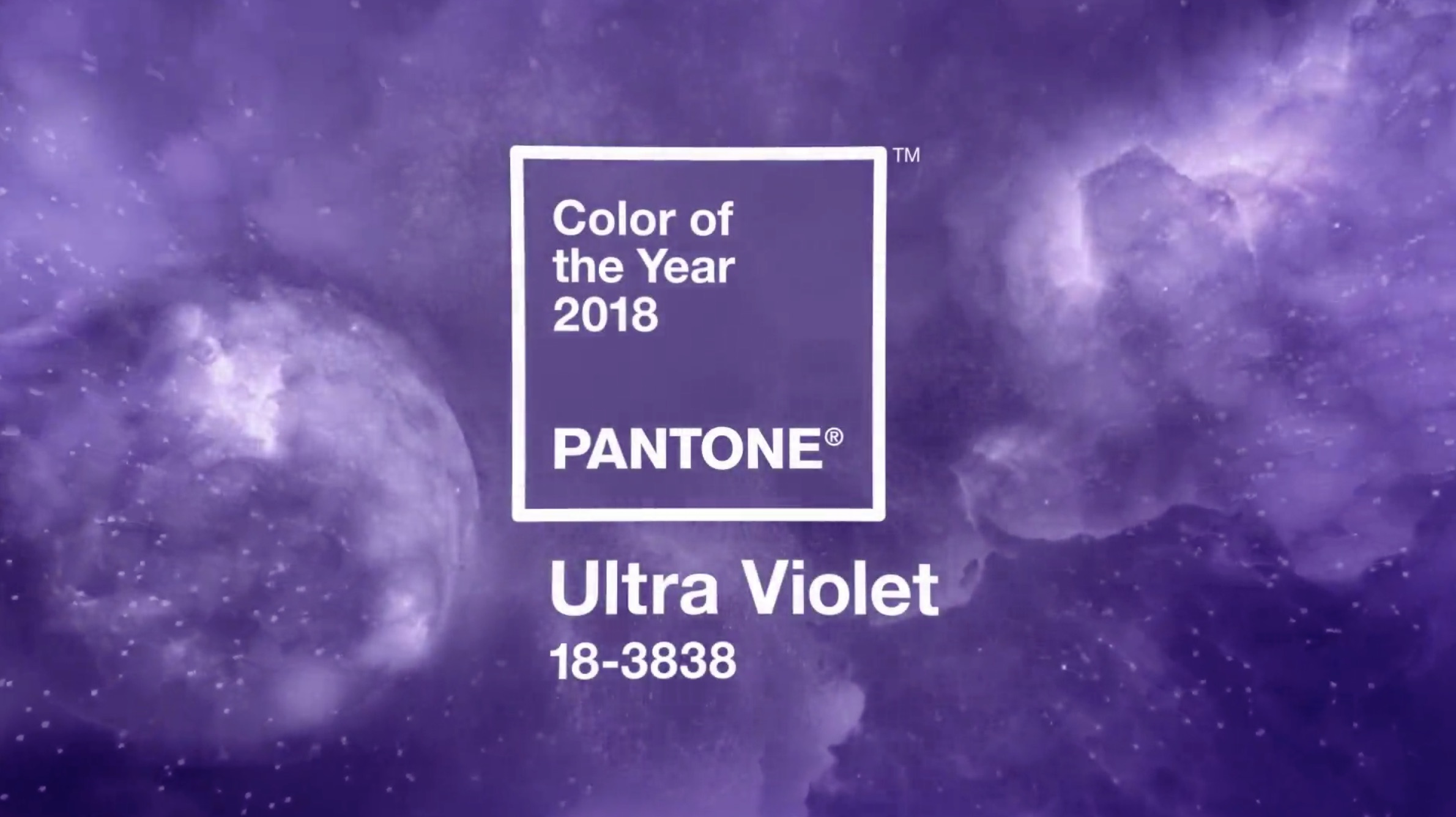
Hello crafters and Happy Wednesday! Are you a fan of purple? If you are, then I have a feeling you will be seeing quite a bit of it this year! Pantone, considered the color authority across many industries, has dubbed 2018 as the year of Ultra Violet! It is a stunning color, don’t you think?
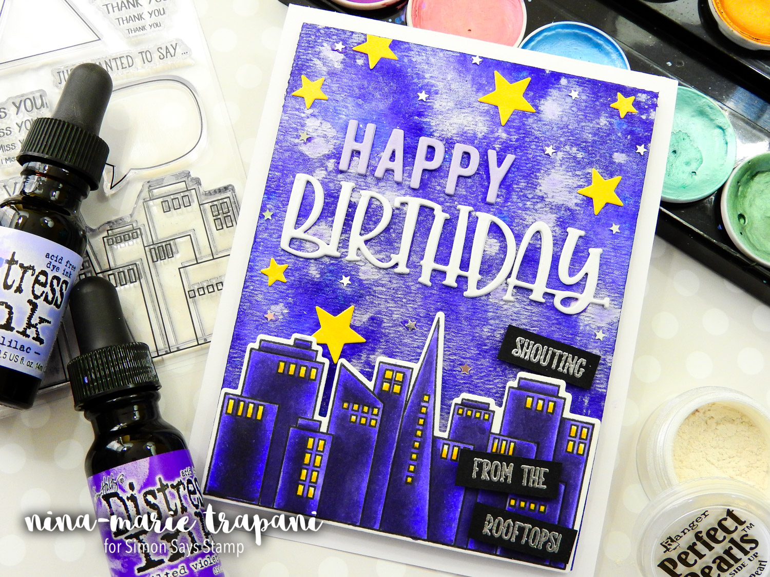
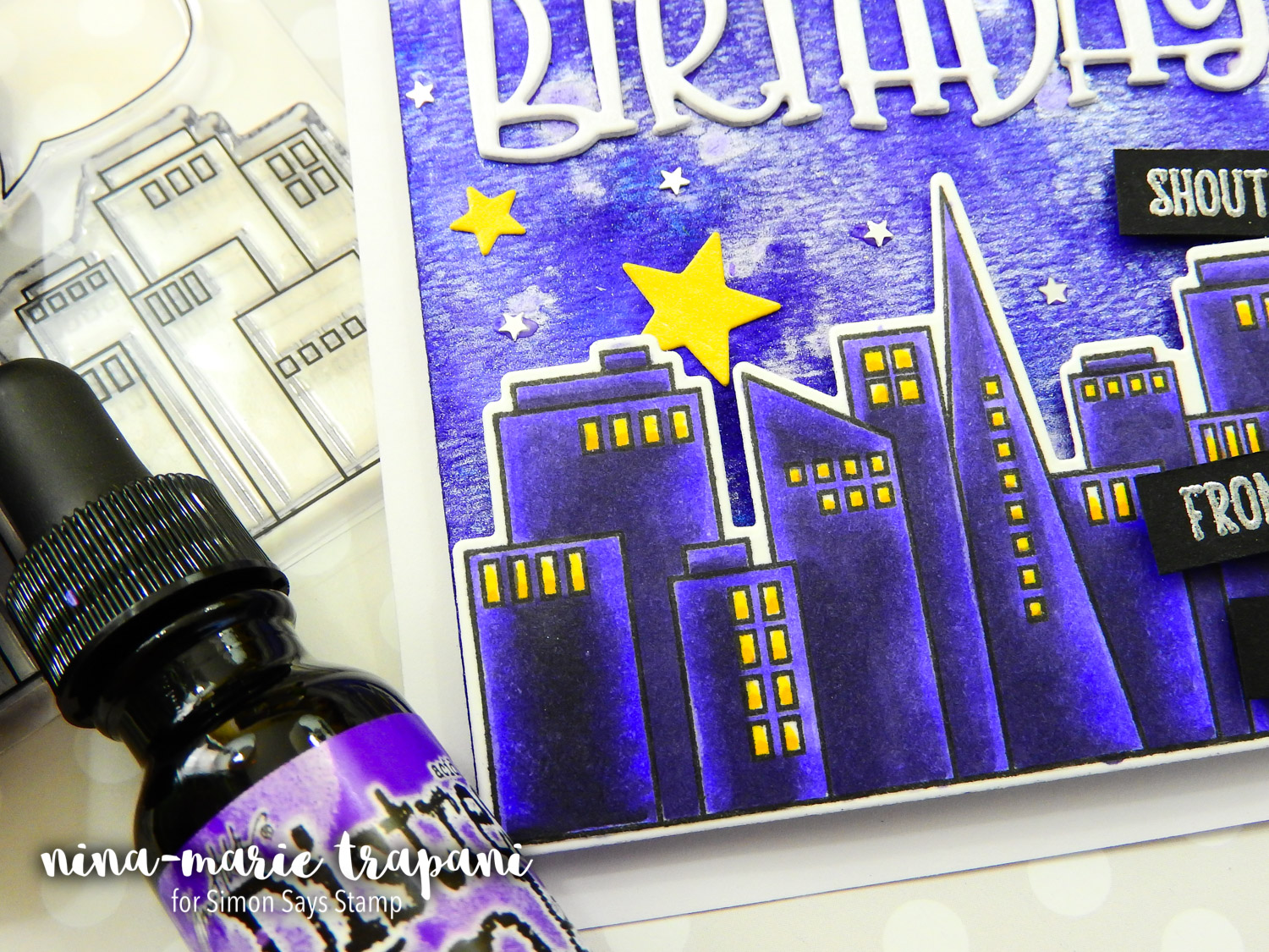
Today I have a project to share with you that features not only some of our newest Simon Brand products, but also LOADS of Ultra Violet details! Our From the Rooftops stamp set was the perfect focal image for the card; colored in rich purples to mimic the lighting in the galaxy-styled sky, the buildings truly pop.
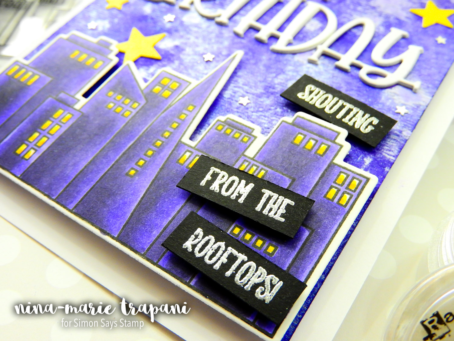
Speaking of the sky in the background of this card… this was so much fun to make and honestly, quite easy (the hardest part was waiting for it to air dry!). Have you ever tried dropping Distress Ink refills onto wet paper? It is a technique similar to dropping alcohol inks onto Yupo paper. The refills bloom and move with the water, creating some amazing effects with very little effort. To make this background really stand out, I sprinkled on a bit of Perfect Pearls and Ultra Violet Metallic Accents from Prima. The final result is amazing!
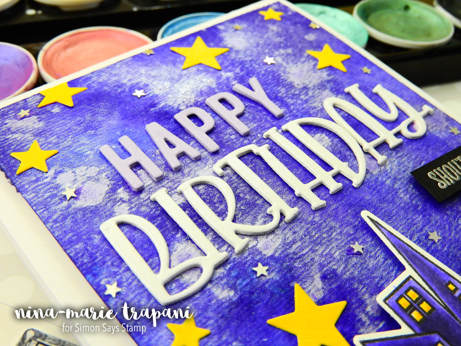
The fun birthday greeting is also a new! This awesome Simon die called Happy Birthday has a really playful feel to it, which looked awesome paired with the cityscape! Both the sentiment and the golden stars are cut from DCWV Shimmer Pastels Cardstock. Accenting the golden stars are some Mini Silver Stars confetti from Pretty Pink Posh.
Don’t forget to tune in to the video below to see how this card came together and watch the techniques I used to make it! I hope this card has inspired you to use some purples in your next card! Remember too, that if purple isn’t your favorite color, you could recreate this card using any color you like! If you do use a different color, I challenge you to try using just a single color as the dominant tone, as I did with the Ultra Violets here.
Thanks for visiting me today!
WATCH THE VIDEO
SUPPLIES USED
|


Blog Candy Alert!! Follow our blog via email and comment on this post for a chance to win grab bags and blog candy! Remember to tag your awesome projects with #simonsaysstamp on social media so we can see what you are creating!