Magical Butterflies Art Journal Page
Hi friends! Please join me in a warm welcome back to special guest Anna-Karin Evaldsson with this gorgeous Butterfly Burlap project! Be sure to scroll through for lots of step by step still shots and enjoy!
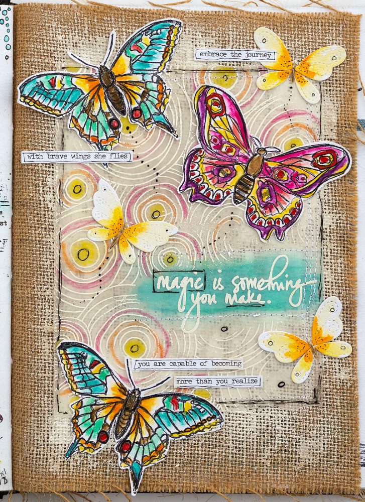
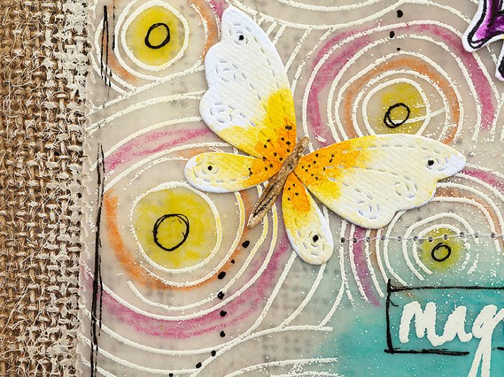
Hi everyone! I am so happy to be here today with a fun and easy tutorial. Spring has arrived in full and I particularly like the shades of green that are now appearing everywhere and the long days. Butterflies are always fun to include in a project and especially fun to color. Today, I wanted to use some pretty large butterflies so that they would really be the focus of my page. Even though I made an art journal page, the techniques work on any kind of project: cardmaking, scrapbooking, tags etc.
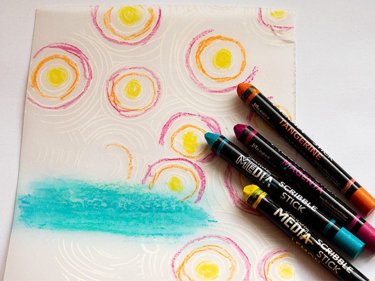
Dina Wakley’s Media Journal is a favorite of mine since it contains four different, interesting surfaces: cotton-rag watercolor paper, canvas, kraft paper, and burlap. Recently, someone asked me about the burlap pages and how they can be used, which gave me the idea to work on one of the burlap pages in this tutorial. It gives really great texture and is wonderful for layering. The butterflies were colored with Dina’s Scribble Sticks. Let’s start.
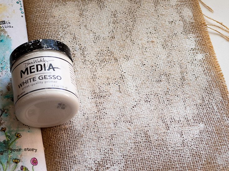
1. I wanted more variation in the background and painted most of the burlap page with gesso, except for around the edges. You need to place a thick piece of paper, or a non-stick mat underneath, otherwise the gesso will seep through to the next page.
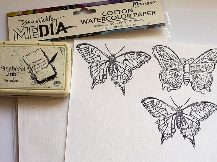
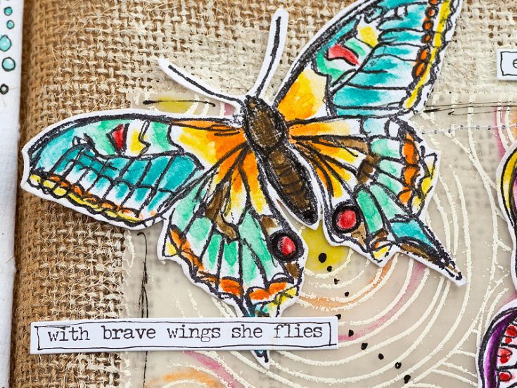
2. The butterflies were stamped with Archival Jet Black ink on Dina’s Cotton Watercolor paper, which has almost a fabric feel to it. It is such a joy to work on.
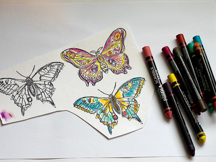
3. Color the butterflies roughly with Scribble Sticks. I used sticks from Set 1 and Set 2.
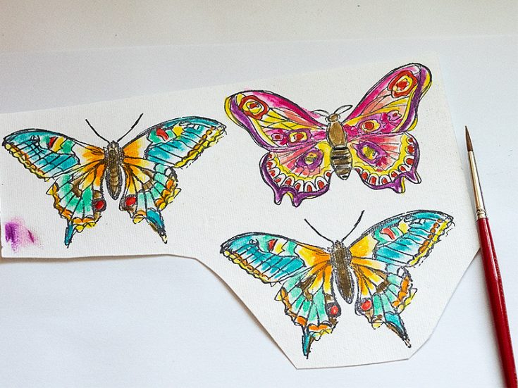
4. Use a paint brush and clean water to dissolve the Scribble Sticks and turn them into watercolor. If you want darker color in some areas, pick the pigment up with the paintbrush directly from the tip of the Scribble Stick.
5. When the butterflies were dry, I went over them with a black pen, which makes the lines stand out more clearly. Here you can see the difference between the butterfly to the left and the one to the right.
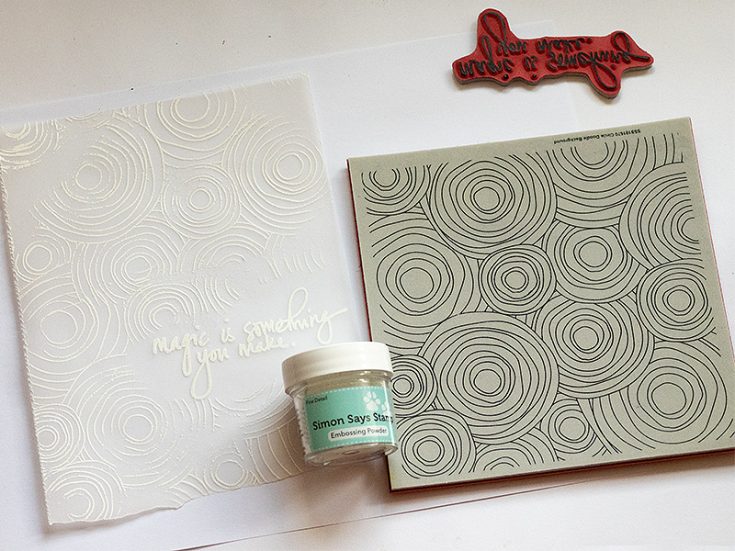
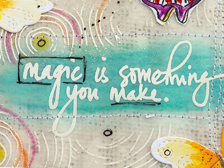
6. Emboss the sentiment with white embossing powder and stamp the SSS Circle Doodle Background around it. Don’t aim for perfection and let some of the stray powder remain.
7. Turn the vellum around and add some color to it. Don’t worry about if it looks rough, it won’t show when you turn the vellum around again.
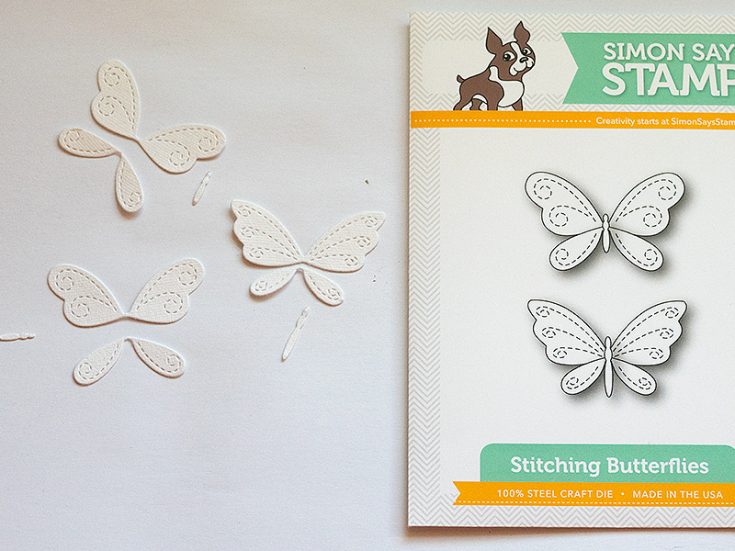
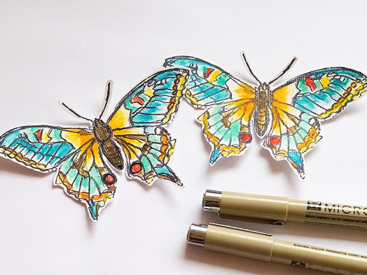
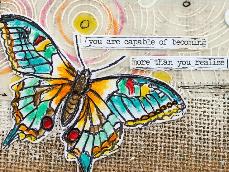
8. Die cut the SSS Stitching Butterflies from the Cotton Watercolor paper.
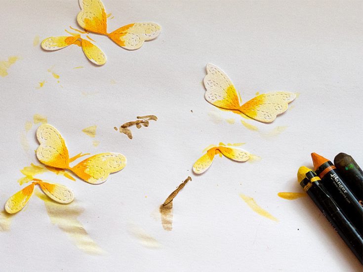
9. Color them with the Scribble Sticks, by picking the color up with a paintbrush directly from the Scribble Stick.
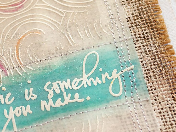
10. It is a little tricky, but you can stitch on the page with a sewing machine. Depending on your machine, you might not reach quite all the way. I couldn’t sew down the left-hand side of the vellum.
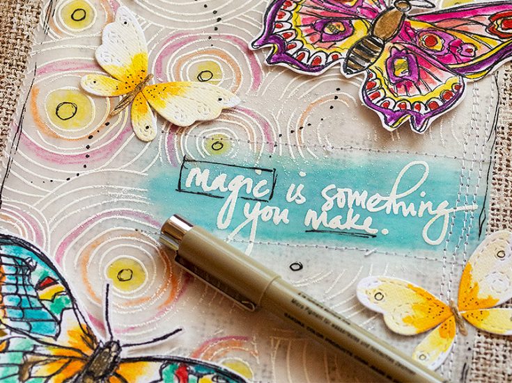
11. Finally, I added some doodled dots on and after the butterflies and scribbled a border around the vellum panel.
12. I used Tim Holtz Small Talk sentiments, and draw a rough border around them.
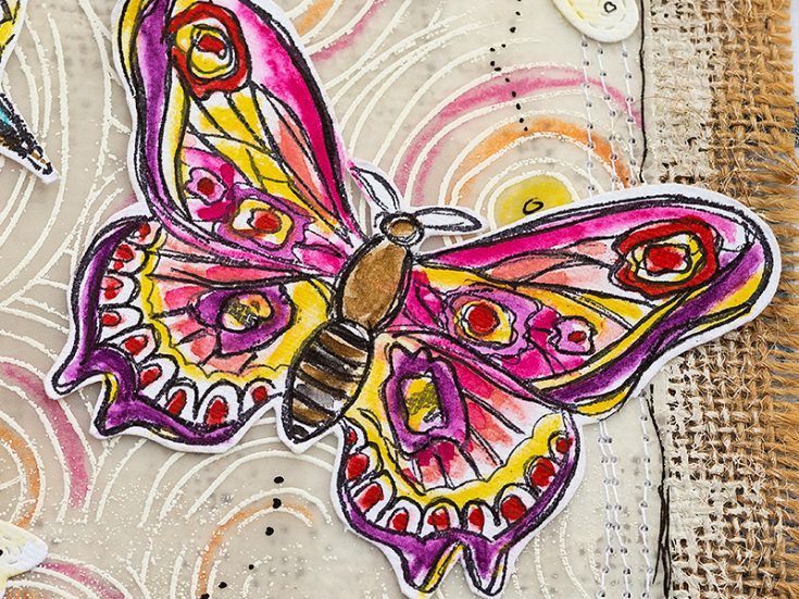
13. You can color these butterflies with so many different color combinations, and it is fun to sometimes try ones that you might not use so often.
14. I never get tired of the look of white embossing on vellum. The burlap gives a subtle texture in the background, which you can see here.
15. These Stitched Butterflies are so cute and the stitched elements add such a nice extra touch.
16. I hope you enjoyed this project and that it inspired you to use burlap as a background and to do some fun Scribble Stick watercoloring. You can use the same techniques to color many other types of images. It also looks great on flowers, for example.
Thank you so much for looking!
Happy crafting!
Anna-Karin
SUPPLIES:
|


Thanks so much for stopping by and thanks to Anna-Karin for being our guest!

Floral Pretty Pink Posh
Hi friends! Happy Tuesday! Please welcome Marge of Pretty Pink Posh as a very special guest on our blog today featuring not one but TWO gorgeous floral cards! Read on for more information and enjoy!
Hello, everyone! It’s Marge here with you today and I’m so happy to share my cards featuring some of gorgeous Pretty Pink Posh Products. I made two floral cards and each was made with different coloring medium.
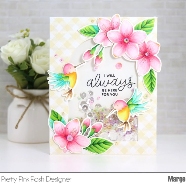
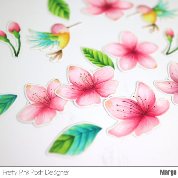
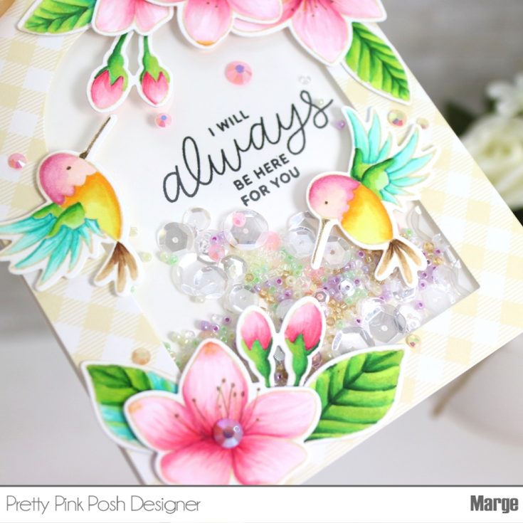
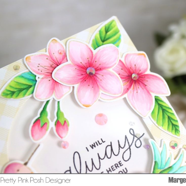
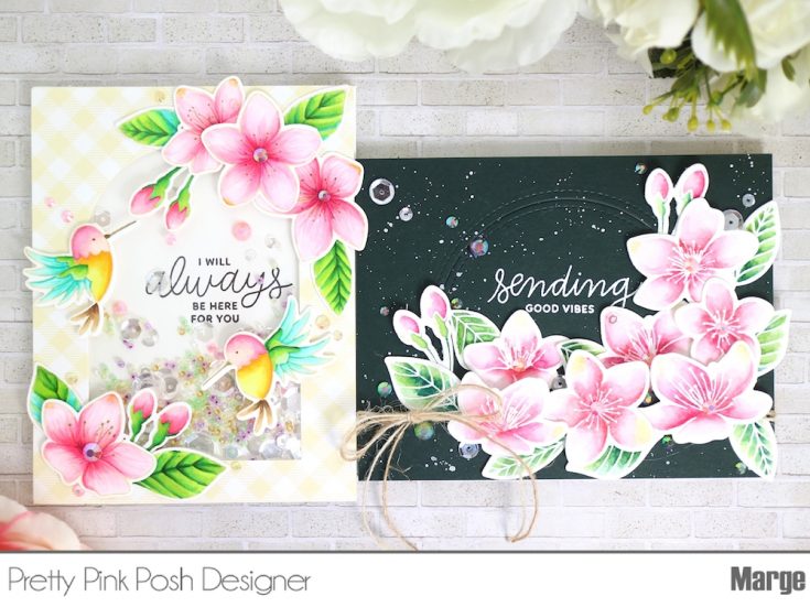
The first one is a no-line Copic coloring card. To begin, I stamped blossoms and leaves from Cherry Blossom Stamp Set as well as hummingbirds from Hummingbird Thanks Stamp Set on a sheet of Neenah Solar 80lb paper using a Distress ink, Antique Linen. Then I colored the images using Copic markers. After I finished Copic coloring, I gave them more details using Prismacolors Polychromo pencils.
Here are Copic Markers I used:
Blossom: RV25,RV23,RV21,RV11,RV00, Y38
Leaves: G28,G07,G14,YG03,YG01,BG 49, BG45, BG18, BG15, BG13
Hummingbirds: R85,R83,R81 / Y38,Y17,Y15,Y11/ E57,E55,E53 , Blue and Green colors are the same as of Leaves.
- Tip: When I do no line coloring, I usually color dark shades first to figure out the outlines then I blend them out by using lighter colors one by one. I also found that adding pencils on Copic coloring look better than just pencil coloring alone, no matter how your Copic colored base is rough.
I then cut the images using the Cherry Blossom Coordinating Die Set.
Next, I trimmed a yellow gingham pattern paper to 4.25×5.5 inch, made a large window using Stitched Duo 3 die. I adhered an acetate film on the back side of it to use it as a front panel for a shaker.
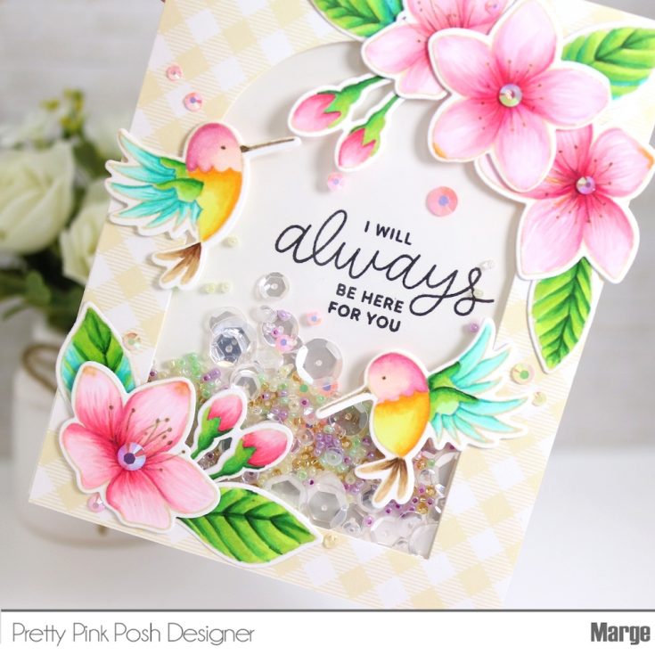
To make a background for a shaker, I cut a white cardstock in 4.25×5.5 inch, stamped a sentiment from Encouraging Greetings using the previous front panel as a guide to position the sentiment.
The next is my favorite moment, mixing sequins and seed beads to put in the shaker! I really love this process and I always enjoy mixing various ones according to the color schemes of a card. For this, I put Sparkling Clear Sequins Mix, Seed Beads (Daffodil, Lilac, Spring Green, Gold Shimmer), Pink Blush Jewels and Buttercream Jewels together into the shaker.
Tip: When I make shaker cards, I usually mix sequins and seed beads together as the seed beads give the shaker more interesting look and sounds!
After I assembled the shaker, I adhered it onto a card base made from Neenah White 110lb, then I adhered previously colored images on the top and bottom of the card as shown here. I finished off the card by adding Pink Blush Jewels and Buttercream Jewels which are my favorite colors of jewels. I really love the iridescent look that the Jewels give.
- Tip: The jewels are basically translucent, above all, the Buttercream Jewels have the most neutral color so they look very well on any colors of cards, which is why I use Buttercream frequently in my cards.
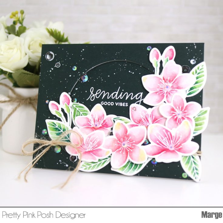
Now let’s move on to the second card I made using watercoloring. To begin, I stamped Cherry Blossom images on a piece of 140lb cold pressed watercolor paper using Versamark ink, then heat embossed them using white embossing powder.
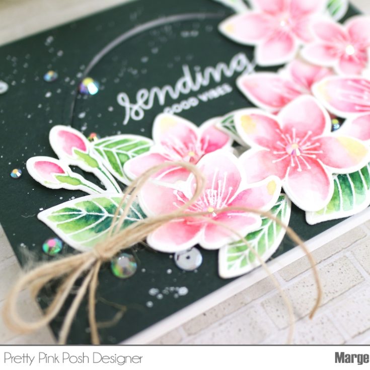
I watercolored them using Daniel Smith Watercolor Paints, then cut them all using Cherry Blossom Coordinating Die Set. Daniel Smith Watercolors I used are : Quinacridone Coral, Quinacridone Violet, Permanent Alizarin Crimson, Quinacridone Gold, Sap Green, and Prussian Green.
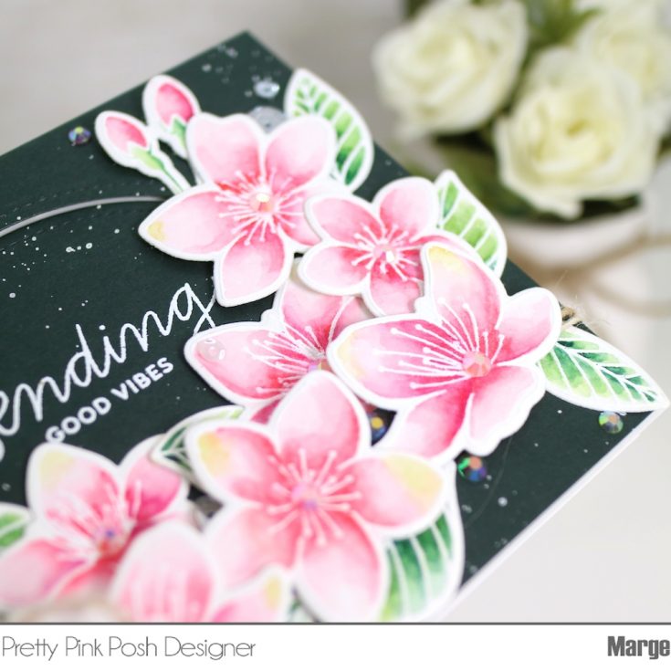
For a background panel of this card, I trimmed dark green Midnight cardstock into 4.25×5.5inch, cut out a semi-round window of it using Window Frames Die set. I stamped a sentiment from Encouraging Greetings on the center of semi-round cut, then heat-embossed it in white. Then I splattered white Gouache all over the panel.
Next, I rounded two strings of twines (Natural and Ivory) around the outer frame panel, tied a bow, then I foam mounted it onto an A2 sized card base using foam tapes.
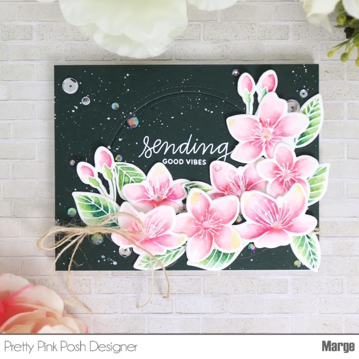
I adhered the inner semi-round cut flat to give the card some dimension. I adhered blossoms and leaves using glue and foam tapes as shown in the picture, then I finished off the card by adding Pink Blush Jewels, Buttercream Jewels, and Sparkling Clear Sequins Mix.
Now I finished my two cards. Thank you so much for visiting here and reading this post. I hope you enjoyed it.
Have a wonderful day!
Marge
SUPPLIES:
|


Thanks so much for stopping by and thanks to Marge for being our guest!
Blog Candy Alert!! Follow our blog via email and comment on this post for a chance to win special blog candy!
Congrats! Blog Candy Winners:
From: Yippee for Yana: Ice Cream Cards: Jennifer Petersen!
From: Hang in there!!: Angie Evans!
From: Fluid Acrylic Pouring: Mixed Medium with Shari Carroll: Celeste Goff!
From: What Would Kelly Make: Watercolor Emboss Resist: Kirsty Vittetoe!
From: Doodling with Debby: Simply Stamped Tropic Leaves: Tara Prince!
Please email [email protected] with the name of the blog you won from, the prize you won, and your address (if applicable) to redeem your prize(s)!
Yippee for Yana: Ice Cream Cards
Hi friends! Happy Monday! Welcome to the latest edition of Yippee for Yana with the always fantastic and inventive Yana Smakula! She’s made a few gorgeous designs that having me longing for Summer (or even Spring! :D) Read on, be sure to watch the video, and enjoy!
Hello friends, this is Yana and welcome back for another Yippee For Yana video! Today we’re stamping delicious Ice Cream and will make 3 yummy and colorful cards. I’ve had my eye on Simon’s So Cool stamp set for a long time and I wanted to stamp ice cream images using ombre inks as ombre makes anything better!
I picked a few ink pads and started stamping images using Hero Arts Pink to Red Ombre ink pad. I inked up my image making sure to pick up the ink just from the 2 lighter parts of the pad. I wanted to have little to no red ink here. Next, I stamped another ice cream image using Hero Arts Ombre Spring Brights and again I wanted to have ink just from the 2 lighter parts of the ink pad.
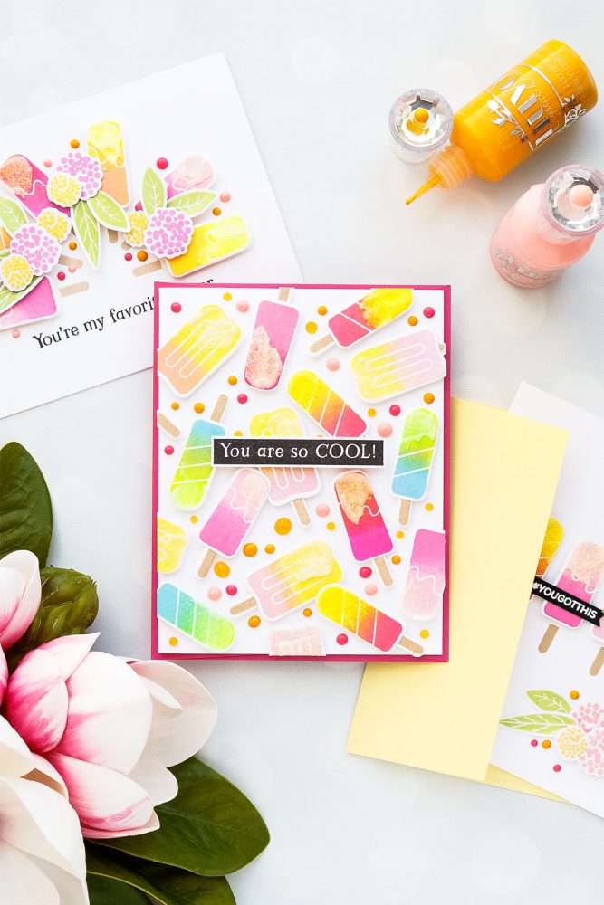
For my third image I was looking to have a softer yellow and pink mix and I didn’t have an ombre ink pad with the colors I wanted, so I just used individual ink pads and inked up my stamp as if I were to use an ombre pad – first by inking up the top part of the image with the light ink (Hero Arts Dandelion) and next inking up the bottom part of the stamp with pink ink (Hero Arts Soft Pink). You do get a bit of ink transfer on your ink pads when you do this, but it only affects a small area and the ink transfer will be insignificant. If this is something that you do want to happen to your ink pads – maybe avoid doing it and just use the ombre ink pads you have.
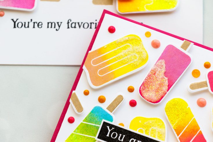
For my last ice cream image, I used Ombre Neon Chartreuse to Blue – I love neon ink pads by Hero Arts for super bright and vibrant ink colors. I also stamped popsicle sticks using Soft Brown ink from Hero Arts. I cut my images out using coordinating dies.
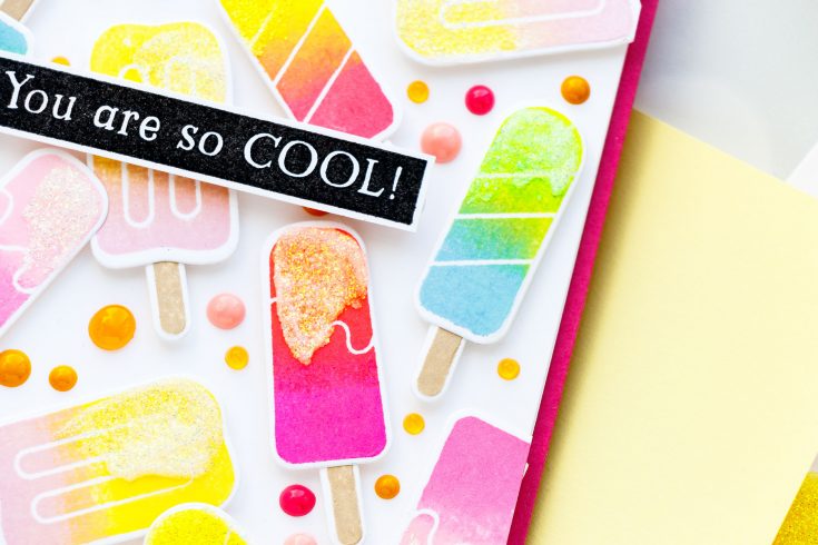
Once I had my parts and pieces created I started working on my cards. For my first project, I wanted to create a dimensional ice cream pattern! I used white foam adhesive squares and foam mounted my ice cream images onto an A2 white card base. Once my ice cream pattern was finished I used glimmer paste from Tonic Studios in color Moonshine and applied it mimicking Sprinkles on my ice cream.
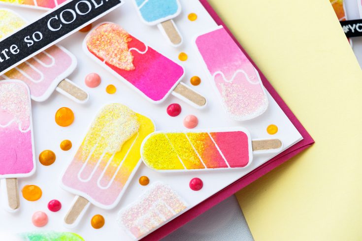
Next, I used Nuvo drops in similar colors – Carnation Pink, Bubblegum Blush and English Mustard and added colorful dots onto the background to fill the space in. The background ended up being very busy and colorful, but this is exactly the look I was going for. I added You’re So Cool sentiment from the same So Cool stamp set and I stamped it in black ink onto a piece of white cardstock, cut it out and adhered to the card. I didn’t want to add anything else colorful here and black seemed like the perfect option.
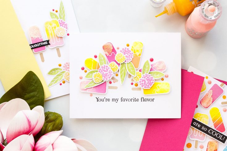
For my card number two, I decided to create a semi-circle made out of ice creams. I foam mounted the ice cream images onto an A2 top folding card base, stamped a sentiment that reads You Are My Favorite Flavor in black ink and embellished my ice cream using flowers.
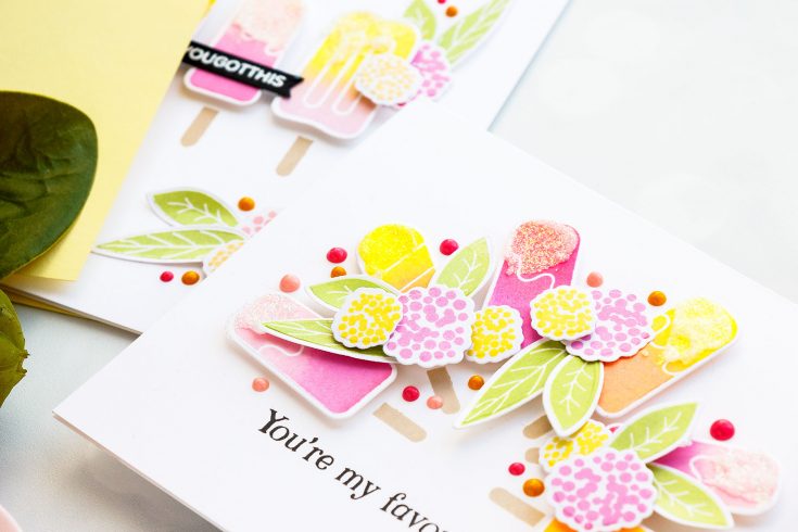
I wanted to add some florals to this card so I used images from the Bold Flowers stamp set and I stamped them using same colors of ink I used to stamp the idea cream as I wanted everything to match. If you are looking for other ideas to use these ice cream images – think about adding an ice cream to a critter or a group of critters. This, I think, would also make a great card design.
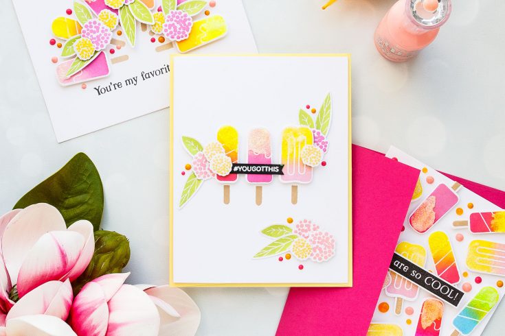
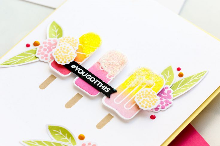
I also made one more card using the leftover die cuts ice creams I had sitting on my desk and here I just went with a simple design – added 3 ice creams in different flavors, added some additional flowers and leaves and of course I embellished the card using same drops and glimmer paste. For the sentiment, I added one that reads You Got This from the You Got This stamp set and this ended up being a fun encouragement card.
I’m looking forward to using this stamp set more in the future – I’m yet to play with the outline images and color these using Copics or my polychromos pencils or maybe even watercolors. Who knows! Have fun stamping!
WATCH THE VIDEO:
SUPPLIES:
|


Thanks so much for stopping by, and thanks to Yana for being our guest!