July 2018 Card Kit – More Inspiration with Kristina Werner!
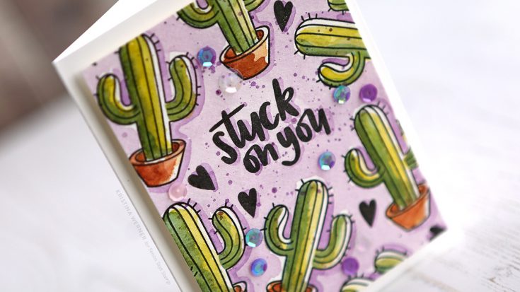
Hello, all! Kristina here. I’m back with more card kit inspiration for you all! The July 2018 Card Kit is packed with fun, summer-inspired products. I couldn’t resist creating a card using the stamp set, One Cool Pineapple, and some watercolor paints.
I stamped the greeting first using Versafine Onyx Black ink. Then I stamped the cactus stamp repeatedly around the greeting area. I also added the smaller heart from the stamp set in more open areas.
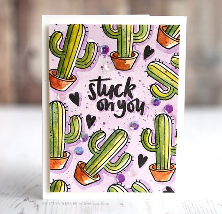
To add color to the stamping, I used the Tropicals set of watercolor paints from Prima. After that was dry, I added some purple sequins (I don’t know which sequins I used exactly, so I’ve linked to some similarly looking ones).
Thanks for stopping by today! I hope this gives you another way to use elements from the card kit! You can buy the July 2018 card kit on it’s own, or you can subscribe to receive this card kit and future kits.
Supplies
|


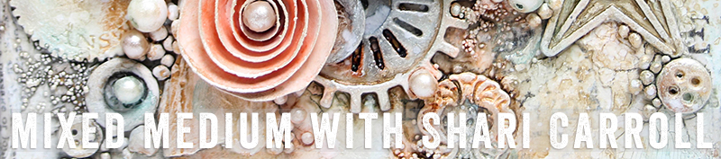
Puddle Pouring: Mixed Medium with Shari Carroll
Hi everyone!! Happy Sunday and most of all… Happy Father’s Day!!!
I’ve been a little obsessed with “paint pouring” lately and thought I’d try Puddle Pouring using Dylusions and Tim Holtz Distress paints. My objective was to create an ocean colored painting. I was able to achieve a lot of action and cells without the use of silicone.
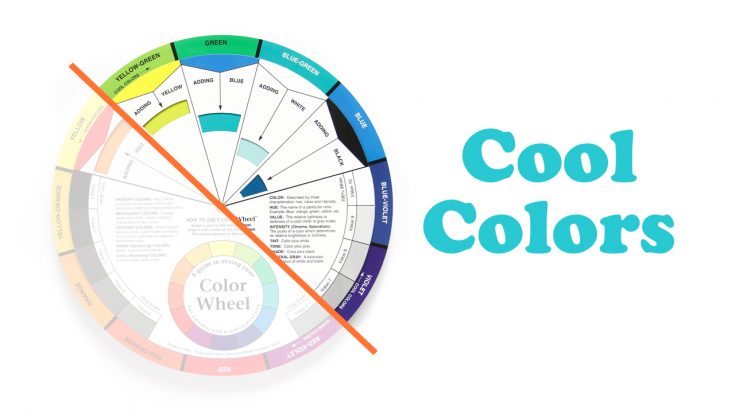
To start you out, here is a little color instruction. I’ve chosen Cool colors and if you look at the color wheel below, they sit to the right of the orange line. Cool colors have a blue base, think of them as ice and water.
My canvas is 8×8″. I mixed my paints with IndigoBlu Go Flow and water only. Go flow helps the paint move, water is used to thin out the mixture. I added water to create a buttermilk consistency. I poured puddles of paint in three main areas and as I went along, I added a few more puddles. I didn’t worry about which color I poured knowing that if they mixed, they would look good together.
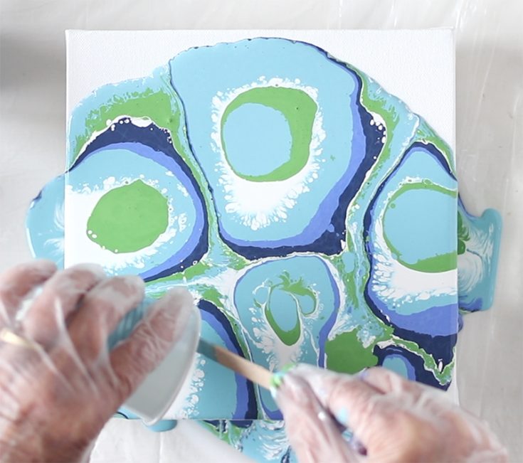
Right away as I moved the paint around on the canvas, I got such an amazing amount of action as the paints interacted with each other. The best part of paint pouring is not knowing how it will turn out. Each painting is different.
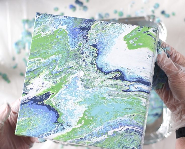
Once my paint sat on the canvas for about 15 minutes, the white went down to the canvas and the other colors came up to the top. This gave me a real cool sea foam effect. I think it’s quite refreshing!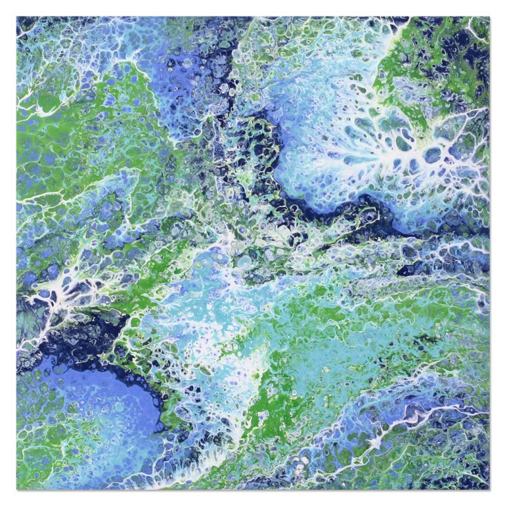 I filmed a video of the entire process which you can view below or on our YouTube channel HERE.

Blog Candy Alert!! Follow our blog via email and comment on this post for a chance to win special blog candy!
Thanks for stopping by. I hope I’ve given you some inspiration to try this technique!
|


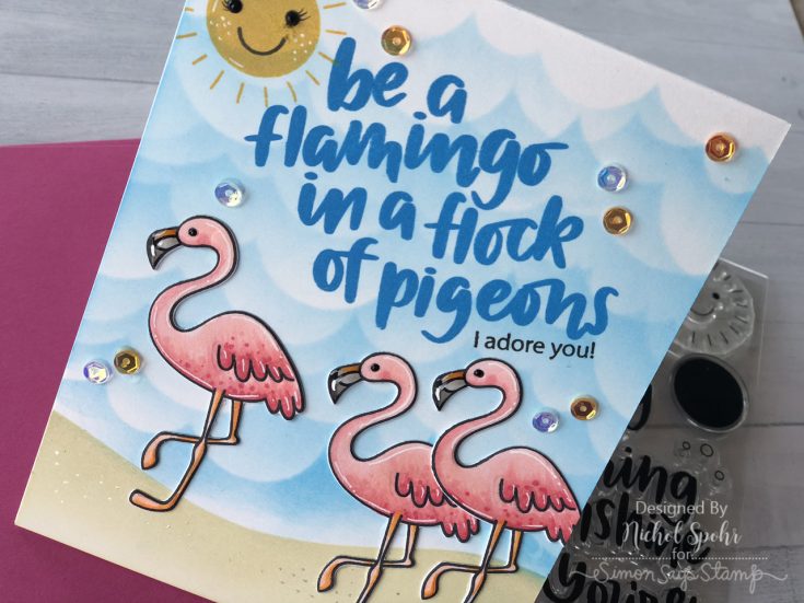
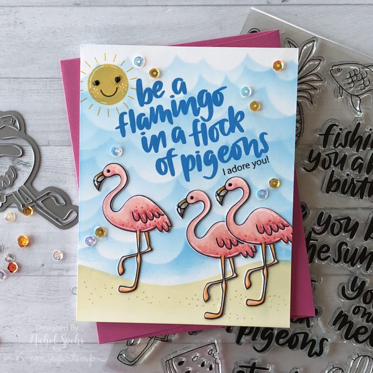
Stenciled and Layered Background Flamingo Card
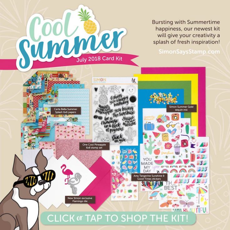
Hi friends! Happy Saturday! Thanks for stopping by our blog today! In case you missed it, our BRAND NEW July 2018 “Cool Summer” card kit was revealed this past Thursday, June 14th! It’s bursting with bright and cheery products to start your Summer off right! As always, the fabulous Nichol Spohr has made some inspiration using the new kit showcasing our One Cool Pineapple stamp set and Flamingo die as well as our Summer Gold sequins. Be sure to watch the video and enjoy!
WATCH THE VIDEO:
SUPPLIES:
|


Thanks for stopping by and thanks to Nichol for being our guest!