Doodling with Debby: Simple No Line Watercoloring
Hi friends! Welcome to the latest edition of Doodling with Debby with the fabulous Debby Hughes! Read on and be sure to watch the video for the full tutorial! Enjoy!

Hi, it’s Debby here for my monthly Doodling With Debby video feature on the Simon Says Stamp blog and for today I have a simple no line watercolored card using the new Plantiful Puns set.

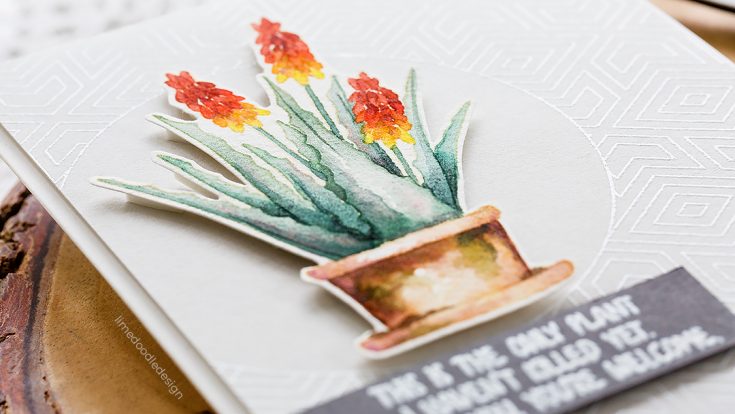
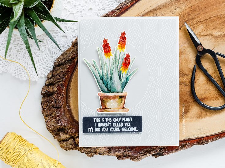
The Plantiful Puns set is so up my street with its plant outlines and pots, jugs and jars to accessorize – I’ve been dying to use it! I started out by stamping the Aloe Vera image from the set in Antique Linen Distress Ink on Arches Cold Pressed Watercolour Card. This is my starting off point for any no-line watercoloring. Distress inks are water reactive and also the light color of this particular ink means that as I watercolor the ink will react with and blend into the painting. I stamped the image multiple times to get a good clear outline to color on the textured watercolor card. I then repeated the process with the terracotta pot.
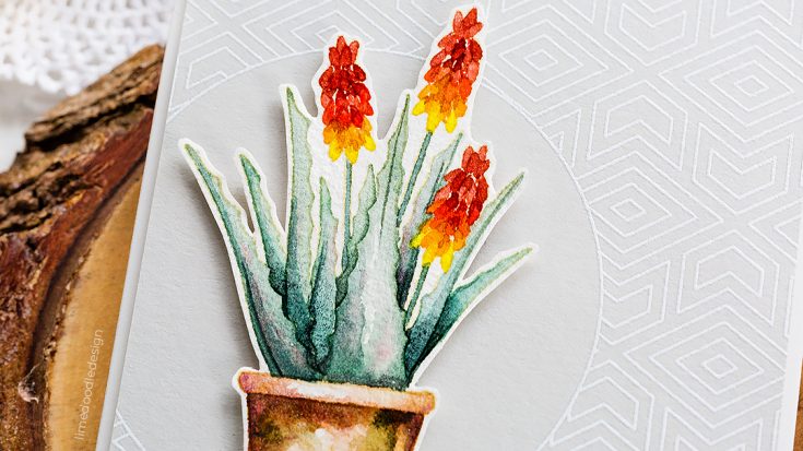
I used Daniel Smith watercolors, and if you are interested in trying these out, then a great way to do so is to pick up my dot sheet from Simon Says Stamp which has a small sample of my favorite colors. To get defined shapes when no line watercoloring it is essential to ensure one area is dry before painting the one next to it. For the flowers, I must admit I didn’t know what Aloe Vera flowers looked like and so I turned to trusty Google to look them up and noticed that some aloe vera plants have flowers which have a gradient of colour from yellow at the base to a vibrant pink/red at the tip and I thought painting my flowers like this would bring in a nice pop of colour and also the changing hue would help separate the petals from one another.
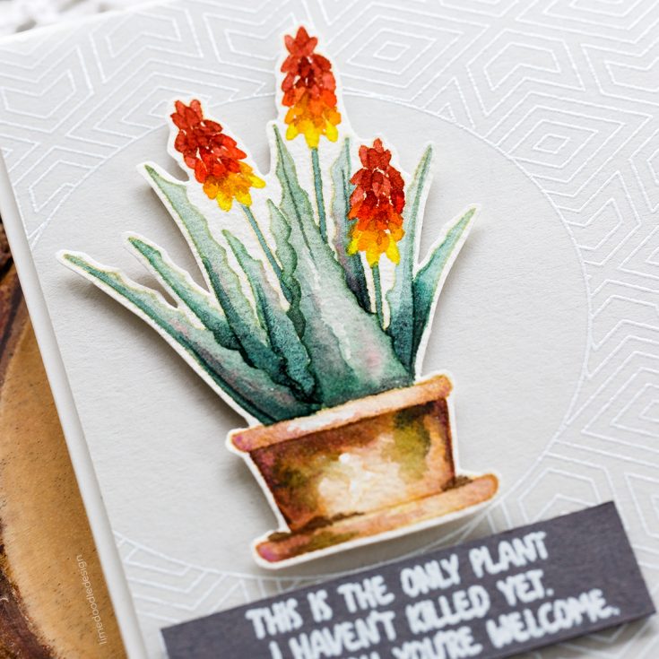
With no line watercoloring, where you don’t have an outline to define areas within an image, it is important to get variations in shade and highlights so that for example the leaves don’t just become one green blob. To do this I mix a relatively concentrated color and painted this in a shadow area such as the base of a leaf and then rinsed my brush and dabbed it off on a paper towel. With my now just damp brush, I drew the color out towards the highlighted areas such as the tips of the leaf. To deepen the colors in the shadows of the leaves I often add just a touch of black and find this works really well to mute and darken the greens and blue-greens of leaves. For the terracotta pot, I find that purple has a similar effect for the color of the pot and so when I painted the first layer of the pot I added touches of purple into the shadow areas.
For those of you that like to talk specific paint colors, these are the main ones I used, although sometimes I just grabbed a mix off my palette.
- Terracotta Pot – Quinacridone Gold + Hematite Burnt Scarlet Genuine + Rose Of Ultramarine for shadows
- Leaves – Ultramarine Turquoise + Lunar Black and then touches of Quinacridone Coral for variation
- Flowers – Hansa Yellow Light + Quinacridone Coral
I mixed a touch of green into my pinky red mixture for the topmost petals. As green is the complementary color to red, it neutralizes and knocks back the brightness of the red slightly which I felt was more in keeping with the subtler shades elsewhere in the image.
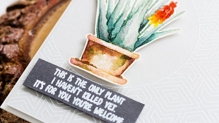
I love to see terracotta pots which have been weathered by the elements and have mossy growths on their sides, and so I brought in a touch of green in patches on the pot. I wanted to keep things simple though and not fiddle too much, but I did add a few slightly darker layers to add dimension and to help define each area from its neighbor. With the painting done, I fussy cut the plant and pot and then set it to one side while I worked on the rest of the card.
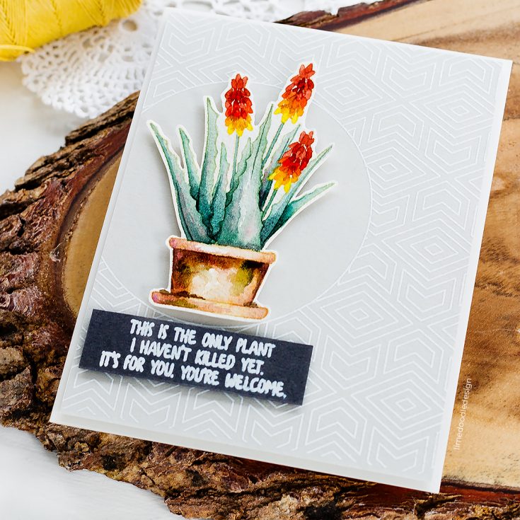
For the background, I thought the open circle of the Center Cut Geometric Pattern stamp would create a great focal area for the plant pot to sit. I placed a piece of Simon Says Stamp Fog card in the Misti and treated it with a powder tool, I then stamped the image a few times in Simon Says Stamp clear embossing ink to get a good impression and sprinkled with Simon Says Stamp white embossing powder, tapped off any excess and heat set. I cut the Fog panel so the center circle was offset and the dimensions of the panel were slightly smaller than an A2 card base. I added plenty of foam adhesive to the rear of the background panel and added this to an Ivory card base. I then added more foam adhesive to the back of the plant and pot and adhered that over the open circle area.
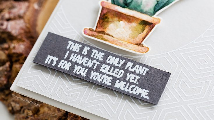
I chose a sentiment from the Plantiful Puns set, and this set has some great options many of them a punny play on words and also this one which suits me perfectly as despite starting my University studies looking at plants I still manage to kill many houseplants from either under or overwatering! I stamped the sentiment in clear embossing ink on a slate card and white heat embossed before trimming to a banner and adding beneath the Aloe Vera with foam adhesive. I did think about adding some sequins or Nuvo crystal drops to this card, but in the end, I preferred to keep it clean and simple and let the watercolor stand out on its own.
Thanks for joining me today, and I’ll see you next time for Doodling With Debby.
WATCH THE VIDEO:
Watch below or in HD on YouTube.
SUPPLIES:
|


Thanks so much for stopping by and thanks to Debby for being our guest!

Monochromatic Stately Flowers
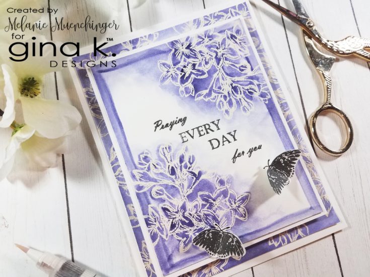
Hi friends! Happy Saturday! Please give a warm welcome to first-time guest blogger Melanie Muenchinger as a special guest representing Gina K. Designs! Please read on and be sure to watch the video for more information and enjoy!
I am honored and humbled to be guest designing for the Simon Says Stamp blog today! We at Gina K. Designs are delighted to have some of our favorite product offerings at Simon Says Stamp. I’ve been stamping and cardmaking for 15 years and illustrating for 11. I enjoy drawing and creating in many different styles to suit my mood or match my recipient, from realistic to whimsical, classic to trendy, clean and simple to over the top!
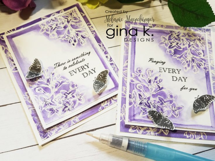
In this video, I demonstrate a watercolored emboss resist technique and surprise, am only using one color to do so! It’s remarkable how many shades you get from just one color, and a monochromatic design is always so impactful. I’m using the purple lilacs image from my Stately Flowers series for both my focal point and background. We started releasing these at Gina K. Designs 8 years ago and are just one set away from covering all 50 states! This set is unique in that it contains a mini calendar you can use with all the flowers in the line or other stamps in your collection. These realistic hand drawn flowers are lovely for any occasion and are so fun for a variety of inky techniques and coloring!
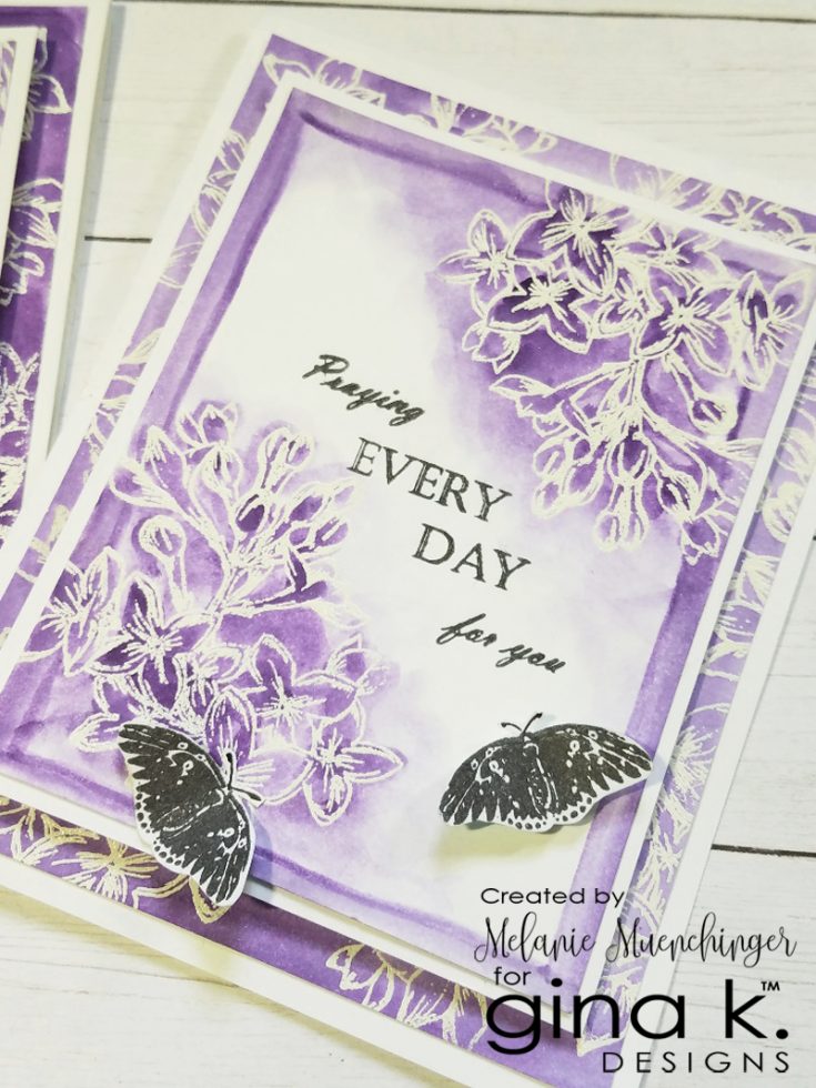
Out of hundreds of techniques I love, I chose this one upon recently discovering that Simon Says Stamp carries my favorite watercoloring medium: Peerless Watercolors! They are no mess, affordable, portable, and include a full range of gorgeous shades that are so vivid and blendable, even on regular cardstock. I love how you can toss a booklet and water brush pen in your bag to paint on the go. They have companion sets as well to expand your palette. I hope you enjoy today’s simple video and be confident that no matter what your skill level or experience, you can produce beautiful, hand-painted effects on your cards in no time with this technique, for one-of-a-kind pieces of art. Happy crafting! Hope you’ll check out my other stamp sets and tutorials.
WATCH THE VIDEO:
SUPPLIES:
|


Thanks so much for stopping by and thanks to Melanie for being our guest!
September 2018 Card Kit – More Card Kit Inspiration with Kristina Werner!
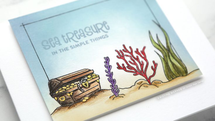
Hi all! Kristina Werner here with some more card kit inspiration! Today I have a card made using supplies from the September 2018 Card Kit. I chose to create a card using the supporting images in the Beautiful Mermaids stamp set.
I stamped the treasure chest scene using VersaFine Onyx Black ink and then ink blended the two Distress Oxide colors included in the kit (Tumbled Glass and Stormy Sky), plus Antique Linen Distress Oxide Ink. This created the sandy bottom of the ocean and the blue water.
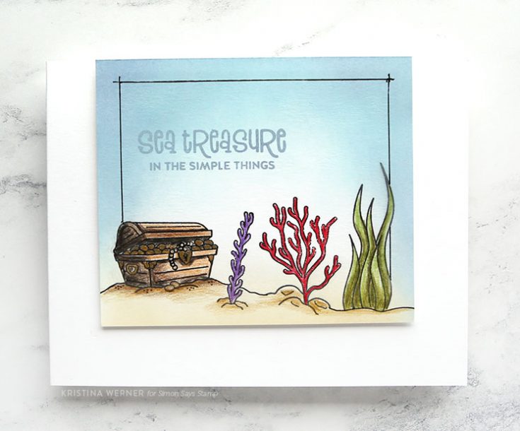
I colored the scene with Faber-Castell Polychromos colored pencils, plus added gold details on the chest using FineTec pearlescent watercolors.
Thanks for stopping by! I hope you enjoy another card made using the card kit! You can pick up this mermaid themed kit HERE, or subscribe to receive future kits automatically HERE.
Supplies
|