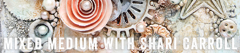
Puddle Pouring: Mixed Medium with Shari Carroll
Hi everyone!! Happy Sunday and most of all… Happy Father’s Day!!!
I’ve been a little obsessed with “paint pouring” lately and thought I’d try Puddle Pouring using Dylusions and Tim Holtz Distress paints. My objective was to create an ocean colored painting. I was able to achieve a lot of action and cells without the use of silicone.
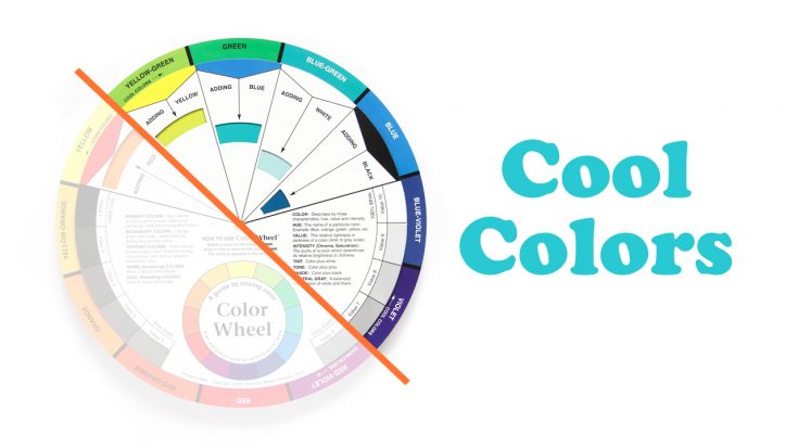
To start you out, here is a little color instruction. I’ve chosen Cool colors and if you look at the color wheel below, they sit to the right of the orange line. Cool colors have a blue base, think of them as ice and water.
My canvas is 8×8″. I mixed my paints with IndigoBlu Go Flow and water only. Go flow helps the paint move, water is used to thin out the mixture. I added water to create a buttermilk consistency. I poured puddles of paint in three main areas and as I went along, I added a few more puddles. I didn’t worry about which color I poured knowing that if they mixed, they would look good together.
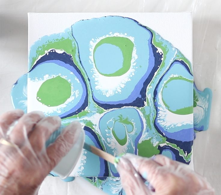
Right away as I moved the paint around on the canvas, I got such an amazing amount of action as the paints interacted with each other. The best part of paint pouring is not knowing how it will turn out. Each painting is different.
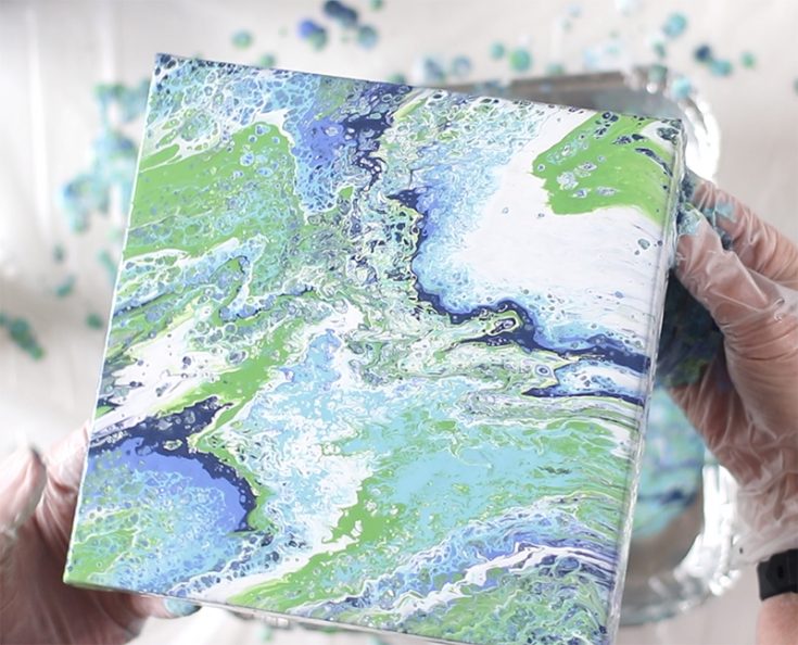
Once my paint sat on the canvas for about 15 minutes, the white went down to the canvas and the other colors came up to the top. This gave me a real cool sea foam effect. I think it’s quite refreshing!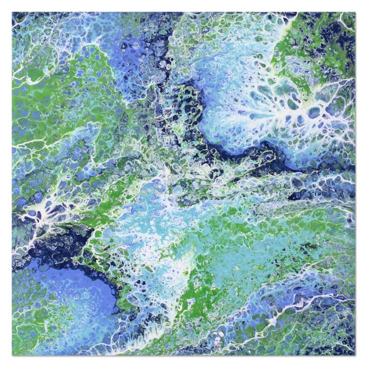 I filmed a video of the entire process which you can view below or on our YouTube channel HERE.

Blog Candy Alert!! Follow our blog via email and comment on this post for a chance to win special blog candy!
Thanks for stopping by. I hope I’ve given you some inspiration to try this technique!
|


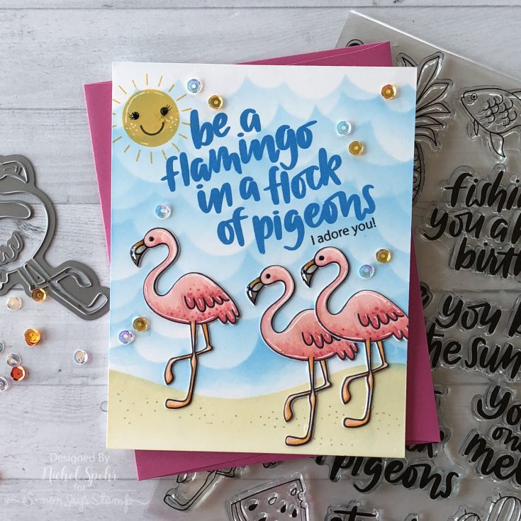
Stenciled and Layered Background Flamingo Card
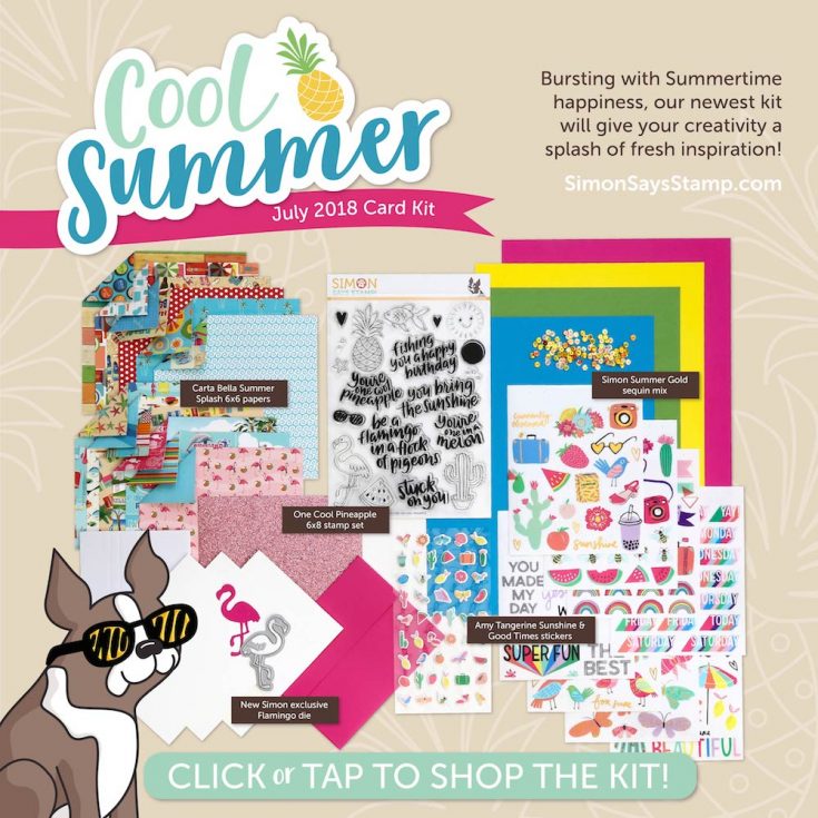
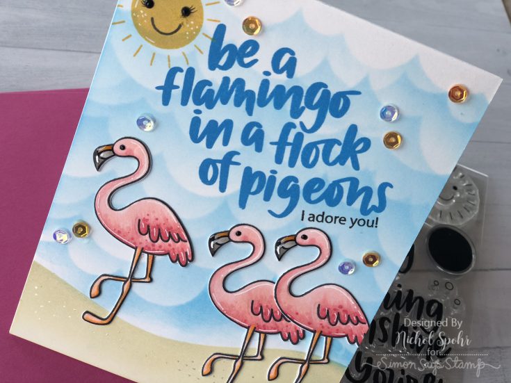
Hi friends! Happy Saturday! Thanks for stopping by our blog today! In case you missed it, our BRAND NEW July 2018 “Cool Summer” card kit was revealed this past Thursday, June 14th! It’s bursting with bright and cheery products to start your Summer off right! As always, the fabulous Nichol Spohr has made some inspiration using the new kit showcasing our One Cool Pineapple stamp set and Flamingo die as well as our Summer Gold sequins. Be sure to watch the video and enjoy!
WATCH THE VIDEO:
SUPPLIES:
|


Thanks for stopping by and thanks to Nichol for being our guest!
Doodling with Debby: Clean and Simple Watercolored Butterfly
Hi friends! TGIF! Please join me in welcoming back the always awesome Debby Hughes as a special guest on our blog this month in her latest installment of “Doodling with Debby”. Be sure to watch the video for more information, and enjoy!
Hi, it’s Debby here for my monthly Doodling With Debby video feature on the Simon Says Stamp blog and today’s card features a clean and simple, watercolored butterfly on a delicate white heat embossed background.
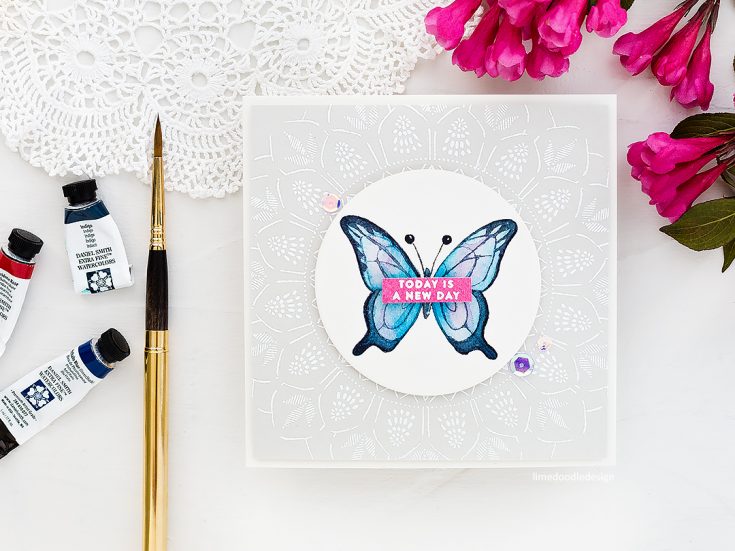
For this card, I used the Beautiful Day set from Simon Says Stamp which has a lovely array of butterflies to choose from. I decided on the large butterfly from the set as I liked the detail of the lower wings. I placed the butterfly in the Mini Misti with a piece of Arches Cold Pressed watercolor card and stamped the image a couple of times with Antique Linen Distress Ink – my go-to ink for no line watercoloring. I stamped the image sufficiently so I had a guideline to paint but the ink is light in color, and it’s water reactive properties mean that as I start to paint the lines blended out and disappeared.
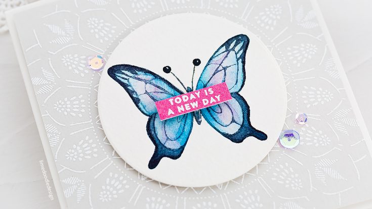
My aim with the first layer of paint was to create a light but colorful base to add darker edge details later on. I used Daniel Smith Phthalo Blue Green Shade which is a lovely bright blue and then added in just the faintest hint of Daniel Smith Quinacridone Rose for some pink highlights. For the darker edges to the butterfly wings, I used Daniel Smith Indigo and mixed a strong enough concentration of paint so that it covered the underlayer but so that some of the original tones still shone through. That’s one of the features of watercolor I love, that when adding more layers, the transparency of the paint allows the lower layers to still play an active part.
I used the lines left from stamping to determine the pattern that I painted with the darker Indigo color although I did use some artistic license here and there. The original butterfly image had a more graphic feel to it, and I wanted to soften it somewhat for a more elegant look. That’s the great thing about no line watercoloring, the original artwork is a guideline and base for painting, but you don’t have to stick to it rigidly.
For the body of the butterfly, I used Payne’s Gray and dropped in a little Phthalo Blue Green Shade while it was still wet for color variation. I then mixed up a thick concentration of White Gouache and added details to the body. Gouache is an opaque watercolor paint, and so even though I’m using white, this will still show up on the darker color of the body. I die cut the piece with a Nested Circle die and then set aside while I worked on the background.
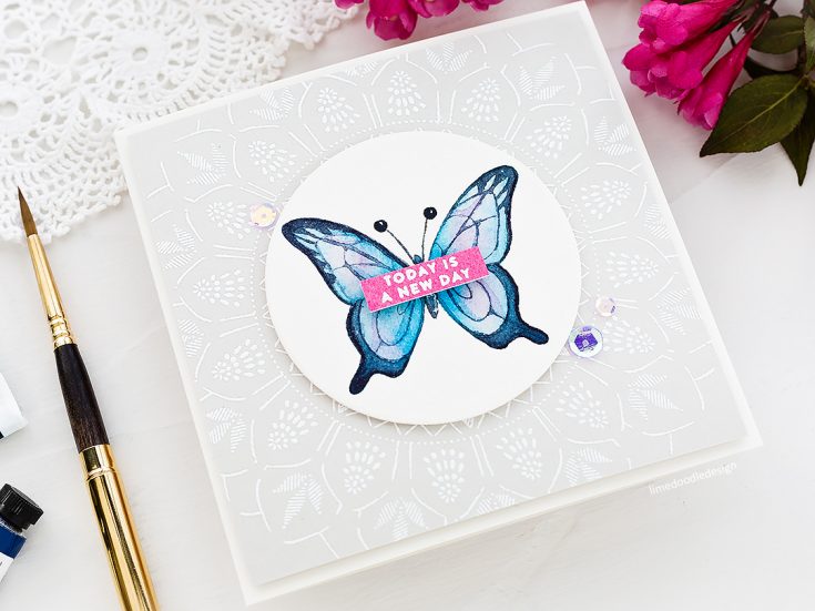
I used the stunning Bohemian Lace cling background stamp on a piece Fog card as I thought the subtle, elegant pattern would complement the butterfly. I stamped it in Clear Embossing Ink and then sprinkled with White Embossing Powder before heat setting and trimming slightly to fit a 5-inch square card base. I adhered the butterfly circle on top with foam adhesive.
For the sentiment, I painted a strip of card with Quinacridone Rose and then stamped a coordinating sentiment from the Beautiful Day set in Clear Embossing Ink and White Heat Embossed before trimming to a skinny banner and adhering over the butterfly with more foam adhesive. Finally, I added a trio of Sweet 16 and Crystal Reflections sequins to accent.

Thanks for joining me today, and I’ll see you next time for Doodling With Debby.
WATCH THE VIDEO:
Watch below or in HD on YouTube.
SUPPLIES:
|


Thanks so much for stopping by, and thanks to Debby for being our guest!
Blog Candy Alert!! Follow our blog via email and comment on this post for a chance to win special blog candy!


