Creating with Pantone’s 2019 Color of the Year: Living Coral
Hello friends, and Happy 2019! It’s Nina-Marie here with you today and I have to tell you… it’s hard to believe we are beginning a brand new year!
One of the most exciting things about 2019 is the anticipation of fresh ideas and new ways to get creative. Discovering new colors is something I always love; did you know that every December, Pantone selects a color to embody the upcoming year? For this new year they have selected Living Coral; a vibrant, warm color that exudes comfort… and in my opinion, love as well. Which is why I centered my card’s theme around this very topic.
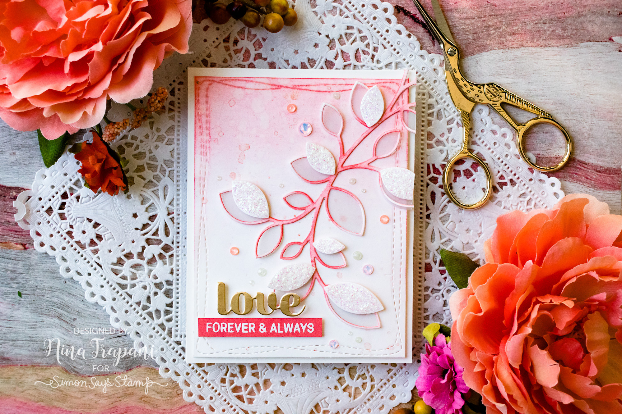
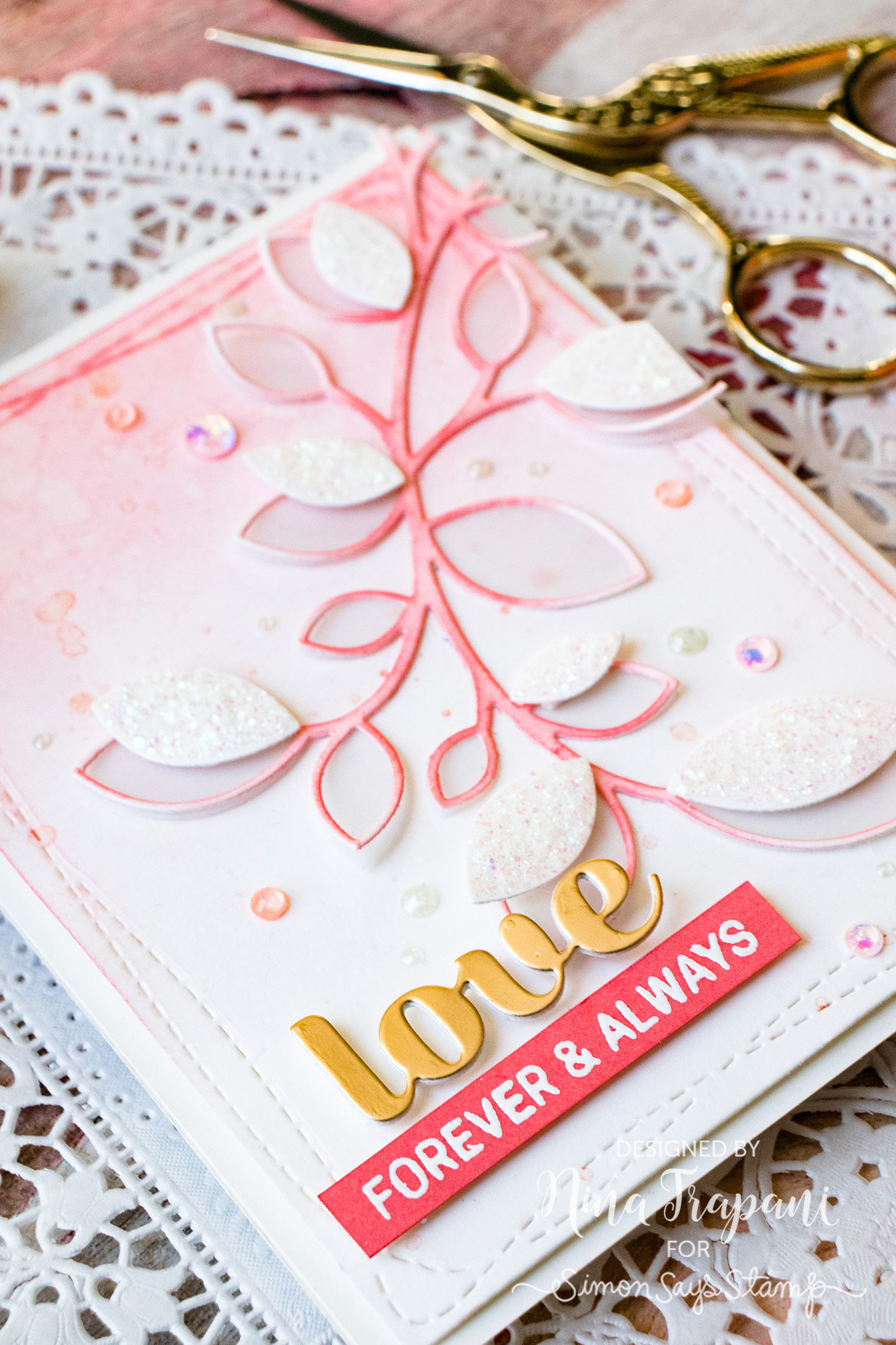
The challenge I gave myself was to make a card that was primarily made up of coral tones. As you can see, most of this card is white and coral, with a kiss of gold. I really love how well this card came togehter!
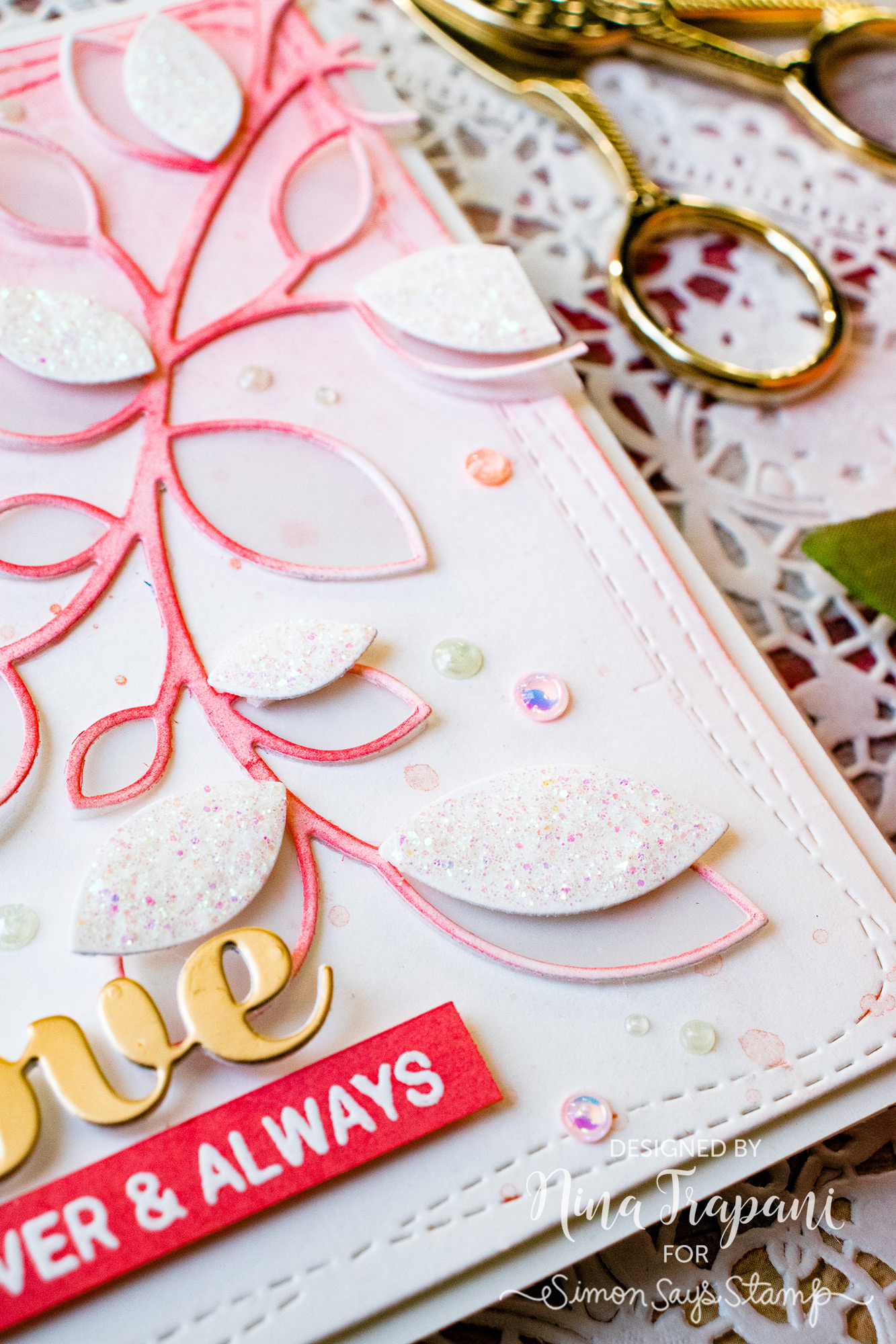
The main focal point includes the gorgeous Clustered Leaves and Outline Clustered Leaves die sets; I cut one from vellum and the other from white cardstock. Using Abandoned Coral Oxide ink, I blended color onto the outline leaves. That same Abandoned Coral ink was used to add some soft blending to the background panel as well.
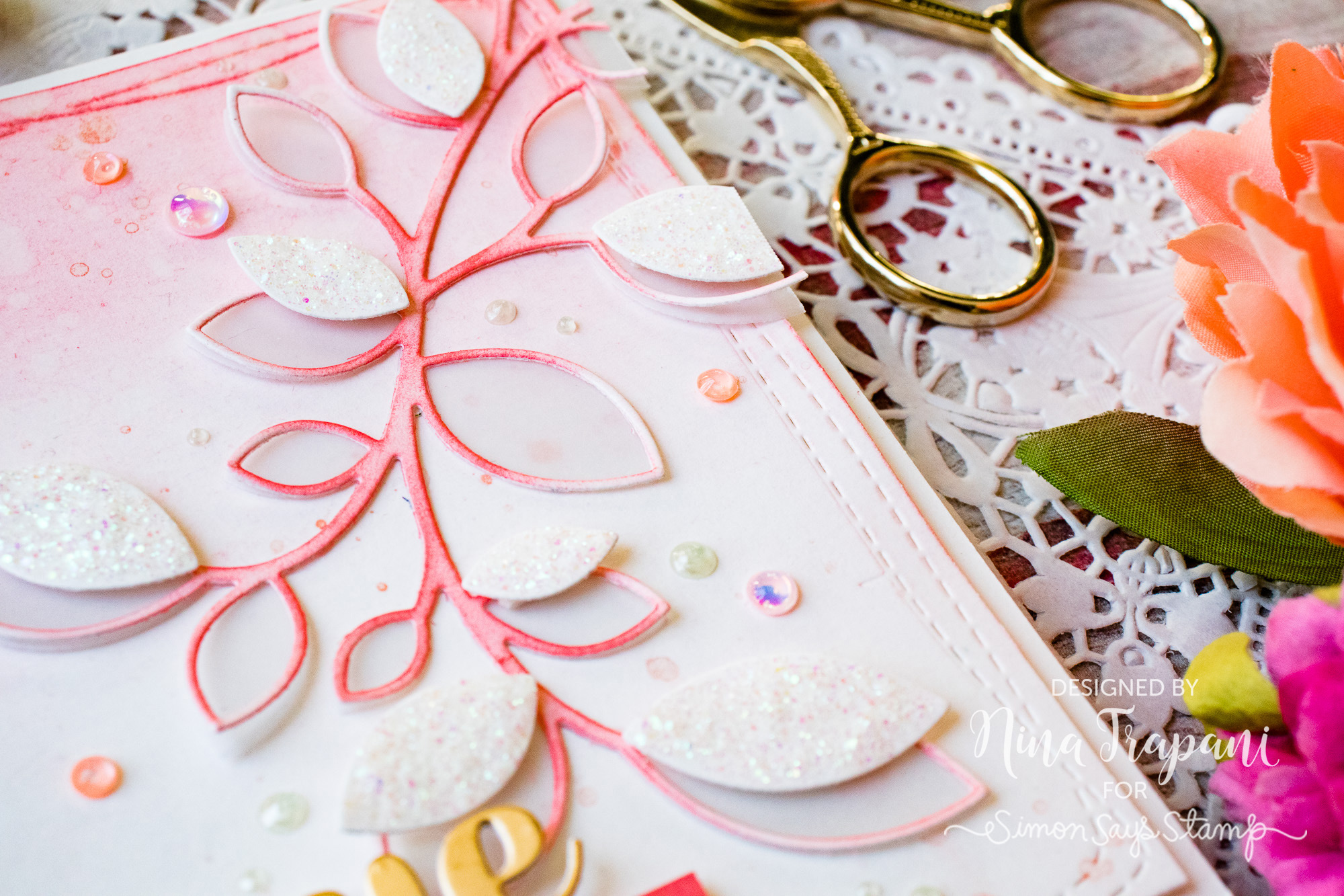
I splattered a watery mix of Perfect Copper Perfect Pearls onto the background, along with splashes of plain water; this created great texture. Around the leaf clusters, I added white leaves (covered with Moxi Glitter Glue), pearlized dots and Simon Says Stamp sequins; each sequin is filled with Morning Dew Nuvo Drops.
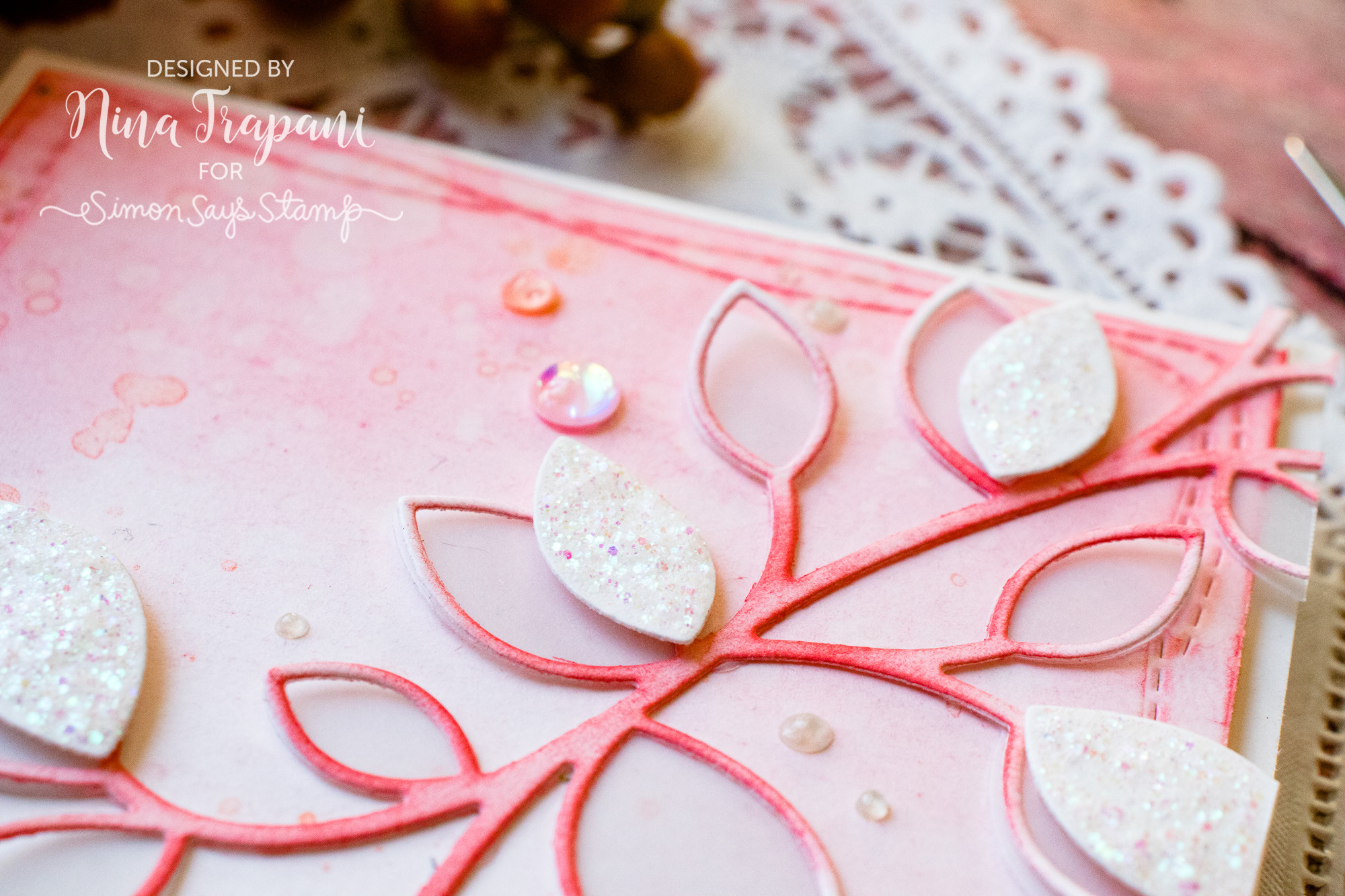
For the greeting, I used the Birch Press Design Sugar Script Love die, and a stamped sentiment from the Simon Says Stamp Floral Bliss set.
I hope you will watch the video to see how I created this coral-inspired project! I also encourage you to try using coral colors on your upcoming cards and papercrafting projects; the color is perfect for just about any occassion, not just love. Imagine birthday, Valentine, thinking of you and thank you cards all featuring this heartwarming tone.
Thank you so much for visiting with me today; I will be back again very soon with more crafty ideas to share!
WATCH THE VIDEO
SUPPLIES USED
|


Blog Candy Alert!! Follow our blog via email and comment on this post for a chance to win special blog candy!
Art Journaling with Shari Carroll
Happy NEW YEAR!!!! Here we are 2019!!! Thanks for joining me today!
I’m starting off this new year with an entry in my Dina Wakley Media Journal. This page is one that I’ve been thinking about. I actually had a direction I wanted to go and it turned out as expected without having to force the techniques.
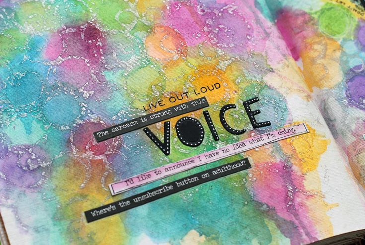
First, I used the Carabelle Studio Mask with Silver Art Spray knowing that the acrylic paint would act as a resist to the watercolors. Instead of spraying through the stencil, I used it as a stamp to create the image which gave me areas to add color, a pattern of circles.
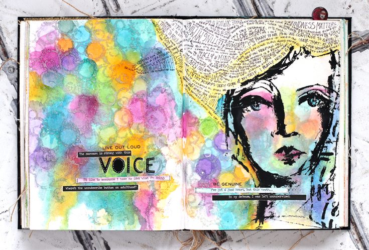
My next layer was the Dina Wakley Collage Paper Faces. This printed tissue paper can be added on top of other designs or colors and they show through. I used Clear Gesso to glue her in place. Yes, you can use gesso for collaging lightweight papers!! I used it so I could add a little detail with Dina Wakley Scribble Sticks on top, other gel mediums will resist water-soluble mediums.
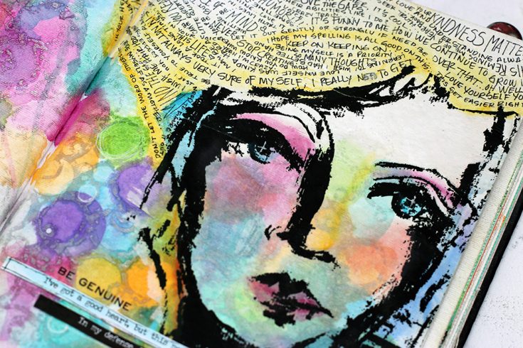
I added in a few Snarky Small Talk Stickers, Tiny Text Remnant Rubs, and the die cut title VOICE to express all the journaling. My journaling is just some of my thoughts, very random and some writing is even upside down to form her hair. Fun right?
Blog Candy Alert!! Follow our blog via email and comment on this post for a chance to win special blog candy!
I hope you have a great start to a fantastic New Year!!!
|


One Stamp Five Ways: So Loved
Hi friends! Happy Monday and happy last day of 2018! Where has the year gone?! Don’t miss the floral beauty of projects by the always amazing and inventive Suzy Plantamura! Read on for more information and enjoy!
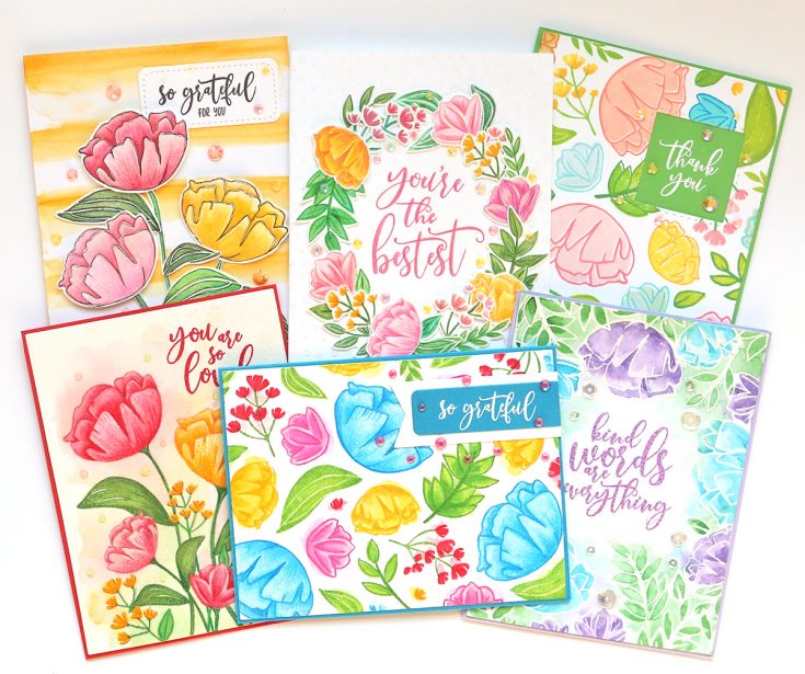
I’m back with a “one stamp, five ways” post today using a new stamp set from the You Are Loved release called SO LOVED! I picked this set to highlight as I love flowers and I especially love sets that offer you both outline and flat images to layer. This set is extra large and has tons of sentiments also making it ideal for making multiple cards.
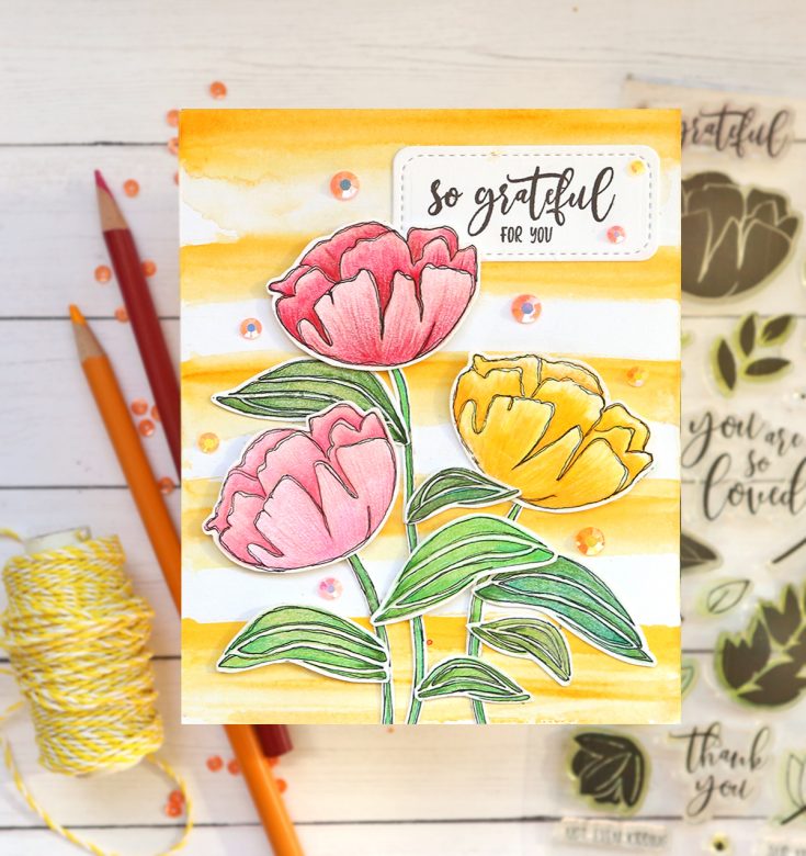
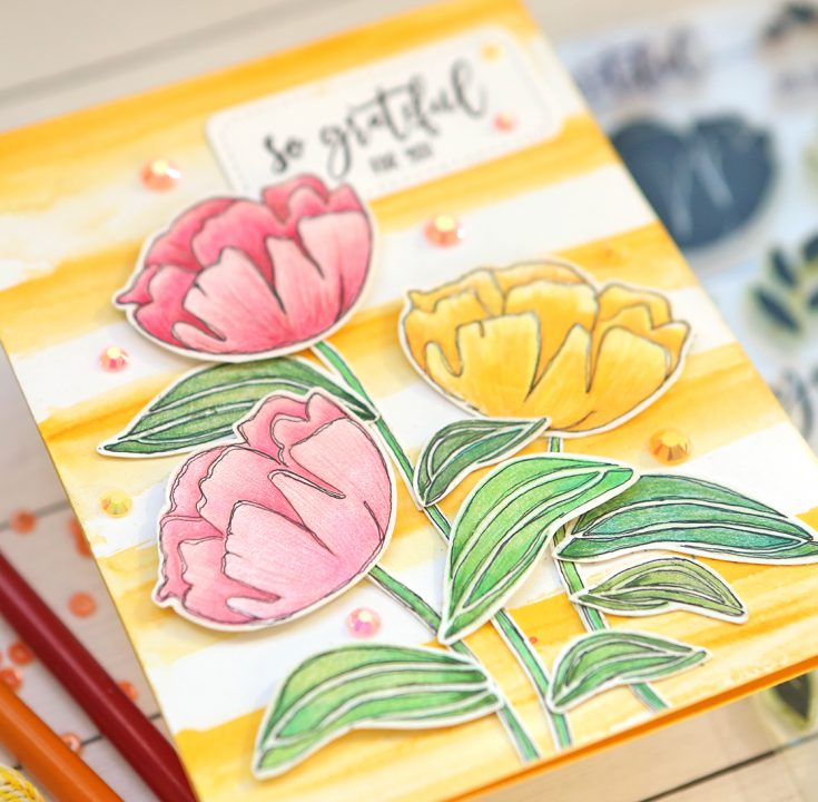
I always have a stack of premade backgrounds that I use for cards to speed up the process. I have two blog posts with examples and directions on that HERE and HERE. This one was made by watercoloring yellow stripes. I wanted to show you a different technique for using the stamps on each of my cards, so below each, I have some tips I used.
Tips:
- Stamp your images with a light color of ink and color in with colored pencils or Copics (I used pencils for these)
- After they are done, doodle an outline around them with a fine-tip black marker; I purposely do two lines so it doesn’t matter if I make mistakes and because I like the look of it
- Combine multiple stem sections overlapping where they join with leaves
- Stamp your sentiment directly on the card front and then when you mess up as I did (hahaha), you can restamp it on a banner die and place it over it!
- I always finish a card with either Tonic Nuvo Drops, sequins, or jewels as I did here; I just like that finishing touch and texture!
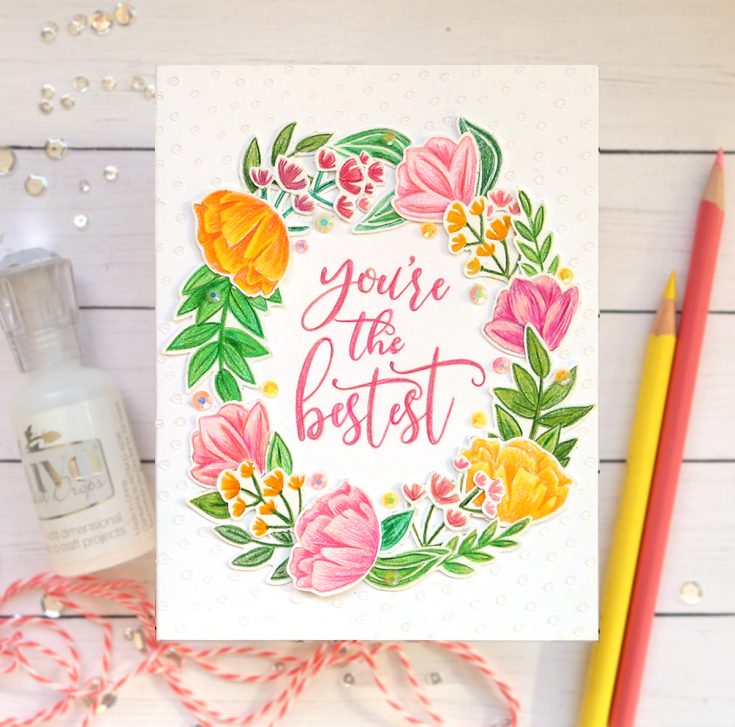
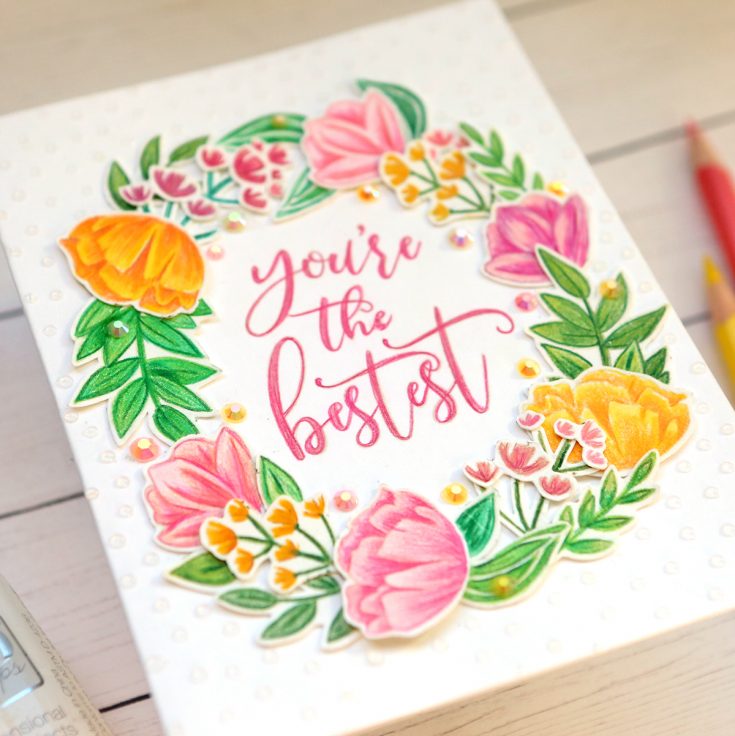
This is my favorite card of the bunch. I would love to hear which one you like the best! I love cards with white backgrounds, especially one layer ones! But I can’t make simple cards – I wasn’t blessed with that skill haha! What I like about this one is it looks kind of simple, but it has lots of details. The little drops of clear Nuvo Drops give the background some extra interest and texture.
Tips:
- Floral stamp sets usually come with some larger images and smaller images; for the card above, I only used the larger flowers and leaves; for this card, I used all of the smaller flowers and leaves
- Arrange your stamped images into a wreath shape when you have a large sentiment you can use on the inside of it; when arranging a wreath shape, have images go both directions so all of your stamps will work in the design
- Stamp the sentiment with a light color of ink as well as the flowers; color over it with colored pencils so it matches the look of the flowers; keep your pencils VERY sharp for this
- When doing no-line stamping using colored pencils, outline the images with a darker shade of the color you are using so they have outlines in the same color
- Use some jewels, Nuvo Drops, or sequins to fill in the open spaces in your wreath
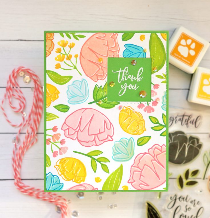
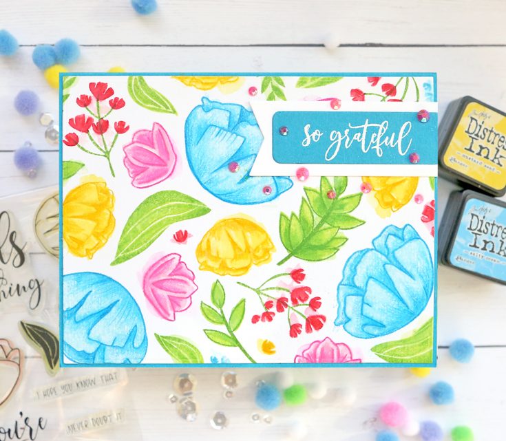
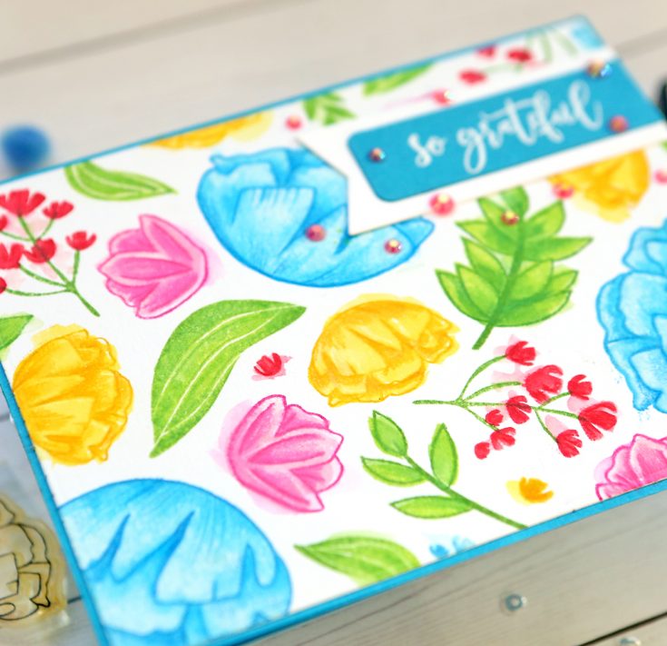
This technique has two examples, so I actually have 6 cards to share with you. I wanted to use all of the flat stamps for 2-step stamping with colored inks (Do they still call it that? They used to in my Stampin’ Up days!). I used SSS colored inks for this version. Both of these cards are randomly stamped, which means I stamped all of the images going in all directions over the card front.
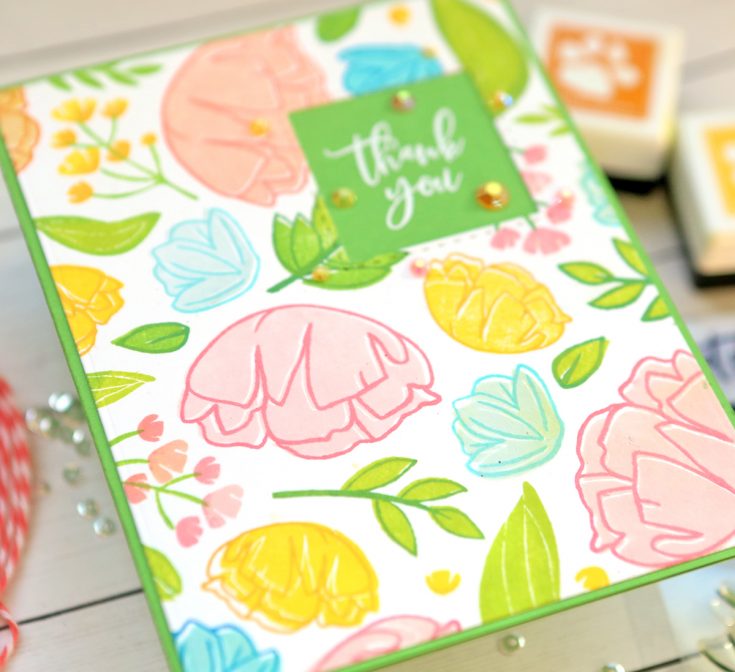
- Stamp the base (flat stamp) with a lighter color and the outline stamp with a shade darker of the same color
- Clean your stamps between colors; I thought I could just wipe mine off, but the yellow showed through on my blue flower in the center of the card (I kept going as I hate to throw mistakes away, so please don’t notice!)
- Purposely (or accidentally!) make the outline not fit directly on the flat stamp to add interest
- On flat stamps, apply the ink to it, then apply a slightly darker ink to it on the outlines before you stamp it so it has shading (you can see I did this on the little flowers)
- This actually would have qualified as a one layer card, but then I die-cut a square out of it and stamped the sentiment on the card base underneath
This card is my second version of 2-step stamping. This card is also all of the stamps randomly stamped over the background. This time I used Distress Inks on watercolor paper.
Tips:
- Stamp your flat stamp first, then your outline; while it is still wet, use a paintbrush with a little bit of water to move the colors around (I purposely went outside of the outlines for a messier look)
- Push your darker stamp pad on a flat surface and pick some up with a paintbrush to shade the inside area of the image
- For stamps that don’t have outlines, do the same technique I mentioned on the above card – press one color on the stamp first, and then press a darker color just on the outer areas of the stamp
- Add additional shading if you wish with colored pencils; also you can fix any borders that got messed up with too much water with pencils
- Layer more than one banner for your sentiment; I embossed this one in white on a blue banner, but it was so small it just got lost on the background; I added a white banner behind it and it stood out more
- Put your jewels or sequins just around the sentiment area to draw the eye to it – this works nicely on busy background cards
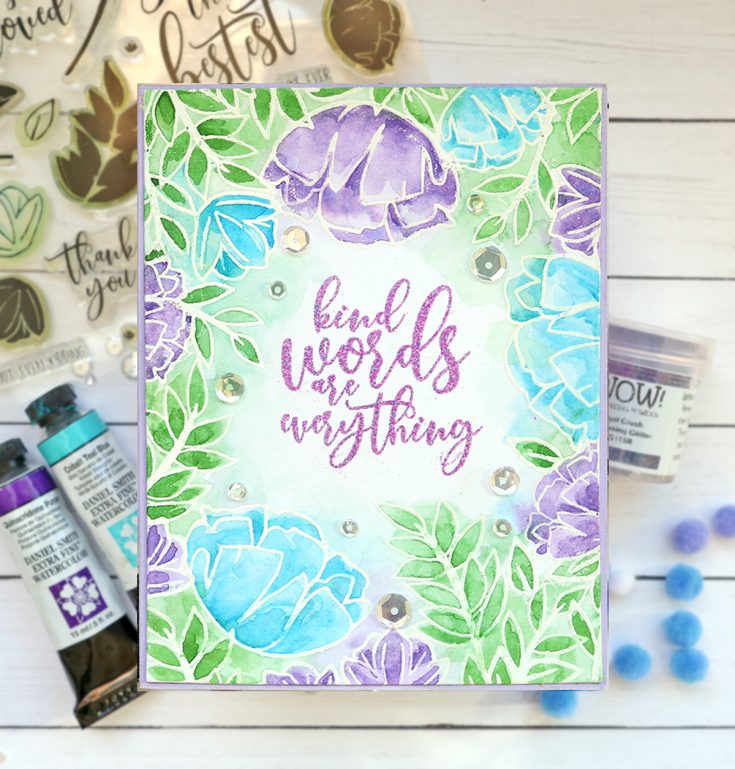
This is my second favorite card as I love the colors. I embossed all of the stamps with white embossing powder on white Ranger watercolor paper. I then used Daniel Smith watercolors to paint them all in. I embossed the sentiment in the center of the card using WOW Royal Crush embossing powder. You can see in the close-up image how it is purple, but it has a bright pink glitter in it. Definitely my favorite embossing powder ever!
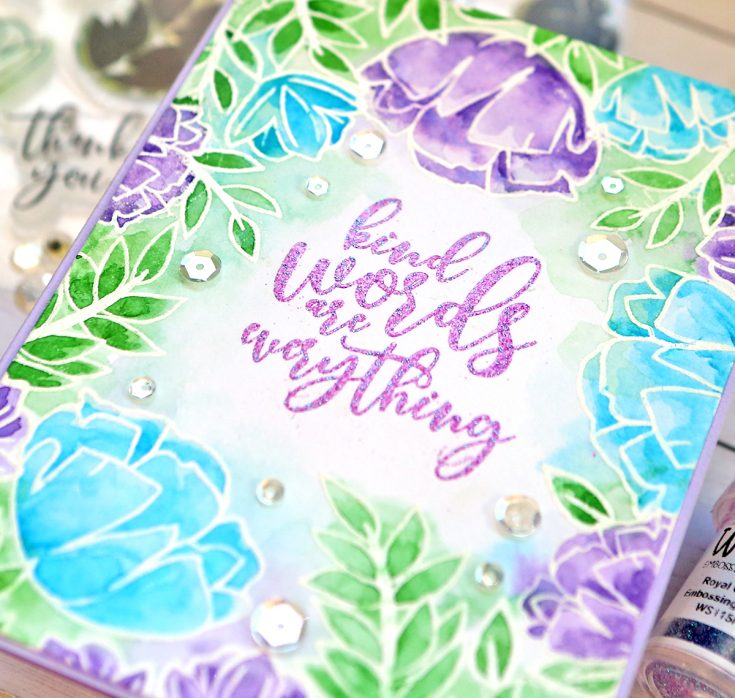
Tips:
- I use a Misti when doing this type of stamping as it makes it way easier; place your sentiment stamp on the paper first so you can see where it will be
- Arrange a few stamps around the sentiment and emboss those; then go in and add more, but layer them over each other just slightly so the white areas overlap
- Use a wash of watercolor for this type of messy painted card so the background is also the same colors; just go back into the actual stamped images and add a second layer of paint so they are darker
- Add some sparkling clear sequins to finish the card and draw the eye into the sentiment area
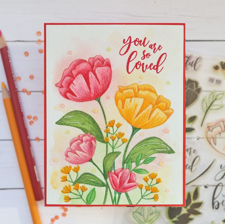
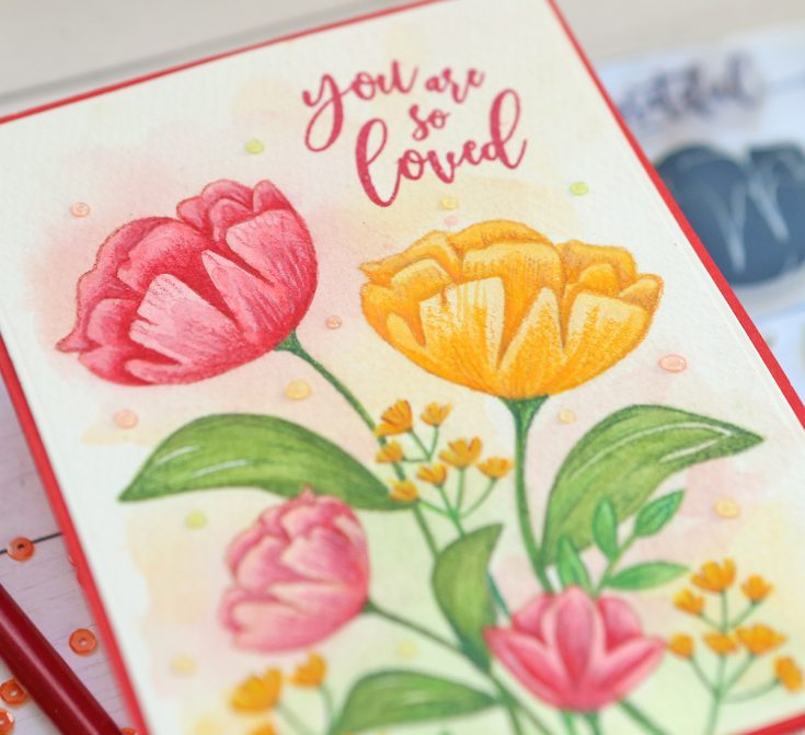
I love to watercolor, so this type of card is one of my favorite to make. I stamp all of the images first with a natural color of ink that is just a shade or two darker than the watercolor paper. You can overlap the images as all of the ink will get painted over – not need for blocking images as you stamp overlapping ones. I always use Arches or Fabriano watercolor paper for my more serious watercolored cards as the paints just move so nicely on the higher end papers.
Tips:
- Use a light natural type color of ink and overlap images as I stated above since they will all be painted over
- Use colored pencils to add shading and depth to your painted images
- Add a darker shade to a flower with a colored pencil to really make the images pop as I did for these little tiny flowers in the bunches
- Do a light wash of watercolor on the background using some of the colors in your images to tie it all together – use LOTS of water so the colors are light
- Add in stems to some of the images in your bouquet with a green colored pencil so each flower or leaf stamp appears to go all the way to the bottom
- Emboss a sentiment in the top corner; I prefer to use embossing powder on this type of cold-pressed watercolor paper as sometimes regular ink doesn’t show up enough on the paper (if you do use ink, use a Misti so you can stamp it several times)
- Add some Tonic Nuvo Jewel Drops around the background in all of the colors used so they are light like the background
That’s it – five ways to use this stamp set with six examples. Do you see why I love this one so much now? The large array of stamps in it give you the option of creating big floral bouquets or dainty floral wreaths. There are enough sentiments to use a different one on all five cards, plus there are lots of small ones I didn’t even use. Have fun trying out these techniques with different stamp sets in your collection so you can get the most use out of each one. I try to make at least 5 cards with each set I purchase so I really get my money’s worth. Have a fun time creating friends and thanks so much for visiting today! Suzy
SUPPLIES:
|


Thanks so much for stopping by and thanks to Suzy for being our guest!