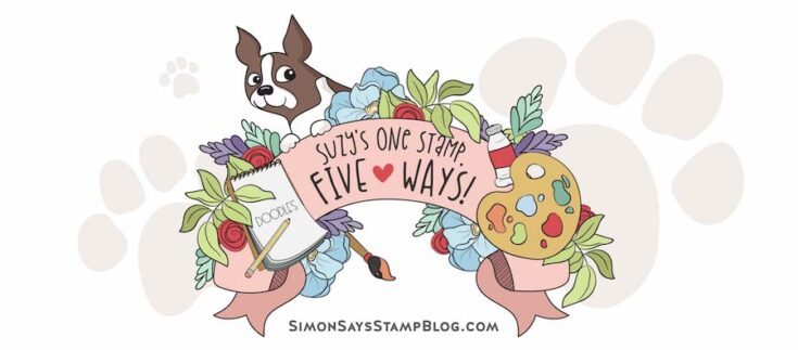
One Stamp, Five Ways: Folk Flowers
Hi friend! Please join me in welcoming back special monthly guest Suzy Plantamura with a BONUS fun rendition of “One Stamp, Five Ways” featuring our newly released Folk Flowers stencil and stamp set! Read on and learn more! Enjoy!
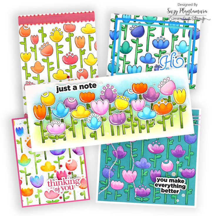
We are in the middle of Spring with lots of flower’s blooming where I live in Southern California. When picking a stamp set for my “One Stamp, Five Ways” series, I wanted it to be able to represent all the beautiful colors of the flowers around me. I picked the Folk Flowers stamp set from the In My Heart release as it is a 6×6” stamp with matching stencils! I also used one greeting stamp for all 5 of my cards called the CZ Good Greetings 1 stamp.
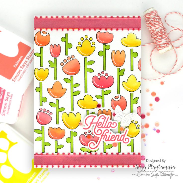
This is a 5×7 card as I wanted to use as much of the stamp as possible on it. I stamped the Folk Flowers stamp set with black ink on a 5×7” background. This is a 6×6” stamp so it left some room on the top and the bottom of my card. I used Pawsitively Saturated Inks and the matching stencil to color it.
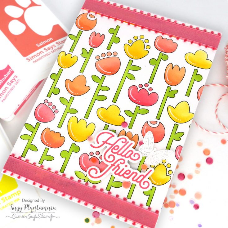
I stamped a sentiment using the CZ Good Greetings stamp and die bundle. I used Rhubarb as it is one of the darker inks I had used in my design. I attached it to the bottom of the card with foam tape behind it. I added a small butterfly leaving it white to the bottom right side of the card. I attached some ribbon I had in my stash to the top and bottom where the stamp didn’t reach. I added a few sequins from the Summer Sunset and Peach Bellini Embellishment Mixes.
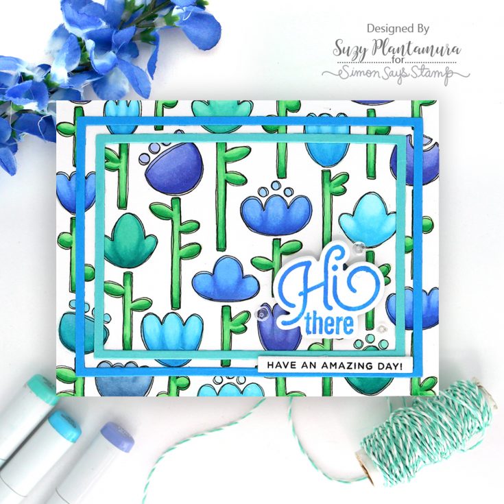
I stamped the Folk Flowers with Latte PSInk this time for no-line coloring. I colored in the designs with Copic Markers. After that, I decided to outline the flowers using a fine tip black marker. I outlined them two times to give it a doodled look which I think goes well with the flowers.
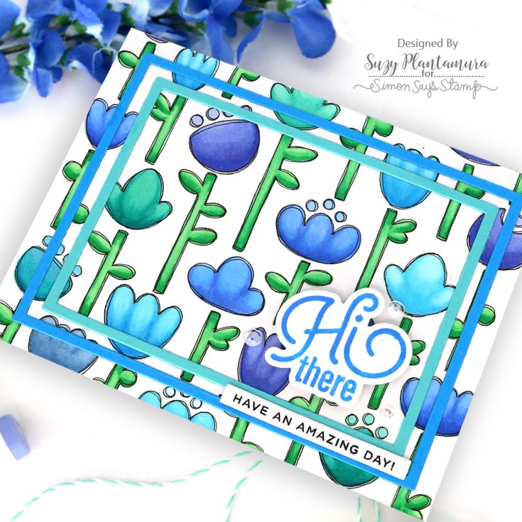
I stamped a sentiment from the CZ Good Greetings 1 stamp set with Marine PSInk (stamped it twice so it was darker). I die-cut two of the A2 Frame Dies out of two of the colors of cardstock I used in my design. I glued both on and then added the greeting inside the smaller one. I stamped another smaller greeting with black ink and used the SSS Banner Dies to die-cut it. I attached it over the center of my two frames. I used some sparking clear sequins around the greeting.
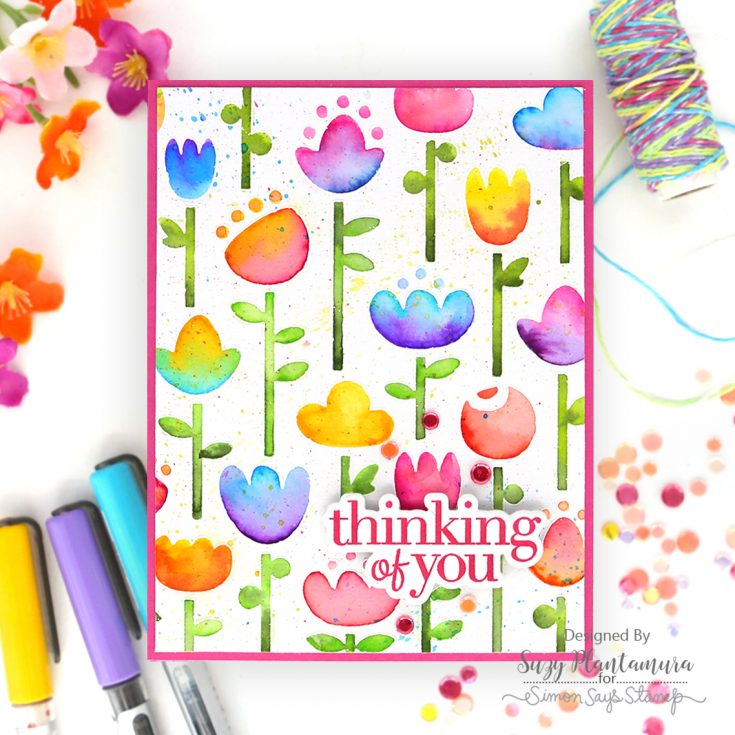
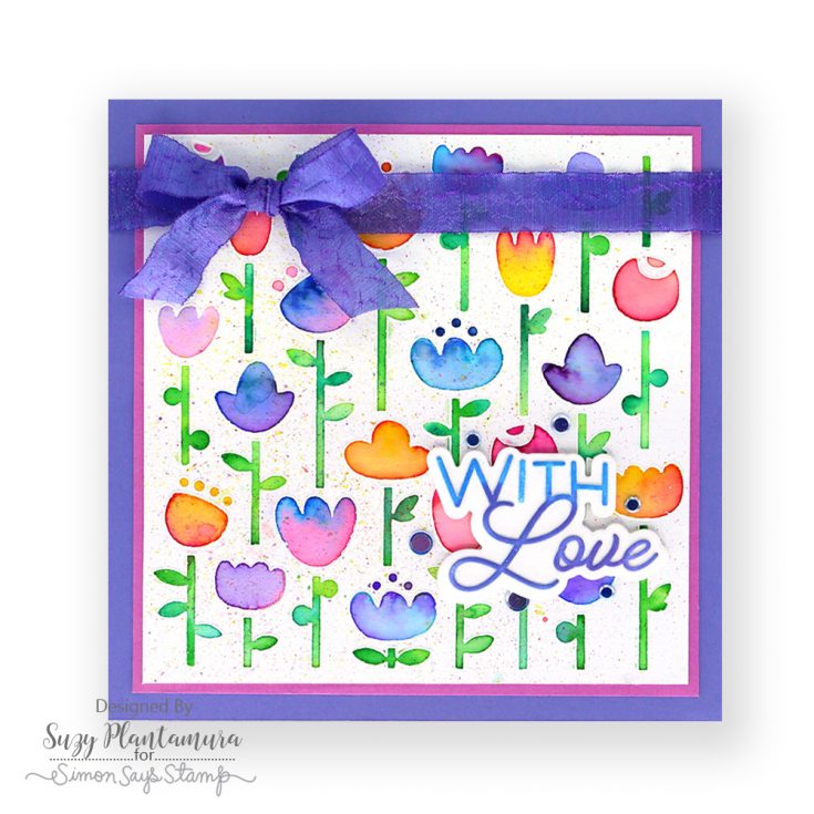
I embossed the Folk Flowers stamp on Tim Holtz watercolor paper using white embossing powder. I watercolored it with Karen Brushmarkers. I love how vibrant they are! I used two colors inside each flower by adding water first and then touched my water brush to the tip of the markers. I prefer to emboss stamps that I am going to watercolor (especially with these markers as they are reactive and easily run out of the lines) so I can keep the color where it belongs! I splattered some of the markers by tapping them over my finger over the card.
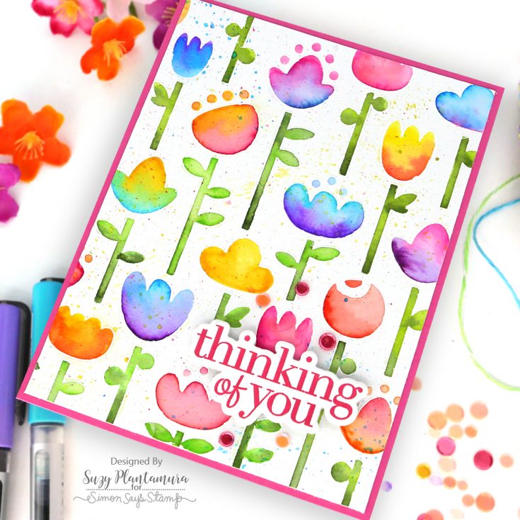
I cut my A2 sized card to be a little smaller, so it fit on a bright pink card base. I stamped a sentiment from the CZ Good Greetings 1 stamp set using Watermelon PSInk and die-cut it out. I attached that to the bottom of the card with foam tape behind it. I used a mixture of Peach Bellini and Summer Sunset Embellishment Mixes around the greeting.
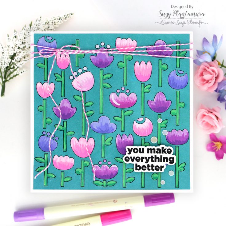
I stamped the Folk Flowers stamp set on Teal Cardstock with black ink. This time I wanted to keep my card 6×6” so I could use the entire stamp on it. I colored the flowers in with Acrylic Markers – I just bought two different brands to paint shells and rocks with and I love using them on my cards. They give you a very vibrant opaque look so they will show up on dark cardstocks.
I wanted to show this card using the Folk Flowers stamp set that I made for the In My Heart blog hop. It uses the stamp for a 6×6” card also embossed and colored with Karin Brushmarkers. I showed this card in the blog hop for this release. My directions for this card are on my blog post HERE.
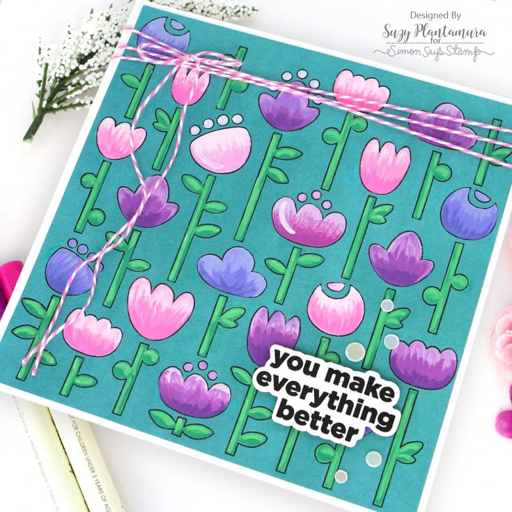
I cut my colored piece down a little and mounted it on a white cardstock card base. When I make 6×6” cards, I cut two pieces of white cardstock, one 6×6” and one 7×6”. I fold the larger piece over, so it has a 1” border. I glue the top piece over this folded area. I stamped a sentiment using the same CZ Good Greetings 1 stamp set and Versafine ink. I attached it to the bottom and then added some Marshmallow Embellishment Mix around the sentiment. I also tied some pink and white twine to the top of the card wrapping it around three times.
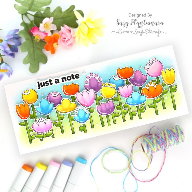
I was trying to think of one more way to use the stamp set, so I stamped it in black and cut all the flowers out. I colored them with Copic Markers and used a white gel pen to add lines to each one. For each flower, I used 3 colors of Copics with the darkest on the bottom and the lightest on the top.
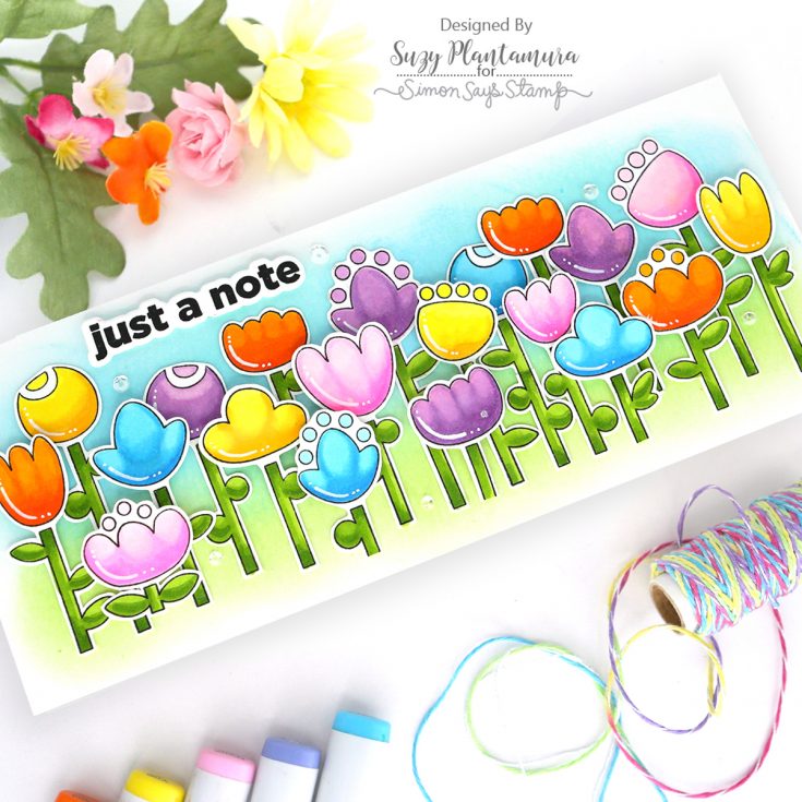
I made the background by applying PSInks in Marine on the top and Sprout on the bottom of a 3.5×8.5”. I attached all the flowers over the background using foam tape behind just the top of each flower for the ones in the front. I stamped a sentiment using the CZ Good Greetings stamp set and Versafine Ink. I attached it to the top of the card.
I think this blog post should be called “Two Stamps, Five Ways” haha. I have so many greeting stamp sets or dies that I could have used on my cards but I wanted to show how versatile a greeting stamp set can be as well. I asked my two grand-daughters which card they liked the best and they both picked the last one above, Just a Note. I would love to hear which one is your favorite! Thanks for visiting the SSS blog today! -Suzy
SUPPLIES:
|


Thanks so much for stopping by, and thanks to Suzy for being our guest!


I love how Suzy showcased the versatility of the Folk Flowers set—using both the stamp and stencil to create such a vibrant, spring-inspired design. The way she incorporated the greeting stamp and layered elements like the ribbon and sequins really elevated the card while keeping the focus on the beautiful florals. It’s a great example of how one set can inspire multiple creative approaches!
Hi, SSS / Suzy – These are all soooo pretty – one as beautiful as the next!
Such happy, colorful cards. I love them all. The
pretty bright colors really make them pop.
Really fun cards – I love the variety of colours
The way you utilized the full scale of that 6×6 Folk Flowers stamp on a 5×7 card is inspiring, especially with the thoughtful balance of negative space at the top and bottom. I love how adding the ribbon and sequins in those gaps creates such a cohesive finish without overcrowding the design. Your approach to letting the flowers take center stage really captures that vibrant spring energy you mentioned.
Suzy’s approach of using one massive 6×6 stamp to create five distinct cards is such a clever way to maximize the potential of a single design. I love how she utilized the negative space around the edges to incorporate ribbons and sequins, which really elevates the layout beyond just the stamped image. It is so inspiring to see how a single spring theme can be interpreted so differently while keeping the core elements consistent.
I love how you utilized the full 6×6″ Folk Flowers stamp on a 5×7″ card to capture that vibrant Southern California spring palette. The choice of foam tape for the sentiment and the strategic ribbon placement really shows how to maximize a large design while keeping the layout balanced. It’s so inspiring to see how one set can transform into five distinct looks while staying true to a cohesive color story.
Such a gorgeous showcase of the Folk Flowers set! I love how each card has its own personality while using the same focal stamp. The watercolor version is my absolute favorite — the white embossing with vibrant brush markers creates such a stunning contrast. Thanks for the inspiration, I can’t wait to try this technique myself!