Using the Pantone Color of the Year: Ultra Violet
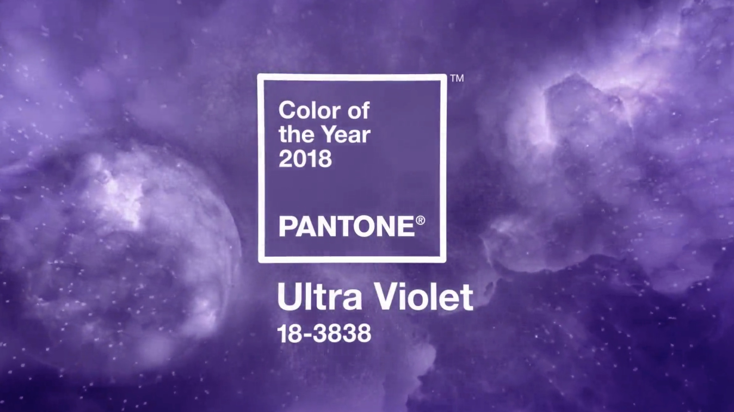
Hello crafters and Happy Wednesday! Are you a fan of purple? If you are, then I have a feeling you will be seeing quite a bit of it this year! Pantone, considered the color authority across many industries, has dubbed 2018 as the year of Ultra Violet! It is a stunning color, don’t you think?
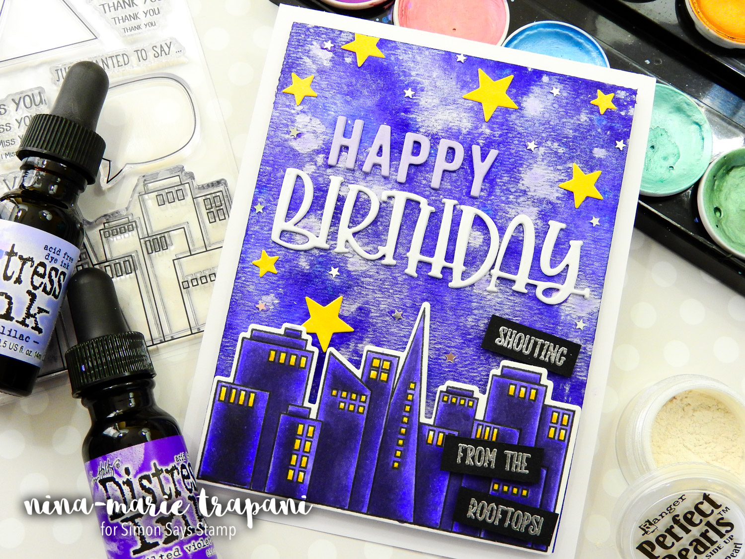
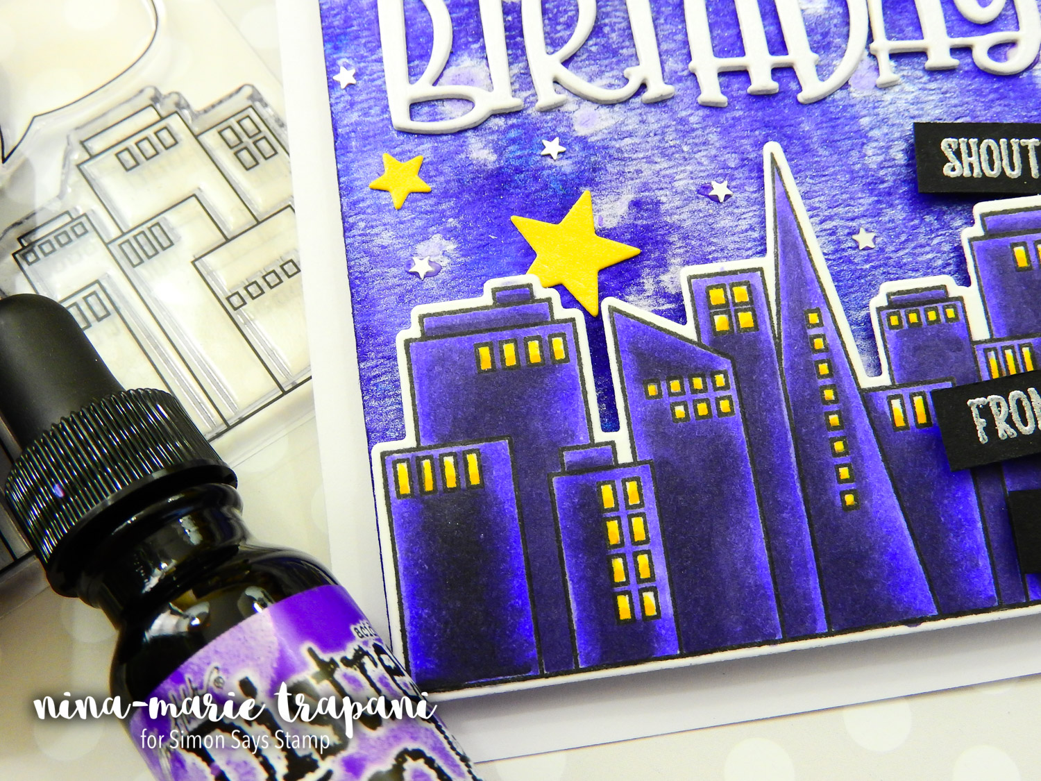
Today I have a project to share with you that features not only some of our newest Simon Brand products, but also LOADS of Ultra Violet details! Our From the Rooftops stamp set was the perfect focal image for the card; colored in rich purples to mimic the lighting in the galaxy-styled sky, the buildings truly pop.
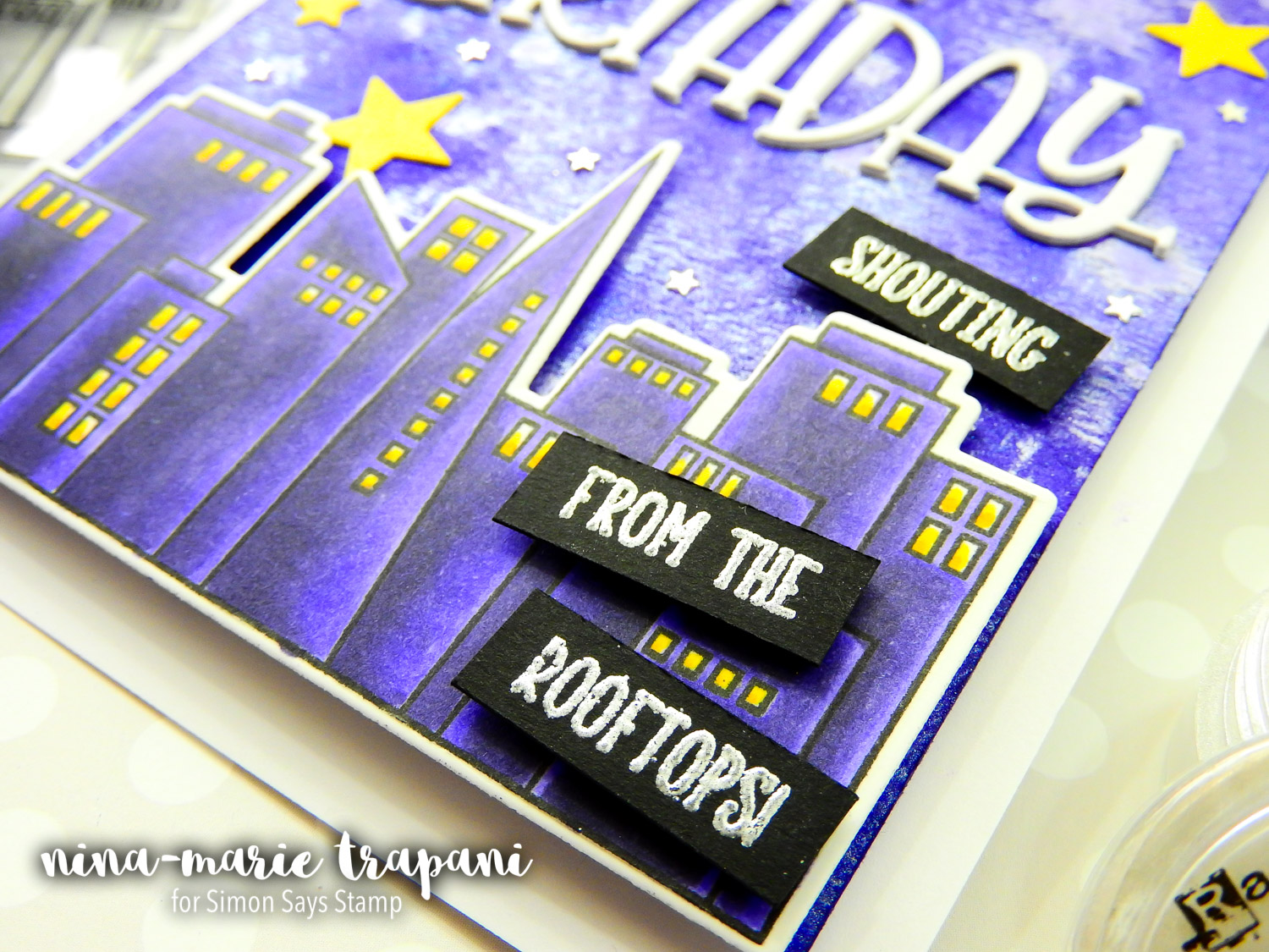
Speaking of the sky in the background of this card… this was so much fun to make and honestly, quite easy (the hardest part was waiting for it to air dry!). Have you ever tried dropping Distress Ink refills onto wet paper? It is a technique similar to dropping alcohol inks onto Yupo paper. The refills bloom and move with the water, creating some amazing effects with very little effort. To make this background really stand out, I sprinkled on a bit of Perfect Pearls and Ultra Violet Metallic Accents from Prima. The final result is amazing!
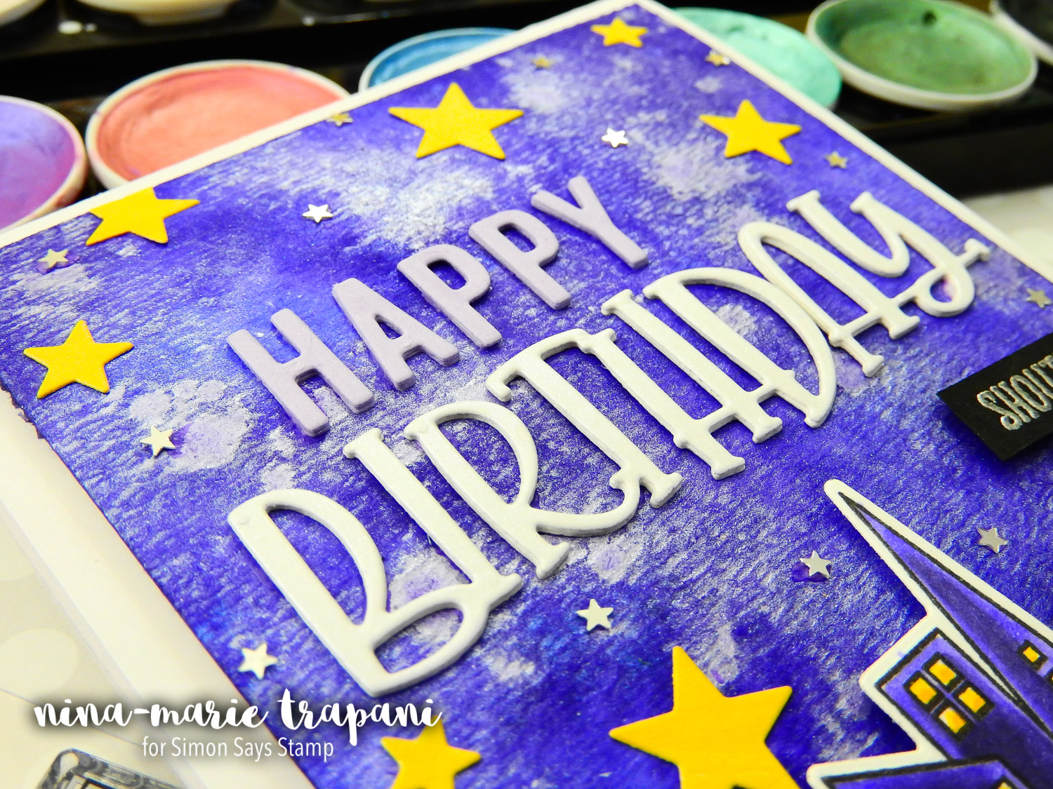
The fun birthday greeting is also a new! This awesome Simon die called Happy Birthday has a really playful feel to it, which looked awesome paired with the cityscape! Both the sentiment and the golden stars are cut from DCWV Shimmer Pastels Cardstock. Accenting the golden stars are some Mini Silver Stars confetti from Pretty Pink Posh.
Don’t forget to tune in to the video below to see how this card came together and watch the techniques I used to make it! I hope this card has inspired you to use some purples in your next card! Remember too, that if purple isn’t your favorite color, you could recreate this card using any color you like! If you do use a different color, I challenge you to try using just a single color as the dominant tone, as I did with the Ultra Violets here.
Thanks for visiting me today!
WATCH THE VIDEO
SUPPLIES USED
|


Blog Candy Alert!! Follow our blog via email and comment on this post for a chance to win grab bags and blog candy! Remember to tag your awesome projects with #simonsaysstamp on social media so we can see what you are creating!


Love purple my favorite color! It looks great on the card!
Such a pretty background; it adds so much to the card.
Hi, What a pretty card and I love that shade of purple.
Beautiful card!!! Love all the shimmer!!!
This a great design with my favorite shade!
Wow!!! I love Ultra Violet!!
WOW! I love the gorgeous Ultra Violet!!
Yes, I love purple, though aubergine/eggplant is my favourite hue. Love this card, as I do all things purple. Thanks for sharing the technique video.
Wow! Great card! Every detail looks fantastic!
Wow! One of my favorite colors! It’s great on this card.
Oh yay, purple is my favorite color! Love your gorgeous card, Nina-Marie.
Purples are nice colors for creating – I like the Polk-a-dot Purple cardstock I have been using lately – thanks for showing us your lovely hues – have a blessed week
Always have and always will love purple.love the purple on purple.
Great card! Since purple is my daughter-in-law’s favorite color I find that I am often choosing shades of purple for my cards, clothing, etc. She would love this card!!
Awesome card! I love purple…Thanks for sharing..
Whoa!! That card is awesome and the background is really beautiful. I love purple myself, but haven’t used it much in cards. After seeing this I want to pull out all my purple ink and papers and make something!
I have some Perfect Pearls in my stash, but never would have thought to sprinkle the powder directly on the card. The effect is awesome! Beautiful card! I think I’m going to love this year’s color!
This year’s color is gorgeous! I love all shades of purple.
Like the color and the card!
Gorgeous colors in the violet range. Loving it.
L O V E purple!
WOW – WONDERFUL card Nina-Marie – a great scene and STUNNING background! Feeling SO INSPIRED, NEED to try this technique NOW :)
Beautiful violet colour!
Cool color for the year!!
I love Purple and
this card just grabs
me! Super fun.
Carla from Utah
Such great card!! I think I need that stamp set!!
Wow. Ultra violet is gorgeous.
Beautiful card! I love the city scape and of course the color!!
OHHHHHHH I LOVE purple so I LOVE this card!!!
Beautiful card! What a nice background!
WOW! This is my color. I love love love love all those projects. Stunning designs!
What a stunning color of the year…and what a great BD card to show its possibilities. tfs
I love the ultra violet because I was born in February and that is my birthstone color. I do love the fun
Birthday die cut.
Funny that I had these already on my wishlist!!!
What a stunning card. Definitely going to try that technique with the alcohol inks.
fun card … great color!
Wow! Awesome background Nina, and I love how dimensional the buildings look. TFS
Fabulous colour indeed! I love your card design, and that happy birthday die is fantastic! Going on my wish list for sure – what a cool font!
Love your card,purple is such an awesome colour
Great sky and cityscape on your card.
Delighted that purple is finally having some recognition, although I have always loved it. Strangely my colours of the moment are brown and blue, but that may change at any time.
Love the colours! And a ard for a guy or lady; that’s so good!
I love your card and purple is my favorite color :) . I love how you did the background with adding the metallic paint over the distress paint and adding the perfect pearls powder while everything was still wet, how smart!! Usually everyone makes up a water mixture or spray bottle but who would have thought to just add the powder since everything was still wed, duh!!! I just learned something new! Thanks for that and thanks for sharing!!!
Nice color choice. And lovely sky on your card.
Hooray for purple!!! Gorgeous!
great card
Love that I’m going to have to have Ultra Violet. Great card!
Great card and color. Thanks for sharing.
Linda D.
What a great card and I am so ecstatic that the color of the year is Ultra Violet!!!
Gorgeous card. Hugz
Great user of this beautiful color. One of my favorites. You did it proud.