New Tim Holtz Paint Preview with May Flaum!!
May Flaum here, and today I’m really excited to do my first post about Tim Holtz Distress Paints and share some initial thoughts with you – and why you may just have to have some! Tim Holtz created a great intro video that you can see on youtube here – but truly you have to see and try these paints to believe them!
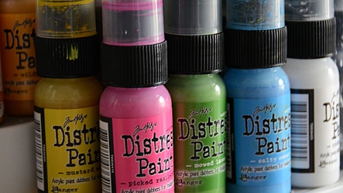
First off, above you can see picket fence and picked raspberry on my craft mat ready to go. These dabber-topped paints are more fluid than traditional dabber or acrylic craft paints, but they are opaque and have more body to them than distress stains do.
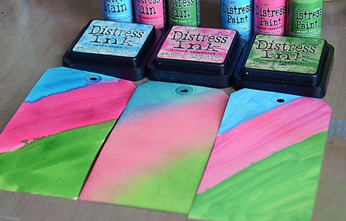
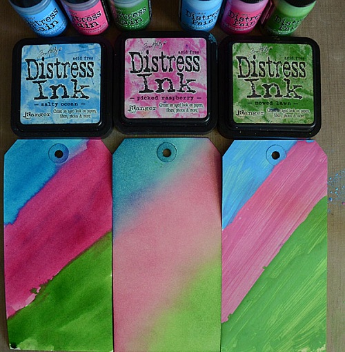
Above you can see (left to right) distress stain, inks, and paints used in the same colors, onto manila tags. The stains have the most fluid, richest look I think. The ink pads are of course the most blendable, and the paints are just fantastic because while yes, it looks like regular paint it is anything but. It has distress properties and is reactive while wet, but once dry it is set! So while getting water on the stains or inks (once dry) would mean water spots and reactivity, on the paint you can layer other colors and mediums without fear! Once dry – it is set.
I just used the dabber and directly streaked paint onto my tag (above), not necessarily evenly so you can see that you can get a semi-opaque to opaque look with them. They dry matte finish and are very smooth. Distress inks, pens, and other mediums work great right over the top.
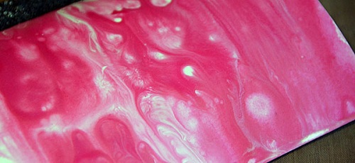
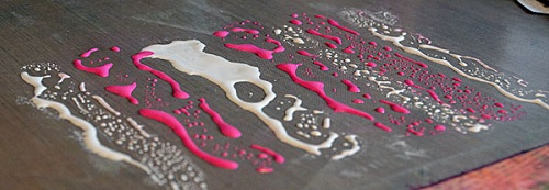
As I mentioned before they are reactive with water (and each other) while wet. Above you see some intense marbling of Picked Raspberry and Picket Fence. This was done simply by using the paints then spritzing with water. Pretty cool!
I am already a fan of using these on book or text printed paper as you can get a very soft milky semi-opaque wash look. I’m also a fan of using them for stamping. Just make sure that you spritz your stamp off with water to remove the excess paint when done.
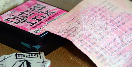
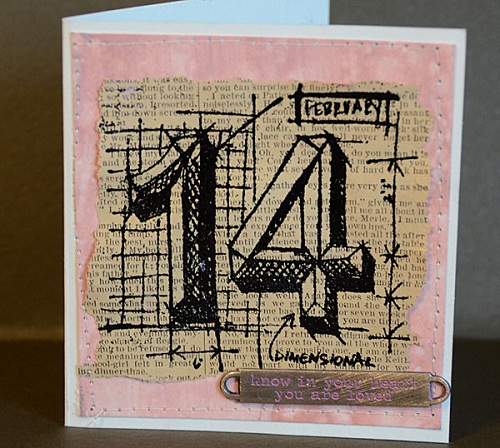
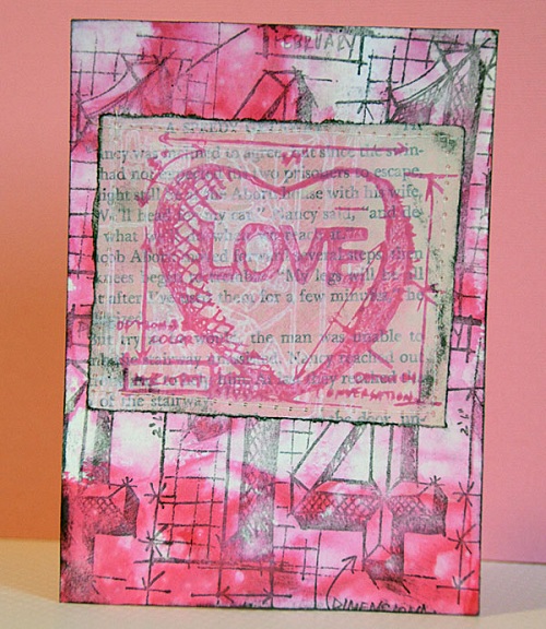
Below you can see a card I created with Victorian Velvet (and water) used to color white cardstock. I also used it on my metal accent (yes, they work on metals and all sorts of surfaces!) on this card, and my 14 stamp is a Tim Holtz Valentine’s Blueprint stamp that is embossed with black powder onto book paper.
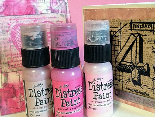
I really like having this more opaque paint format of distress – it creates a totally different look and I know I will enjoy using the paints on everything from accenting metal embellishments to cards to layouts to mixed media canvas pieces as well.
Now I could always get wild with that marbled pink background I showed you before as well…
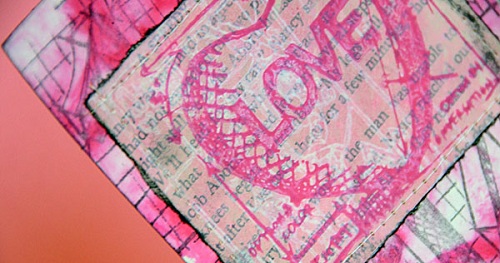
Hmm, I may have gotten a bit TOO wild with my paints and blueprint stamps here – but that’s ok! I am in that stage of creating with these where I am really getting to know the product and how I can best work with it. I’m a big believer in creative play and letting yourself be free to create and try stuff without pressure.
I can tell you that I’m already a fan, and I’m thrilled that I no longer have to mix my distress stains with white paint to get distress colors of paint! These are so much better, and I think I’ll be having a lot of creative fun with them.
Want more ideas, tips, and projects? Well I will be back with another article soon! This was just my introduction to these paints that are now available for pre-order at Simon Says Stamp.
Pre-order your favorite colors now! We anticipate to have them in stock sometime between now and mid February.
Congrats Blog Candy Winner!
From: What Are You Known For?: Jess!
Please email [email protected] with your address and the name of the blog you won from to claim your prize!
Blog Candy Alert! Join our following and comment on this blog for a special surprise candy!


There are no comments.
Leave the first?