Distress Ink Color Pop: Candied Apple!
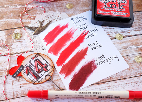
Hello creative friends! It’s Color Pop Day! This Color Pop is sort of bittersweet…because it’s the last one! Twelve beautiful new colors for 2015! Can you believe it? What a fun ride it has been. I have really truly enjoyed sharing with you and bringing you a project with each new color. I’m sad it’s over. The good news is that I think that maybe this is my favorite project of all of them – and I have been so anxious to show it to you! The final color in the Distress 2015 ink series is Candied Apple. It is a beautiful, bright, apple, fire engine RED! Man, this color is vivid and bright and I love it! The swatch above shows where it fits into the Distress Ink color family. It’s very close to Barn Door in my opinion – with a little more warmth to it. I think it’s the perfect color for Valentine’s Day. This color just had to be made into hearts! Since this color is so vivid, I paired it with neutrals for today’s project – Vintage Photo and Antique Linen.
Before we get too far into the photos – I want to tell you some other good news! Since we got lots of good feedback on the Color Pop Series, we have decided that I will keep doing a monthly Ranger Color Series. YAY! I’m still figuring out the best ideas for it. Maybe I will show color combinations….or maybe feature some of my favorite colors….or keep it seasonal? I would really love your input on this. Tell me what you want to see more of!
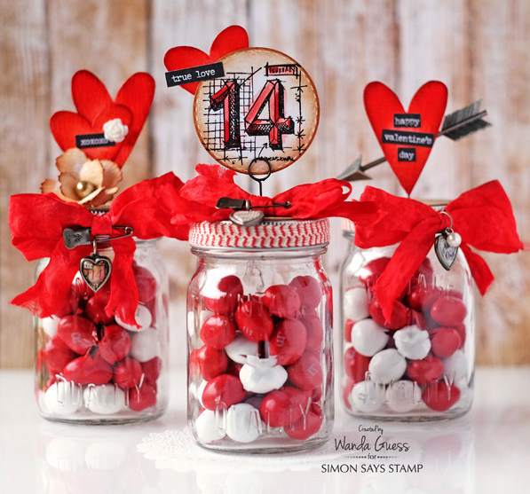
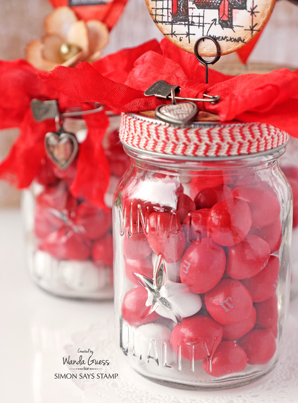
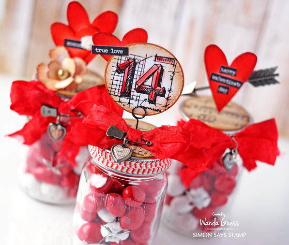
For my Candied Apple project, I used the Tim Holtz Mini Mason Jars and lots of cool Ideaology embellishments to make Valentine treat jars. I had the best time making these! One of the fun things about this project is that you can go as crazy or as simple as you want. (I went crazy!) My jars are filled with Peanut M&M’s.
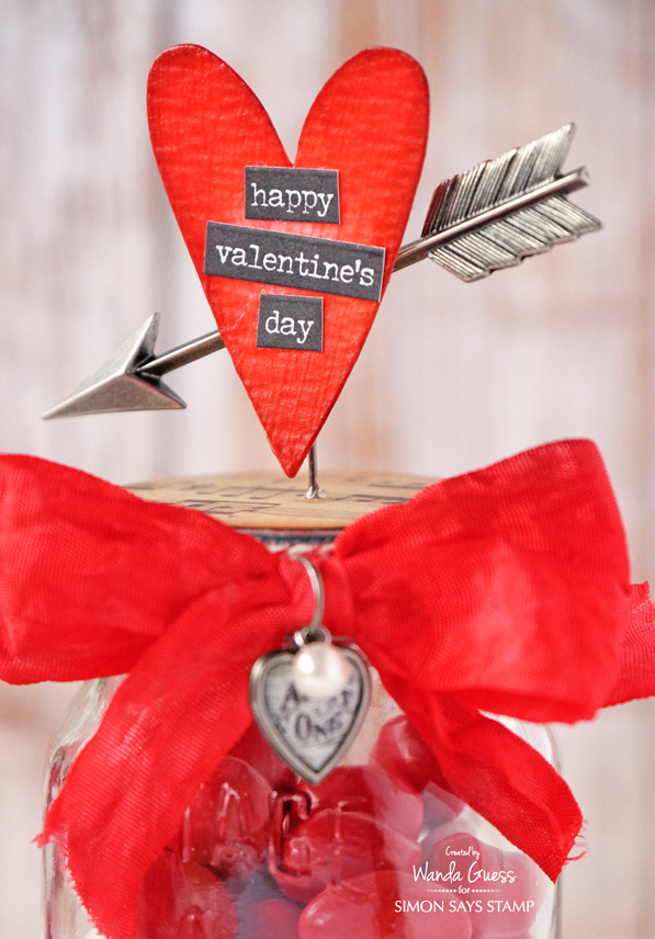
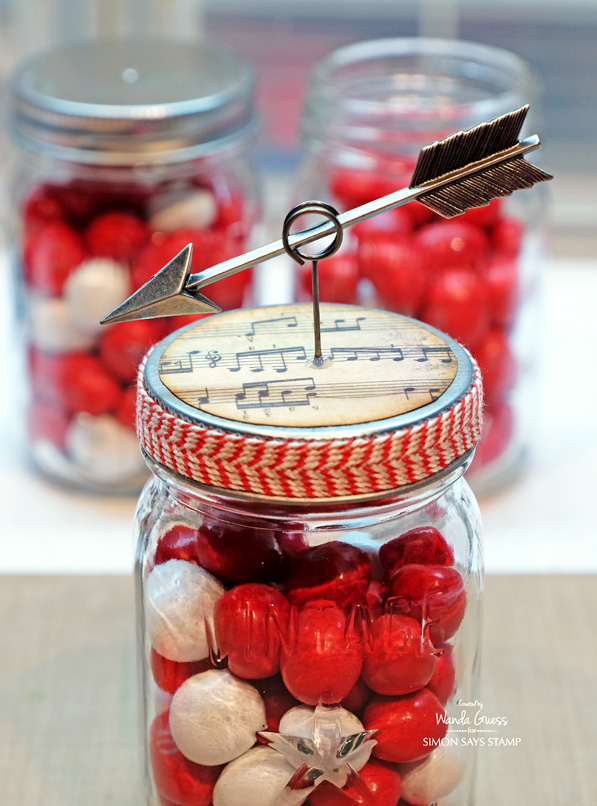
For this jar I used the Silver Arrows along with a Movers & Shapers Heart Die and the Occasions Stickers.
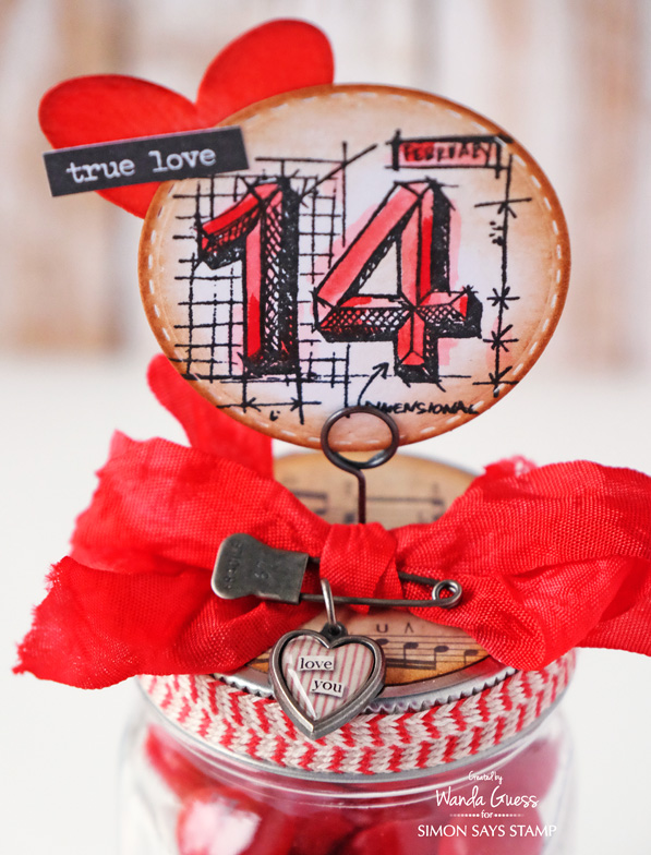
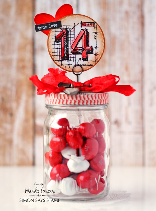
For this jar I used the Tim Holtz Mini Blueprints stamp set along with more hearts and stickers! My stamped image was colored using a Candied Apple Distress Marker and a Water Brush for a soft watercolor effect. The Stitched Circle was edged in Vintage Photo Ink.
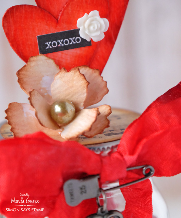
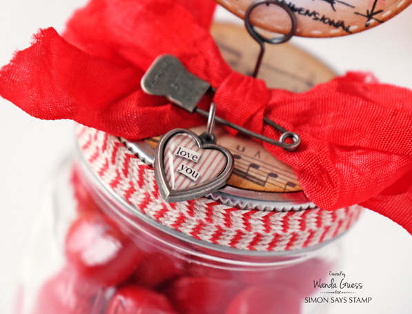
You know that I love to dye my own ribbon! I used the Tim Holtz Crinkle Ribbon and the Candied Apple Spray Stain for a rich, deep red. OOH LA LA. After the ribbon was dry, I sprayed it with Perfect Pearls, so it also has a little shimmer. I die cut my hearts out of watercolor paper and then inked them with Candied Apple Distress Ink. Then I added a few coats of the new Crazing Distress Medium. It makes a really cool finish on paper. For the tops of the jars I cut Tim Holtz music paper into two inch circles and edged them with ink. 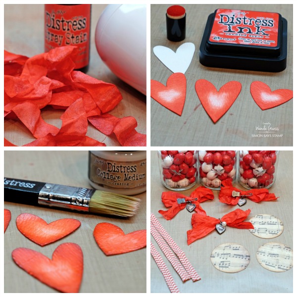
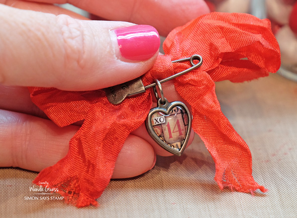
I wanted to show you how the arrow was mounted onto the jar. The lids are not super thick, so it was easy to poke a hole in the top using just the memo pin. Then I put the arrow into the ring at the top. The heart covers the middle. I added a drop of Glossy Accents to keep the pin from sliding down into the jar. Tip: I kept all the decorations affixed directly to the lid, so the recipient can open the jar and get the candy without too much trouble and without ruining the look.
I made this rose using the Mini Tattered Floral Movers and Shapers Die. I cut two of them and formed them into a rose – then I added a pearl to the center. I used different word stickers on each jar. I love that there are now Occasions stickers for Valentine’s Day (and every other holiday too)!

I have always been crazy about these heart charms! That reminds me – I need to buy some more!!
Thanks for joining in on the Color Pop adventures with me! It has been my pleasure to do this collection of projects. I wish there were MORE new colors for this year too! Don’t you? CLICK HERE to see all the Color Pop Blog Posts! Happy Crafting everyone!
SUPPLIES:
 |
 |
 |
 |
 |
 |
 |
 |
 |
 |
 |
 |
 |
 |
 |
 |
 |
 |
 |
 |
 |
 |
 |
|
 |
 |
 |
 |
 |
 |
|
 |
Leave a comment on this blog post – for a chance to win a blog candy grab bag! Winner will be announced next week! Good luck! Have a great day!


thanks for putting all the reds distress inks together! This makes it so helpful to decide which is right for my project!!
I love this project. It’s very lovely!
I’m so happy your color series will continue. I look forward to your projects and can hardly wait to see what you come up with in 2016. I vote for Distress color combos and suggestions if one has just the pads and markers. I’d also like to see your ideas for the new Distress crayons.
Awesome projects, I love this new red!
What adorable jars and you decorated them beautifully! That’s such a yummy red. It does look like a Candy Apple!
Lovely love project. Once again I am grateful for the colour swatch to compare the colours – thank you
Scrumptious!!
Wow! You put quite a lot of work into these, and it sure shows! TFS
LOVE this red, it has become my most used ink pad of late! Awesome jars!!
Super cute!
Your projects are really glorious, and almost make me wish we celebrated Valentines Day. I am glad you will be continuing the Color Pop Series. I would enjoy seeing how to combine all the various colors. Water coloring is my current love, so any ideas, or techniques on that subject would also be appreciated.
So bright & lovely!!! Stunning!
Wanda, I really love your creativity and vision!
Gotta love a true fire engine red color! Such a fun project, thanks for sharing.
Love this series, so glad to hear you will continue it
This is such a fun project!
I love how you decorated all the mason jars….great designs and awesome candied apple color.
This is such a fun display! Thanks Wanda.
OMGosh, I think this one is my fav, too! Your projects are awesome and thanks so much for sharing! Great inspiration!
The Valentine treat jars are awesome! Love the new color and all the fun Tim Holtz embellishments! Thanks for the tip on coloring the ribbon — I hadn’t thought about the spray. And thanks for pictures and not a video — while I love videos, I don’t always have the time to watch. As far as the color series — I recommend doing seasonal colors that would include some holidays!
This is such a vibrant red! Although, like many of us out there, I have a range of red inks {
Oops something went wrong with my post…let’s try again. This is such a vibrant red! Although, like many of us out there, I have a range of red inks {:)}, I don’t have anything so vibrant & saturated! Beautiful projects & use of color ♡
These are gorgeous. Thanks for sharing!
Looks like you had lots of fun with candied apple ink!!!
stamping sue
http://stampingsueinconnecticut.blogspot.com/
Agreed- it is bittersweet since it is the last one. But, the last Color Pop post is fabulous! You really showed off the beauty of the color and I love all of the details for each project.
Oh these are just beautiful…I can’t stop looking at all the fabulous details!!!
Wow these are fantastic! Love the ‘candied apple’ hearts! This project is very cute! Love the lil mason jars :)
Love this cheery red color!
Love this…may have to case it. Thanks for all the inspiration you share!!!!!
Adorable valentine. Can’t wait to make for granddaughter.
Wonderful Wanda!! I do love that red. The recipient of these jars will be so pleased. Glad to know the saga will continue. Love the idea of monthly occasions. Seems there is something in every month. Thanks for sharing and please keep amazing us…..
Cute jars! Love the new red color.
I just love this color! Great projects using it!
What a great idea. It’s so valentiney.
Thanks for putting all the reds together, it really helps with organizing them! Your project is fantastic, I am inspired to try something like it for my daughter!
Love the color!
That sure is a gorgeous red colour, Wanda! Fab projects that showcase it.
Sad that the Color Pop series is ending. Of course it is ending with a bang with the gorgeous Candied Apple and amazing inspiration! Excited that you are continuing with the monthly distress ink series. Would love to see some interesting color combos every month.
The finished jar looks gorgeous. Red is a great color by itself.
Wanda, I always get giddy when I have an email notification of one of your projects! I just love this, and all your others!
These Valentine treat jars are gorgeous, I love the vintage feel and the beautiful details!
What cute jars! The Candy Apple red is such a fabulous color for Valentines Day.
Awesome projects! Thank you for sharing, and for all the tips!
Thank you for the inspiration. I didn’t know that the color series for the Distress Ink was only for 2015…sad. I recently just started following their releases.
Awesome! I love these and thanks for showing the candied red.
Fun valentines projects! I love the bright red and embellishments.
Awesome color!!! This one is gonna be a real favorite of mine! Love it!
Love this project! Thank you
Love these color posts. That tone of red looks so vivid and bright. Yummy!
Wanda! Those projects are gorgeous and I know they will make the recipients’ hearts sing. I think this red is the bomb! It’s a great color and fits in the palette very nicely.